Clear Files

April 16th, 2024

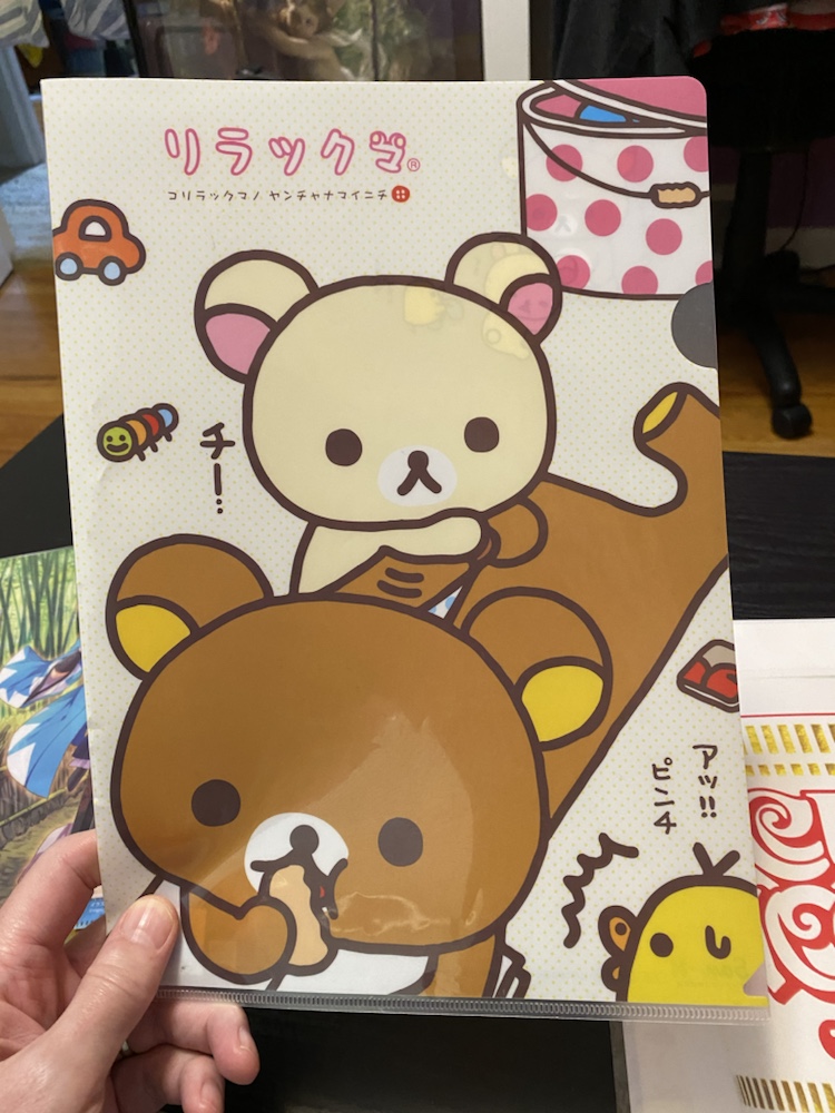
A ubiquitous type of Japanese collectible is the ‘clear file’. A plastic, printed equivalent to the ‘manila folder’ of the west, these are the cheapest example of otaku/anime merchandise and are available seemingly everywhere in Japan.

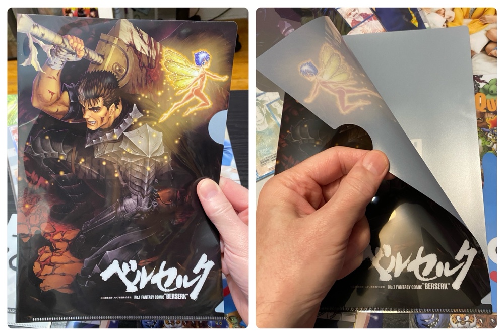
The most common type is shown above: a piece of printed thin plastic folded and sealed at one end to create a folder that opens diagonally. As with most merchandise in Japan, the manufacturing is top-notch, and they have a great smooth feel in your hands and the print quality is super high.

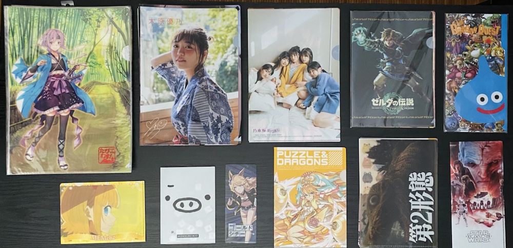
Over the many years we’ve been traveling to Japan we’ve been accumulating these, and now have almost 100. The above photo shows the variety of sizes we own, with the most common being the two in the top left, which are A4 (the kimono girl) and slightly larger. I’m sure there are many more sizes than those shown above – I’ve seen a few as big as a wall poster! – but easily 75% of ours are A4 size.

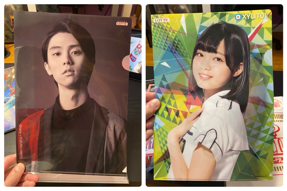
A decent selection of ours were ‘free’, such as the two above which were bonuses for buying packs of gum/chocolate at convenience stores. If I’m ever in a ‘konbini’ and they have a clear file offer, I’ll bend over backwards to buy whatever it takes to get the file. And no, I don’t know who the people on the above are either!

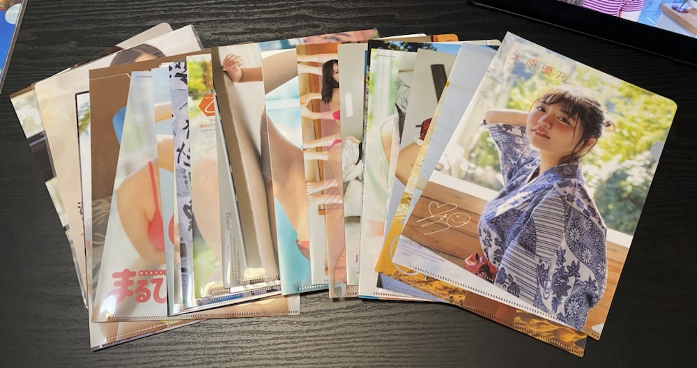
We have dozens of clear files showing pretty models, which frequently come free with manga magazines. When they do, it doesn’t raise the price of the magazine, which shows how cheap and disposable these things are.

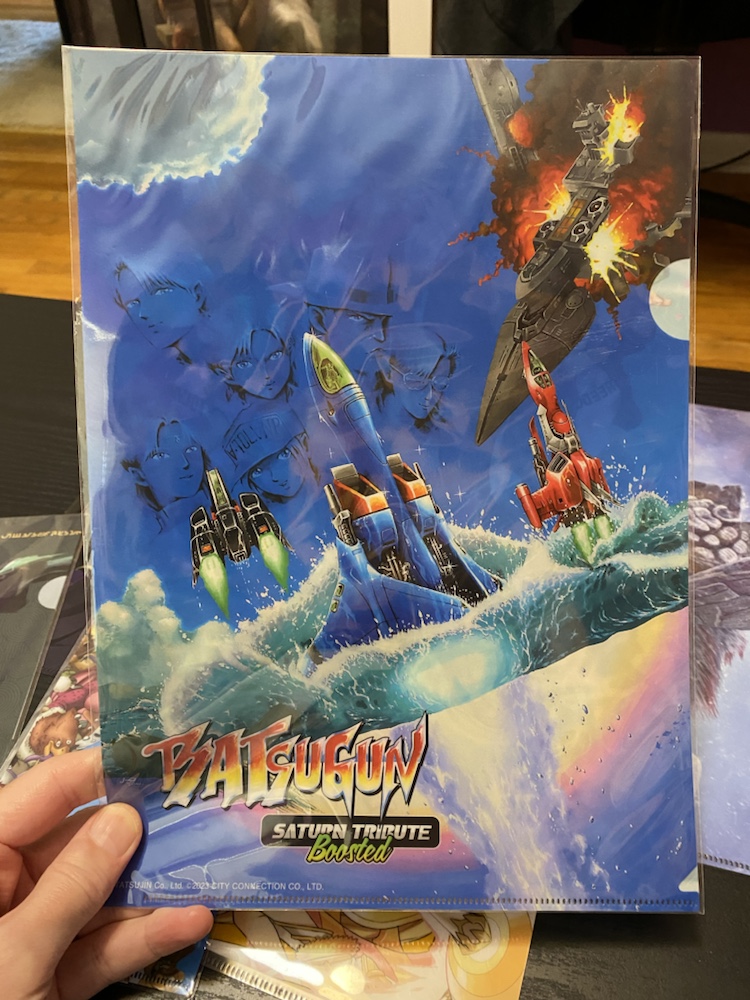
They are frequently given as bonus items when you purchase games, such as the above that came with a Switch game. More than once I’ve been checking out in a Japanese shop and seen a pile of files behind the counter and seriously considered buying the game just to get one.

Girl models aside, the majority of ours are anime related, but files are available for just about anything it seems. There’s a very good chance I’ve bought you one (or more!) of these over the years, and I know such purchases have included animals (squirrels, owls), trains, food and Japanese scenic photos.

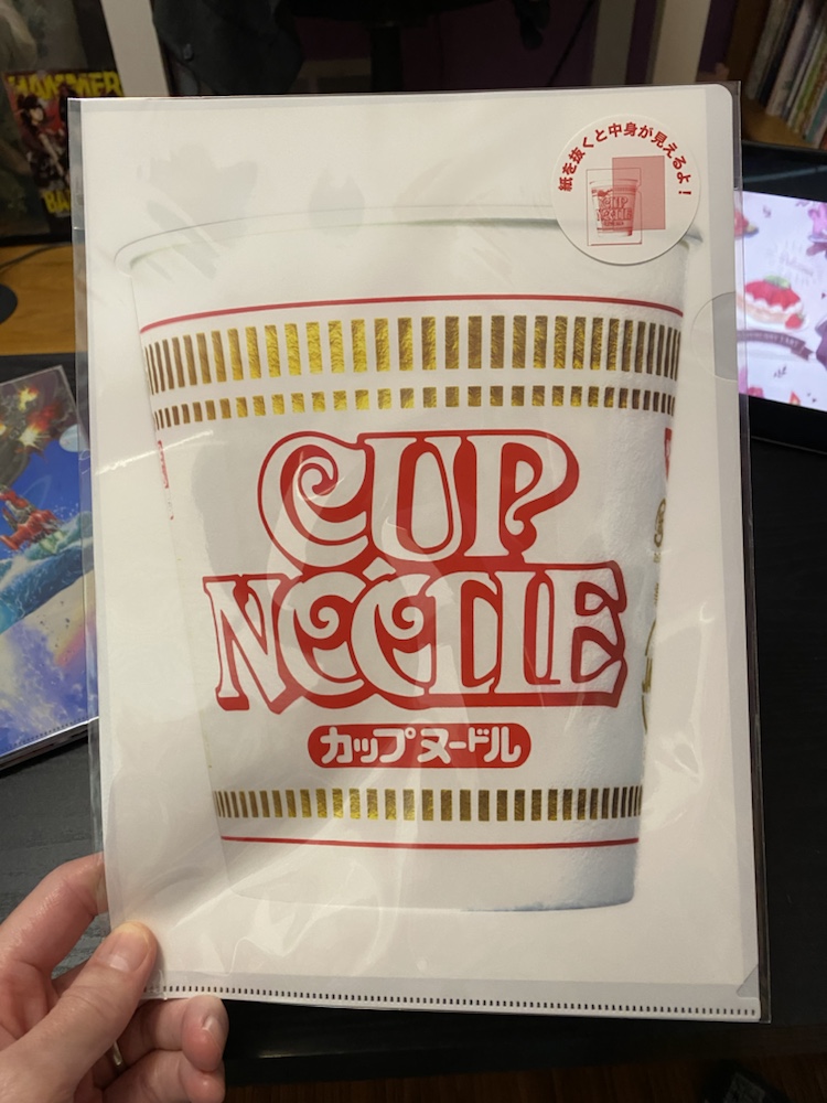
I bought the above at the Cup Noodles store in Yokohama. In fact I almost always buy a clear file when I’m in a souvenir shop since they can be so inexpensive: often only a few dollars.

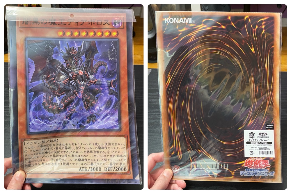
The above is very clever. While I don’t play the Yu-Gi-Oh card game, I love that they made this file to look like a giant card. I wish they’d make a MtG basic land into a clear file!

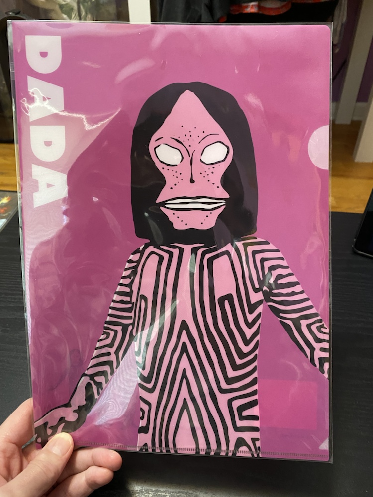
Earlier this year at the Osaka Ultraman store I spent enough yen that I got to play a bonus game where I had to shoot a little dart gun at a target board. I won the above pop-art clear file of an alien in the Ultraman universe 🙂

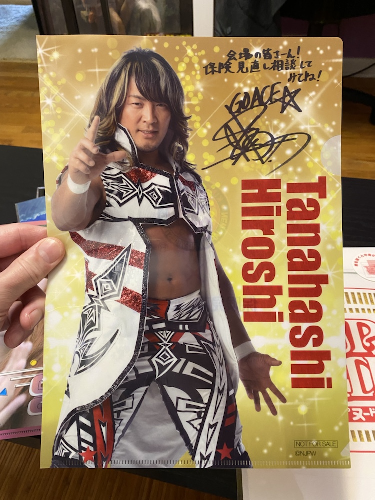
Several years ago when we saw NJPW at Tokyo Dome, the above was a freebie if you signed up for life insurance. I played the dumb foreigner and successfully talked my way into a free one! The signature is a facsimile, and ever since getting this KLS and I have nicknamed this wrestler ‘clear file’.

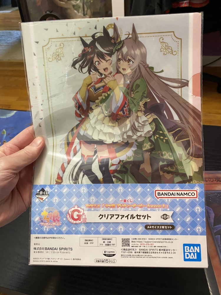
Clear files are often prizes in Ichiban Kuji lotteries (which probably deserve a post of their own one day), and we have quite a few such as the G prize from a recent Uma Musume Kuji.

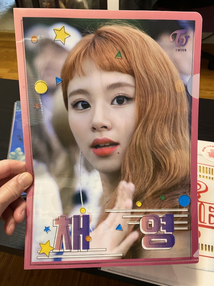
The above is a girl from the K-Pop band Twice. Bernard bought me this when we were last in Japan together, and one day when he has long forgotten about it I’ll send it to him for Christmas 🙂

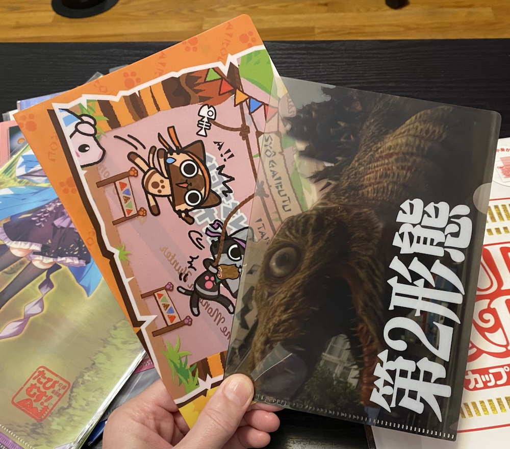
Clear files are also available in gacha machines, and the above are two examples (the right is Shin Godzilla). These machines have evolved over the years, and these days the files they vend are usually A4 size.

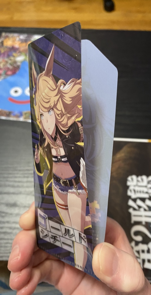
If you thought the gacha ones looked impractically small, look at the above! This came in a blind pack with a stick of gum, sold like trading cards. The file is so small it can’t even hold a single cheque (remember them?); what’s this supposed to be used for?!

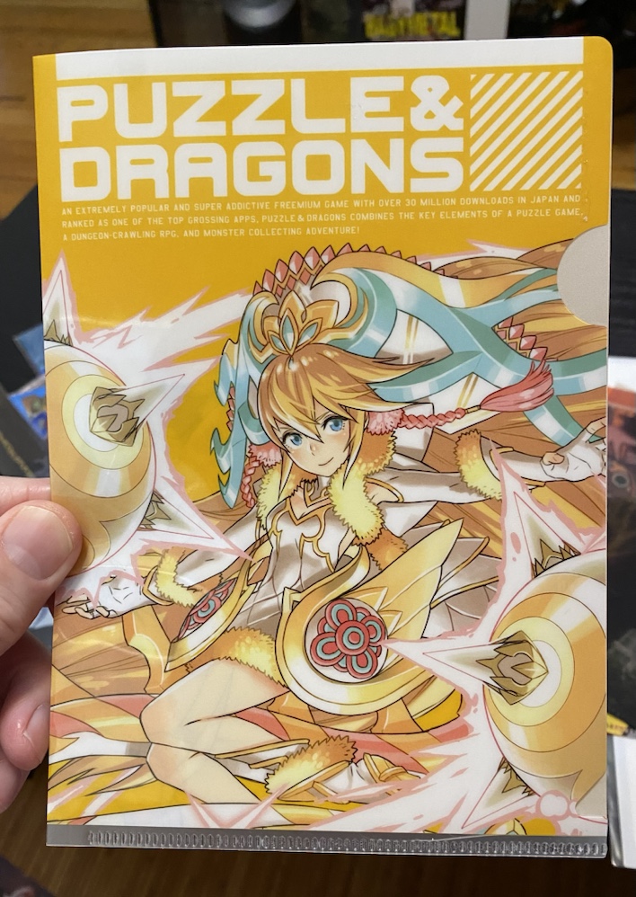
As far as favourites are concerned I have two. The first is the above Puzzdra file sent to me by Adam’s alliteratively-named sister AC. For a game as popular and long-lasting as Puzzdra there’s a dearth of merchandise and this file is special for that reason.

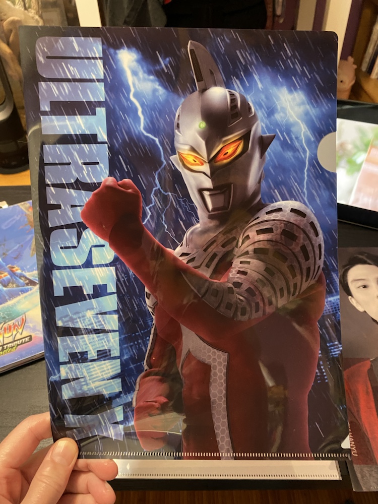
And no surprises I love the above. I really should get some more Ultraman files…

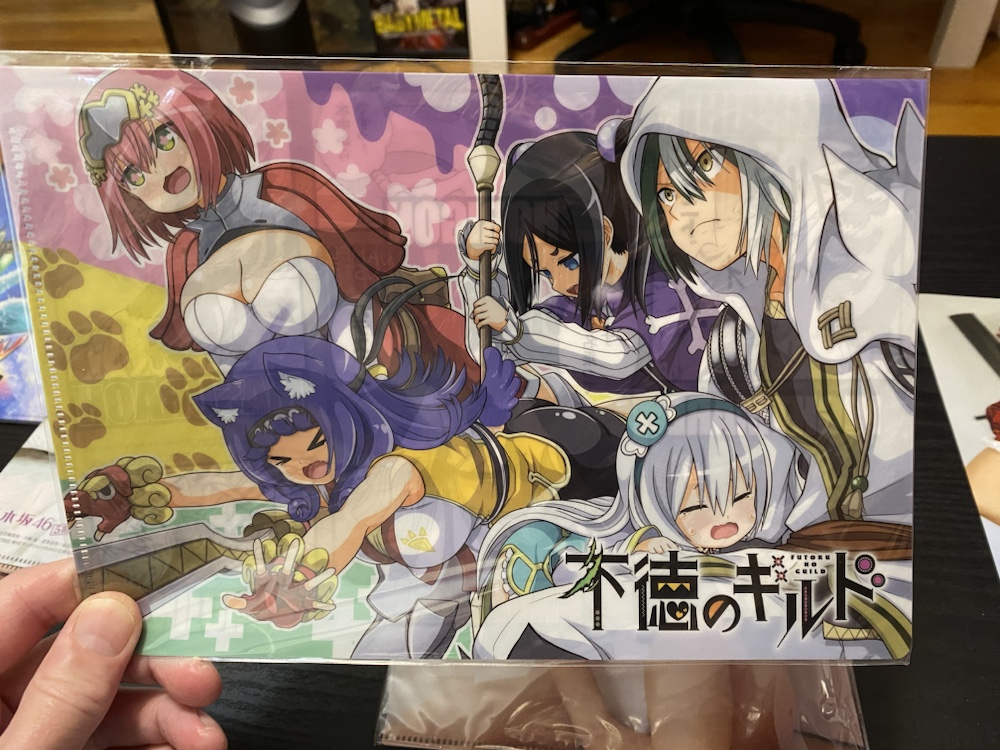
The most recent one we’ve obtained is the above, which came free with a manga weekly I bought in Japan. I’ve never heard of the series, and the mag was long tossed, but of course this file will remain in our ‘collection’ forever.

Oh, and I actually use these things! In fact this post was motivated by me replacing a very worn out one I use for school with a new one (above) taken from our collection 🙂

Landscape Contest: Halftime

April 10th, 2024

Another year, another postcard contest. Once again Bernard and I pit our artistic talents against one another, and once again the winner will be decided by a panel of five expert judges.

This year we’re painting ‘landscapes’ (our definition may be a little fluid…) using acrylics, a medium in which neither of us have any experience. Pencil sketches are forbidden, so it’s all about paint directly onto card.

The subjects are all countries, and each was chosen by either a judge, a wife, mum or us! The contest is now at the half-way point, so let’s see how the scores are after five countries…

China

Bernard’s is on the left, and mine on the right. He went for the obvious – The Great Wall – where’s I went for a whimsical depiction of ‘The Yangtze and The Yellow Mountains’. Both of us were learning our craft (his brushes were too big, I only used a single brush) and getting used to the terrible paints (which I had bought at a discount store)! Looking at both arts now, it’s clear both of us were inexperienced!

The judges gave Bernard the win, but it was as close as possible with final scores of 7.51 to 7.49 (each of the five judges awards three points). Here’s some of their comments:

“Left is quintessentially Chinese, and right has artistic merit. Good start for one of you. The other needs to lift his game.”
“Left conjures China most directly, Right could be Japan? Left has some weirdness with its shadows; the one on the broad forward facing prominent wall. Right has a better color palette and composition.”
“The one on the left instantly says China. However, on closer inspection, the one on the right has the artistic edge.”

Italy

My Colosseum is on the left, and Bernard’s Venice is on the right. When I first received his in the mail I knew I had lost, since no matter how much detail I had attempted the colour of his piece and especially Monet-like reflections in his water were unbeatable.

As expected the judges handed him the win, 8.15 to my 6.85. Here’s what they said:

“I appreciate how difficult painting the colosseum must have been. And actually, the artist really captured the dimension of the thing really well!! It felt so much “squatter” in real life. Still staggering and huge but not like in the movies. I like that you can see sky through some of the windows. Right colors and composition are great. Just a really pretty picture. Now, if it’s supposed to be Venice, I think that water color is generous! It was stinky when I was there. In any event, very pretty picture, and still conjures Italy.”
“I like the layered clouds above the colosseum, but I also like the Impressionistic style of the Venetian canal scene.”
“Painting one is again iconic for the subject. I like the trees and the colosseum but the dark grey buildings in the background don’t seem right and being Italy I want to see cobble stones!”

France

Bernard did the Arc de Triomphe on the left, and I did the Eiffel Tower on the right. This was an amusing inversion of sorts to our approaches to Italy, where this time mine was the more whimsical. The guy with the balloon? That’s because when I was there I remember seeing balloon-sellers on the avenue leading up to and under the tower 🙂

This was my first win, 8.75 to 6.25. The judges were hardly effusive with comments this time, but here’s the few I received:

“Did I immediately recognise the landmarks? Yes. Do I find one more pleasing to the eye? Also yes.”
“Left looks a little unfinished. My eyes want more detail in the foreground. Right gets the higher score despite Pennywise being in it.”

The Netherlands

Given the lead time in this contest – between us painting, mailing and receiving the cards – this was the first one we painted after any judging had occurred. Obviously we both put in significantly more effort, and it’s interesting we both chose the same subjects. Mine is on the left, and his on the right. I spent a lot of time detailing those foreground flowers with a tiny brush!

I won this one convincingly, 9 to 6. I was proud of mine, thinking it was my best yet, so I was happy to tie the scores after four. Here’s what the judges thought:

“Left is lovely. The balance and contrast of the colours is very pleasing to the eye. The aspect is well done giving great depth of field as the eye is drawn across the tulip beds to the distant forest.”
“Composition on left is superior, as well as the definition on the windmills. But right is a good effort.”
“Those Dutch scenes are so similar… They could be from a series by the same artist.”

Egypt

Even though everyone thought it was an oasis (in Egypt?!) my painting in the left was supposed to depict The Nile with a Pyramid in the distance. Bernard’s was a vista of the Pyramids in their glory after being built. He used gold paint for the cap, but the metallic paints don’t show up well in photos (my colosseum was mostly metallic paints). I was quite pleased with mine – look at the detail on the papyrus! – but when I saw his I knew this would be a very difficult one for the judges.

After the dust settled I emerged victor, 7.7 to Bernard’s 7.3. The judges words:

“Gotta go with the greenery. The gold cap on the white pyramid is a nice touch.”
“Left has nice colours and brush strokes and I like the idea of the oasis mirage in the desert. I would have liked the palm trees to look more palmy and the pyramid dimensions look a bit wrong. Right I like a lot. I love the bold colours and strong contrast and the silhouette of the Bedouin on his camel is very well done. A very striking painting!”
“Why is the oasis in left so close to the pyramid?? Right must be a very ancient image because it doesn’t look white and gold anymore but the coloring is too plain.”
“I liked them both but left immediately granted my attention.”

At the halfway point I’m ahead 3-2 but the contest has been much closer than any previous! Also I think it’s clear we’re both getting better as we go, and putting more effort in as well.

I feel the best subjects – and artworks – are yet to come, and I look forward to see what the judges decide!

I Made Sushi!

April 7th, 2024

I purchased the above model kit in Japan for about $6. It’s as much a puzzle as a plastic model since it doesn’t contain any instructions and acknowledges its own difficulty. Here’s what’s inside:

Three parts for the shrimp, and two runners containing 364 identical pieces of rice:

The rice grains are translucent and very convincing. Here they are off the runners:

The challenge is to make a piece of shrimp nigiri. With no instructions you’re free to assemble the rice as you see fit, which obviously requires plastic cement.

This was indeed a challenge. My glue is very fluid so I used a paintbrush to apply it and applied the rice grains individually with tweezers. It was difficult to get them to adhere and form a blob naturally, and the fumes from the glue quickly became overpowering.

I did this for an hour, applying exactly 177 grains before deciding I was done. It was an accursed procedure, akin to making a monochrome jigsaw puzzle. The translucency of the rice made it difficult to see individual grains once applied, and my eyes were in agony when I stopped. Here’s what I had created:

And here it is turned correct-side-up:

An imperfect shrimp sushi perhaps, but undeniably recognizable.

What do you think? Did I pass this challenge?

Turkish Delights!

April 6th, 2024

I was surprised recently to find that Walmart sells store brand candy bars. Made in Turkey, generically named and about half the price of the ‘real’ bars, they are versions of Twix, Kit-Kat, 3 Musketeers, Snickers and Milky Way. Naturally we had to try them, and here are our thoughts.

Twix bars have been around since 1967 and are sold in many countries around the world. Considering the real versions, Twix are probably my favorite of the five in this post.

In this post the left photo is the Walmart version, and the right is an official advertising shot of the actual bar. You can see their Twix knockoff is flatter than the original, the cookie biscuit is crispier and the caramel harder and chewier. The chocolate has a slightly ‘cheap’ taste to it – but the upside is the caramel is chewier and the biscuit tasty. Overall it’s very convincing to a real Twix and considering the cost a more than acceptable substitute. Thumbs up from both of us!

Kit Kats are now 88 years old and more widely available worldwide than any other bar in this post. They’ve also been sold in an astonishing amount of flavours: over 300 alone just for Japan! We once watched a documentary about the making of Kit Kats that revealed the wafer is the same as a communion wafer!

I can eat Japanese (plain) Kit Kats until the cows come home but I don’t much like the US versions (since Americans chocolate tastes strange to me). These knockoffs were the least impressive of the five we tried: the ‘wafer’ lacked the filling and the chocolate coating wasn’t consistent. Taste wise they weren’t good: since they’re basically just chocolate the sickly sweet taste was overpowering, and we couldn’t finish them. We both gave this one a thumbs down.

3 Musketeers (known as Milky Way outside of the USA) is so named since when it was launched 92 years ago it had three flavours: chocolate, vanilla and strawberry. It’s a brick of soft nougat thinly coated in chocolate and so light and fluffy they float in milk!

This Turkish knockoff was extremely convincing, even down to the swirly design on top of the chocolate. The nougat was notably stiffer than the real version, but this gave it a delicious chewy texture that in some ways is better than the original. Again we were surprised by how much we enjoyed this, and it’s another two thumbs up.

Snickers, named after a horse, was introduced 94 years ago and is now the best selling candy bar in the world. In the USA alone over 400 million are sold annually!

This one was extremely good. As with the Twix knockoff, the caramel was chewier (a good thing) as was the nougat. It had fewer peanuts than a real snickers which may be good or bad to you, but which I liked. The taste was just right, and due to the caramel and nougat texture I think I liked it better than a real snickers! KLS said this was her favourite of the five, and we both give it an easy thumbs up!

Lastly was the Milky Way bar, better known to Ozlings as a Mars bar. This is the oldest candy bar in this post: first sold an astonishing 100 years ago! When I was a youngster Mars bars were a staple of my diet, so I felt particularly suited to judge this knockoff.

Once again the caramel is harder, nougat less fluffy and chocolate thinner than the original, but what’s important is the taste and much like the Snickers knockoff this one delivers! It’s wonderfully chewy and dense, and the caramel and nougat helps offset the slightly unusual chocolate taste. This one is also debatably preferable than the real version and once again got a double thumbs up from us.

In truth, these results were greatly surprising. I had imagined the worst: half price knockoffs from Turkey?!? But Kit Kat aside, these bootleg bars ranged from acceptable to good and in two case arguably better than the originals. Maybe I should see what other knockoff grocery products have made their way into the local shops?

Eggstravaganza 2

March 31st, 2024

Happy Easter! Yesterday JK and DK visited and we coloured eggs like we’ve done before. Here’s the results…

Just dunking them in the dye (once again made by dissolving dye tablets in a vinegar and water mix) isn’t too exciting, so we first used a marker to create some more interesting designs.

I’m sure I don’t have to identify the above, but Ronald WcDonald, Gudetama and Ultraman all look wonderful on boiled eggs eggs!

A transparent crayon keeps the dye from colouring the egg, which is how the parts are kept white. It’s an imperfect method as you can see in this pic of the finished eggs:

Let’s just assume Ronald has some sort of wasting disease and both Doraemon spent the morning rolling in dirt! I’d say all things considered the ‘basket’ of eggs looks wonderful and probably much more interesting than in many other homes today!

We also tried another unusual method of colouring (again from a kit), which involved making a weird foam (KLS did this, using the included powder mixed with water and a hand mixer), then putting the dye on top and swishing the egg around. It didn’t work anywhere near it claimed to, was horribly messy, and I’m sure there were homes in America today where children created an ungodly mess using this kit!

In case you’re wondering, the K’s will eat the eggs 🙂