Once again Bernard and I are doing a postcard art contest. This year the subject is ‘monsters’ and we collectively decided on 10 subjects before starting. Each week we’re taking turns picking the next subject.
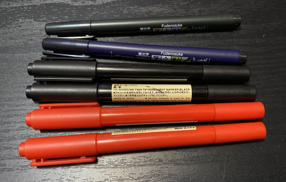
The rules are a little different this year. Firstly we’re using identical media, specifically only the markers in the above pic. I bought two sets of each and sent him one, and (aside from pencil for the initial sketch) this means our art is black and red only.
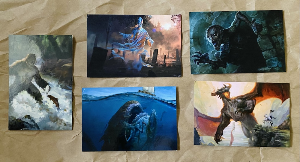
Secondly I printed the postcards in advance with the subjects on the front. This means, unlike previous years, we only get one go at drawing our art and can’t just grab another postcard and start again if we don’t like it or make a mistake!
The judges are the same as last year (JF, JK, SMS, SS and AW) and as far as voting is concerned the only change was I formalized that they could split their votes (which most of them had been doing last year anyway). We’re now half way through and here are the results so far:
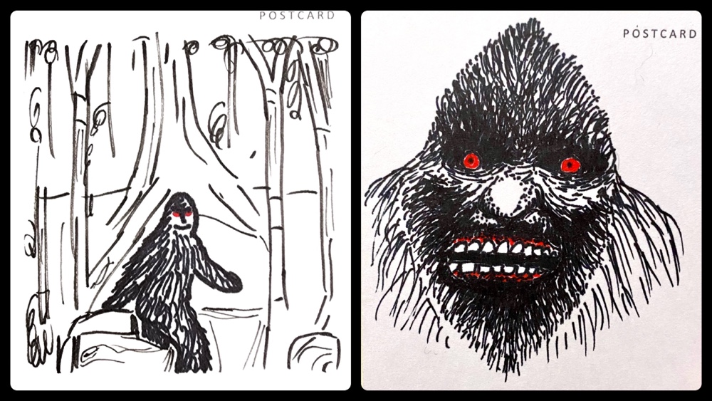
Bigfoot
Lessons were learned on card one. I hadn’t done any testing of the markers, and was very surprised to note how much they bled into the cardboard of the postcard. I had visions of fine detail in our pictures that faded fast when this became apparent. Even so I think we hit the ground running, with Bernard’s creation on the left and mine on the right.
The voting was incredibly close, with Bernard’s 2.51 points just beating my 2.49. Most judges commented how difficult it was to choose, and how surprised they were by the quality 🙂
Some judge comments:
“It’s a strong start. The depiction of trees in the first artwork is very well done as is Bigfoot striding through the forest. Although I would have preferred for him to refrain from smiling at the artist.”
“The second artwork is stunning. The shape of the head is very pleasing and the use of negative space creates effective dimensionality. He’s a scary beast even though his square chompers are only built for chewing grass.”
“I like the way we see him in his environment in left image. And I like how scary he is in other image.”
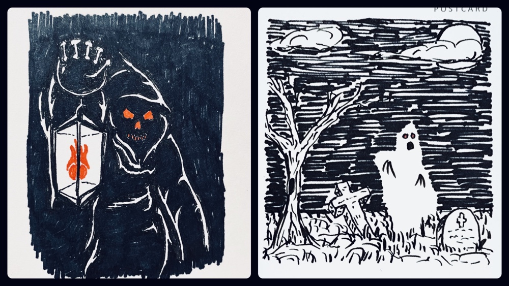
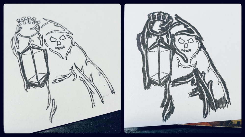
Ghost
Mine is on the left, and Bernard’s on the right. This was another tough one for the judges, although I had a ‘judging question’ about the lack of red in the right picture (it is there, just difficult to see without zooming in). Some judges questioned whether mine was even a ghost!
Voting was very split and seemed to rest on whether judges liked a darker or a more whimsical ghost. Ultimately I won with 2.65 points to Bernard’s 2.35.
Here are some judge comments:
“Right is clearly Casper!”
“There’s not much I don’t like about left. I particularly like the flame, and the teeth. Right…… it doesn’t capture me unfortunately.”
“Love the bony hand and lantern flame!”
“…I do actually like the left pic better. But right is a much better ghost.”
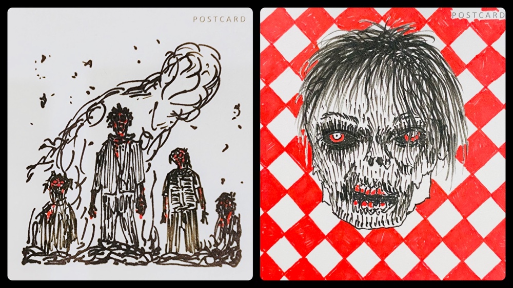
Zombie
Bernard is left, and I am right. This one led to another judges question about whether multiple subjects was acceptable. We hadn’t discussed that in advance, and after this one we decided to keep it at one only going forward. By this third week some judges had observed that one of us was using the same style weekly, and the other was mixing it up. Although they didn’t know who was who, I suspect this began to be factored in to their judging (one suggested that variety was advantageous).
Bernard’s apocalyptic vignette scored him an easy win with 3.26 points to my 1.74. None of the judges noticed that mine was supposed to be Michael Jackson…
Here’s what the judges had to say:
“The vertical lines speak of skeletons, the horizontal lines the prison of the life of a zombie endlessly driven to feed. Baby zombies barely exist and the mushroom cloud of death is a creature of its own advancing on us. The bloodied satiation of the zombie family gives the viewer a moment of peace to view the encroaching doom before the hunger takes hold again.”
“Right is a punk zombie head on a red gingham picnic table cloth.”
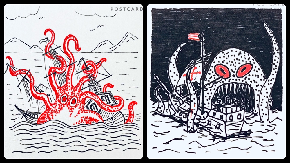
Sea Monster
I drew left, and Bernard drew right. I had a vision of a medieval style ‘monster on old map’ which didn’t quite work out, but I love that we both basically drew the same idea. Both artworks have a lot of fine detail; I wonder how much the judges noticed?
Voting on this one was very split, with three judges giving us equal points! Ultimately though the other two preferred mine and I won 3.1 points to 1.9.
Here’s the judges comments:
“Both squidtastic!”
“Impossible to choose.”
“I love left. But right will get a few points because I dig the night sky contrast.”
“Left is very well crafted. The use of white space, the detail of the ship, the twining tentacles, the striking contrast of the bold red of the monster, the minimal detail of the background that gives the artwork perspective. I like everything about this artwork??”
“Right which depicts a sea monster attacking at night conveys a terrifying sight with the cavernous mouth and enormous teeth about to envelope and destroy the ship. The detail of the ship gets a little lost in picture with the tentacles of the monster and the waves of the sea. The spotty creature looks a little diseased.”
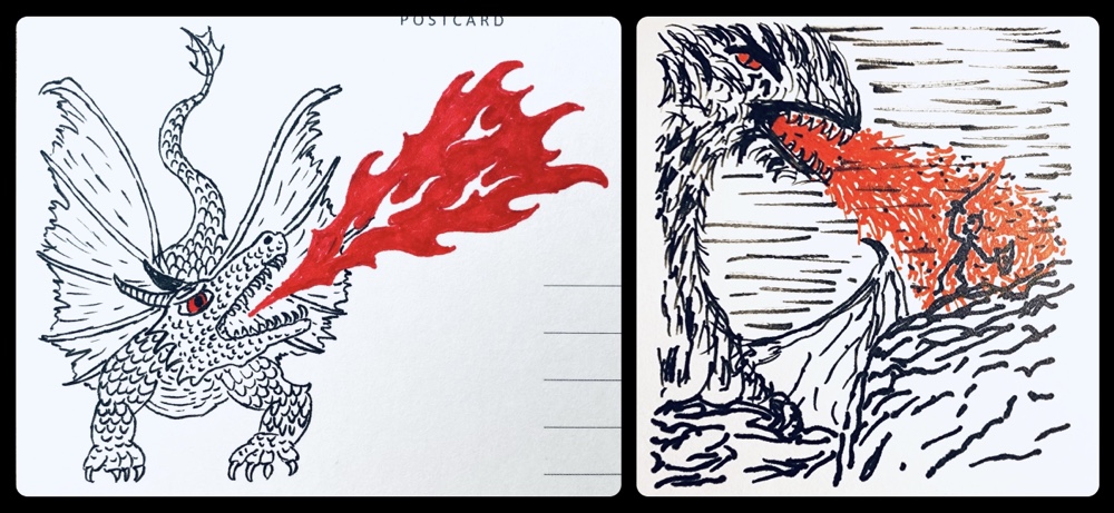
Dragon
Mine is left; Bernard’s is right. This was a somewhat controversial piece since two judges have very strong opinions of what dragons look like and one of the above pieces not agree with their expectations!
Voting was a blowout, and I won 4.05 points to Bernard’s 0.95. I was pleased by this since I put more effort into my dragon than any previous piece, but had been nervous since I had wanted to draw hind legs but couldn’t work out how to add them! I also liked that judges noticed I’d gone (more successfully this time) for a medieval art style.
Here’s what the judges said:
“While I’d like the artist to have shown the back legs as well, I prefer it to the “hairy” dragon on the right.”
“Left: great detail of body, especially scales and excellent flames. Right: Torching guy!”
“Left is really charming. Reminds me of medieval illustrations. I tip my hat to right for the dynamic flaming I feel in its depiction!”
“I love the shape of the flame and the traditional look of the dragon on left. A good solid effort”
“Right is a bit of an abomination I’m sorry to say. Being an ardent fan of the dragon I emphatically reject the enormous hairy slug that is for some reason breathing fire. The only saving grace of this artwork is the charred remains of the valiant knight who is a charming and comical figure.”
Halfway through I’m ahead 3 to 2, which means with five subjects remaining this is still anyone’s game.
I asked Bernard for his comments at this point and he said: “Once again the judges appear to be unable to recognize true art when they see it. My remaining five pieces will be of the same stellar quality as my initial five pieces have been.“
As for myself, I’ll probably still continue trying a different style with every piece and hoping the judges appreciate the detail and work that has gone into my mini-masterpieces 🙂
Come back in five weeks to find out what the remaining five subjects were, and who wins this years postcard art contest!