On the way back home from Rochester this past weekend we stopped at what claims to be the biggest antique warehouse in the state. With over 1000 vendors I’m inclined to believe them, and even though we only had a ‘quick focused look’ through the vast complex we still were there over two hours.
Here’s ten items we didn’t buy:
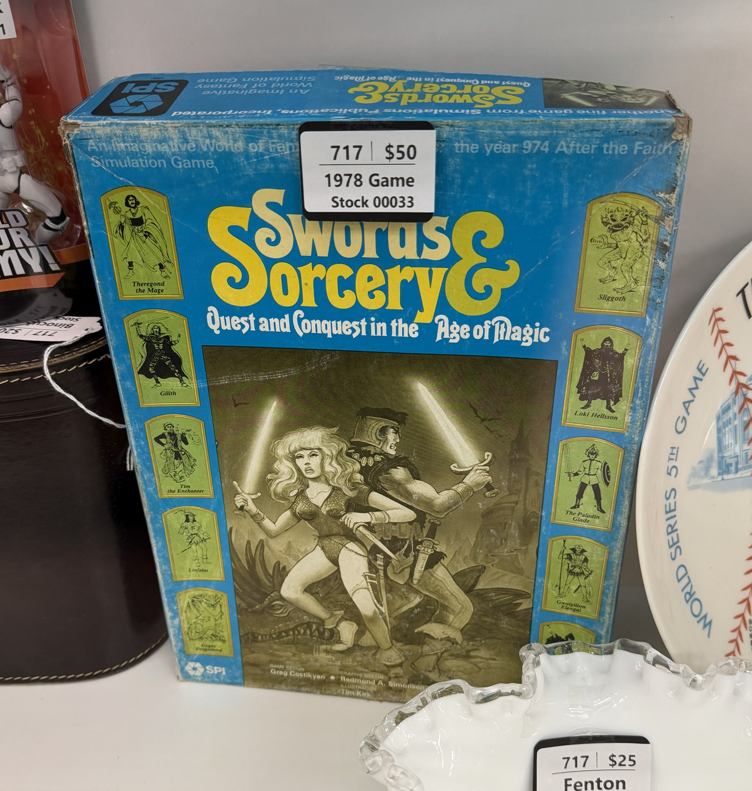
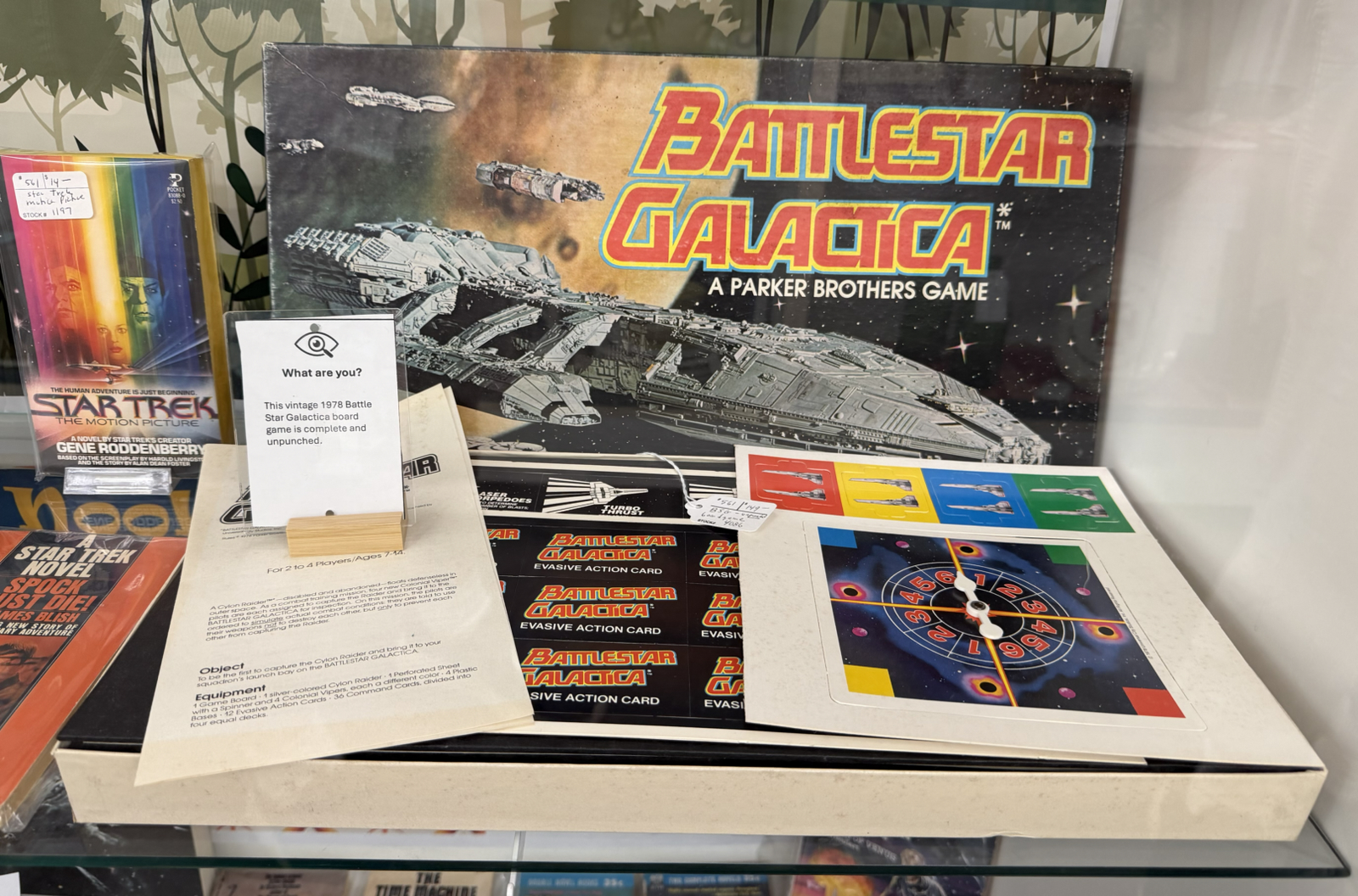
I’d never heard of this intriguing nearly 50-year-old boardgame and I’ll admit I was tempted. But I found a few reviews online that say it has poorly written rules and gameplay is boring so I left it in the case. Had it been less expensive I probably would have got it for the art alone.
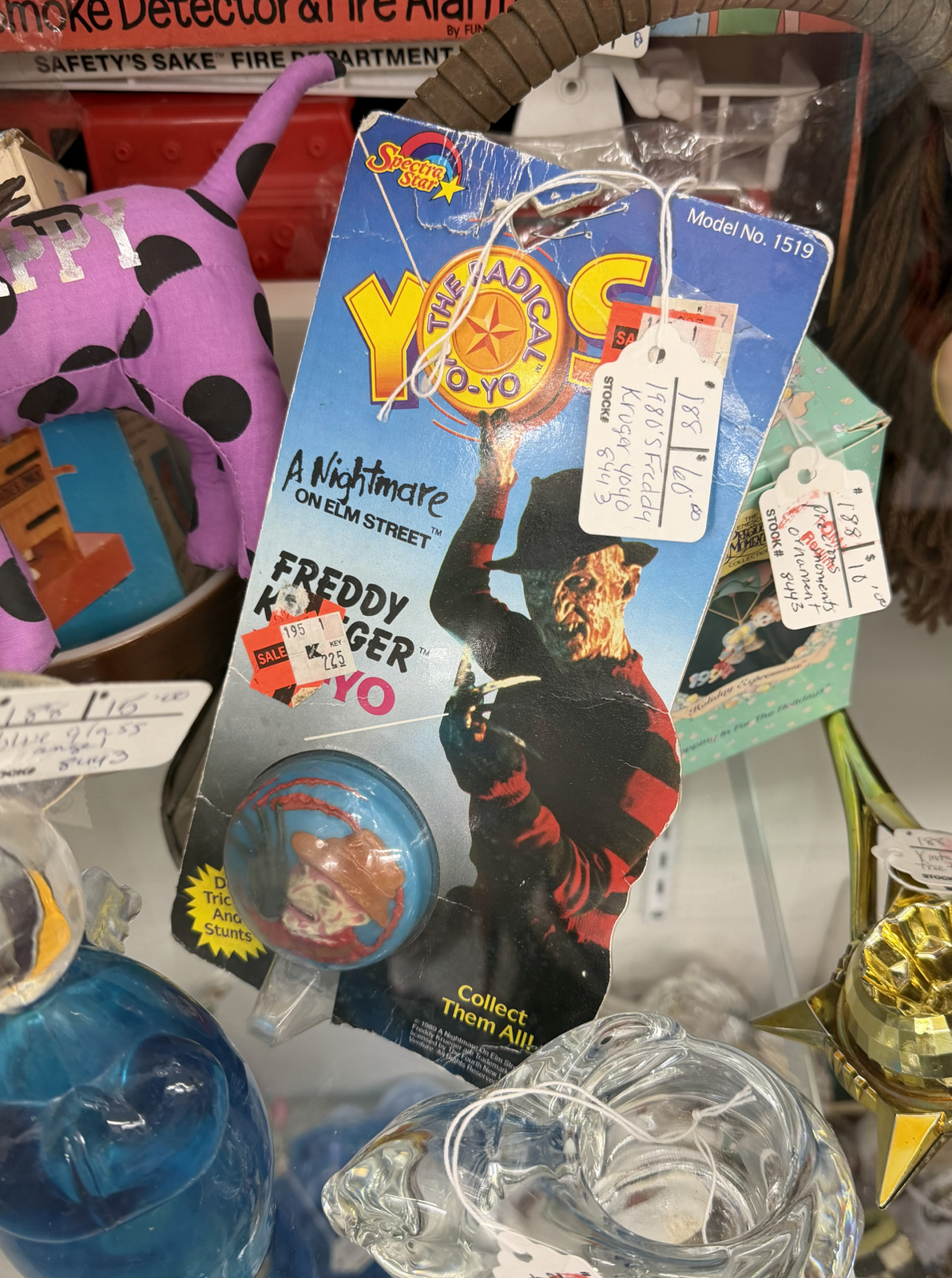
$60 for a 37-year-old yo-yo? There’s surely a Freddy Kreuger fan out there for which this item is a grail, but for me it’s just something fun to see.
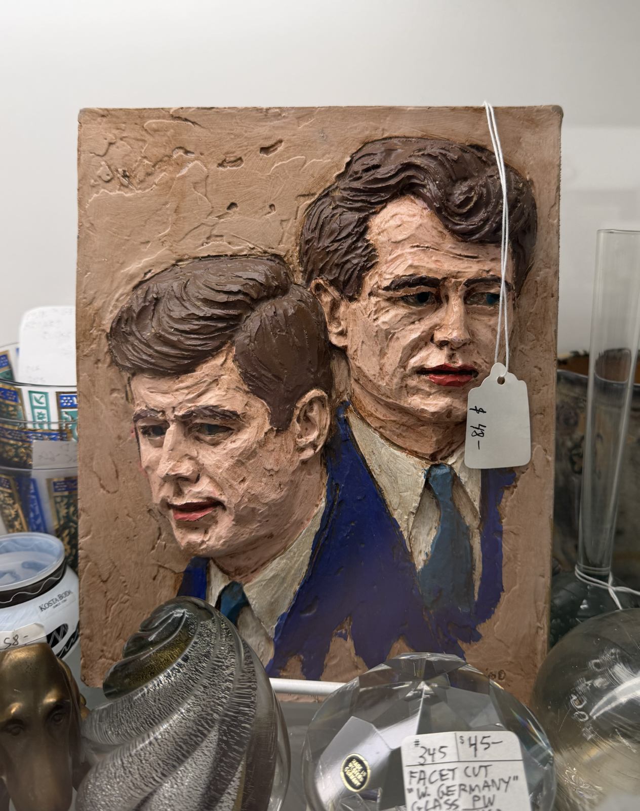
This is a resin frieze of John and Robert Kennedy created in 1968 by an artist named Joseph Zutz. These were originally sold unpainted – a dull grey colour – but this one has obviously been coloured. There were a lot of JFK items in the warehouse; I knew he was a popular president but I thought idolatry of politicians was a recent phenomenon.
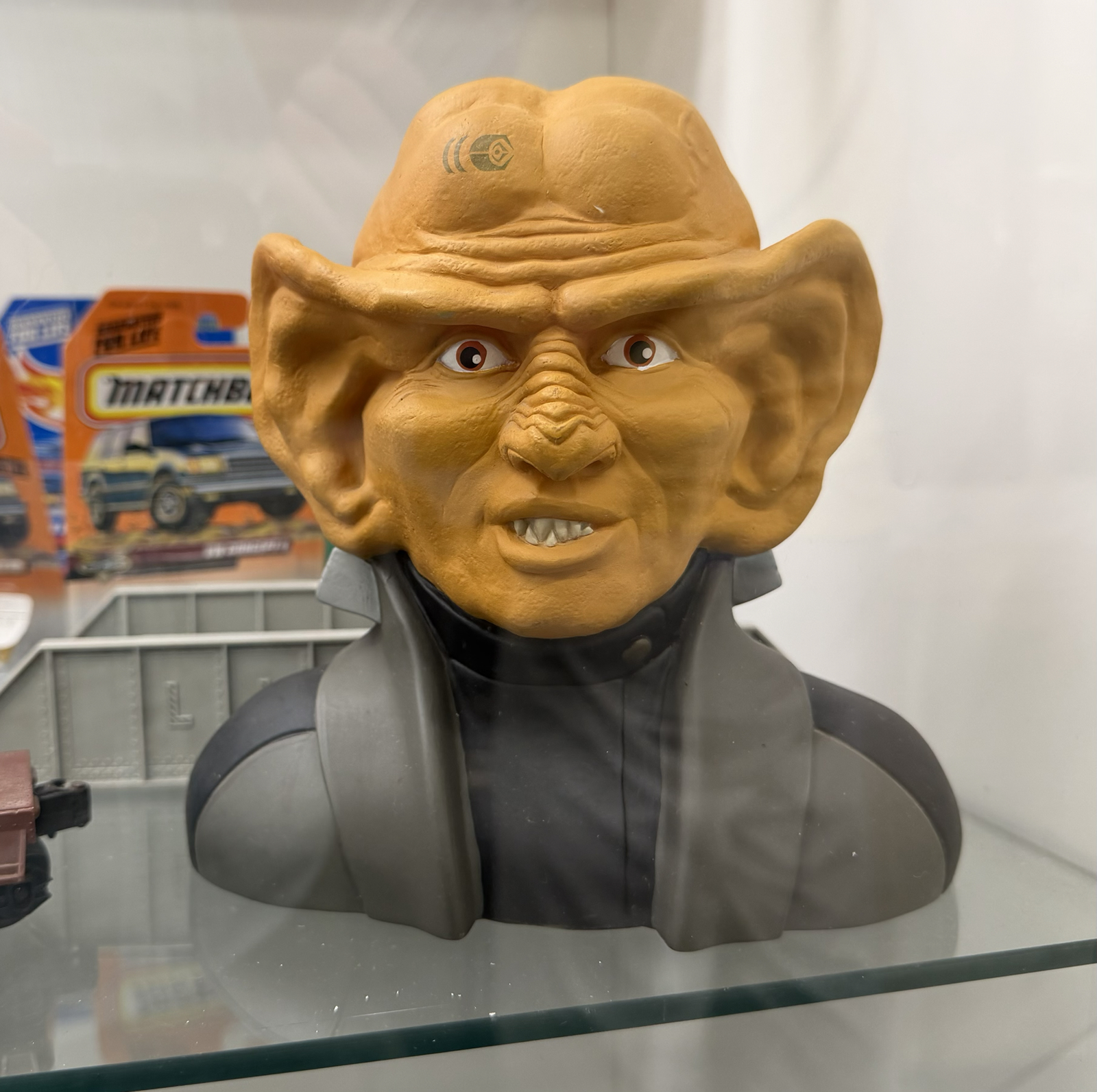
This reminds me a lot of a similar Darth Maul bust I own, the exception of course being that this Ferengi (from Star Trek) is absolutely hideous. I probably should have bought this one and flipped it to Bernard for a tidy profit.
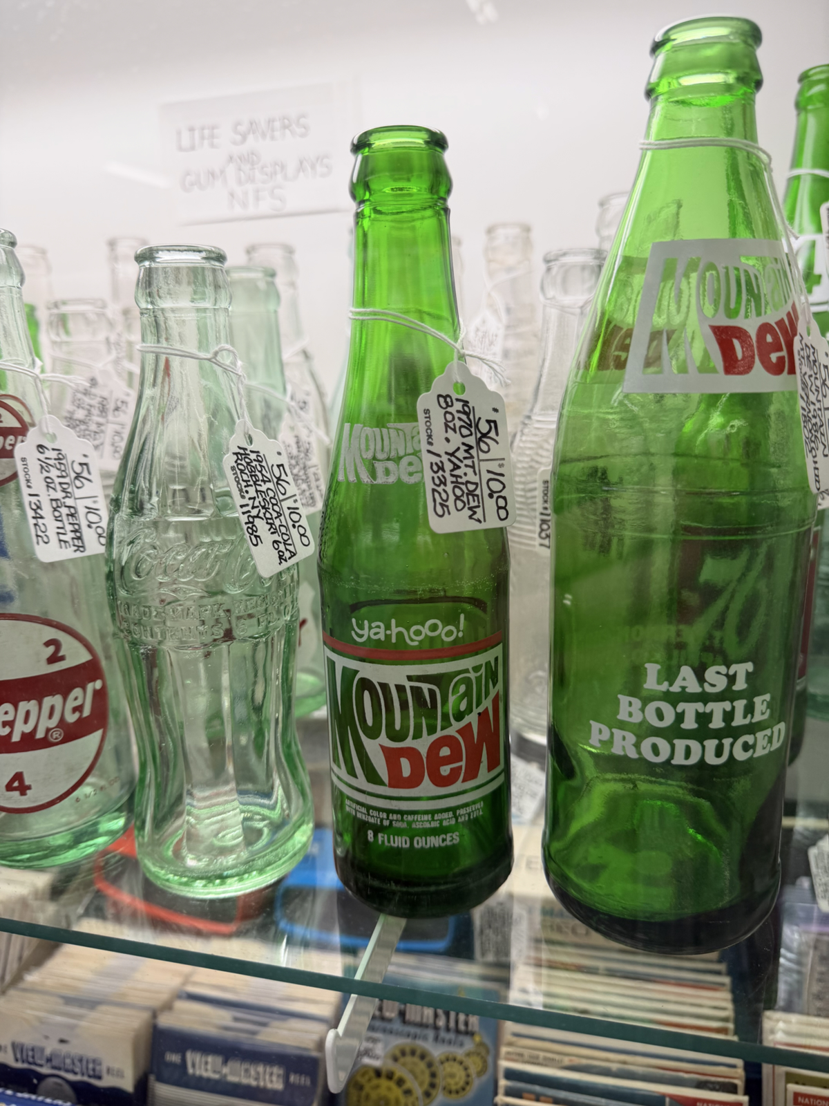
A 56-year-old Mountain Dew bottle?!? This is my favourite drink, and of all the things I’m showing here this is the only one I regret not buying. If you look closely at this photo you can also see a vast selection of View-Master slides on the next shelf down.
This would be a cool find for the deep-pocketed Battlestar Galactica fan that has everything. There wouldn’t be too many copies of this over 40-year-old game still existing, and of those I imagine a minuscule amount have unpunched game pieces. Like many of these formulaic licensed games from the 1980s, I bet the gameplay is dull.
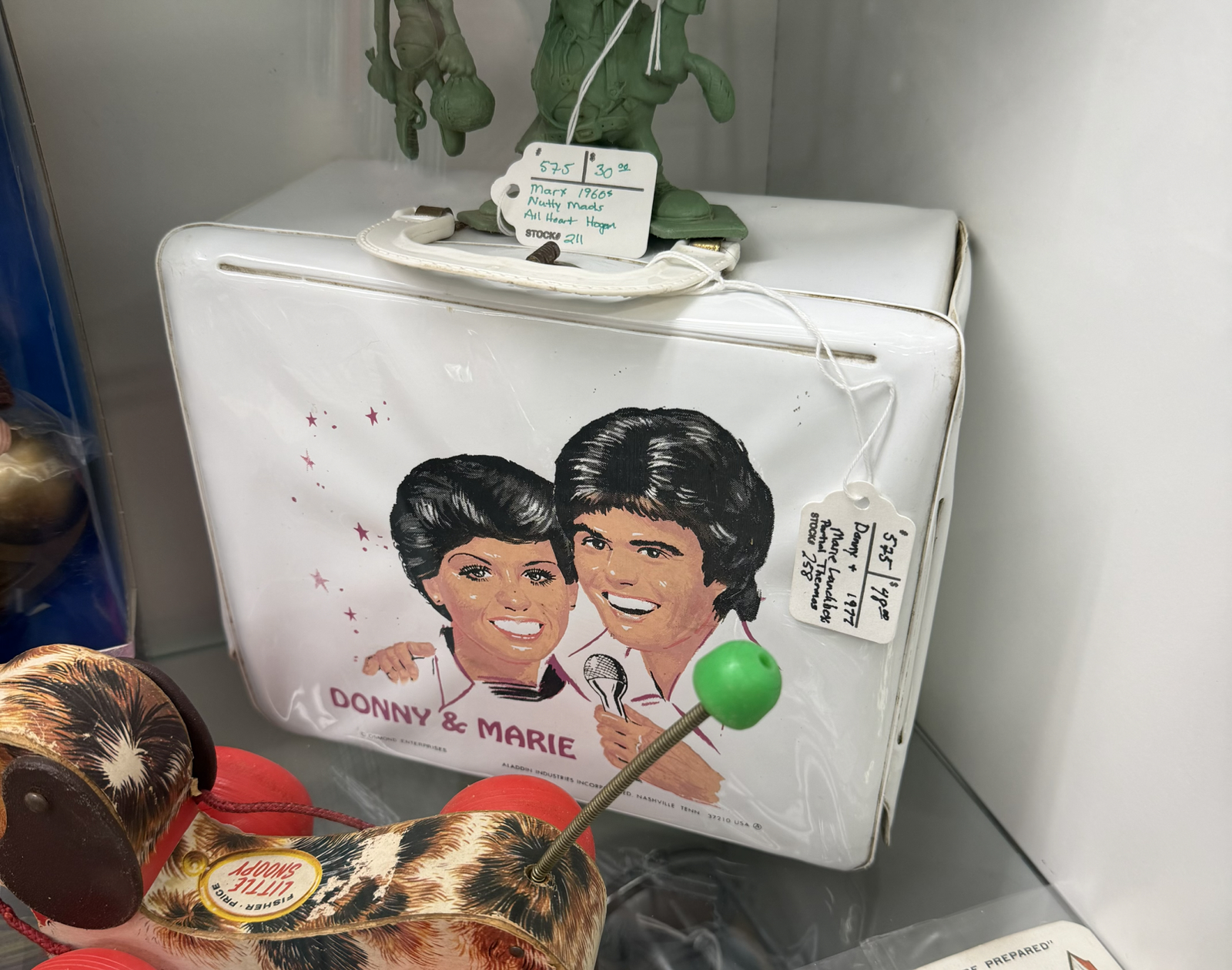
I don’t have much to say about this one, except that I love it still exists in such good condition, and that the basic design of it reminds me of a lunchbox I owned around the same time (1977). What was mine? I no longer remember…
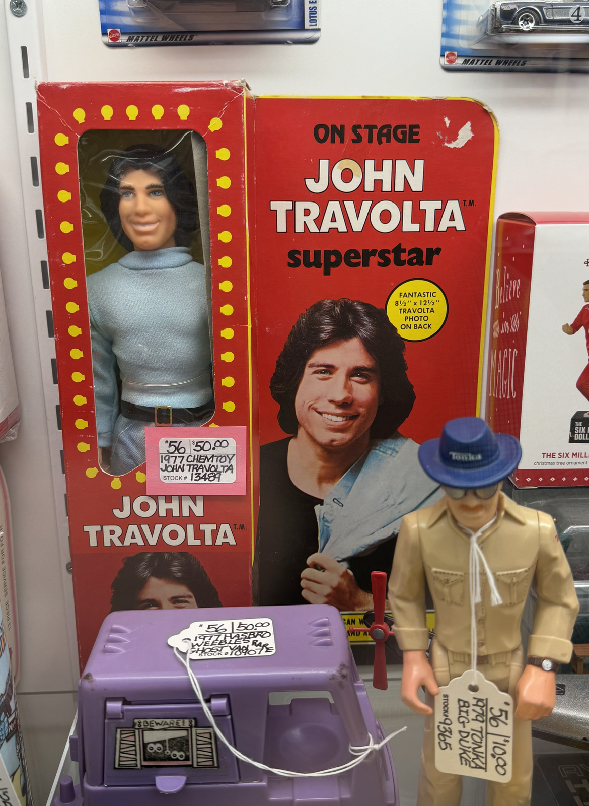
From the same year we have this doll. In remarkable condition considering it’s a half-century old and virtually encourages you to destroy the box to free the ‘photo on back’! This item reminded me of a John Travolta postcard book I purchased – also at an antique shop – about a decade ago and have yet to use.
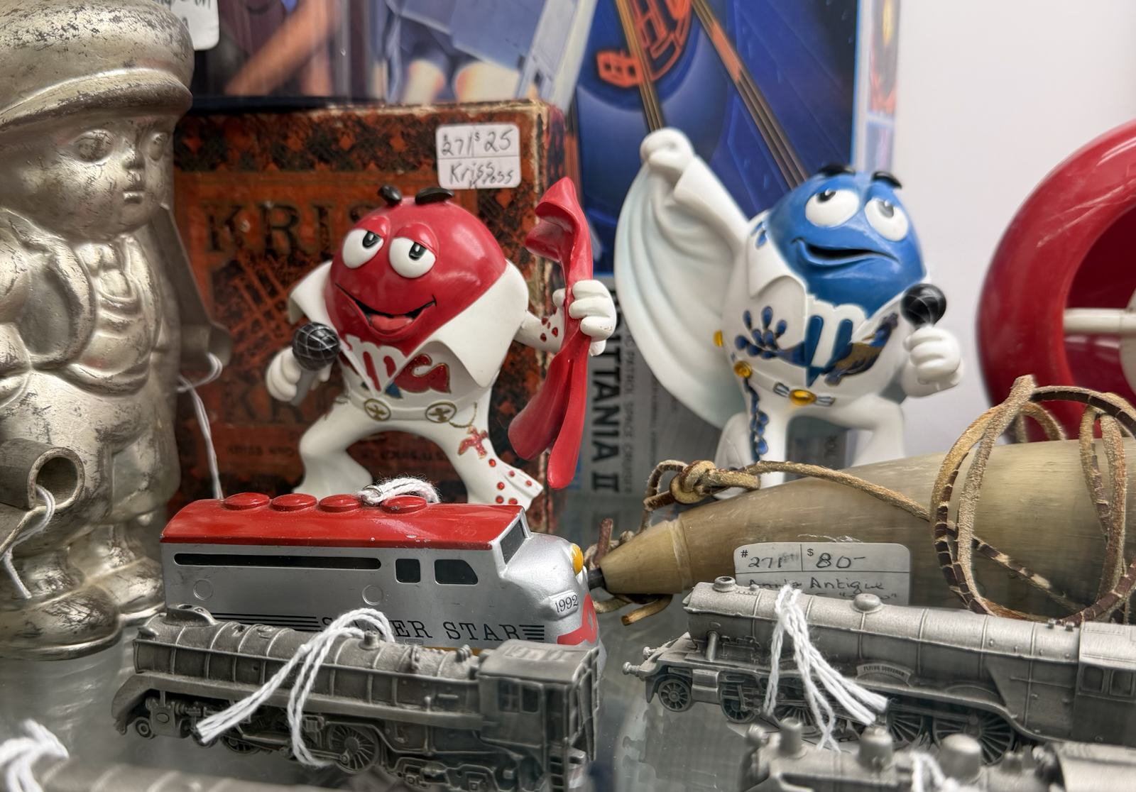
Bernard’s a big fan of both Elvis and M&M’s but I didn’t buy him these because he probably already has them in his collection. Possibly that was a poor choice since if he didn’t I could have flipped them to him for a king’s ransom.
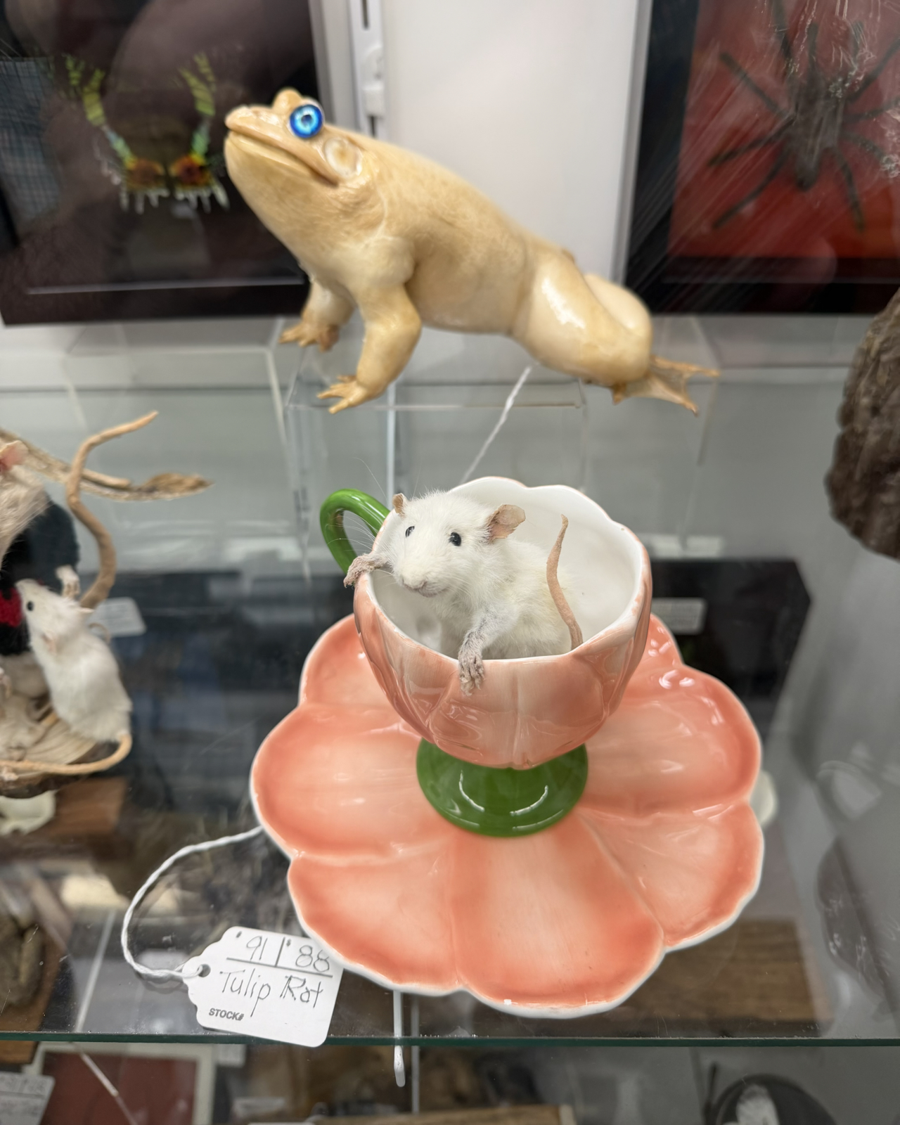
These taxidermy dioramas are called ‘whimsies’. A whole case was full of these, with the animals all posed anthropomorphically or interacting with props. The toad is creepy with his fake eyes, but a stingray (!) was even creepier!
So if we left all these fine things in cases (and this is just a portion of the interesting items we spotted) then what did we buy? Here’s the list:
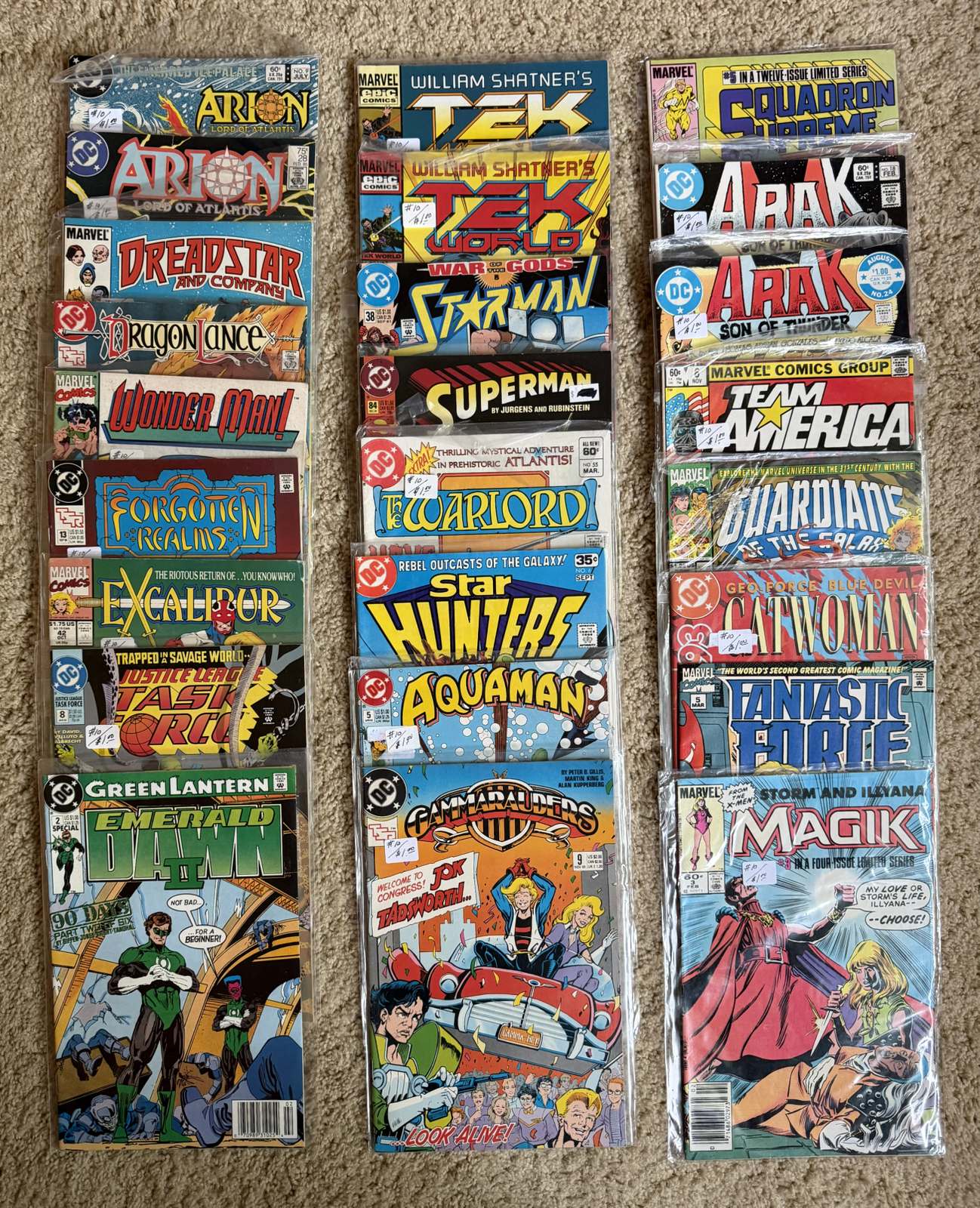
I pulled these comics from dollar boxes where almost every comic seemed to be a different series. I told the cashier there were 25 but she counted 23 so I got them for only $0.92 each. I’ll read all these and then pass them on to students.
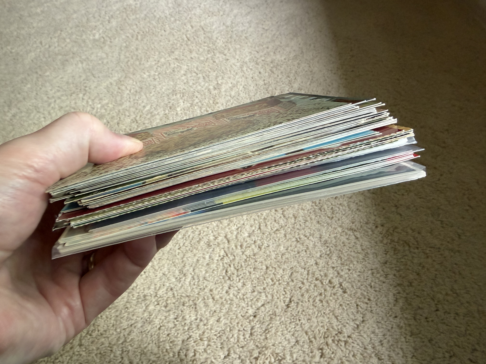
This is about fifty postcards, most of which I’ll use for Postcrossing. They averaged about $0.50 each which is a good price for unused vintage cards, and I’ll never grow tired of buying such things. The pile includes ten identical copies of the same card, which I will send to Sue long after she’s forgotten about this blog post 🙂
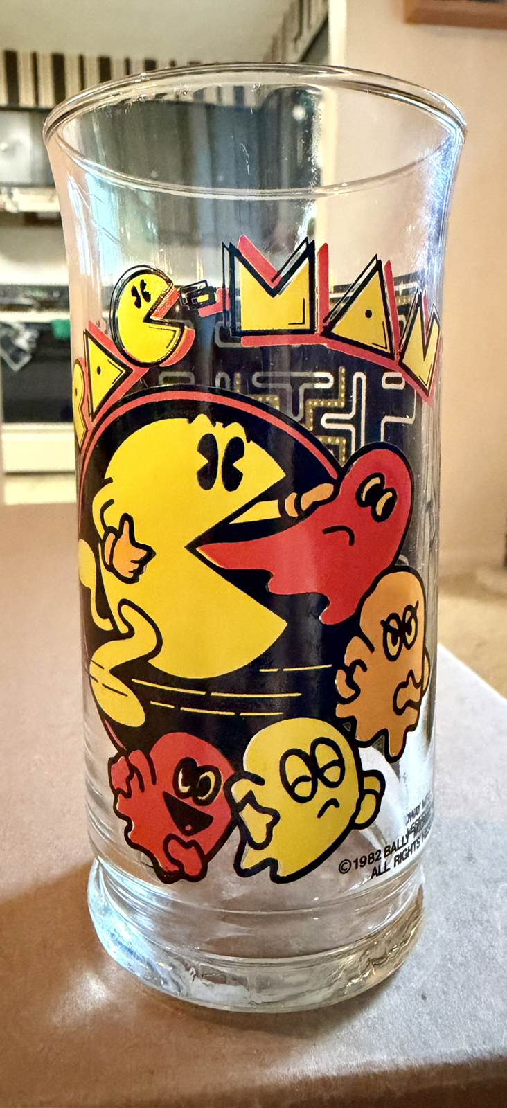
Printed glasses from the 1980s are somewhat common in antique shops these days, but there was a remarkable abundance of them at this particular warehouse. This was the only video game related one I saw, and it’s a glass with an intriguing origin. From what I can determine, this was made by Bally in 1982 for sale in stores. However they also made very slightly different versions for game arcades, cinemas and even for the burger chain Arby’s. It seems this was a very common glass in its day!
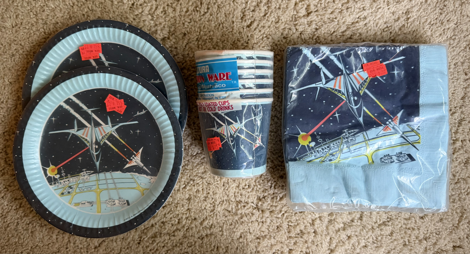
And lastly how could I resist this set of kid’s party supplies from 1978? Obviously inspired by Star Wars, these paper plates, cups and napkins are unused, still sealed and even have original price tags ($0.25 and $0.50) on them.
Antique stores continue to get better and better as we age and the stuff from our youth is now ‘antique’. I’ve already located another big warehouse about an hours drive away that I’ll probably check out later this summer!