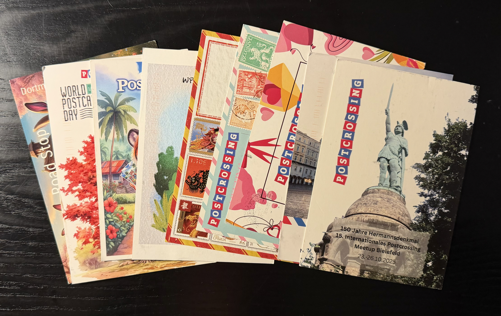
Another six months have passed, and it’s time for another Postcrossing update. I do these periodically to review all the cards I’ve received, before they are put into attic storage.

Those are my numbers since the last update, an increase of about 275 each. I’m averaging just shy of 50 cards a month, as I have been for about a year now.
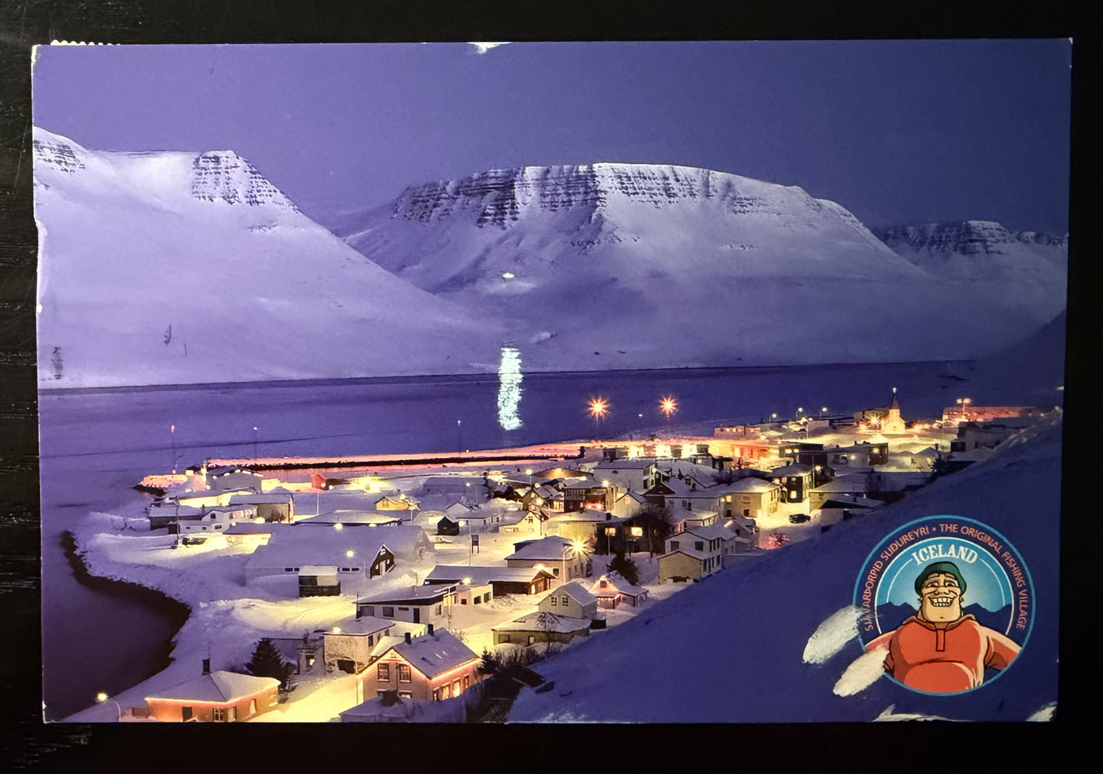
For the first time in over a year, I received a card from a ‘new’ country: Iceland. The card is shown above, took 43 days to arrive, and the seller wrote that their school was closed the day they wrote due to a snowstorm! Even though it was my first Icelandic card in 8 years of Postcrossing, it was still the 40314th card sent by an Icelandic user, which gives you an idea of the number of people that uses this hobby.
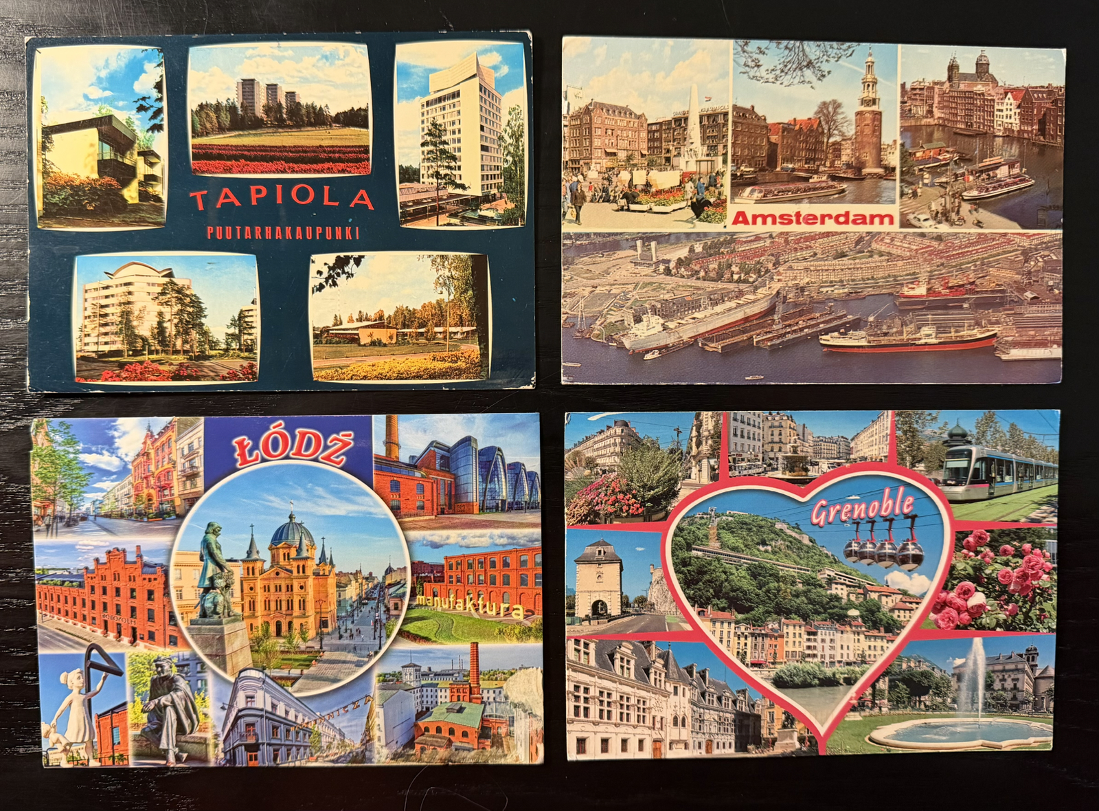
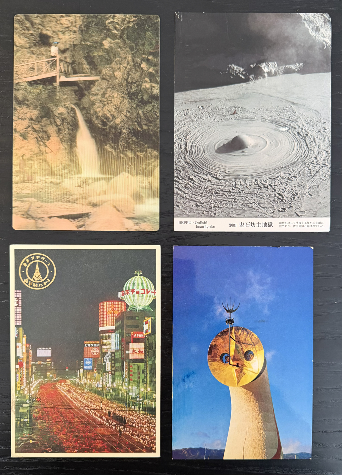
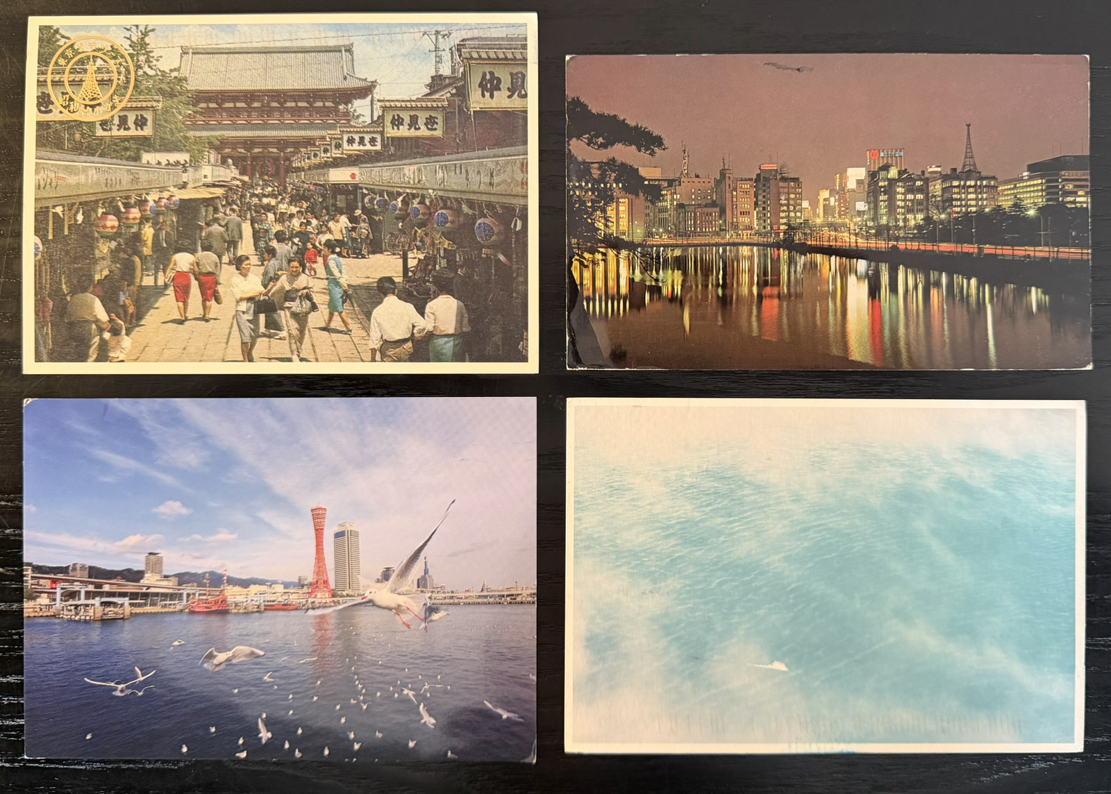
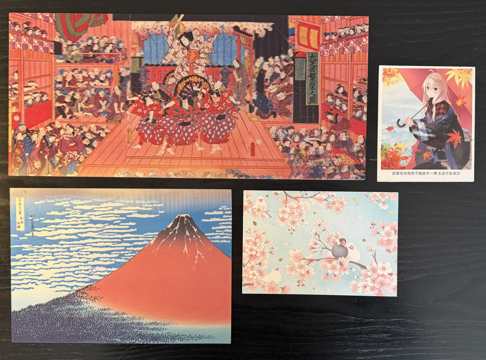
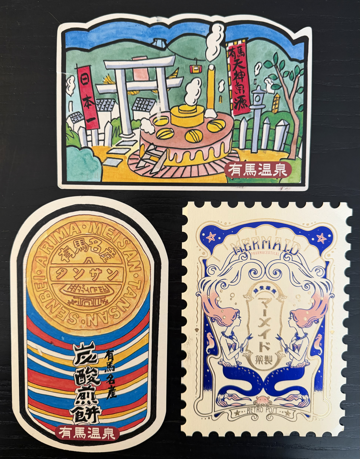
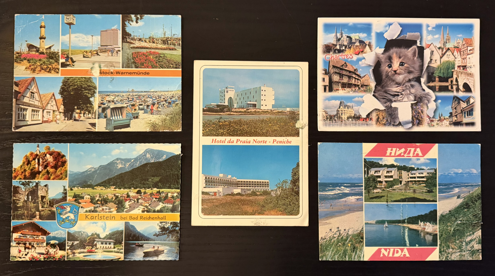
A good amount of cards I receive continue to be ‘multiview’ tourist cards, which I mention (on my bio) I like. These are not as available as they used to be, so they’re often older cards, and I always want to step into them to visit the locations when the photos were taken!
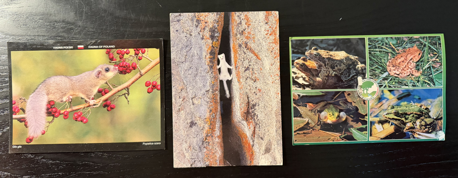
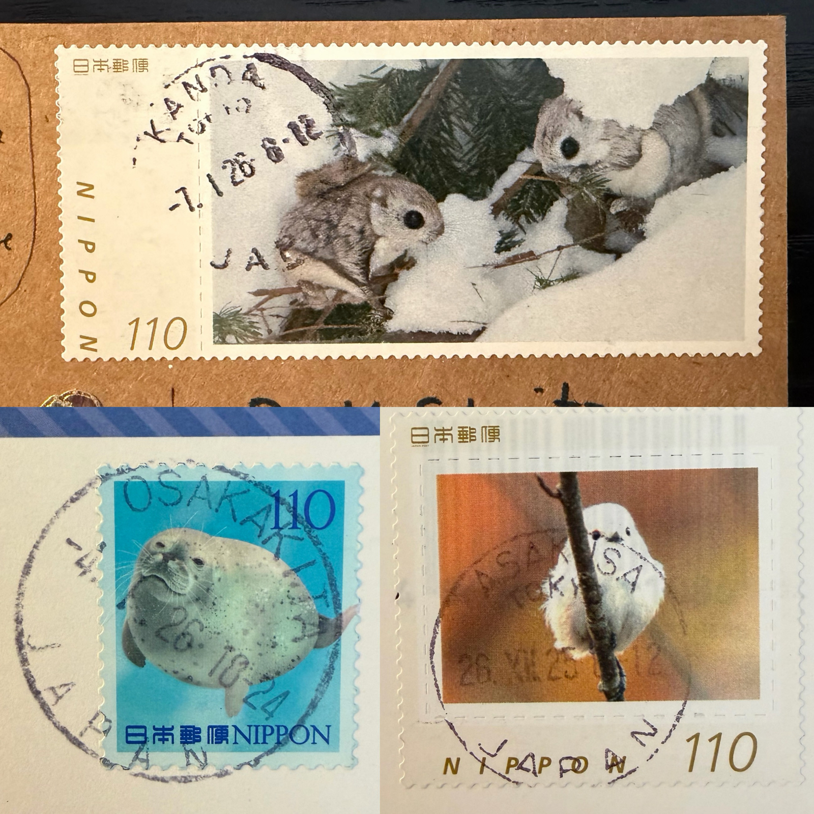
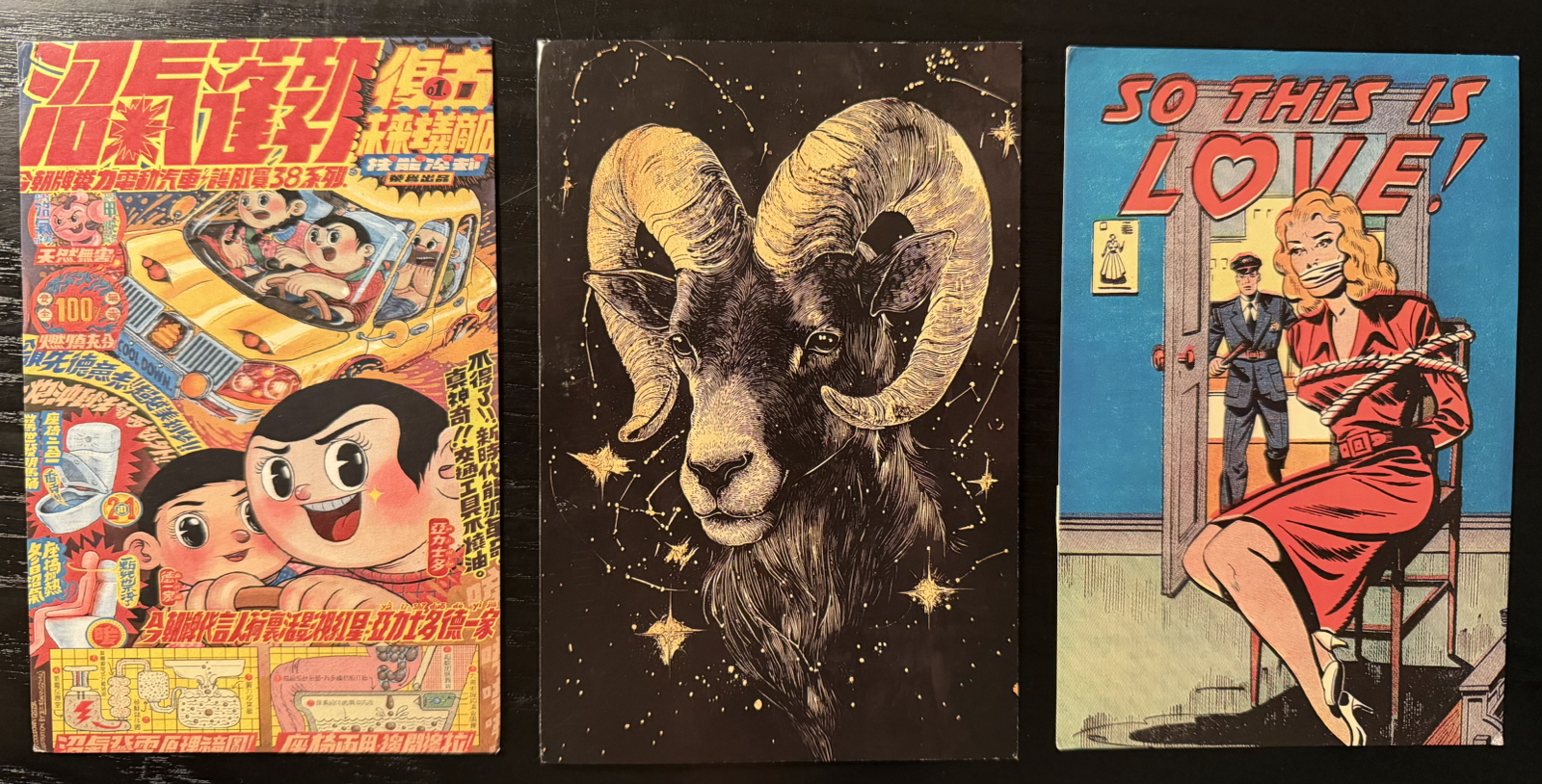
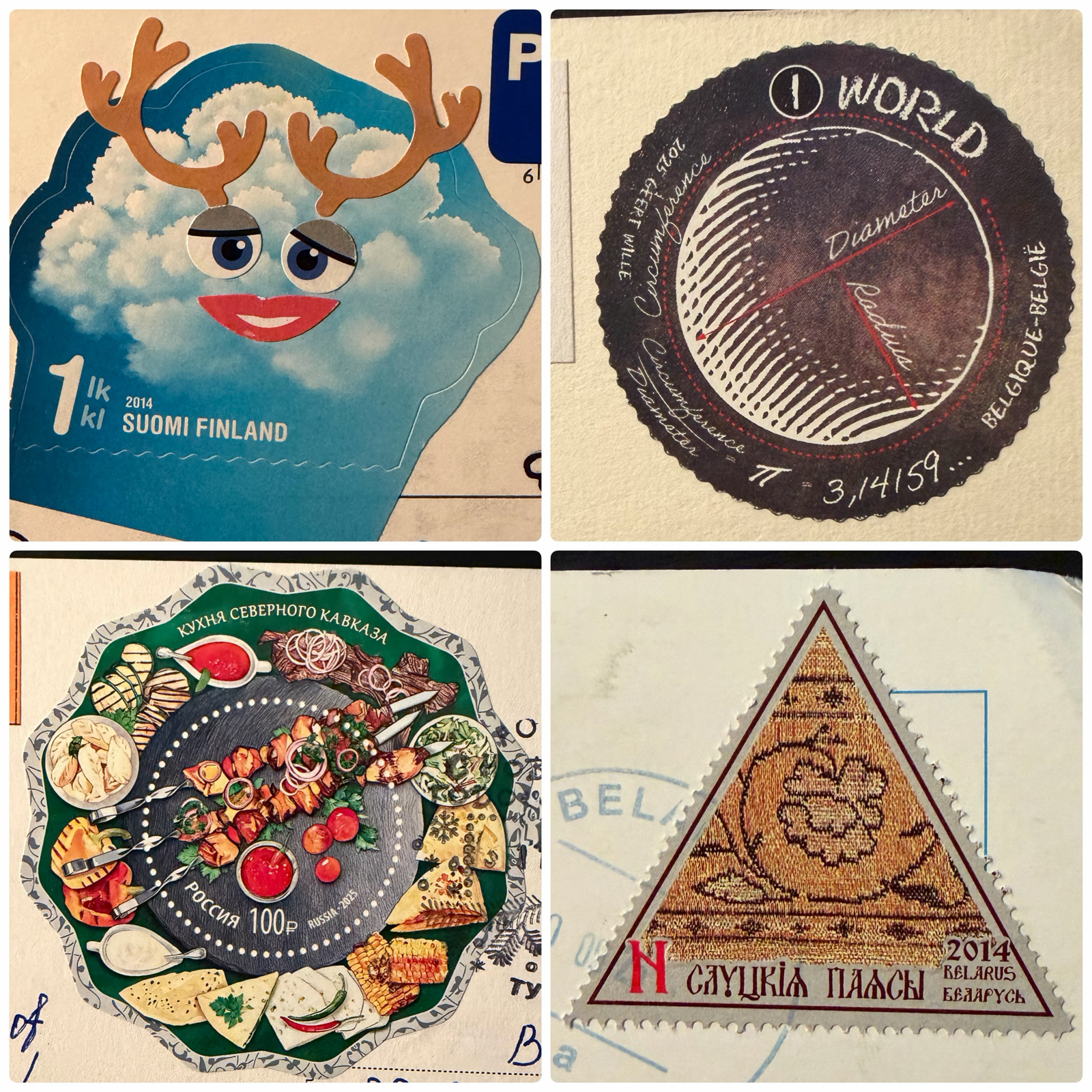
Animal cards weren’t as common this half-year, and in fact an increasing amount of cards are just art (sometimes AI) or generic designs. I expect this is due to tourist postcards becoming increasingly unavailable in many cities around the world.
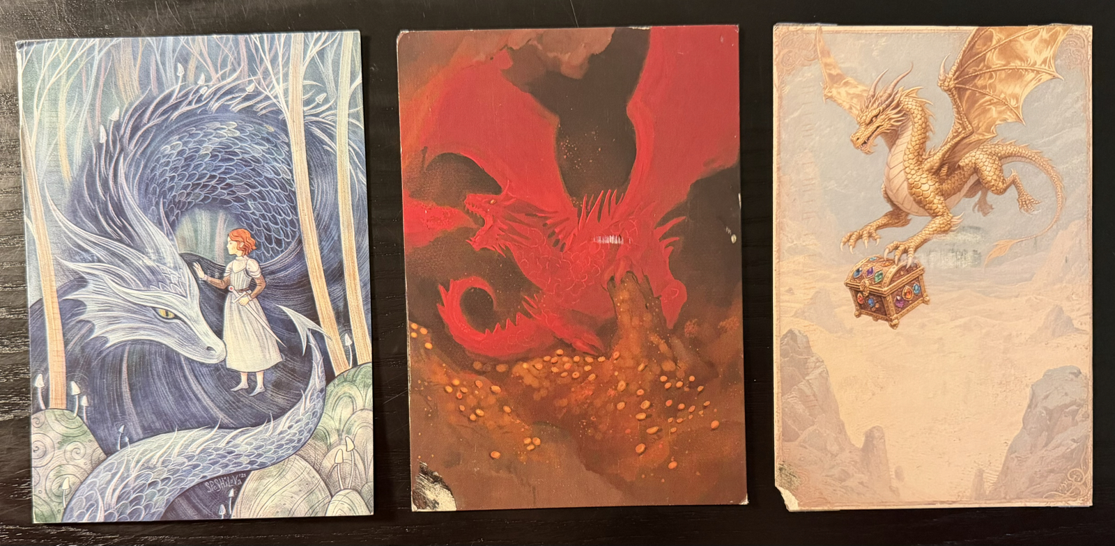
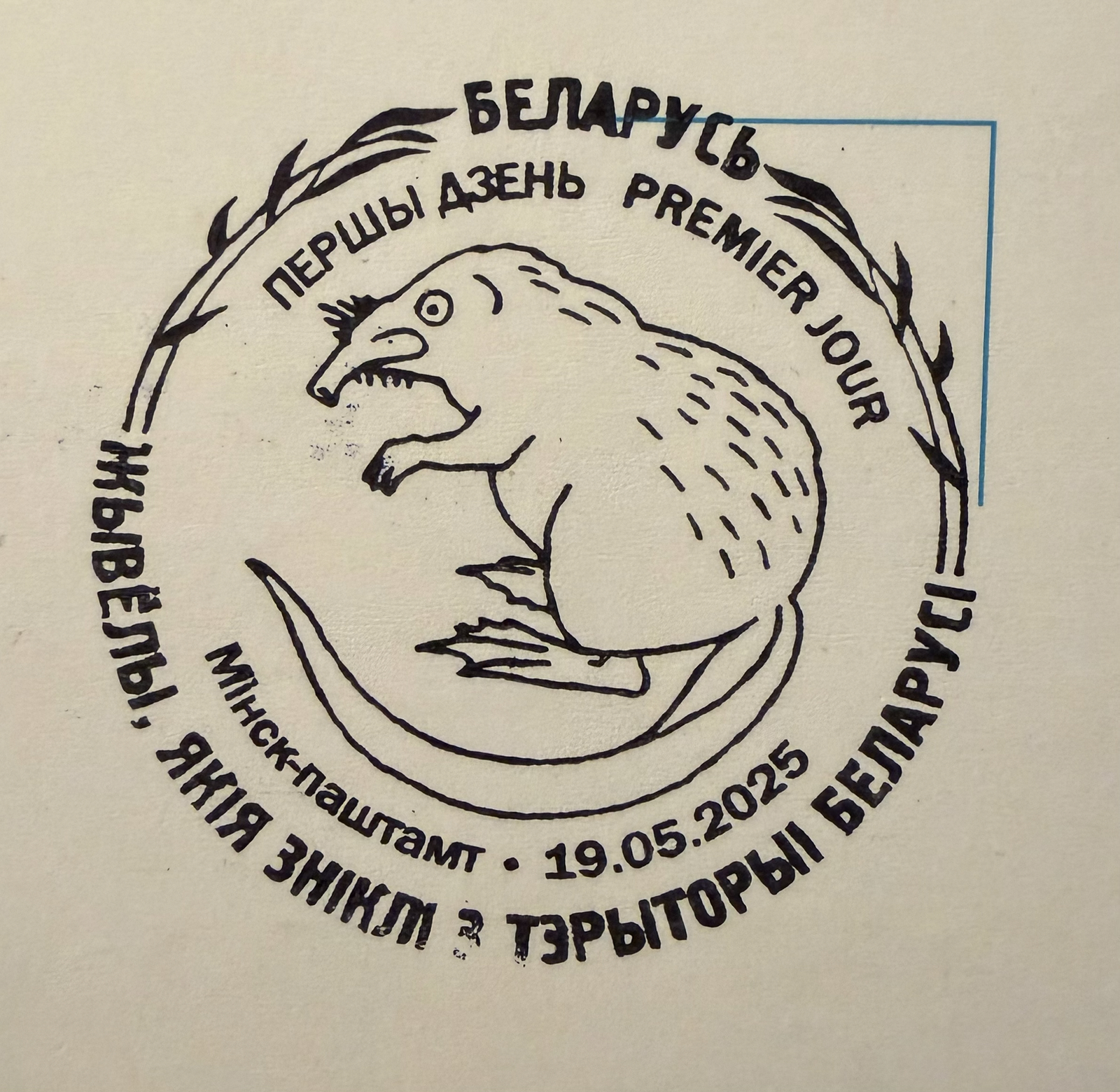
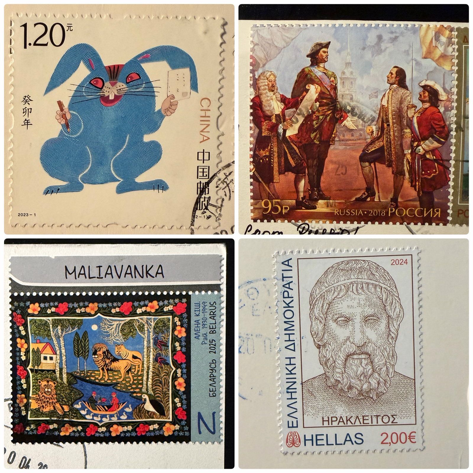
I received six dragon-themed cards! In my bio I also say I like fantasy art and I get it a fair amount of it. All three of the above came from Chinese senders.

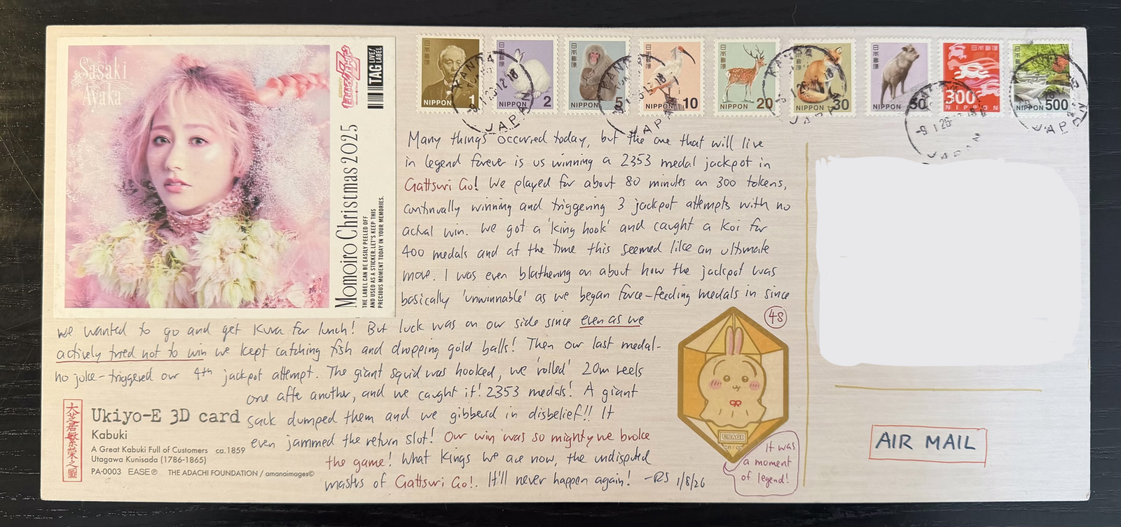
Of course I need to send cards to receive cards, and getting 50 a month means I write that many as well. What do I write? Usually something trite about me, my job, what I’m doing that day and mundanities like that. It’s not easy writing the same thing on ten or more cards at a time, so I sometimes mix it up with a movie review or comments on the card image.
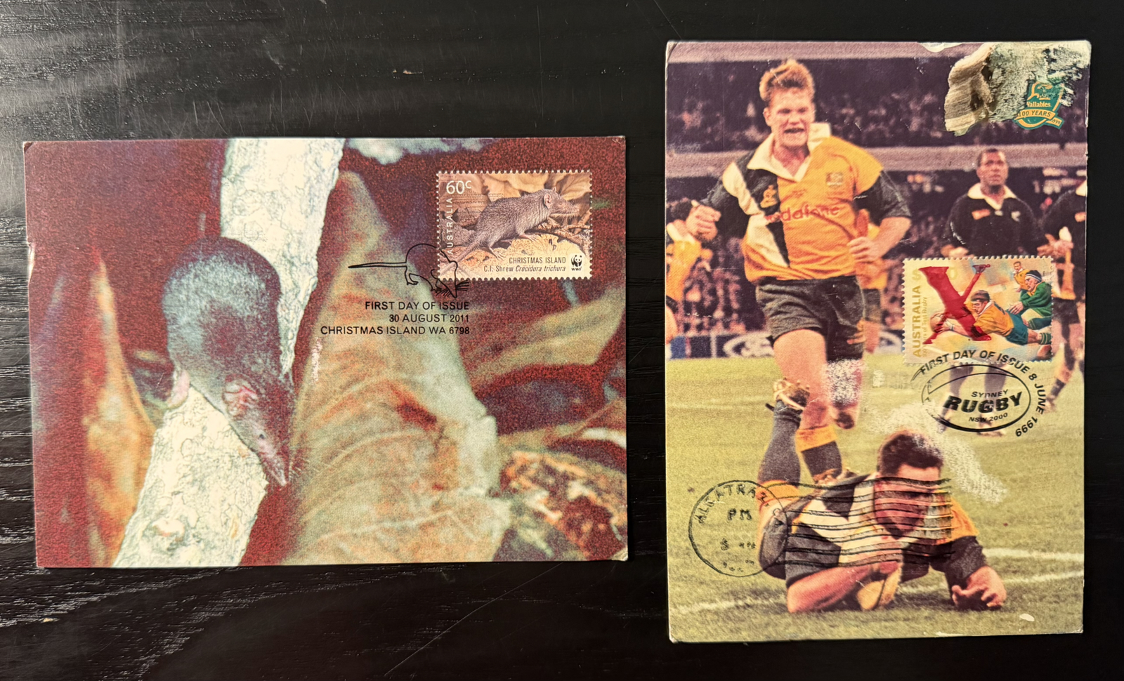
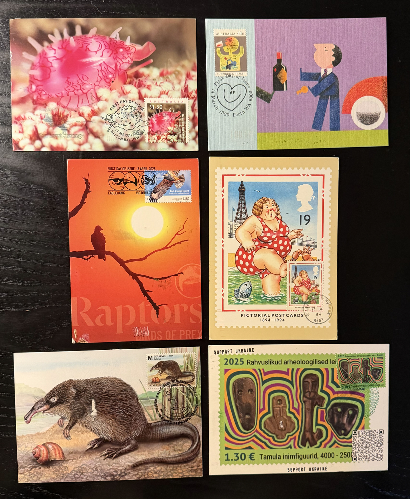
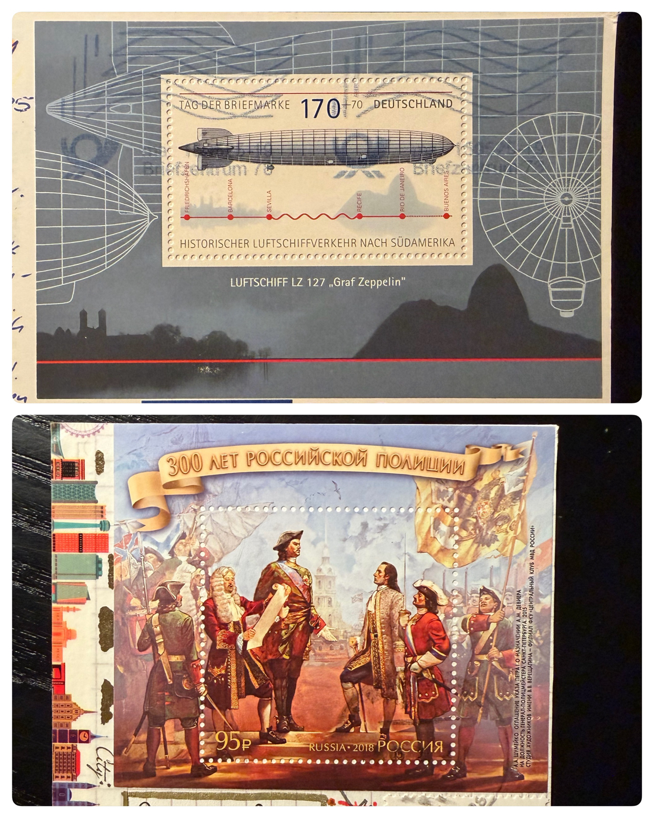
The Australian maxicards continue to arrive. As I’ve said in the past, these will get a dedicated post one day…
On the topic of stamps, next week the USA releases its first Postcrossing stamp! This is remarkable enough, but the fact it’s a triangular stamp makes it even more notable. The official release will be at a massive stamp show in Boston that runs for the entire week. I’d love to go, but alas I must visit Australia 😉
In the last update I mentioned I had considered slowing down with this hobby, although as evidenced that hasn’t happened! Not only did a renew the postbox for another year (which costs over $200 now!) but I didn’t reduce the amount of cards I sent in any way. I guess I’m in it for at least another several hundred cards!