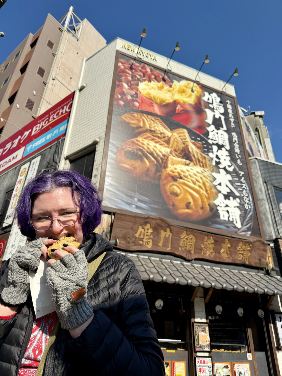
Today we split up. KLS went to classy shops and purchased fine goods, and I spent hours looking in shops like this:
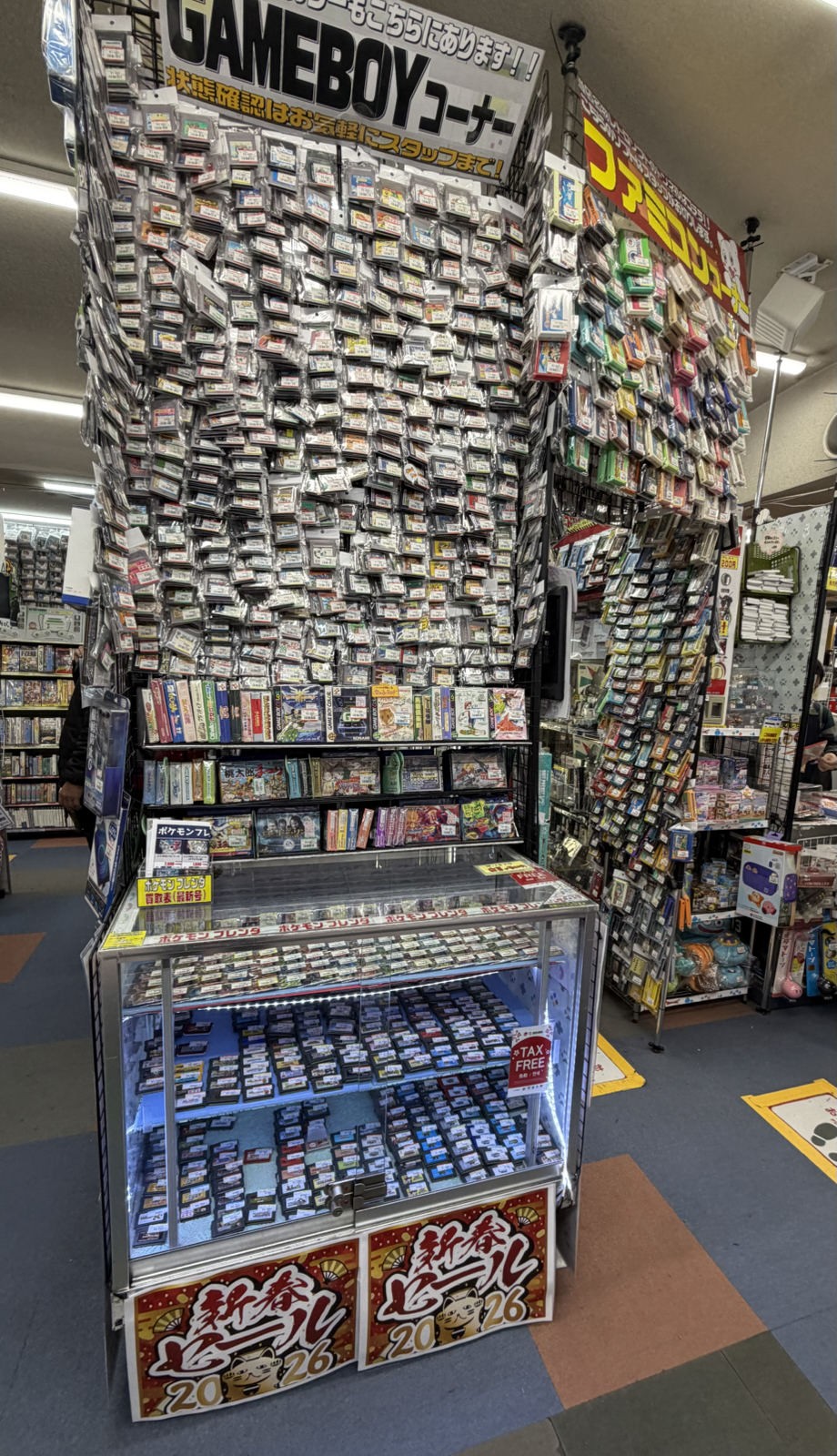
And this:
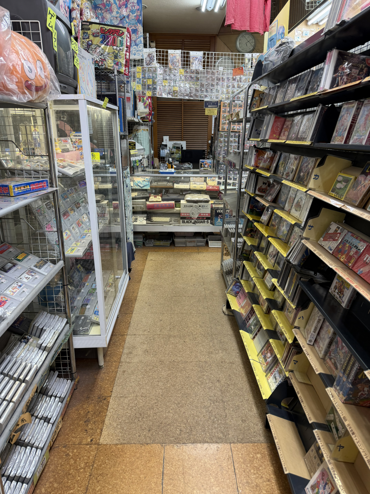
That sold stuff like this:
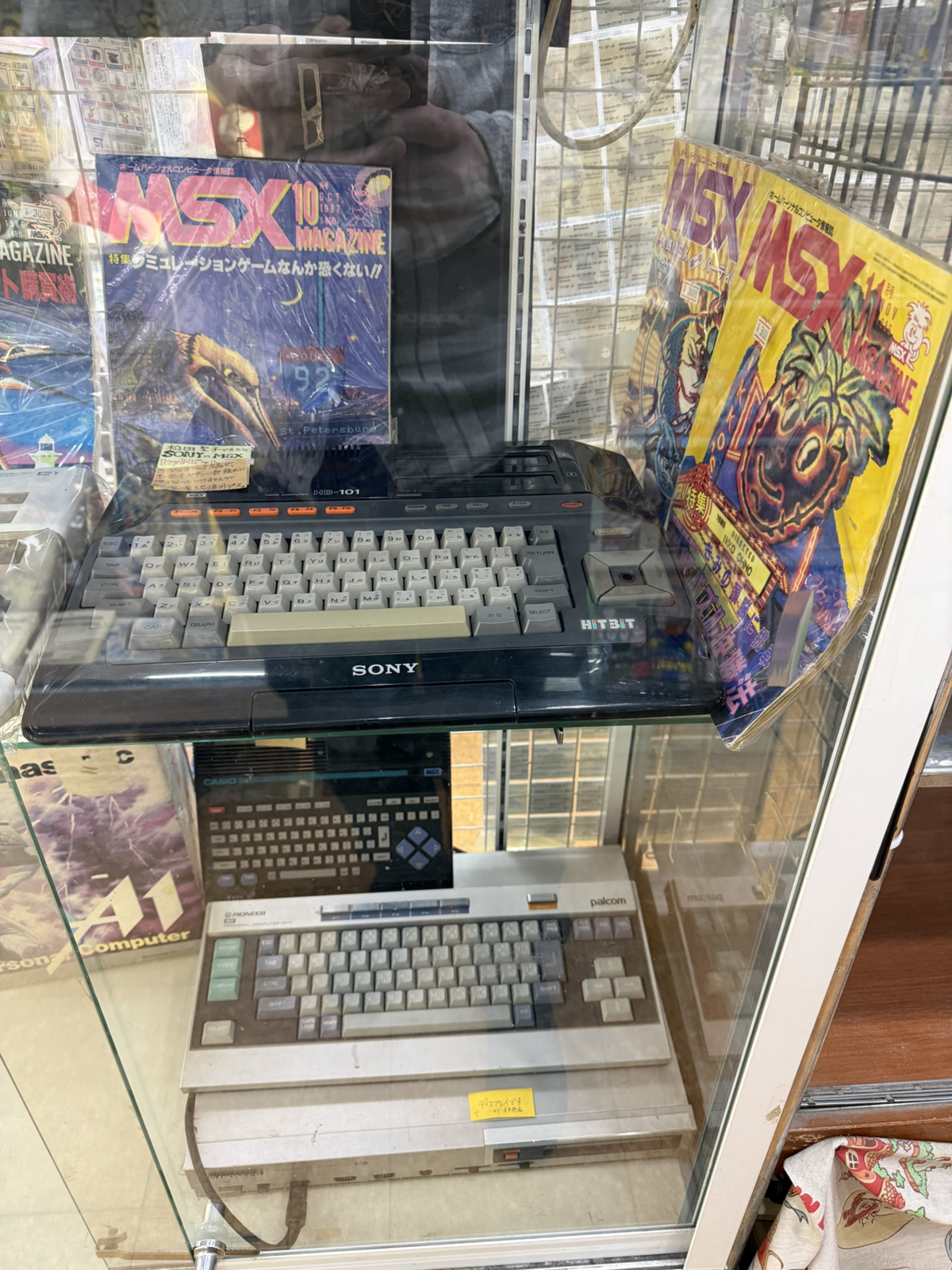
I also lurked in alcoves like this:
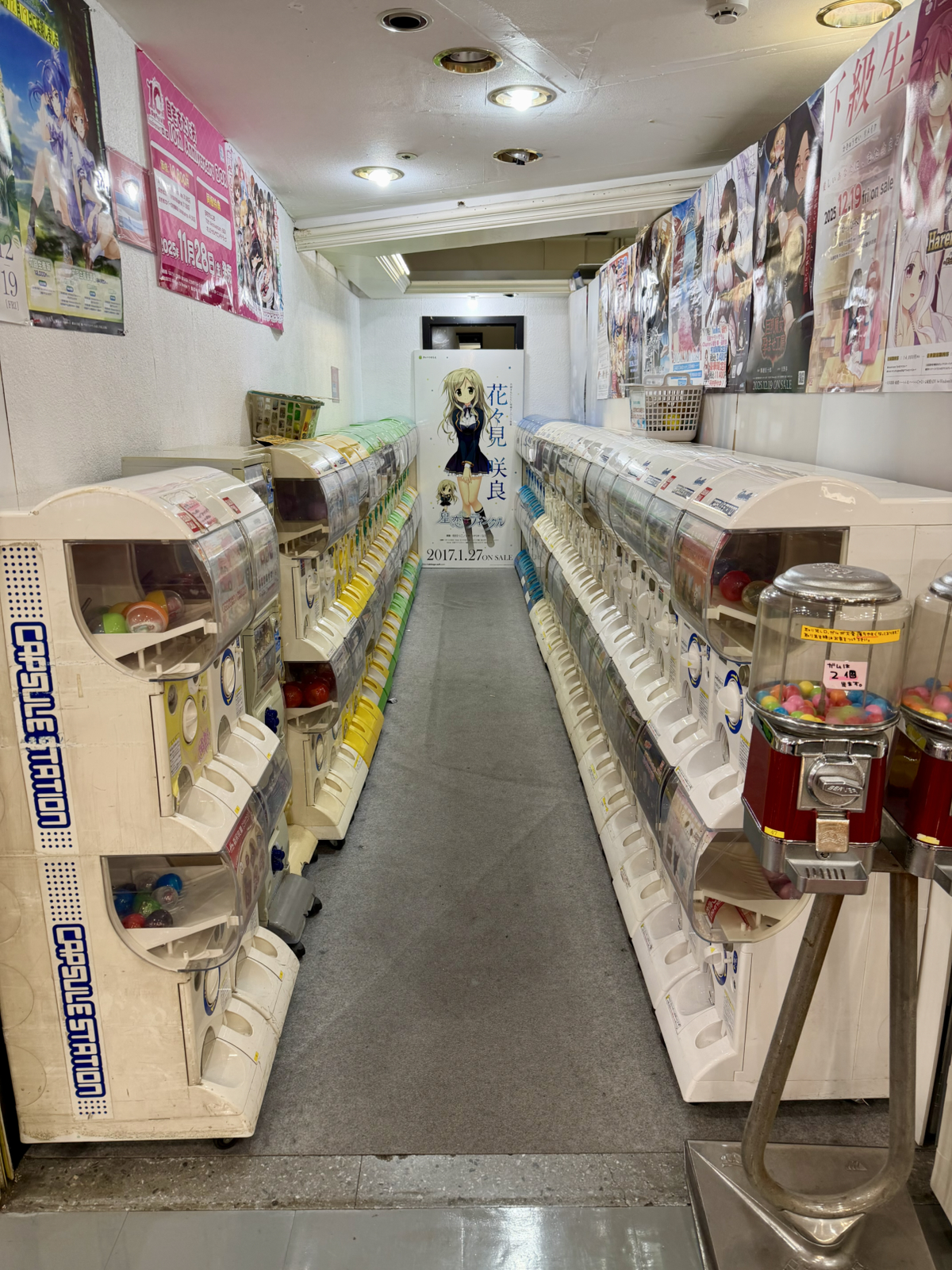
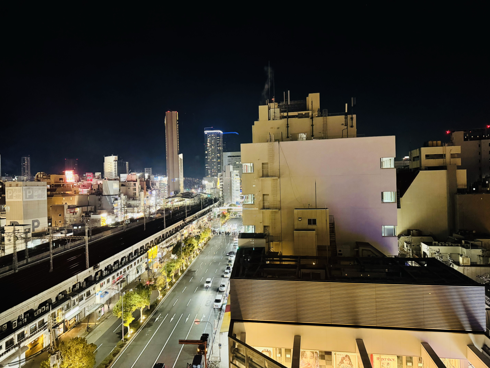
It was all in the same shopping building across the street from our hotel as well, and even after 6 hours I felt I hadn’t seen everything. In short, a wonderful day. 🙂
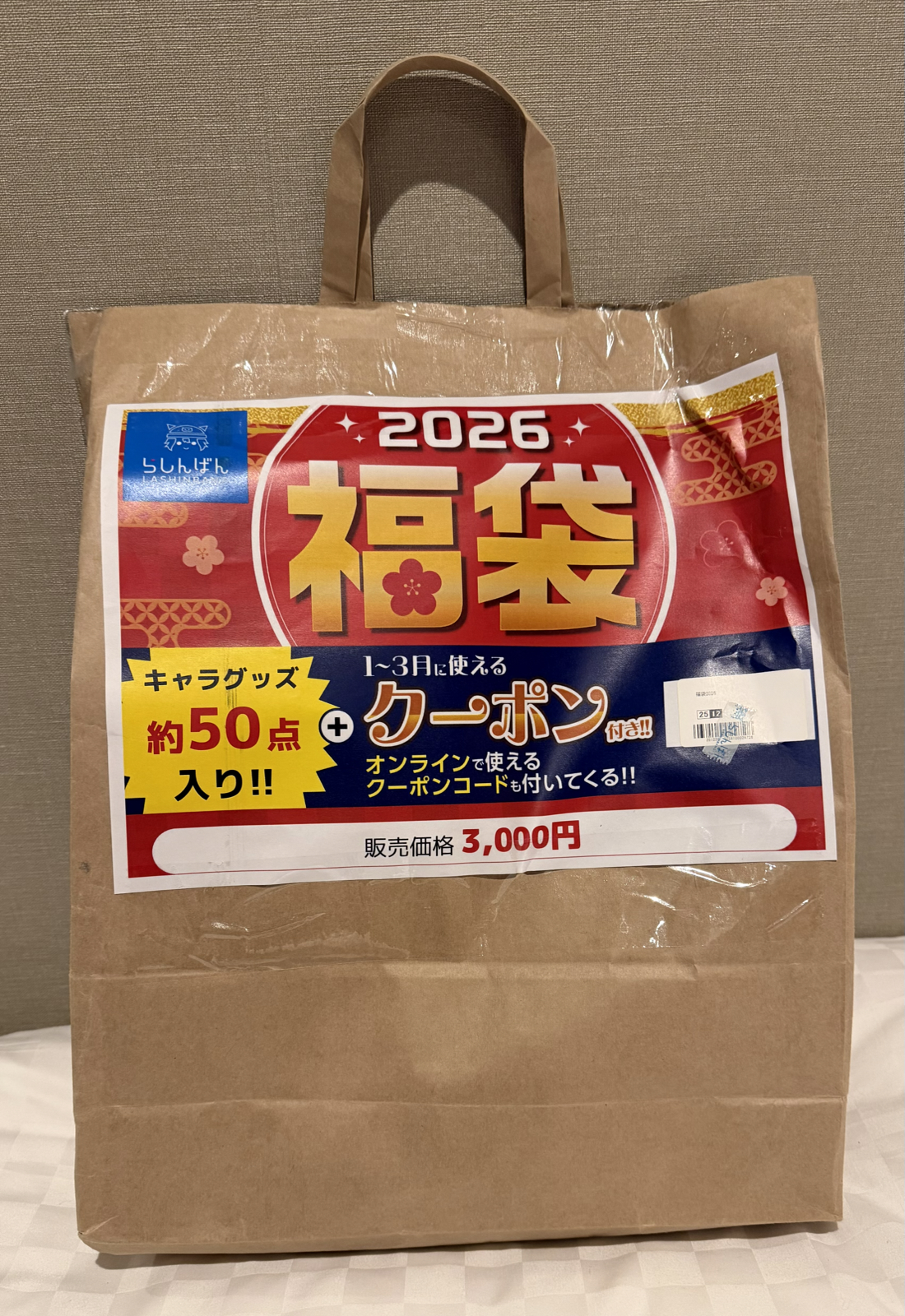
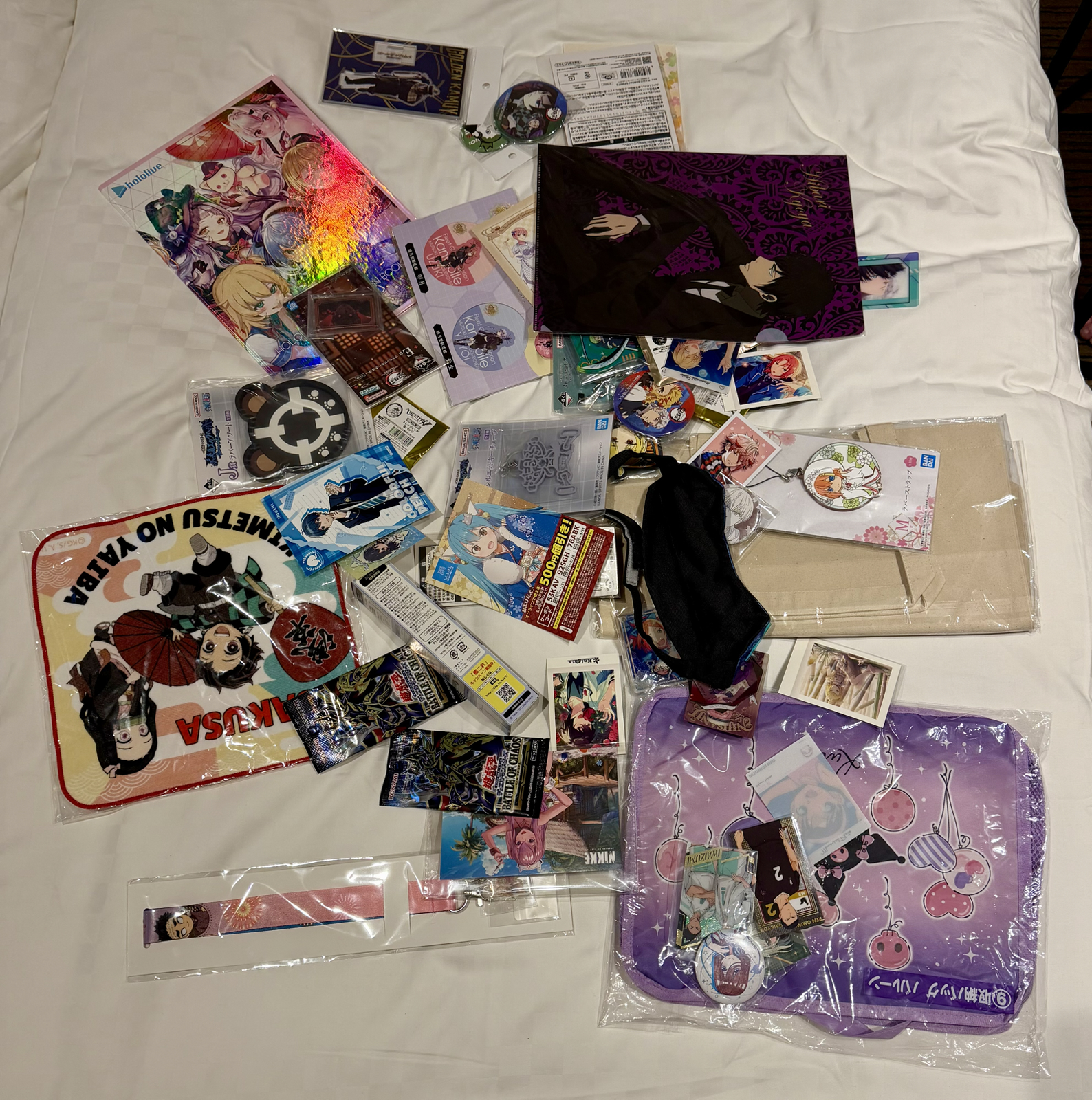
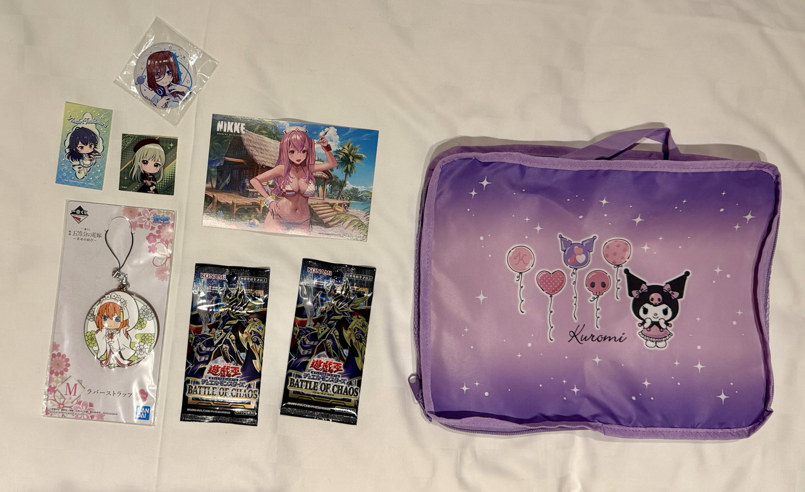
Let’s get to some highlights. For starters, inside this store:
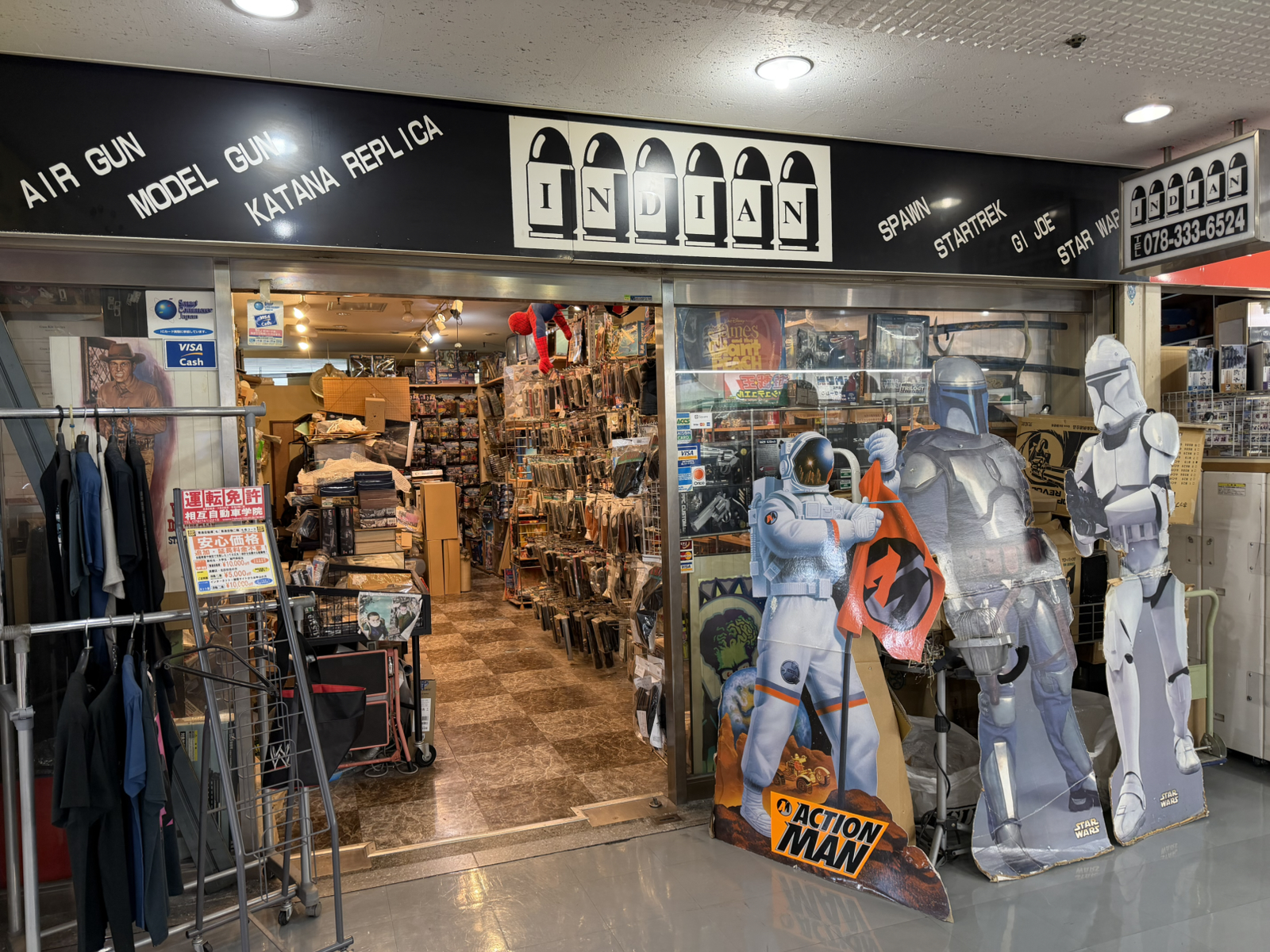
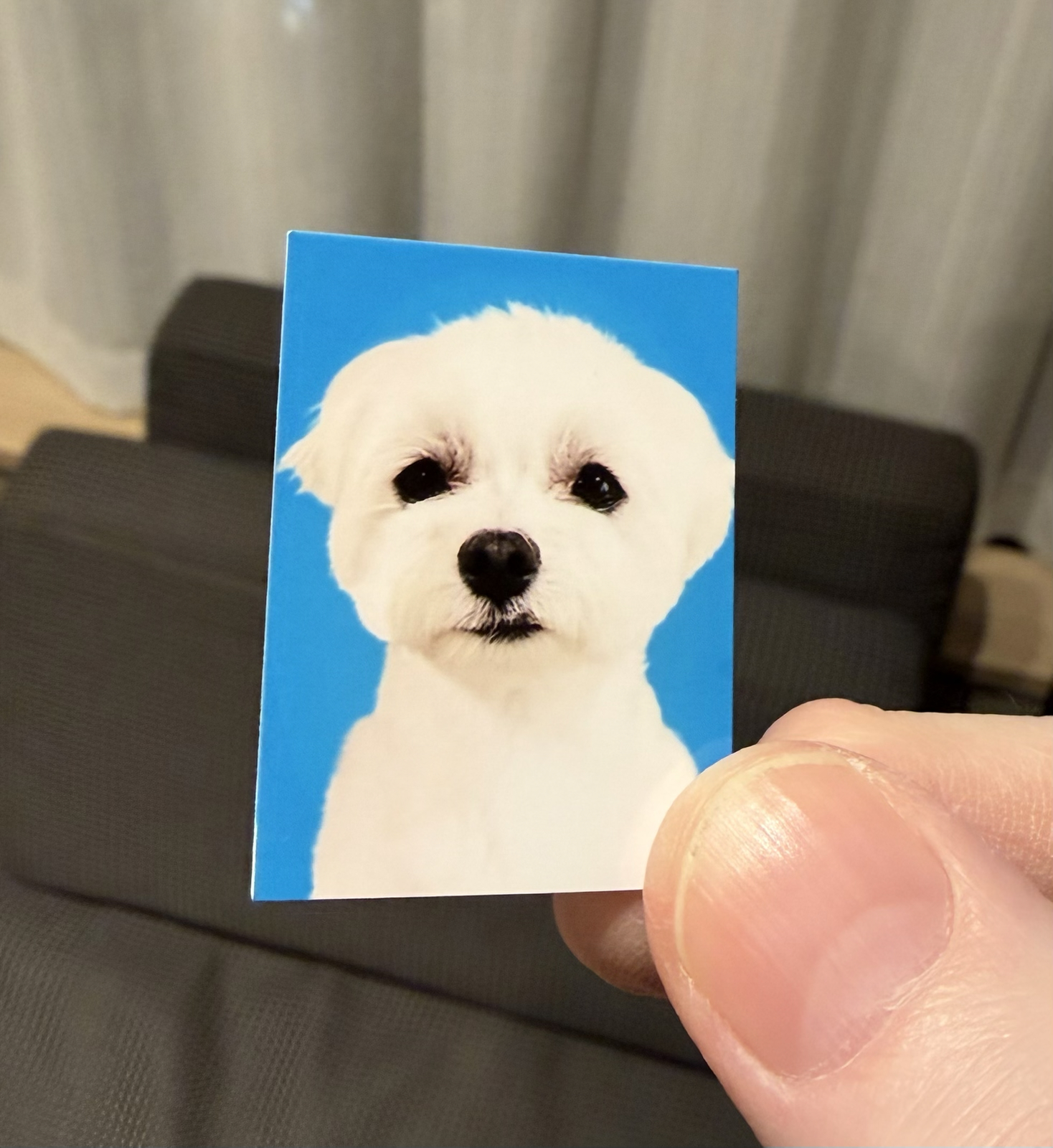
I found this magnetic ‘paper doll’ set:
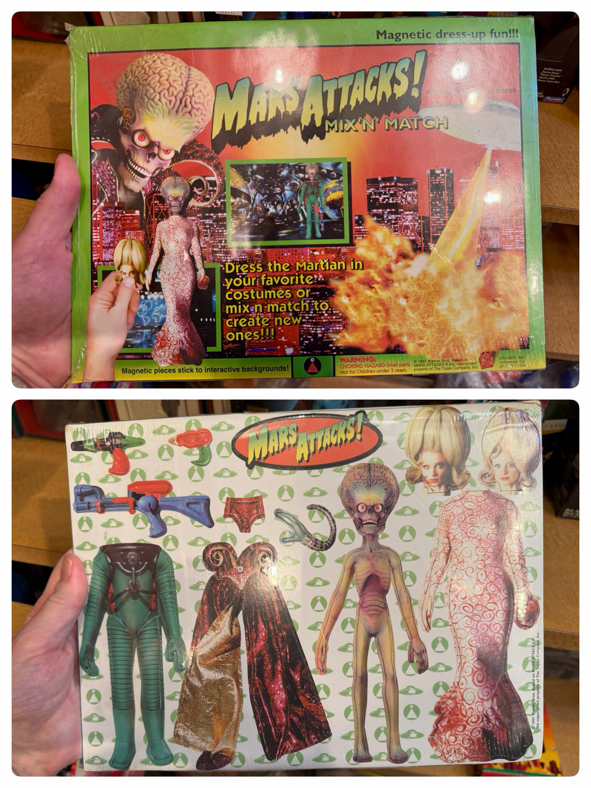
Yes it’s awful, but for that exact reason I wanted to buy it for a future gift for Bernard. The store was tiny and (unusual for Japan) dirty and I was the only customer. The salesman was at the counter with his laptop when I tried to get his attention to get a price: “sumimasen” I said (‘excuse me’).
No answer.
I tried again. It was just him and I, and I stood virtually in front of him. Even if he didn’t hear me he certainly could see me. Again, he didn’t reply. I assumed he didn’t want to deal with a foreigner and left. Alas, no Mars Attacks paper doll for Bernard!

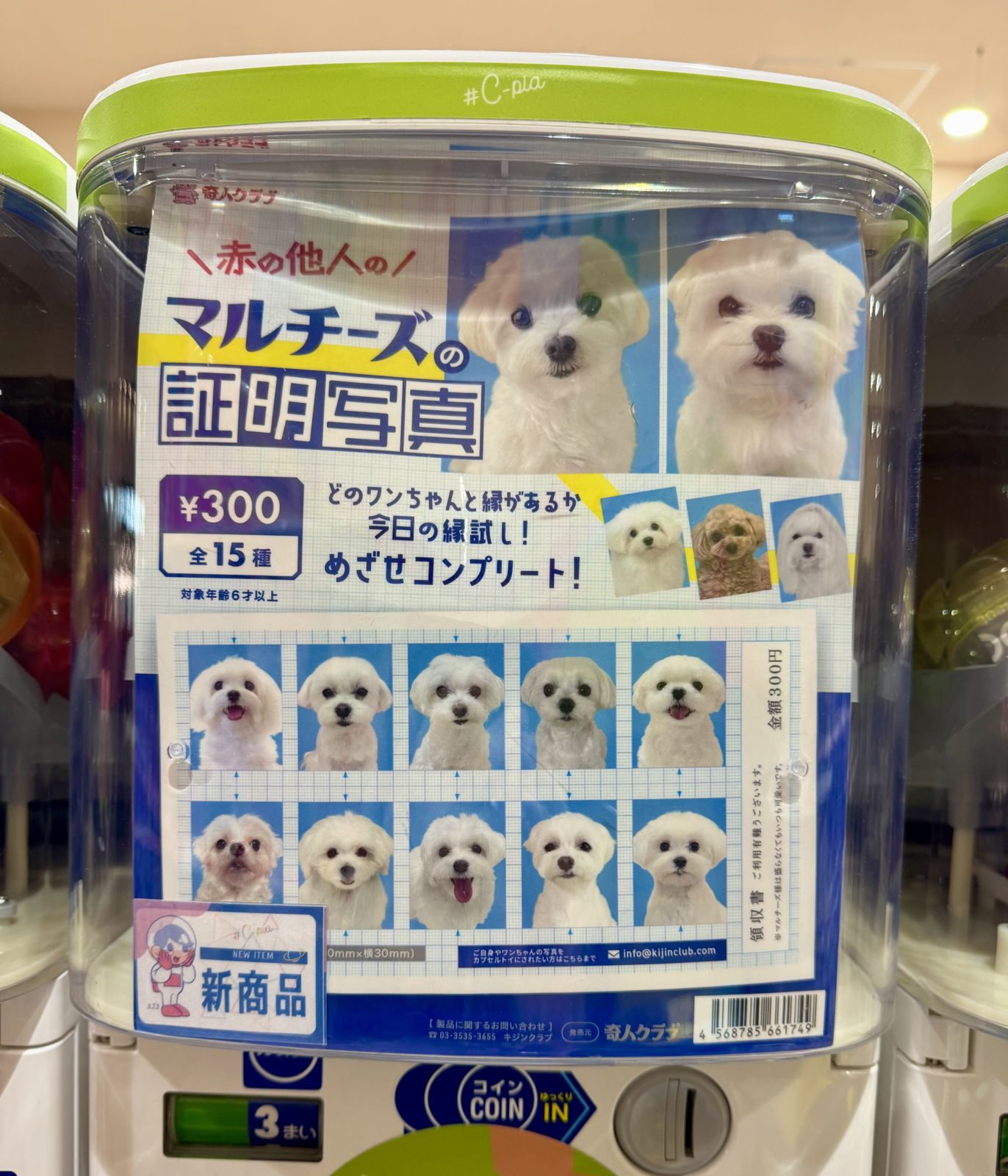
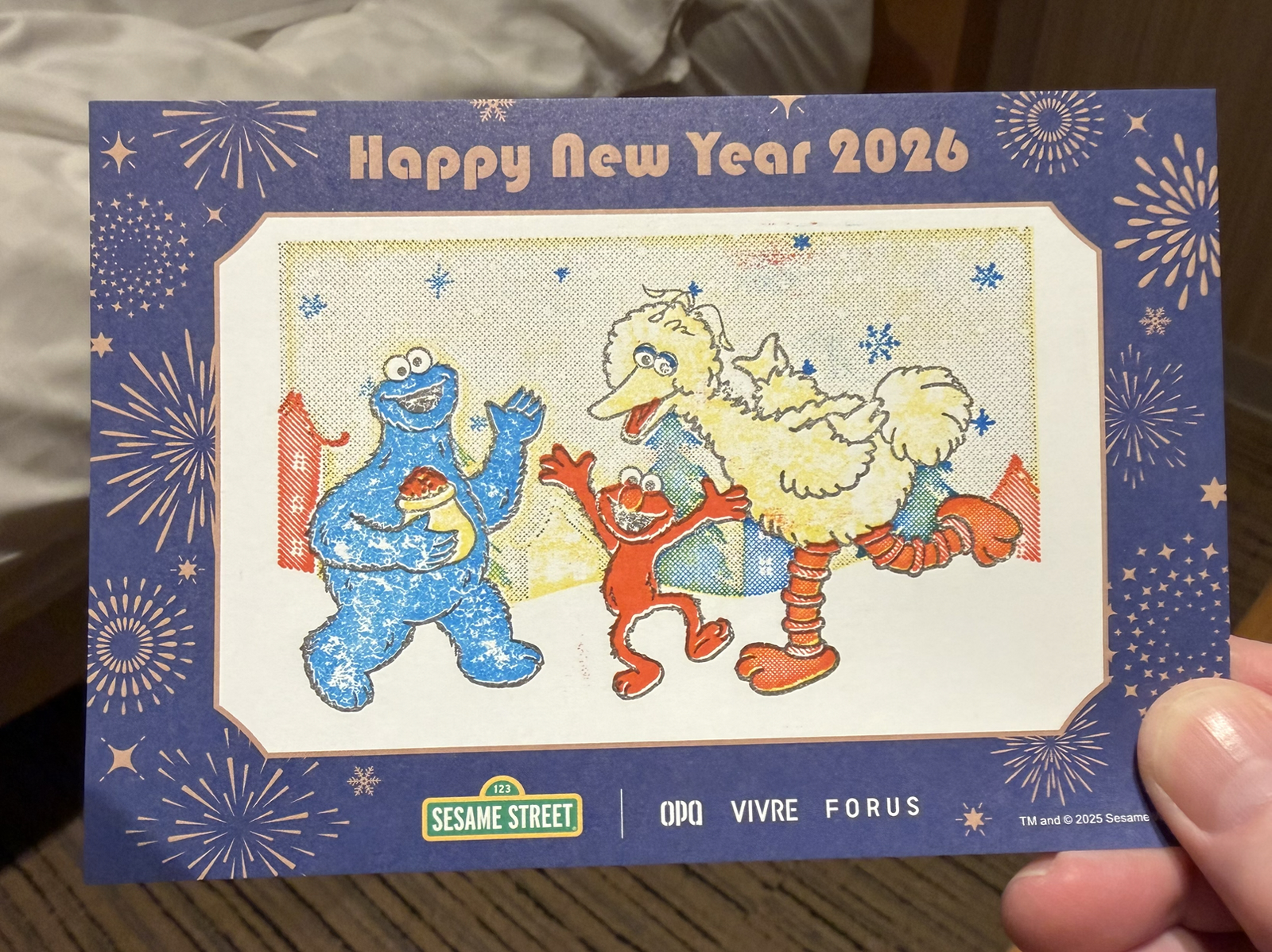
It was time for a stamp rally. We had seen this one the day before, and the goal was to create an image by using four different stamps scattered around the mall. Cards were provided as well as a frame to align the stamps correctly but I wanted to use my own postcards which didn’t fit into the frame. Finesse was therefore required.,.
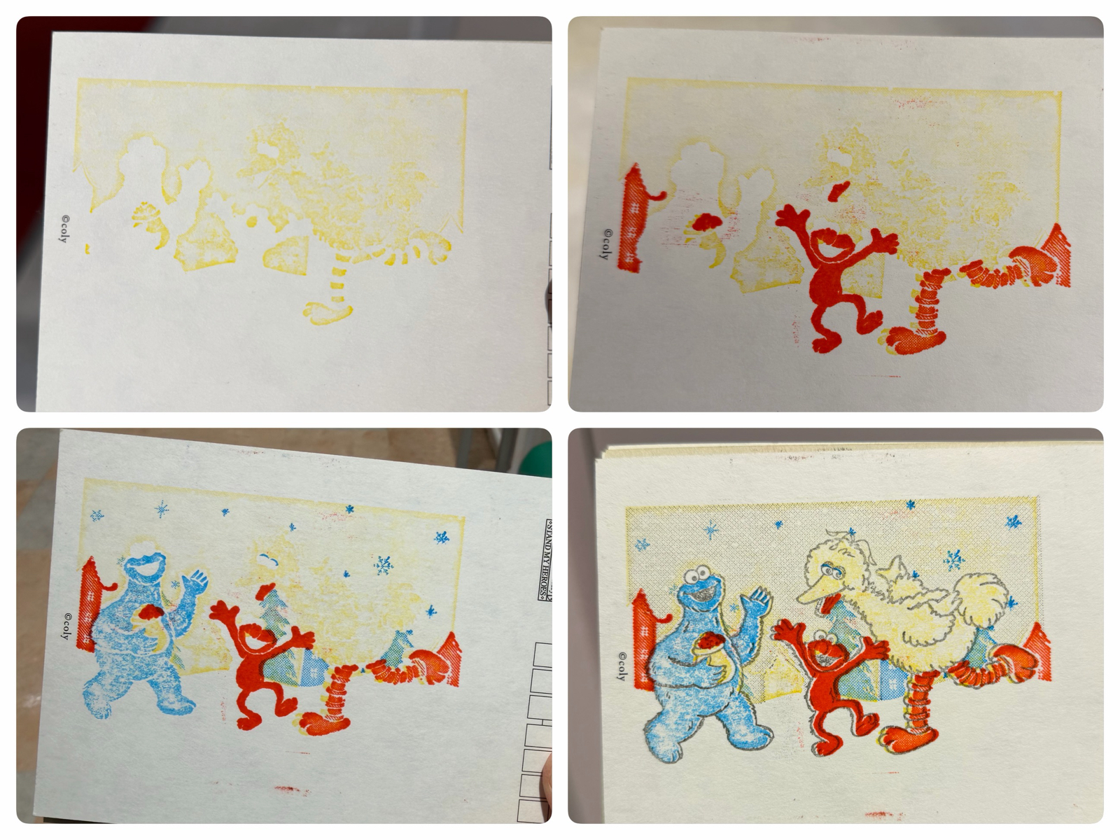
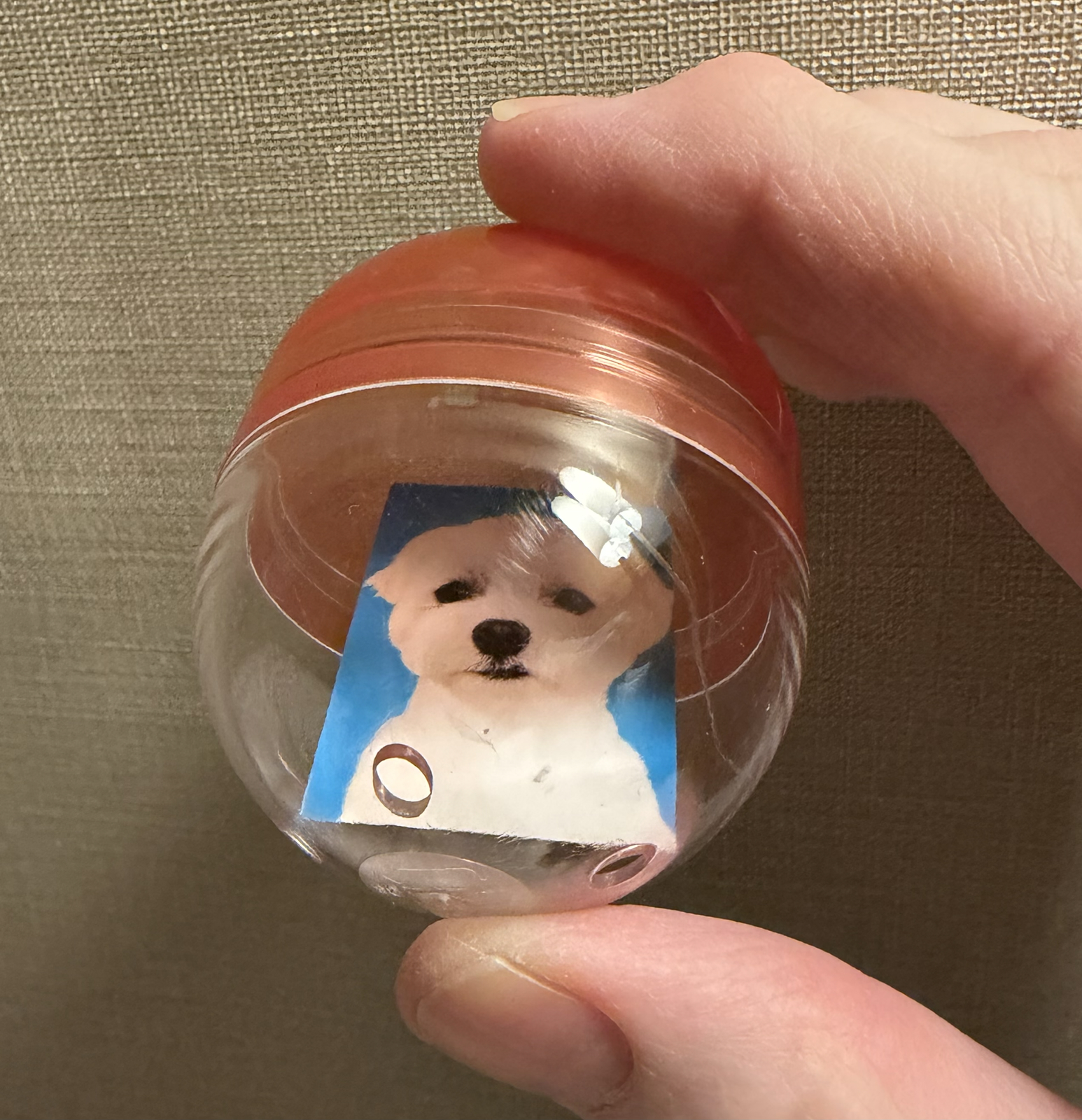
Not bad I think! I also did one using the frame to see what it was supposed to look like:
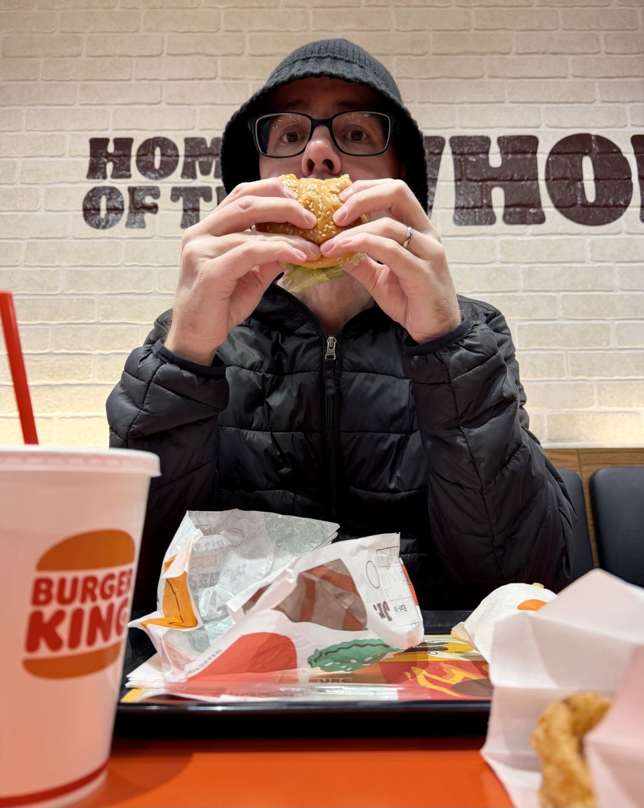
As I said we both shopped for hours and then met for dinner, which was our fourth Sushiro in under a week:
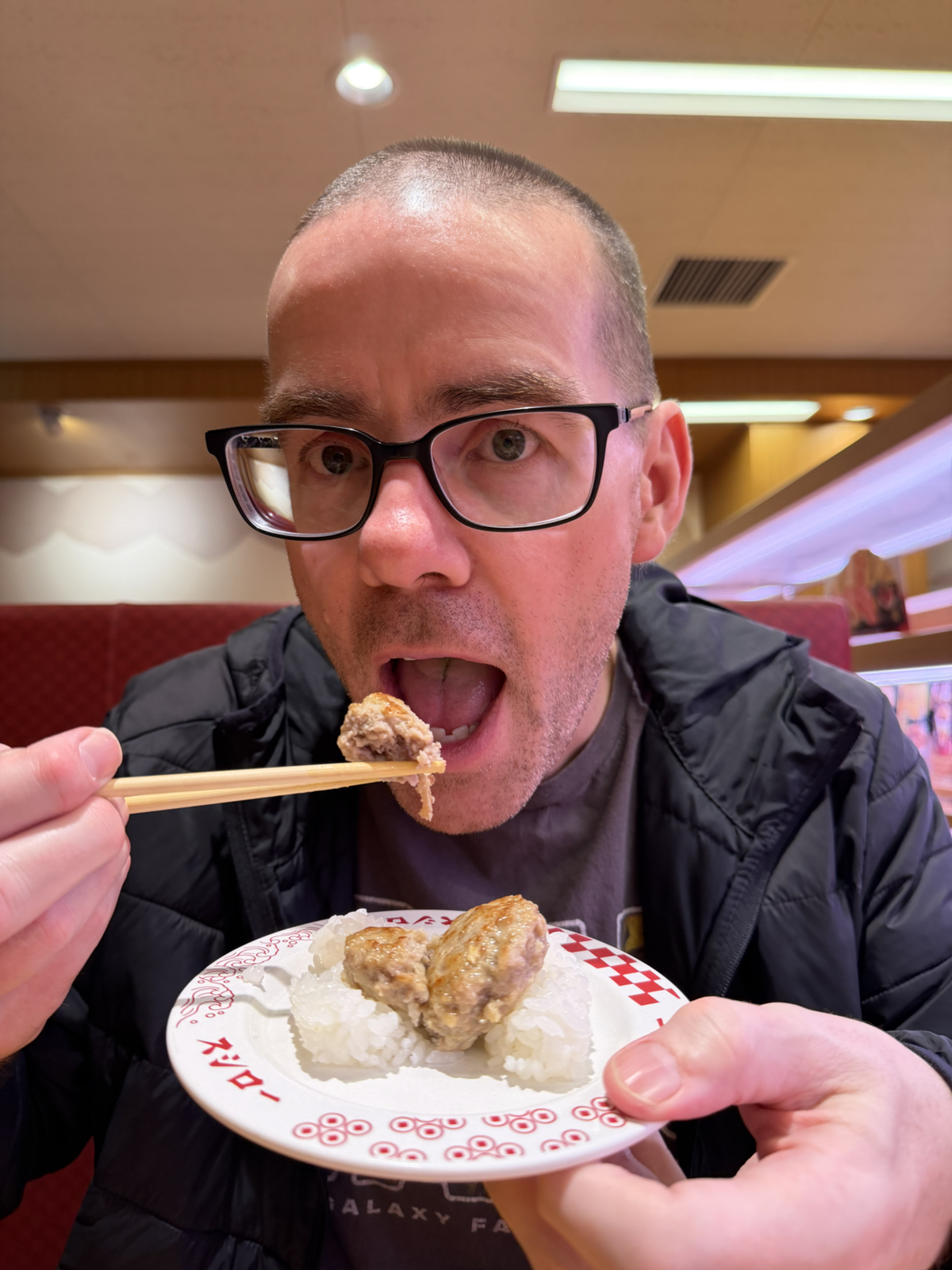
I’m eating my favourite: hamburger sushi. Made with beef. But not, I suspect, the type of beef most tourists visit Kobe to eat:
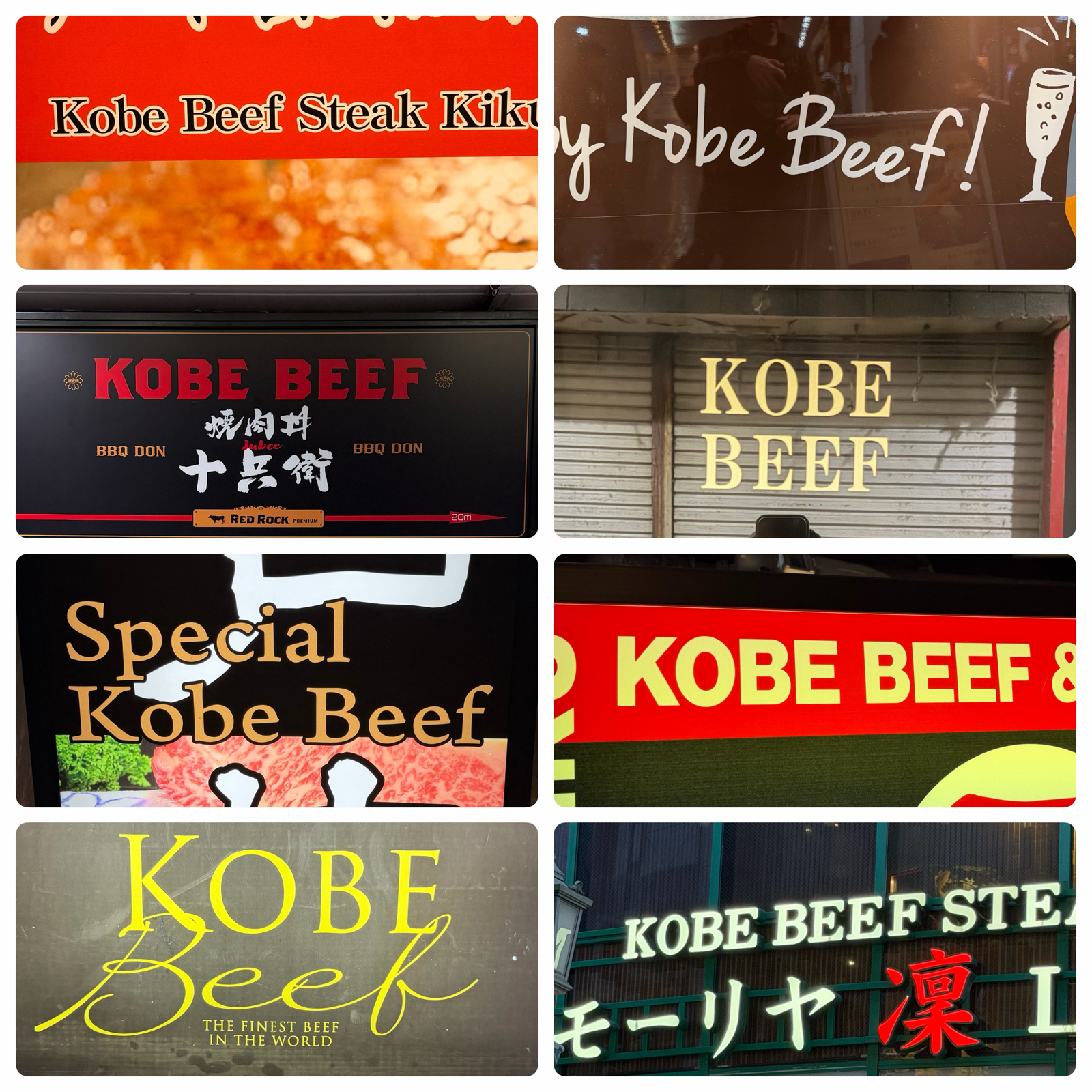
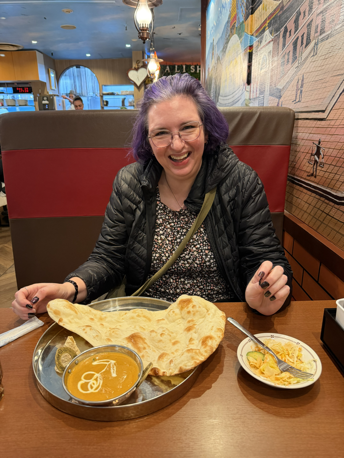
Many non-Japanese know this city as the beef place, and while this is true, and that there are beef/steak restaurants in abundance in the area we are staying, to my shame I’ve eaten none of the legendary beef!

Perhaps I should have ventured out of my comfort zone a little?
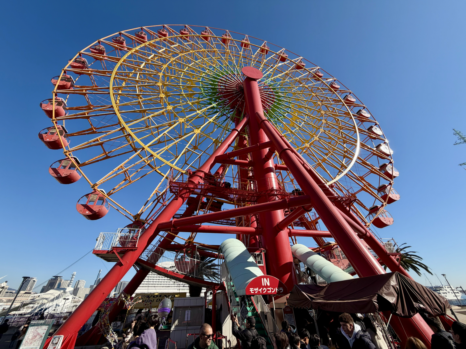
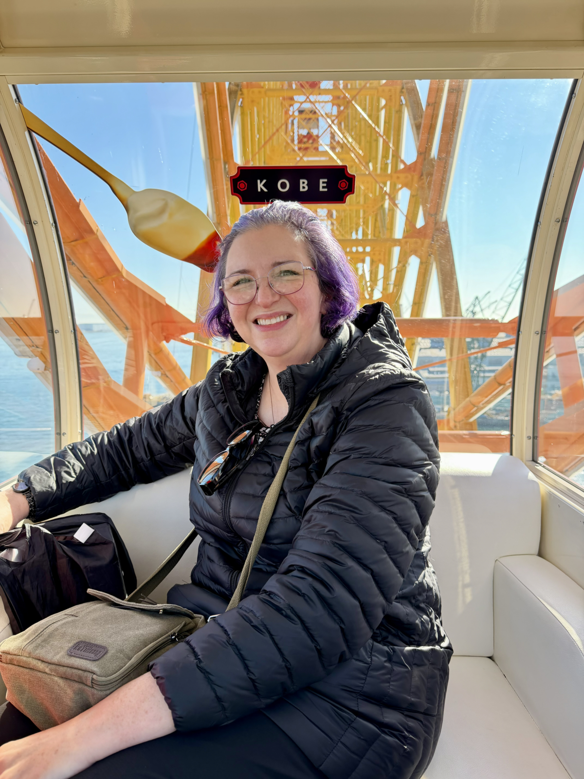
Tomorrow we leave Kobe for the fourth destination on this vacation. It will take us farther from Tokyo than on any previous trip to this country, and indeed we’ll even be crossing to the southwest island of Kyushu. Stay tuned to find out where we end up!
My final thoughts on Kobe…? I’m pretty sure I’ll be back here again soon enough 🙂