Category: Art

Landscape Contest: Results

The judges have spoken and the ‘landscape’ postcard art contest is now complete. The first five scores were already revealed, after which I was ahead 3 wins to Bernard’s 2. It’s now time to see the results for the second half…

Japan

Bernard’s is on the left, and mine on the right. We both went for the obvious choice of Fuji, and I’ll humbly point out that only one captured the true colour of the famous mountain! I worked hard on my piece, which is based on a real location I hope to visit one day, and looking at it now I’m proud of how much better it was than my earlier works

The judges agreed and gave me the win 9.6 to 5.4. Here’s what they said:

“I think the painting on the right is a work of fiction. I donโ€™t think this vista actually exists but is a juxtaposition of multiple scenes. Despite that it is very well painted and distills and concentrates the scenic essence of Japan into a small image.”
“Both are unmistakably scenes of Japan. I like the way in the right painting Mt. Fuji is being framed by the Tori, inviting me to walk right along the pathway. The left one however has the best color cherry blossoms.”
“I think both qualify as actual landscapes. I am naturally drawn to Right. The iconic gate, the subtlety of the mountain shading.”

India

Bernard is left, I am right, and once again we’re both choosing the same subject (in our defense what else could we have painted for India?). To be honest I’m not entirely clear what happened with Bernard’s (and the judges were confused as well) which appears unfinished! I went for a sunset view myself, and even attempted a (poor) reflection!

Unsurprisingly I won this one, once again 9.6 to 5.4. Some judge comments:

“This is the toughest one yet!! Left better represents the subject (size and color). Right has better use of paint.”
“The painting on the left suffers from poor colour choices, or being washed out. Right is a much more striking image..”
“I’d be curious to see the completed painting of left because the color is correct. The gold is long gone and if you’re going to say it’s sunset then right is missing the sky!”

Australia

You knew our home country would eventually make an appearance and here it is! Yet again we painted the same subject although our time of day differed. Mine is on left and Bernard is on right, and amusingly some judges assumed the reverse since they thought the silhouette indicated the same as the person (Bernard) who painted Egypt with the camel rider!

Judges seemed to struggle with this one and deliberated quite a bit. Eventually I emerged winner 8.1 to 6.9. There were a lot of comments about this one; here’s some extracts:

“The left one is vaguely Christmas card-ish. For some reason, that bothers me. The right-hand painting reminds me more of when I visited Uluru.”
“Kangaroo says it all.”
“Left is superb. The glowing last rays of the sun before it plunges into the horizon to cast the vacuous landscape into darkness. The anticipation of the twinkling stars ready to ignite across the night sky. And the charming little chap silhouetted against the setting sun. I just love it!!! Right has great detail in Ulu?u and a reasonable attempt at a scrubby foreground with good contrast from the bright blue sky. Two great paintings!”
“Left: Kangaroo is a nice touch.
Right: Best use of color”

Antarctica

Antarctica was Bernard’s choice, which made me think he had a plan. His with penguins is the left, and mine with a whale is on the right. It was clear the judges loved the penguins and it seems many didn’t know whales frequented Antarctica! I spent a lot of time on my iceberg shading. Maybe I should have added a penguin ๐Ÿ™‚

This was close and ultimately Bernard won 7.7 to 7.3. The judges words:

“I like the color scheme on the left way more, but the penguins look like they are perched on clouds. Enjoy the crispness of the landscape more on the left, but why is the sky so grey?”
“Left wins because penguins definitely only live in Antarctica. Whales don’t mean it’s Antarctica. However penguins move in groups, how come only two?”

Atlantis

The final choice was mine, and naturally I picked a country I thought others may overlook and one that would give us a good final challenge. Happily we produced very different takes with my mermaid and Cyclopean undersea temple (left) contrasting with a monochrome depiction of a submerged ruin from Bernard (right). Both are I think striking in their own way, and I expected the judges to struggle.

And they did a bit, and as it turns out this category has the two most wildly divergent takes with each of us receiving an overwhelming victory from different judges. In the end though Bernard won 8.2 to 6.8. Here’s what the judges said:

“Wow. I love the painting on the left. Such lovely colours and the composition is superb. The colourful corals in the foreground with the looming ruins. The colour of the water is gorgeous and reminds me of the sapphire seas in the Mediterranean. I love the gorgeous little mermaid silhouetted in the background going to her underground castle bathed in the suns rays. Pure delightful fantasy.”
“I really love the right.”
“These visions of drowned Atlantis show how far both artists have come in mastering the budget paints at their disposal and in the ambition of their compositions. Once again, there are surprising parallels in the two paintings done in isolation from each other. So…does a marker reward a clever use of perspective in a dynamic, vibrant scene OR the not inconsiderable feat of evoking a setting with depth, light, shade and a hint of mystery using only blues? The answer is yes.”

Ten subjects completed, twenty paintings painted, and 100 judges scores tabulated. The final results are in.

The winner was me, with six wins to Bernard’s four! I’m taking a humble bow as you read this, and now it’s time for some final thoughts and comments from the entrants themselves.

Firstly I believe I speak for both of us when I say we struggled with the media and our tools. I recently read an interview with an artist talking about he liked acrylics since he could layer light colours over dark but this absolutely did not work with the cheap paints I bought us for this contest! So any mistake with dark paint was almost impossible to fix, which many times caused problems! Secondly the paint was very sticky to brushes, and with a canvas as small as a postcard obtaining any sort of fine detail was quite a struggle.

What was our best and worst? I felt my best was Japan, and my worst Italy. Bernard felt his best was Japan and his worst India.

Our opinion on the others work? I felt Bernard’s best was Australia and his worst India. He felt my best was Netherlands and worst Antarctica.

Did we agree with the judges? Broadly yes, although Bernard felt I should have won China and he should have won Egypt or Australia. I agree that he should have won China but felt I should have won Antarctica.

And thus another years contest ended, although with planning well along you can bet there will be anot—-

What’s that? The contest isn’t yet TRULY finished? There was a mystery SIXTH JUDGE?!?!??

Come back tomorrow to find out what I’m referring to…

My Favourite Lands

I’ve written about my Magic The Gathering basic land collection before, and now seems like a good time to revisit it. Today I’ll talk about some of my favourites amongst the thousands of land cards I own.

I store each type in its own box these days, and have five like the one shown above. Each box can allegedly store 800 sleeved cards, and currently there’s roughly 770 of each basic land, of which I have maybe 750 of them, so I’ve got space yet.

If you’re wondering, the omissions are either due to excessive cost (a set of the five ‘Guru’ lands costs thousands these days) or extreme rarity (the FBB and Salvat foreign-only lands).

I’m quite a fan of this collection, and for the vast majority of new sets it only cost me a few dollars (including shipping) to get all the new basics so it’s a very inexpensive way to keep my toe in magic ๐Ÿ™‚

With so many cards it was tough to isolate favourites, but I tried hard for this post. Each land is divided into three types otherwise the results would have been very full-art heavy, and my choices were based exclusively on the art. Since the cards are glossy and sleeved photography was a challenge, and all of these look more vibrant in real life.

Plains

Plains cards generate white mana, and often depict fields or wide open skies. As the game has matured artists have begun to take liberties, as you can see in some of the full-art examples below.

The above are my favourite normal frame Plains cards. The leftmost is the APAC land featuring Uluru, which may be my favourite magic card of all time. I like the middle (from the 2013 basic set) because it’s instantly recognizable as a white mana card and is unique due to its vantage, and the right is one of the Doctor Who basics, all of which I love (and more you’ll see here).

Moving onto full-arts we have one of the Kamigawa lands (which were printed in Japanese in all regions), the best of the ‘space lands’ from Unfinity and a Japanese version of an evocative not-a-mountain from the recent Ixalan set. As with most cards shown today they usually look better in foil and the space plains shown here is particularly dazzling in its ‘cosmic foil’ treatment, where the foil effect includes tiny stars in the pattern!

I’m treating Secret Lair cards as a separate category since these are available only in special sets sold directly via a website. In researching this post I was surprised at the overall quality of plains cards in secret lairs, and the above list wasn’t easy. From left to right we have a plains version of Shibuya in Tokyo (from The Tokyo Lands), a lovely bright plains by Kozindan featuring two beast riders, and yet another Japanese-themed plains from the Ukuyo-e Lands set.

Island

Island land arts are interesting. For years they were extremely literal (a plain painting of an island, usually rising from an empty ocean) but in recent years artists have interpreted ‘island’ as ‘area with lots of water’ which allows greater variety.

The three normal-frame versions I’ve chosen are mostly from recent years and from left are the ‘squirrel island’ from Unsanctioned, a near-photorealistic painting of a ruined bridge from one of the D&D sets and yet another Doctor Who land ๐Ÿ™‚

My favourite full-arts are a looking mountainous island from Unstable, a ‘stained glass land’ from Dominaria Unleased and an isometric – and very busy – blue cityscape from Murders at Karlov Manor. The lands from this last set weren’t popular with many players due to their similarities, but I liked them quite a lot.

The secret lair lands I’ve chosen include one depicting a serpent by Kozindan, a snow-covered island (is that cheating?) from Meditations on Nature and yet another card from the Ukiyo-e secret lair.

Swamp

For me, it’s important that lands are recognizable at a glance and I tend to prefer those with color identities very similar to their mana. No blue mountains or red forests for instance. In the case of swamp this means black, and lots of it.

From the normal frames, the leftmost is the ‘Phyrexian’ text card from Jumpstart, the middle is an eerie swamp scene from Kamigawa and the rightmost an ominous depiction of two robotic craft patrolling a noxious swamp from the Warhammer 40k set. This last one looks extra-good in the ‘surge foil’ treatment that debuted in that set.

Continuing the mostly-black theme, the full arts all display dark and unwelcoming swamps. From left we have Unhinged, then one of the dramatic black-and-white lands from Crimson Vow and lastly a full art from Wilds of Eldraine. The black and white lands were available in every colour and while I love all of them I think there’s no question they work best for swamps. The Wilds of Eldraine lands are all photographs of detailed papercraft, so well done they look like paintings.

As for secret lair swamps we have a bonus card from the Seb McKimmon artist set, one of the Brutalist lands and one of the Dracula lands. There’s a lot of good secret lair swamps and this was a difficult category to only choose three from.

Mountain

Mountains generate red mana, usually associated with fire and direct damage. Early mountains were just literal painting of mountain ranges, but I prefer the more volcanic or aflame cards.

From left we have another APAC card, in this case Fuji itself. In the middle is another Jumpstart card depicting unusual burning pyramids, and at right we almost combine the two in another Kamigawa card showing a Fuji-like mountain with a fire spirit in the foreground. Many of the basics in Kamigawa were exceptional.

For the full-art mountains, I think the mountain is the best of the ‘zodiac/Pokรฉmon’ mountains from Theros Beyond Death (this set of lands seems to be the most popular of all the full arts amongst players). The middle one from New Capenna – a city based expansion – takes an unusual choice to depict a skyscraper as a mountain and I think it works well. And on the right we have the best of the Jurassic Park lands, depicting T-Rex himself!

As for secret lair mountains, we see another from the Tokyo Lands set (depicting Fuji once again), one of the ‘vapor wave’ lands from the Shades Not Included set and what I think is the best of twelve exceptional mountains in the Mountain Goats secret lair (which is also the only borderless card in this post).

Forest

Forest cards remain the most literal: trees and greenery. I feel that green mana as a whole hasn’t shifted much since Magic began 30+ years ago, and much more so than any colour art for the basic forests from that time doesn’t look unusual compared to recent versions.

The leftmost art – which debuted in Invasion back in 2000, has been reprinted in many sets. I’m showing the original above, but probably prefer a reprint where they increased the saturation to make it a brighter green. In addition we have another Kamigawa card and probably my favourite of the Doctor Who arts. This was another trio hard to pin down, because there’s a lot of beautiful near-photorealistic forest scenes (mostly painted by John Avon) that could have equally made this list.

My favourite full art forests include the iconic John Avon example from Unhinged, what I consider to be one of the few Lord Of The Rings full art map lands that ‘works’, and a very clever piece from the recent Thunder Junction set: can you see the green mana symbol hidden in the art?

My favourite lands in general may be forests, but I felt that in the category of secret lairs there are fewer outstanding ones than other lands. And yet the above – a work by popular artist Magali V, one of the Transformers lands and a cat-themed land from the Raining Cats And Dogs deck – are all exceptional. It’s worth mentioning that most of these aren’t particularly green ๐Ÿ™‚

Lastly I’ll add that the above are only cards I own. There’s a small few I don’t that I think are wonderful, and maybe if I ever get my hands on them (unlikely, due to price!) I may feature them here one day.

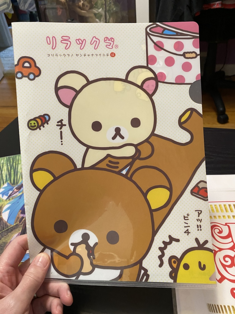
Clear Files

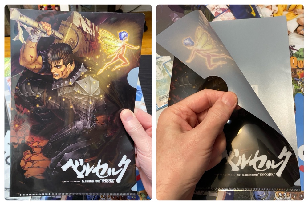
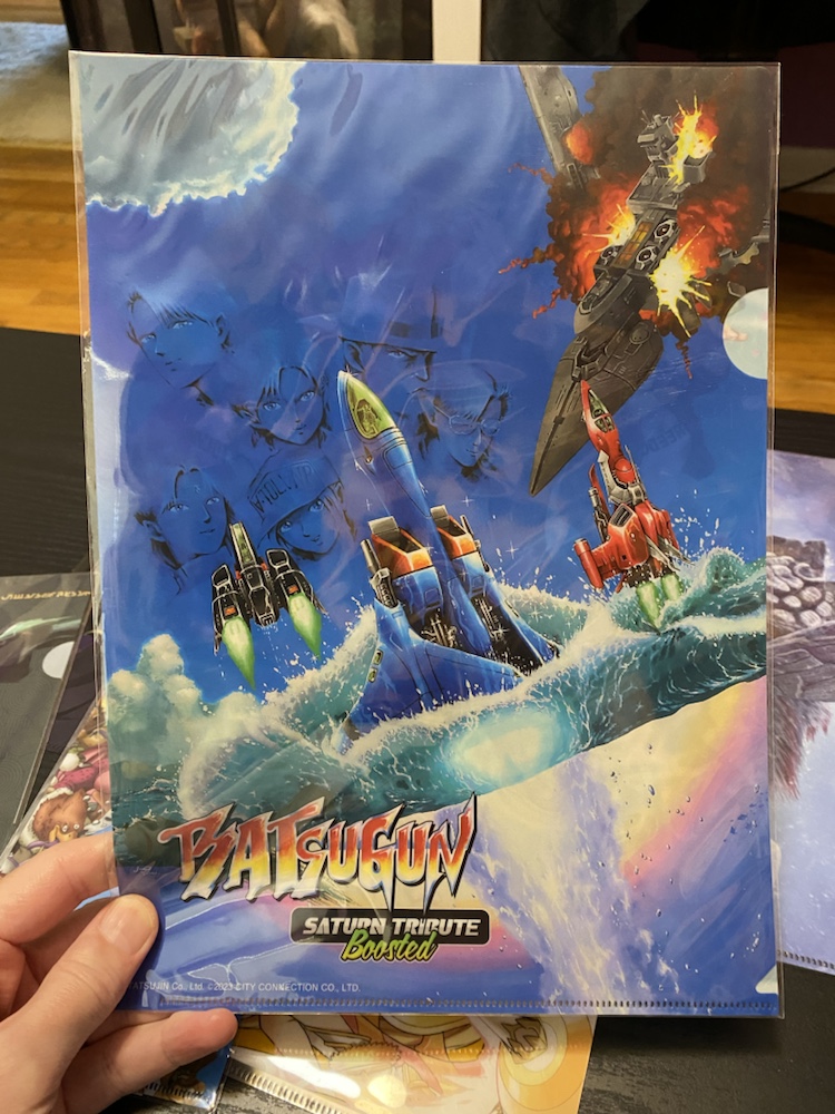
A ubiquitous type of Japanese collectible is the ‘clear file’. A plastic, printed equivalent to the ‘manila folder’ of the west, these are the cheapest example of otaku/anime merchandise and are available seemingly everywhere in Japan.

The most common type is shown above: a piece of printed thin plastic folded and sealed at one end to create a folder that opens diagonally. As with most merchandise in Japan, the manufacturing is top-notch, and they have a great smooth feel in your hands and the print quality is super high.

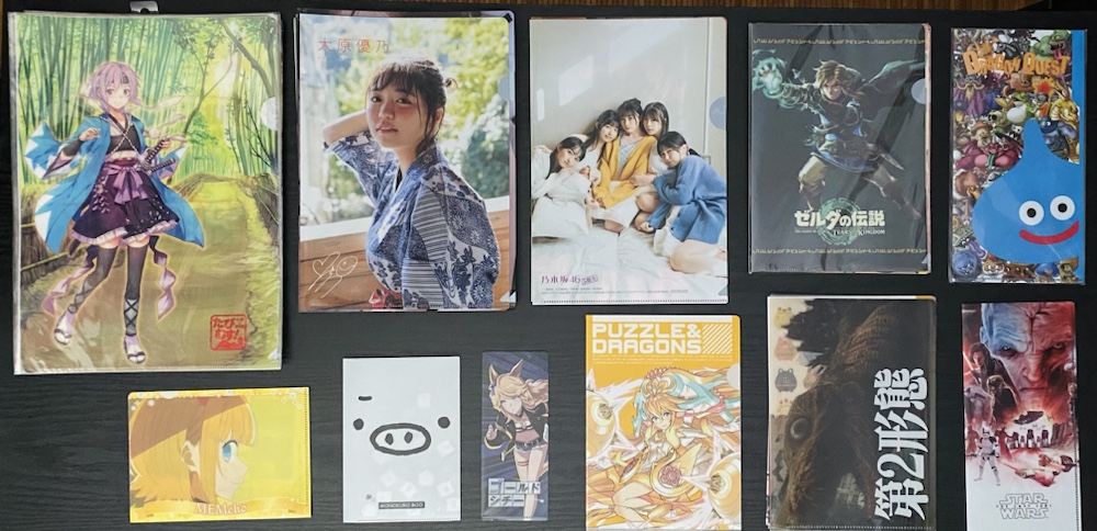
Over the many years we’ve been traveling to Japan we’ve been accumulating these, and now have almost 100. The above photo shows the variety of sizes we own, with the most common being the two in the top left, which are A4 (the kimono girl) and slightly larger. I’m sure there are many more sizes than those shown above – I’ve seen a few as big as a wall poster! – but easily 75% of ours are A4 size.

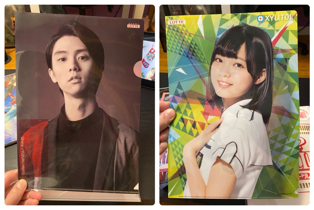
A decent selection of ours were ‘free’, such as the two above which were bonuses for buying packs of gum/chocolate at convenience stores. If I’m ever in a ‘konbini’ and they have a clear file offer, I’ll bend over backwards to buy whatever it takes to get the file. And no, I don’t know who the people on the above are either!

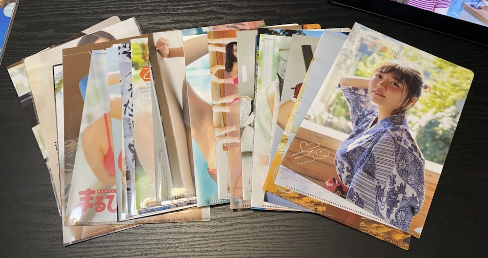
We have dozens of clear files showing pretty models, which frequently come free with manga magazines. When they do, it doesn’t raise the price of the magazine, which shows how cheap and disposable these things are.

They are frequently given as bonus items when you purchase games, such as the above that came with a Switch game. More than once I’ve been checking out in a Japanese shop and seen a pile of files behind the counter and seriously considered buying the game just to get one.

Girl models aside, the majority of ours are anime related, but files are available for just about anything it seems. There’s a very good chance I’ve bought you one (or more!) of these over the years, and I know such purchases have included animals (squirrels, owls), trains, food and Japanese scenic photos.

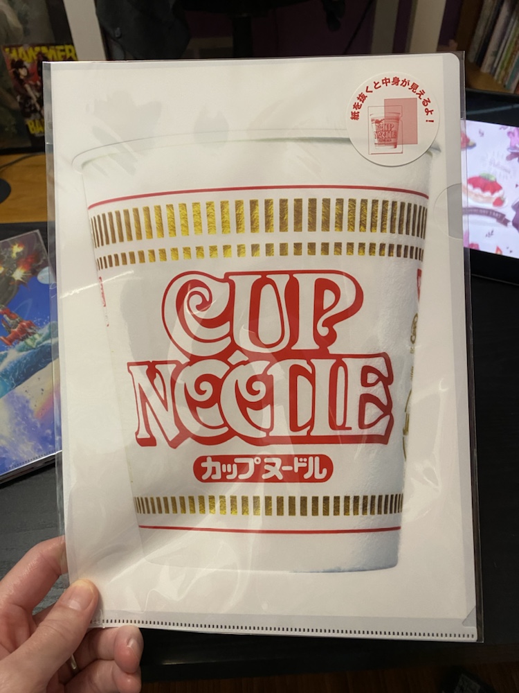
I bought the above at the Cup Noodles store in Yokohama. In fact I almost always buy a clear file when I’m in a souvenir shop since they can be so inexpensive: often only a few dollars.

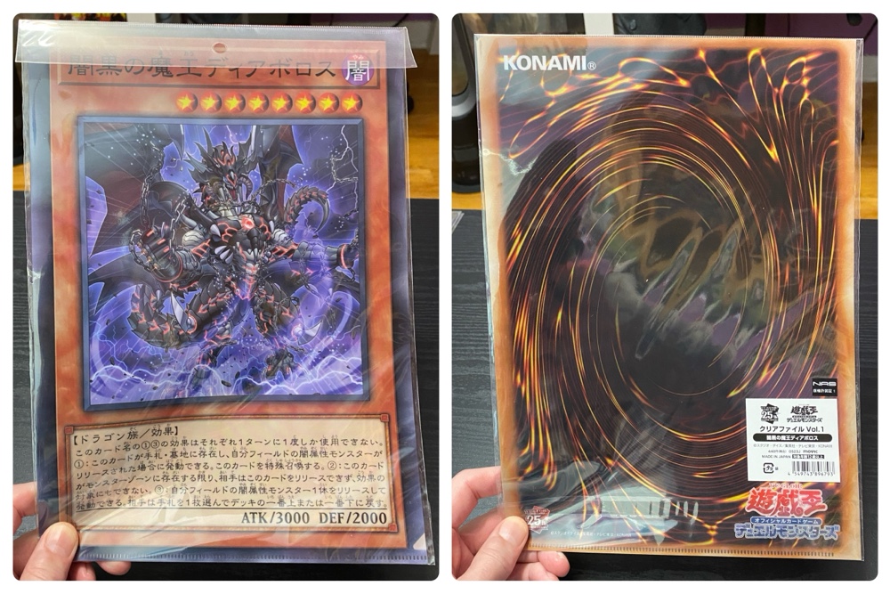
The above is very clever. While I don’t play the Yu-Gi-Oh card game, I love that they made this file to look like a giant card. I wish they’d make a MtG basic land into a clear file!

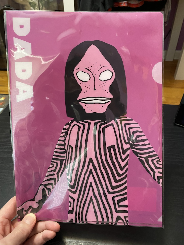
Earlier this year at the Osaka Ultraman store I spent enough yen that I got to play a bonus game where I had to shoot a little dart gun at a target board. I won the above pop-art clear file of an alien in the Ultraman universe ๐Ÿ™‚

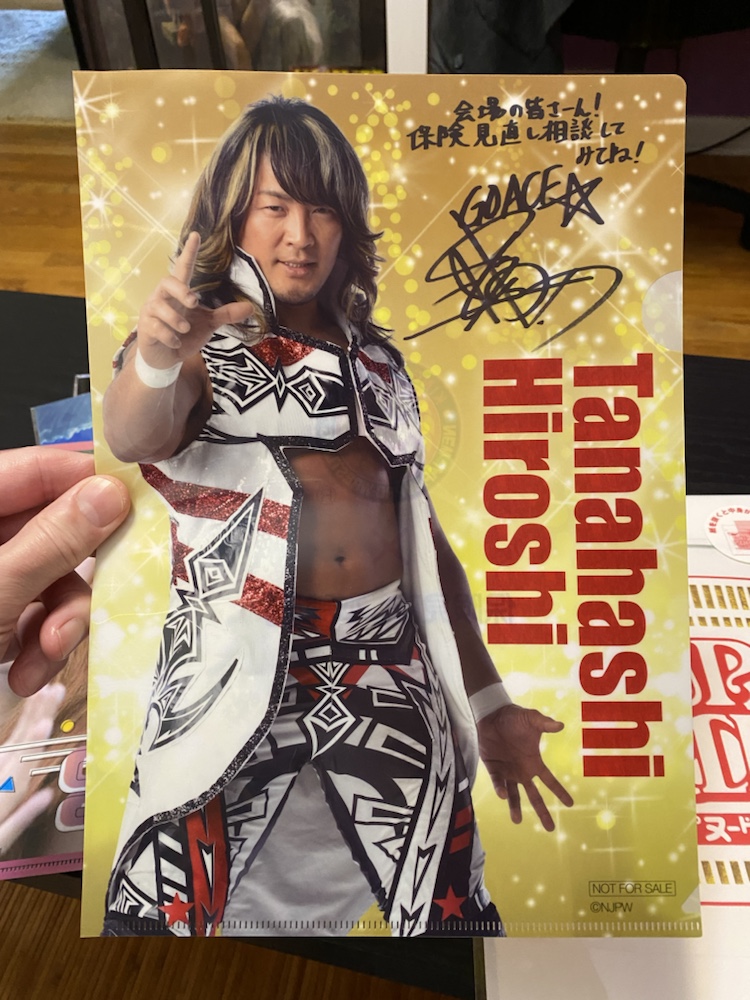
Several years ago when we saw NJPW at Tokyo Dome, the above was a freebie if you signed up for life insurance. I played the dumb foreigner and successfully talked my way into a free one! The signature is a facsimile, and ever since getting this KLS and I have nicknamed this wrestler ‘clear file’.

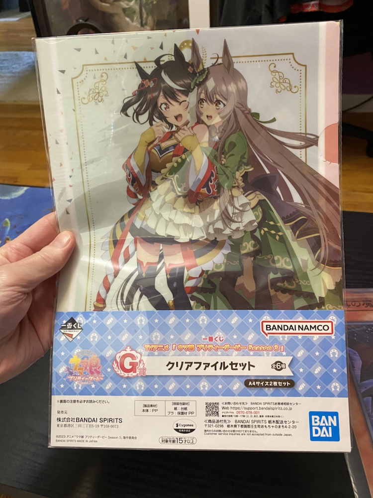
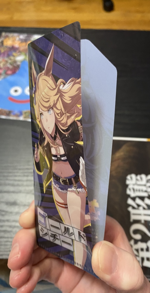
Clear files are often prizes in Ichiban Kuji lotteries (which probably deserve a post of their own one day), and we have quite a few such as the G prize from a recent Uma Musume Kuji.

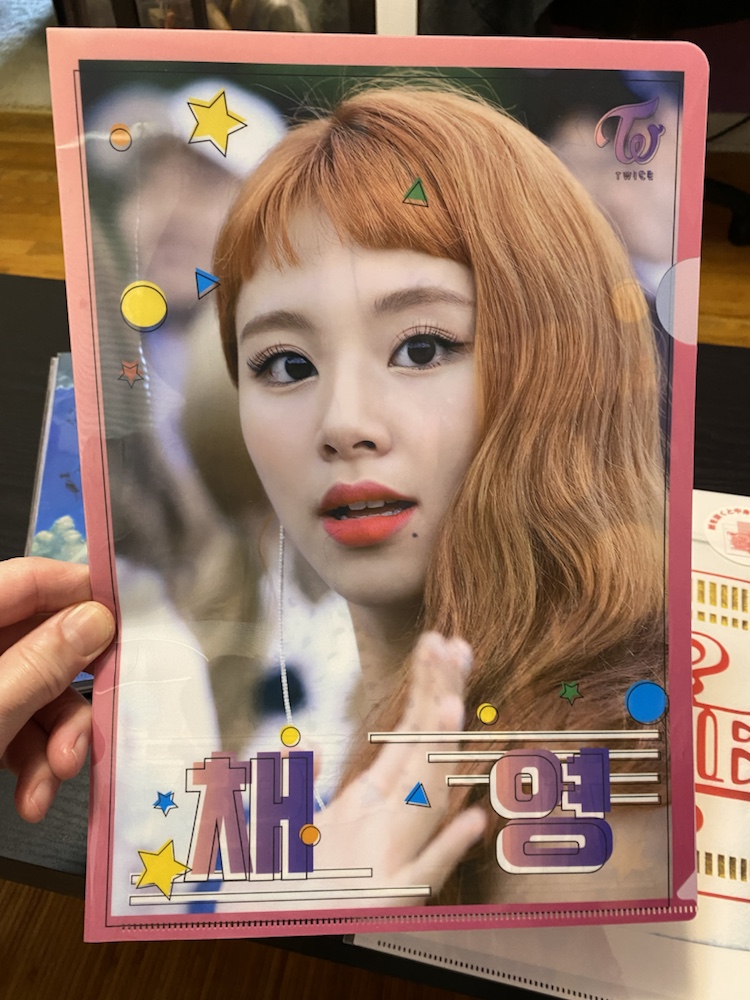
The above is a girl from the K-Pop band Twice. Bernard bought me this when we were last in Japan together, and one day when he has long forgotten about it I’ll send it to him for Christmas ๐Ÿ™‚

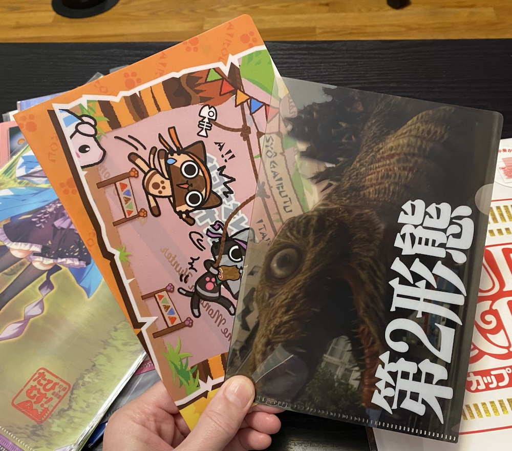
Clear files are also available in gacha machines, and the above are two examples (the right is Shin Godzilla). These machines have evolved over the years, and these days the files they vend are usually A4 size.

If you thought the gacha ones looked impractically small, look at the above! This came in a blind pack with a stick of gum, sold like trading cards. The file is so small it can’t even hold a single cheque (remember them?); what’s this supposed to be used for?!

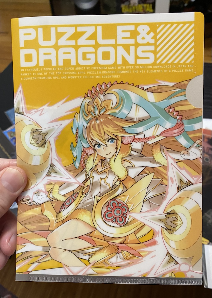
As far as favourites are concerned I have two. The first is the above Puzzdra file sent to me by Adam’s alliteratively-named sister AC. For a game as popular and long-lasting as Puzzdra there’s a dearth of merchandise and this file is special for that reason.

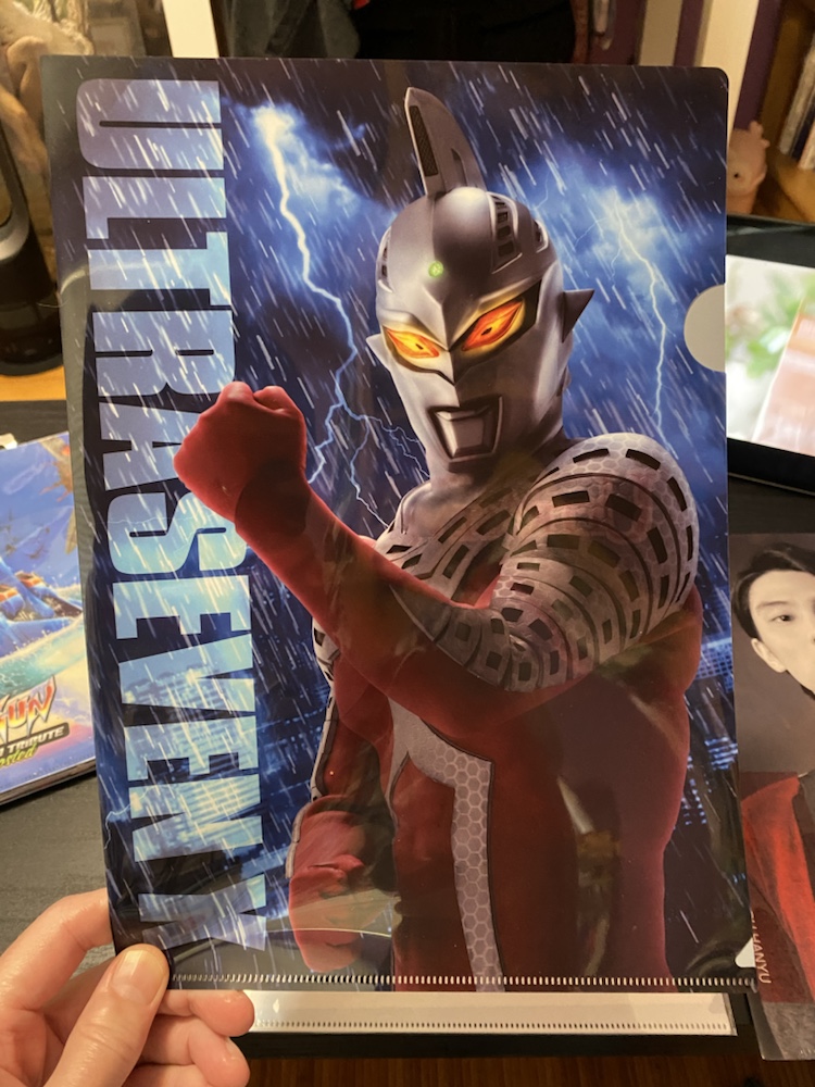
And no surprises I love the above. I really should get some more Ultraman files…

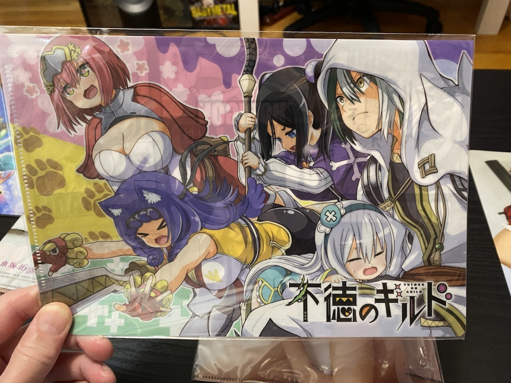
The most recent one we’ve obtained is the above, which came free with a manga weekly I bought in Japan. I’ve never heard of the series, and the mag was long tossed, but of course this file will remain in our ‘collection’ forever.

Oh, and I actually use these things! In fact this post was motivated by me replacing a very worn out one I use for school with a new one (above) taken from our collection ๐Ÿ™‚