Another year, another postcard contest. Once again Bernard and I pit our artistic talents against one another, and once again the winner will be decided by a panel of five expert judges.
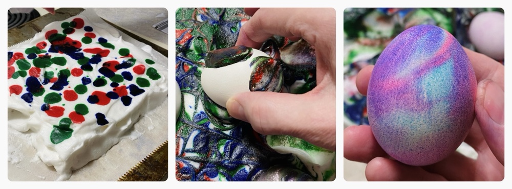
This year we’re painting ‘landscapes’ (our definition may be a little fluid…) using acrylics, a medium in which neither of us have any experience. Pencil sketches are forbidden, so it’s all about paint directly onto card.
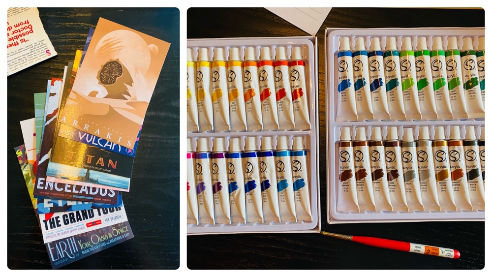
The subjects are all countries, and each was chosen by either a judge, a wife, mum or us! The contest is now at the half-way point, so let’s see how the scores are after five countries…
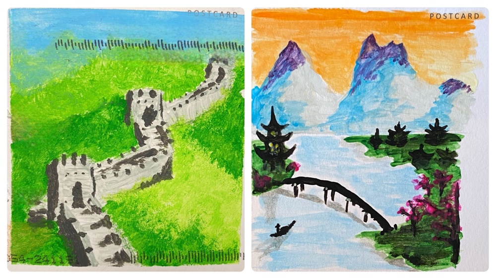
China
Bernard’s is on the left, and mine on the right. He went for the obvious – The Great Wall – where’s I went for a whimsical depiction of ‘The Yangtze and The Yellow Mountains’. Both of us were learning our craft (his brushes were too big, I only used a single brush) and getting used to the terrible paints (which I had bought at a discount store)! Looking at both arts now, it’s clear both of us were inexperienced!
The judges gave Bernard the win, but it was as close as possible with final scores of 7.51 to 7.49 (each of the five judges awards three points). Here’s some of their comments:
“Left is quintessentially Chinese, and right has artistic merit. Good start for one of you. The other needs to lift his game.”
“Left conjures China most directly, Right could be Japan? Left has some weirdness with its shadows; the one on the broad forward facing prominent wall. Right has a better color palette and composition.”
“The one on the left instantly says China. However, on closer inspection, the one on the right has the artistic edge.”
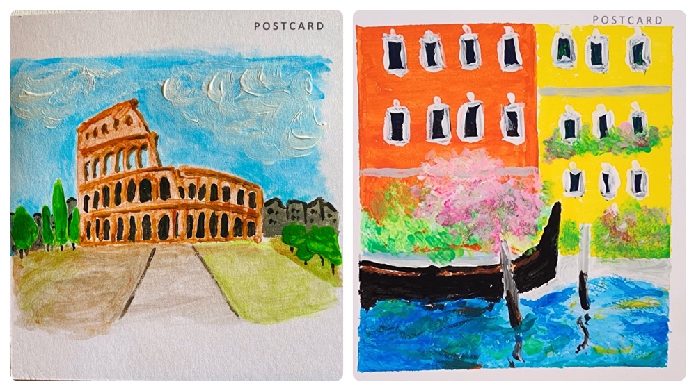
Italy
My Colosseum is on the left, and Bernard’s Venice is on the right. When I first received his in the mail I knew I had lost, since no matter how much detail I had attempted the colour of his piece and especially Monet-like reflections in his water were unbeatable.
As expected the judges handed him the win, 8.15 to my 6.85. Here’s what they said:
“I appreciate how difficult painting the colosseum must have been. And actually, the artist really captured the dimension of the thing really well!! It felt so much “squatter” in real life. Still staggering and huge but not like in the movies. I like that you can see sky through some of the windows. Right colors and composition are great. Just a really pretty picture. Now, if it’s supposed to be Venice, I think that water color is generous! It was stinky when I was there. In any event, very pretty picture, and still conjures Italy.”
“I like the layered clouds above the colosseum, but I also like the Impressionistic style of the Venetian canal scene.”
“Painting one is again iconic for the subject. I like the trees and the colosseum but the dark grey buildings in the background don’t seem right and being Italy I want to see cobble stones!”
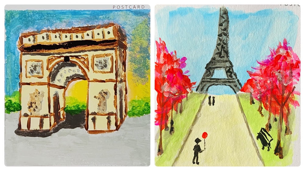
France
Bernard did the Arc de Triomphe on the left, and I did the Eiffel Tower on the right. This was an amusing inversion of sorts to our approaches to Italy, where this time mine was the more whimsical. The guy with the balloon? That’s because when I was there I remember seeing balloon-sellers on the avenue leading up to and under the tower 🙂
This was my first win, 8.75 to 6.25. The judges were hardly effusive with comments this time, but here’s the few I received:
“Did I immediately recognise the landmarks? Yes. Do I find one more pleasing to the eye? Also yes.”
“Left looks a little unfinished. My eyes want more detail in the foreground. Right gets the higher score despite Pennywise being in it.”
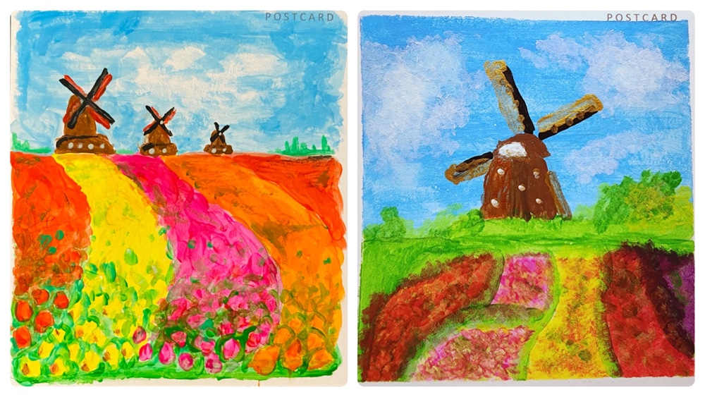
The Netherlands
Given the lead time in this contest – between us painting, mailing and receiving the cards – this was the first one we painted after any judging had occurred. Obviously we both put in significantly more effort, and it’s interesting we both chose the same subjects. Mine is on the left, and his on the right. I spent a lot of time detailing those foreground flowers with a tiny brush!
I won this one convincingly, 9 to 6. I was proud of mine, thinking it was my best yet, so I was happy to tie the scores after four. Here’s what the judges thought:
“Left is lovely. The balance and contrast of the colours is very pleasing to the eye. The aspect is well done giving great depth of field as the eye is drawn across the tulip beds to the distant forest.”
“Composition on left is superior, as well as the definition on the windmills. But right is a good effort.”
“Those Dutch scenes are so similar… They could be from a series by the same artist.”
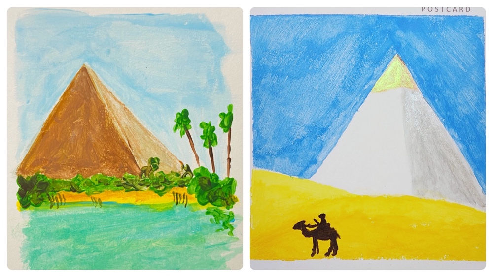
Egypt
Even though everyone thought it was an oasis (in Egypt?!) my painting in the left was supposed to depict The Nile with a Pyramid in the distance. Bernard’s was a vista of the Pyramids in their glory after being built. He used gold paint for the cap, but the metallic paints don’t show up well in photos (my colosseum was mostly metallic paints). I was quite pleased with mine – look at the detail on the papyrus! – but when I saw his I knew this would be a very difficult one for the judges.
After the dust settled I emerged victor, 7.7 to Bernard’s 7.3. The judges words:
“Gotta go with the greenery. The gold cap on the white pyramid is a nice touch.”
“Left has nice colours and brush strokes and I like the idea of the oasis mirage in the desert. I would have liked the palm trees to look more palmy and the pyramid dimensions look a bit wrong. Right I like a lot. I love the bold colours and strong contrast and the silhouette of the Bedouin on his camel is very well done. A very striking painting!”
“Why is the oasis in left so close to the pyramid?? Right must be a very ancient image because it doesn’t look white and gold anymore but the coloring is too plain.”
“I liked them both but left immediately granted my attention.”
At the halfway point I’m ahead 3-2 but the contest has been much closer than any previous! Also I think it’s clear we’re both getting better as we go, and putting more effort in as well.
I feel the best subjects – and artworks – are yet to come, and I look forward to see what the judges decide!