It’s time for the second five subjects – and final results – of our Monster postcard art contest.

To summarize the midway point, I had 3 wins to Bernard’s 2. The voting had been tight, and the art quality had been improving every week. Onto the next five then:

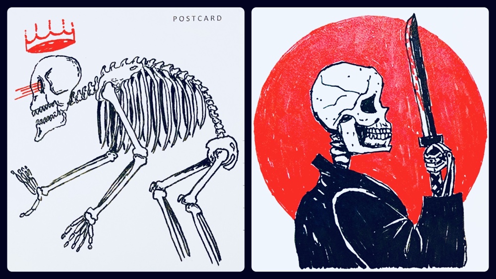
Skeleton
It was clear by this point that we were both taking this very seriously, and both of these show more detail than most of the previous entries. Mine on the left was supposed to suggest a giant skeleton, hunched over due to his massive bulk. He was a king in life, and is a boss in a Soulslike game in Death! Bernard’s (on the right) was – in his words – based on an image he saw on Etsy!
Once again the voting was close and any one judge could have changed the result with the decision. I won 2.75 to to 2.25.
The judges were much more verbose during the second round. Here’s their skeleton comments:
“The skelly on the right is more of a dude.”
“The detail in the skeleton of left is very well done. I like the almost reptilian spine and the massive rib cage. I’m just not sure about the floating crown and laser beams. They seem like an afterthought that don’t really suit the skeleton. Right is bold and striking. I like the blood moon and the bloodied knife but I don’t like his oversized jacket or his button nose.”
“This is a tie. I love the detail on the spine on the left, specifically the curved round saw like vertebrae. The contrast and the samurai tie in on the right are just too cool though.”
“Right reminds me of Japanese flag and Seppuku (I think that was the intention with the yukata), but the sword is too small. Left has impressive depth expression on skull and shoulder bones; I can feel the back pain. I don’t know what that crown is for though. Old king aging or back stabbed by enemy???? And as you know both are anatomically quite wrong.”

Vampire
Bernard is left, I am right. I love that we both went for a minimalistic style here, and I think in each case this was the least ink we used the entire contest. I was going for a ‘poster art’ style but my portrait of Lugosi never looked quite right to me. Bernard’s lady was very subtly vampiric, and even in person the teeth are tiny!
The judging was extremely close and the winner switched with every vote! In the end Bernard won with 2.55 to my 2.45!
Here’s what the judges said:
“Left could be something else.”
“The male vamp is very traditional. Lugosi? It’s also too good not to receive at least a portion of the mark. The reason I prefer the female vamp is it does more with less ink. Sentimentally, it also reminds me of the Redheads matches mascot, despite this gal being a different kind of “bloodnut”.”
“Left gets points for minimalistic hot girl vibes. But I love the kitschy feel of the right.”
“I love that the left vampire is female. I love the sensual curves of hair and the bloodshot eye. She’s fresh from a feast and still dripping with blood and enticing her next foolish male victim. The right vampire is very stylised and cartoonish. He is the classic villain of childhood tales but with laser beam eyes. I don’t like his red teeth.”

Demon
Another subject in which we both spent a lot of time. My original intent was ‘tattoo art’ with my Japanese Hannya Oni portrait (on left) and Bernard went with what to me looks like an almost Tolkienesque depiction of classic evil on the right. Mine took a long time to do since the red ink bleeds into the postcard so I had to be extremely careful not to overwhelm the black. I wanted the Sakura flowers to look good as well, without distracting from the face. Bernard actually covered the entire card in red ink, so his demon appeared flying in a conflagration. It’s a dramatic sight!
The judges seemed very impressed with both, and several indicated this was a difficult choice. Ultimately I was the victor with 3.14 to Bernard’s 1.86.
The judge’s comments:
“…the grinning skull leaps off the page, whereas the twin-sword demon is less distinct and less threatening.”
“I can see some good ideas in both of these”
“Left is immediately recognizable and just drew a tapestry of different texture with these markers. The flowers even look soft! Very clean drawing. I really personally love the style right was going for and credit the use of contrast. I absolutely love the “halo” feature and the wings. Also using a red background was probably time consuming and conveys an absolute MOOD. I can picture this scene in an anime. Ultimately left wins due to excellent & clean lines but I loved both.”
“Left: Love the detail of the teeth and flowers! Right: I like that entire body is shown.”
“I love the detail and design of left. The patternation in the face is very pleasing and the horns are perfectly crafted. The flowers are lovely and well done but the contrast of the beauty of the flowers with the misshapen jaw and teeth of the demon detracts from the overall impact I want the image to have. The form of right is perfectly constructed and the bold use of deeply applied colour is striking but the detail in and around the face is frustratingly lost and blurry”

Alien
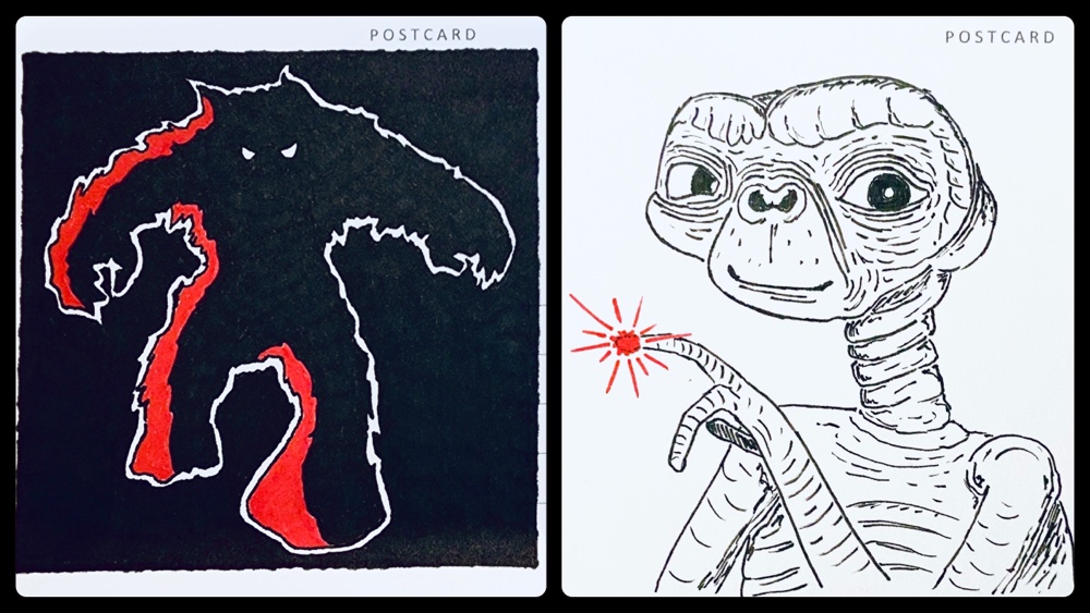
Bernard is left, and I’m right. For me this was the most difficult category since the possibilities seemed endless, but I made an early decision to not do a grey alien since I thought there was a good chance Bernard would. I debated characters from shows such as Star Wars or Doctor Who before going with the iconic extraterrestrial itself: ET. He’s an ugly bugger and hard to draw, but I think I nailed the face enough to be convincing (just don’t look at his shoulders closely…).
Bernard on the other hand went with an amazing rendition of the cabinet art from the side of the original Space Invaders arcade machines. It’s an extraordinary work since the detail and colour saturation is amazing: it looks printed and not hand drawn. Obviously this image spoke to me, but I had a feeling it would be lost on most of the judges…
The results were closer than I anticipated. While I won with 3 points to Bernard’s 2, one judge gave him the entire point since mine wasn’t scary enough! Once again therefore, the result could have changed with the votes from a single judge.
Here’s the comments:
“I always appreciate the more detailed drawings! Also right one has better use of red color.”
“Excellent likeness of both a Space Invader and E.T.”
“Very good contrast on the left”
“I love these images!! Left is everything I want an alien to be. His terrifying form is beamed out of space with dark and electrified menace. He’s a black hole come to life to diffract and suck the light out of everything around me. Right is so well known and beloved by all. His image is beautiful and endearing. The line work is superbly executed and his tiny red spark just so adorable.”
“It’s hard to judge this one as both artworks are incredibly well done and pleasing to look at. I ask myself what I want to see in a monster image and unfortunately it is something scary, unsettling or disturbing not something I would cuddle up in bed with.“
“Left is interesting with the contrast but… I wouldn’t call it an alien! Wolf man maybe? Gets some points because of how much effort went into the black contrast. Right: I mean, I really like it and I didn’t really like ET as a child. The movie terrified me. This is a great rendition. It has me wondering, did the artist play the long game? Marker color choices are perfect for this content. I’m just saying we might be dealing with a Kira level master mind with how far ahead this artist was thinking. Anyway, great ET, I can see the whimsy in his eyes and that he comes in peace.”

Werewolf
Mine is left; Bernard’s is right. I think these are the two most similar images of the entire contest. I originally started drawing something else but had to colour over it with solid black since it wasn’t working. The tail was a late addition and the moon an afterthought. I originally told Bernard mine was weak but grew to like it more after I had mailed it. His has incredibly detail (the fur texture looks oily!) but – in his words – his art has ‘a fatal flaw’! Did the judges notice…?
Yes they did, since a few of them mentioned that Bernard’s was more wolf than werewolf. Once again I was the winner, and a bit more decidedly here with 3.2 points to 1.8.
Here’s the comments:
“I love the angst of the left werewolf howling at the full moon and the striking moon against the red sky. I love the line work on the right werewolf. He is a ravenous beast dripping blood from his fangs. I particularly like his pointy ears.”
“Wow!! These are great! Both are really great.
Left wings for the high contrast red black and white. Amazing! I feel like this is something I could have drawn haha. So… I love it. Right is an excellent wolf man head!! I would have loved to see the paws and claws, haunches, tail, etc. obviously a wolf head, but where is the man???”
“Head/Mouth detail on right is great. Like the full body view with moon on left. Get a sense of his torture.”
“They’re both technically proficient. However, the drawing on the right, in not showing the body, could merely be the head of a large wolf.”
“Both look like Shiba inus but I figured out with my keen eyes that the intention was werewolf.”
Final Results
With ten subjects drawn, posted and judged, what were the final results?
I won, with 7 victories to Bernard’s 3!
This was a hard-won victory, since what I had assumed would be a leisurely (only two colours) and somewhat whimsical contest turned into a real struggle with every week being a battle! I think if you look back you’ll agree the quality increased week-to-week.
Here’s some of our own opinions on the contest:
- Bernard felt his best piece was alien, and I agree with him. He felt his worst was dragon, and I also agree with that.
- I felt my best was demon but Bernard thought it was my sea monster. I felt my worst was zombie and he agrees.
- Bernard believed he should have won alien and I agree.
- I believe I should have won bigfoot but he disagrees.
- When asked for a comment for the judges, Bernard said: “They all ought to be ashamed!” (ouch!)
- As for me, my comment to the judges is: “It’s reassuring to see that they looked past sensationalism and recognized the souls of the artists :)”
What remains is the awarding of prizes, which will happen soon. While I’ll be sending Bernard a special prize for his Space Invader unfortunately since he didn’t win he won’t be getting the amazing $8 retro 1980’s sticker I purchased for that purpose. It’s a good thing there’ll be another chance in the 2024 postcard art contest…
What will the theme be? That’s a surprise for now, but I will say as with 2022 the judges will once again have their say 😉


