It’s Easter time again, and for the first time in a few years we (Kristin, Jessica and myself) coloured eggs:
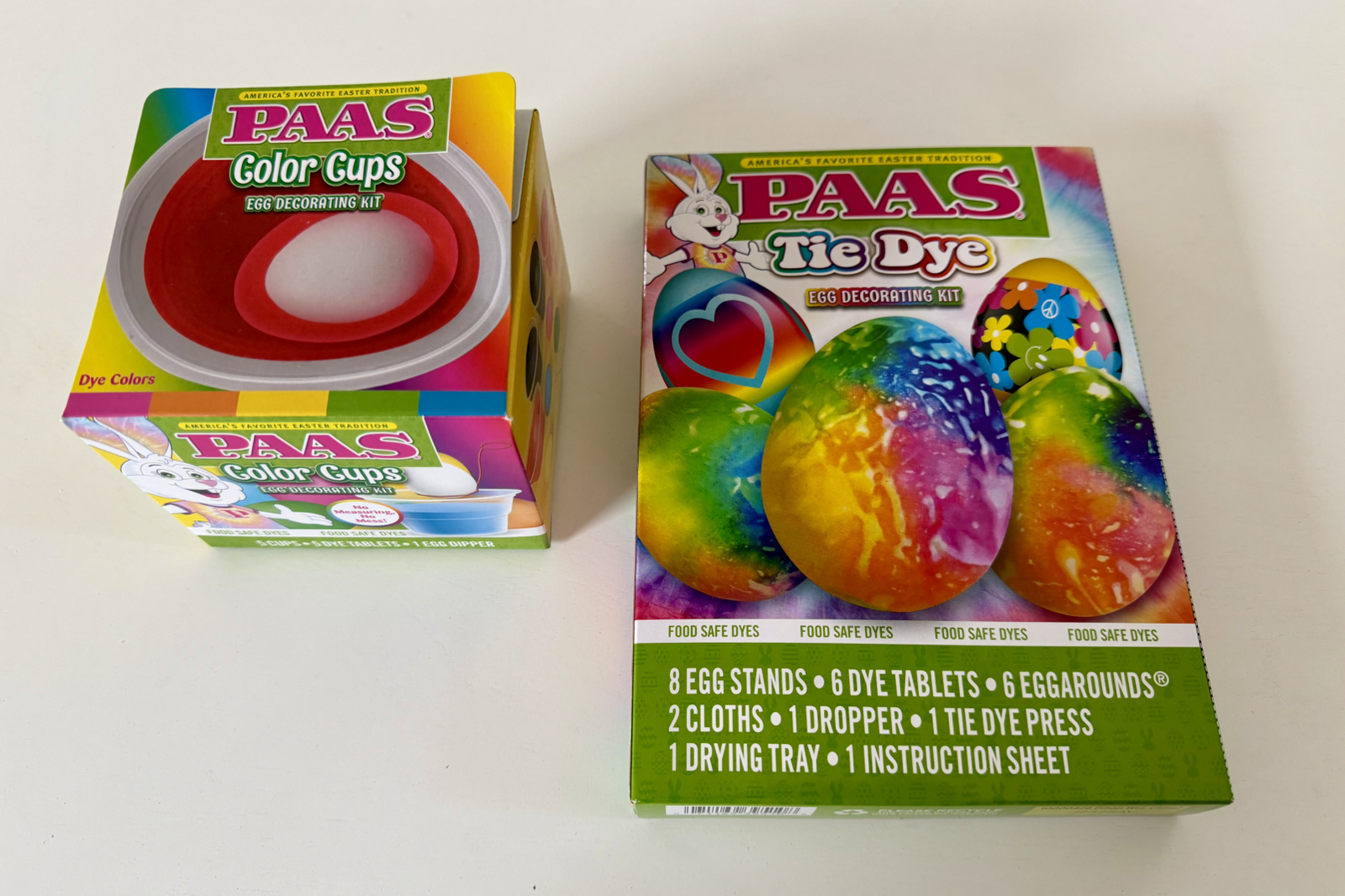
I got two kits: the normal one and a ‘tie dye’ variant. We tried the tie-dye set first.
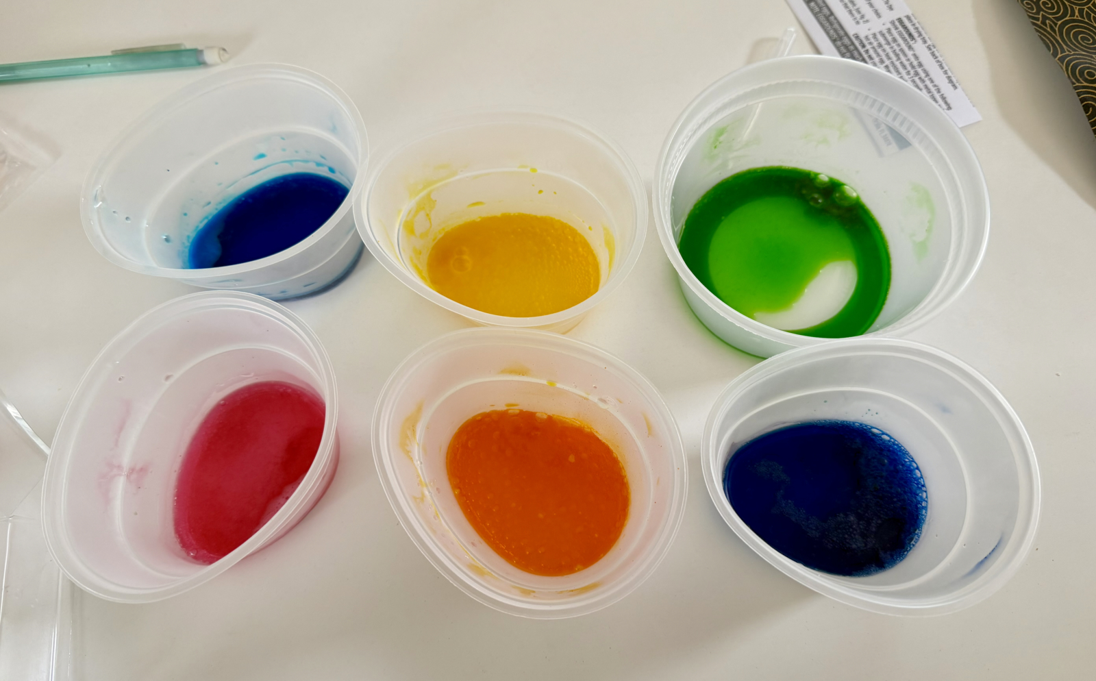
These are the six colours included. They come in small pellets which are dissolved in vinegar, and in real life look a bit less vibrant than in this photo.
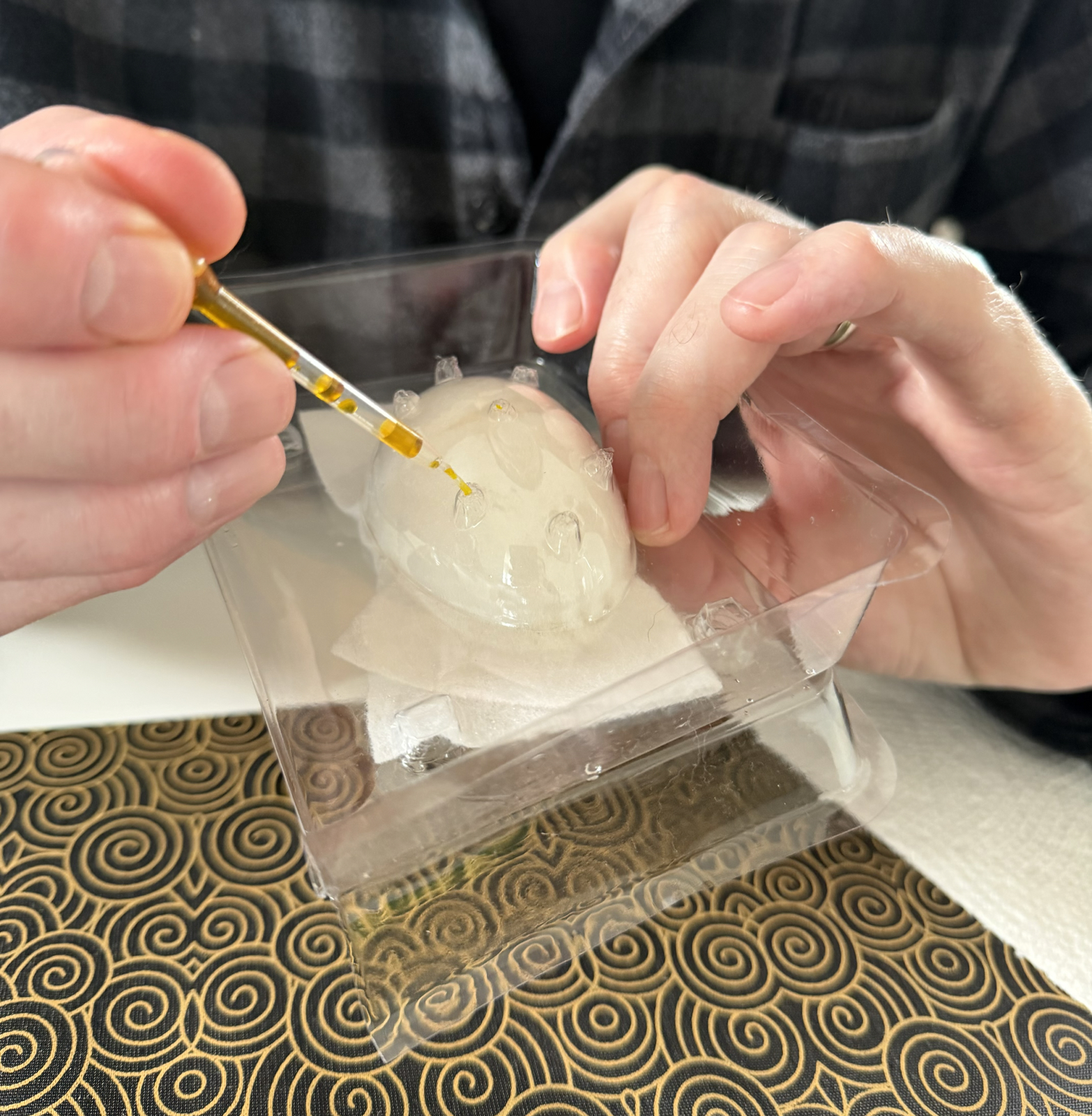
The system to tie dye the egg involved a special frame in which to hold the cloth-wrapped egg while dye was added drop at a time via a dropper. It was fiddly and not easy (for kids?) and difficult to cover the entire egg. We quickly modified the technique to use paper towels without the frame. This was somewhat successful, and our tie-dyed eggs looked like this:
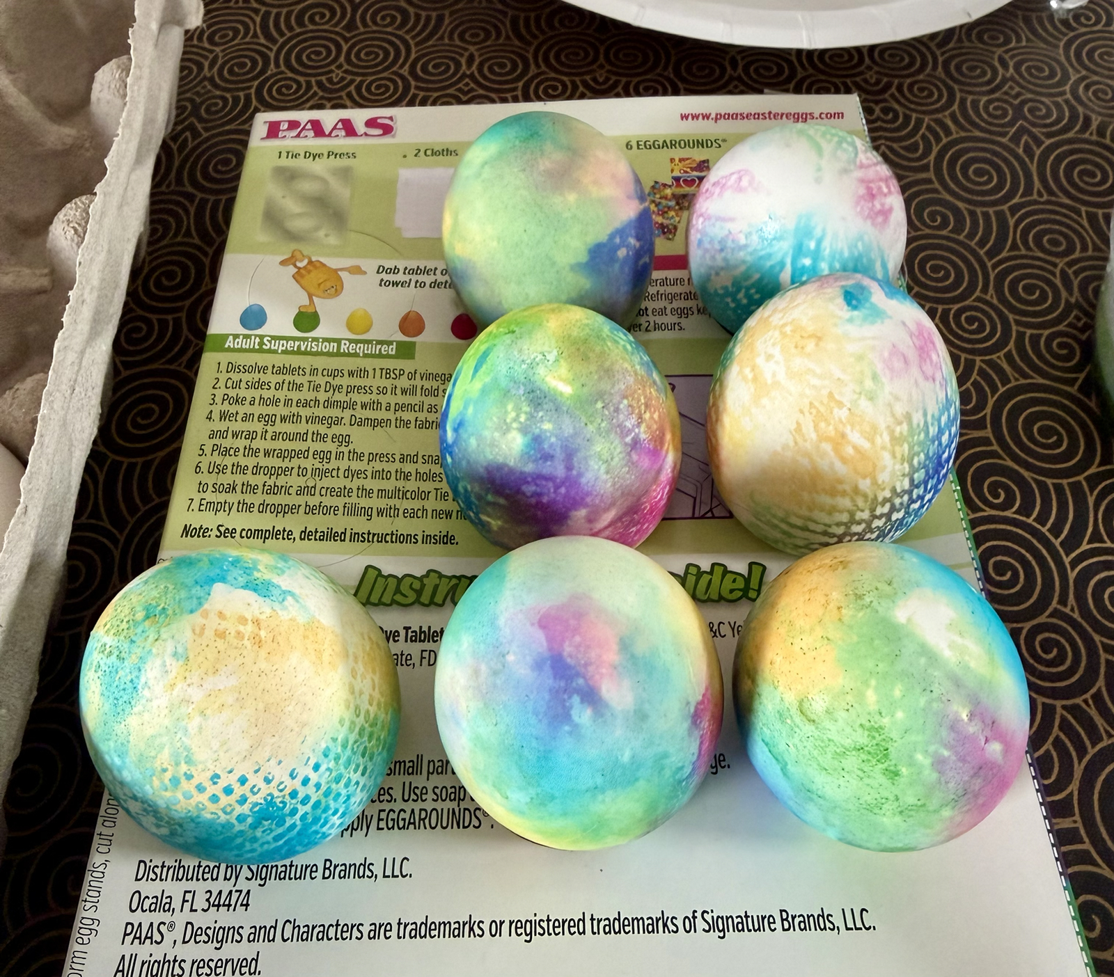
I think they look good. The interesting pattern on a few of them is from the paper towel.
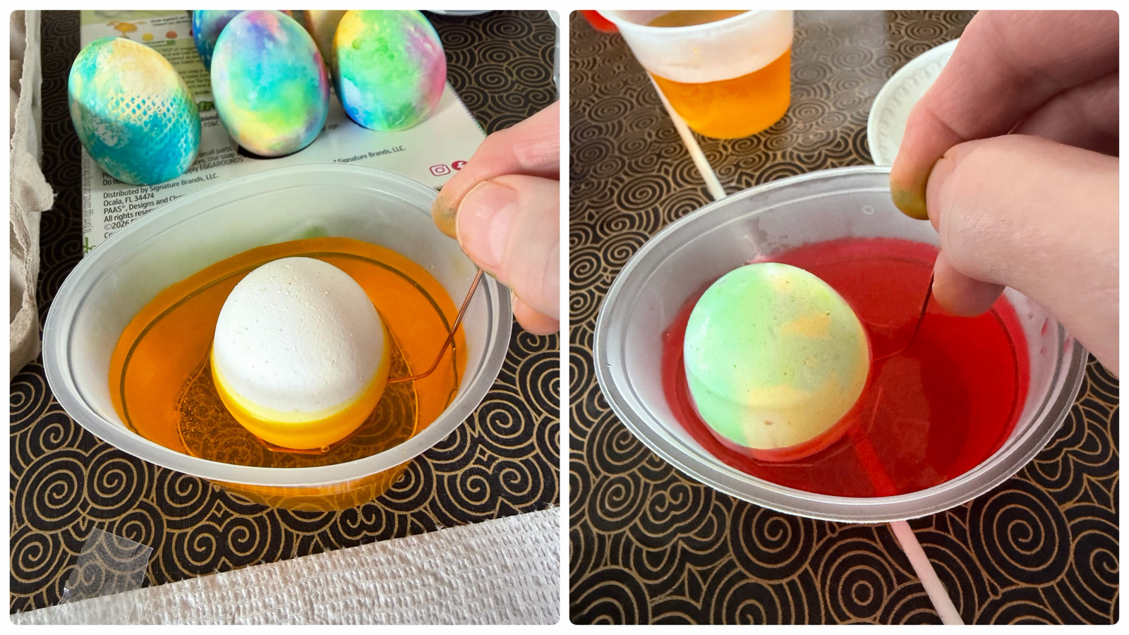
Next we did the normal dyeing kit, which just involves placing the egg into the dye (a pellet dissolved in water and vinegar). In previous years we’d used crayons to put patterns on the eggs but the kit didn’t come with one this time so we had to be creative.
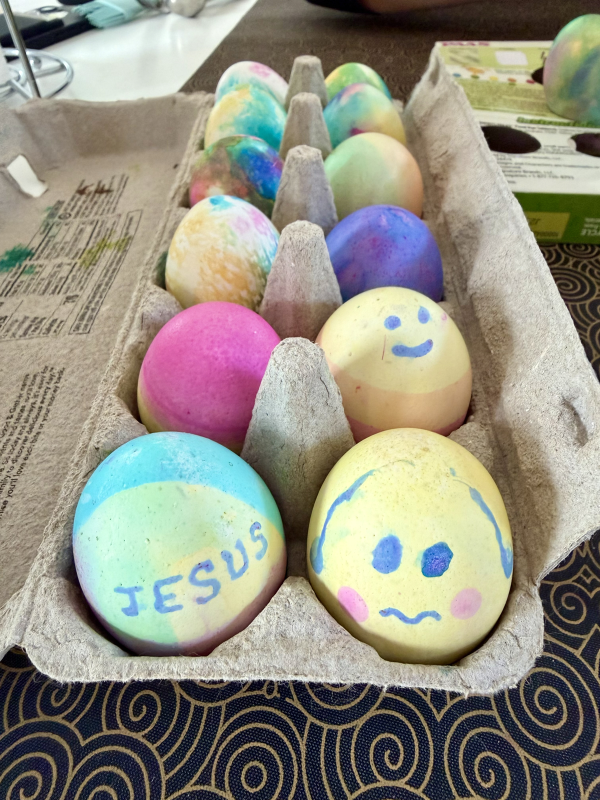
I tried to make one holiday specific! Can you guess who the character in the bottom right is supposed to be?
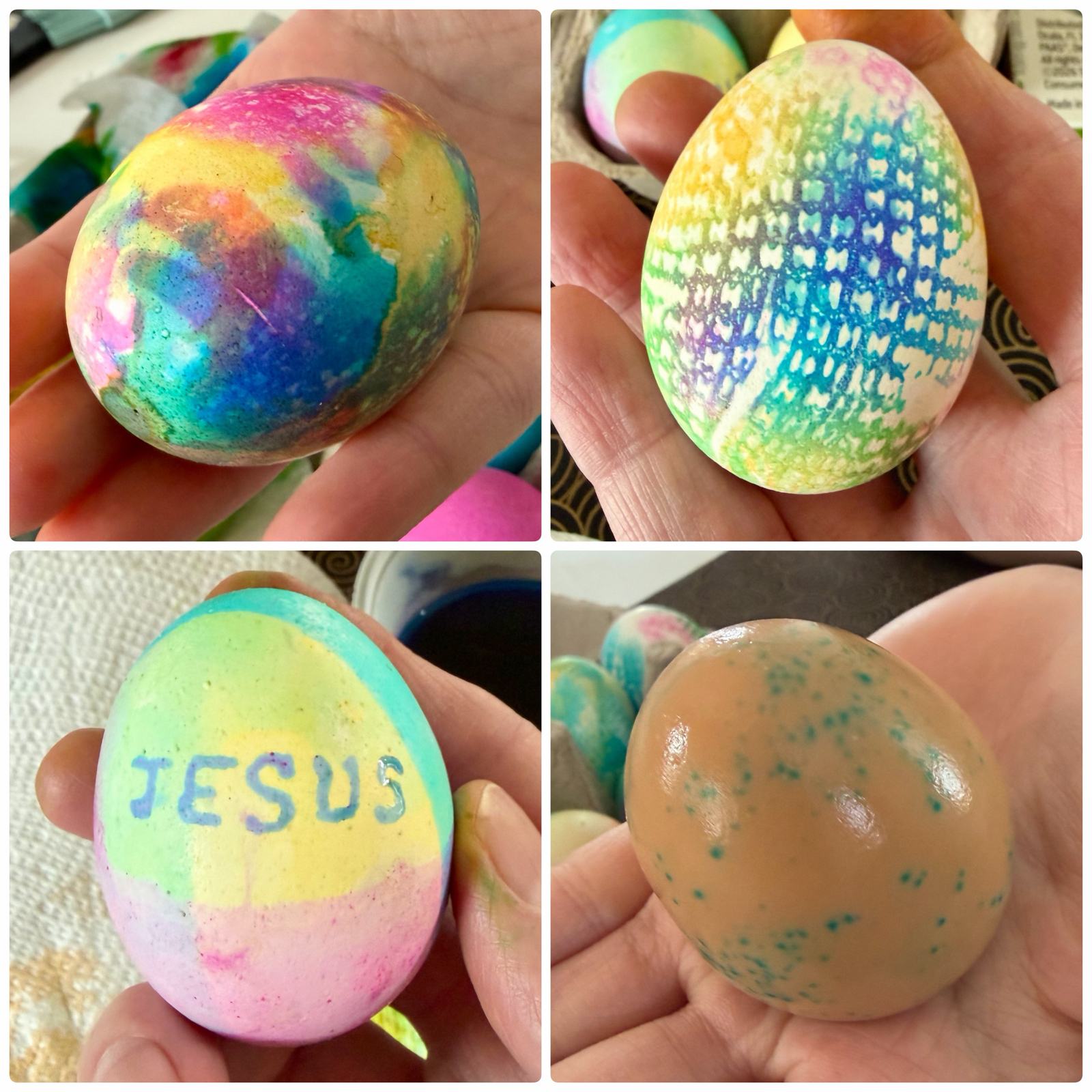
As usual it was fun and the eggs looked good The bottom right is what one looked like with the shell removed. You can see some of the dye went through the shell, and the brown colour is because she had roasted the eggs.
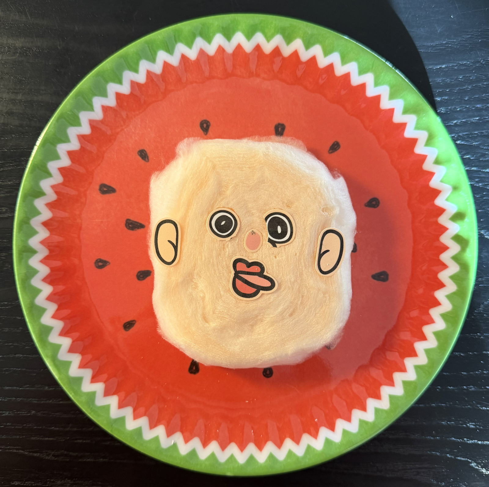
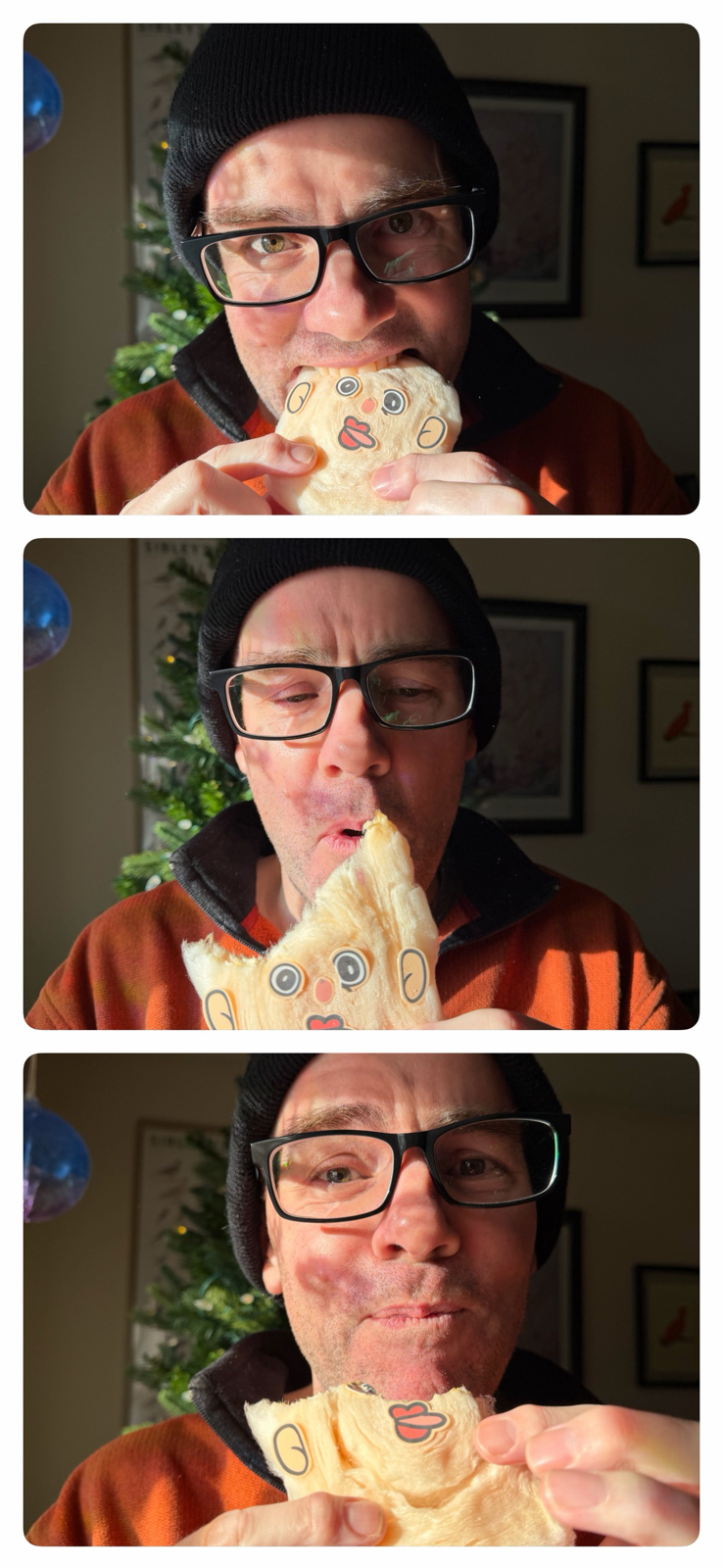
Here’s my little Easter snack which I am enjoying as I write this. I hope you have a good Easter 🙂