Category: Food

Ramen 31: March Of The Ramen Queen

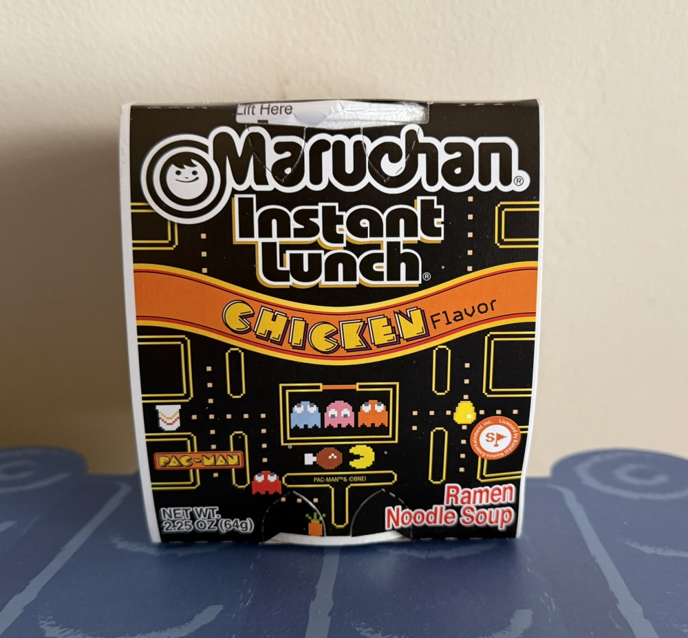
It’s been a long time since the last post reviewing some chicken ramen, but I’ve (finally!) found a few more. Let’s see what I thought…

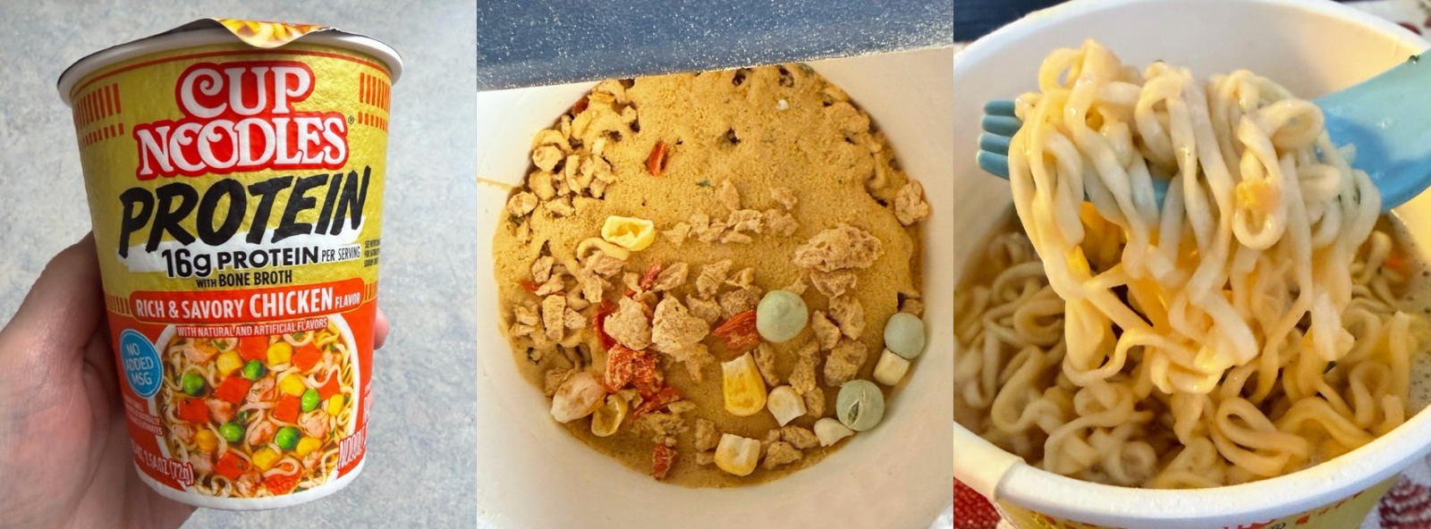
Cup Noodles Chicken (290 Calories, 11g fat, 1160 mg sodium)

This is a new version of one of the ubiquitous chicken ramens, with the difference being it’s in a paper cup and intended to be cooked in a microwave. I followed the instructions (2.5 minutes at maximum) and it worked well, although the paper cup was much hotter to hold than the styrofoam version. The contents seemed a bit ‘blobby’ after cooking, but a quick stir and everything was ok.

As far as taste this was simply acceptable. As with the ‘normal’ version the flavour is cooked into the noodles and it lacks veggies aside from a few tiny pieces of corn and carrot. In a world with no other options this would be ok, but with better available I won’t be trying it again. I’ll give it 7/10.

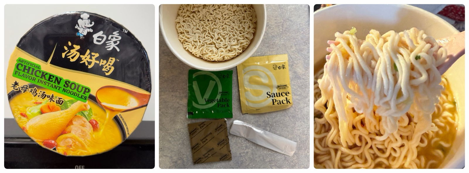
Oolongmen Chicken Ramyun (310 Calories, 10g fat, 1430 mg sodium)

This was purchased in Canada, and I didn’t eat it for months since most of the other Canadian ones were awful. But when I finally got to this, I was pleasantly surprised!

The first taste was unusual – arguably not like chicken at all – and the ramen contained lots of veggies included dehydrated mushrooms. Subsequent forkfulls were better, and since I actually ate it all I deem this a higher-quality product, probably in the top 10% of those I’ve tasted. I’ll score it 8/10.

Cup Noodles Rice With Noodles Teriyaki Chicken (300 Calories, 5g fat, 1100 mg sodium)

I know this isn’t a ramen product, but since it clearly says ‘with noodles‘ I purchased it anyway. It’s another microwave-only product, and after the required 4.5 minutes on high the contents had become a sort of brown slush.

I was hesitant since the sickly sweet smell was reminiscent of rot, and when I tentatively tried a small forkful my fears were confirmed since this was one of very worst cup noodle products I have ever tasted. I hated this, and even now regret preparing it since the stench has filled the house. Score: 0/10.

I know brands I haven’t yet tried exist, but I’ve never seen them in local stores. I wonder how long it will be until my next installment?

Food Contest: AI Results

Once again Bernard had an AI judge the food postcards alongside the real judges, and here’s a photo of the judging in process:

The AI considered each pair of images several times (for an average score), and the following are some comments it produced for each food category.

Fruit: “B’s composition is simple and not as visually engaging as the intricate mosaic pattern. While both fit the fruit theme well, R’s image excels with its detailed portrayal of grapes in a compelling composition.” (R win)

Pasta: “R’s composition is creative but chaotic; B’s is more coherent. Overall, B’s piece fits the theme better.” (B win)

Hamburger: “R’s is slightly chaotic, focusing on a character more than the hamburger theme, whereas B’s is well-balanced and centered on the burger itself.” (B win)

Ramen: “While both fit the theme of ‘ramen’ well, B’s has a stronger thematic expression due to its appetizing depth.” (B win)

Cereal: “R’s uses vivid colors and a dynamic composition, creatively incorporating surreal elements like the floating cereal box.” (R win)

Salad: “In terms of detail and fitting the ‘salad’ theme, B’s conveys the variety and freshness associated with salads better than the other.” (B win)

Donuts: “B’s entry impresses with a vibrant color palette and detailed rendering of multiple donuts. However, the composition feels slightly crowded. R’s offers bold colors with cleaner presentation but lacks the complexity of details seen in the other.” (B win)

Pizza: “Both pieces fit the theme well, but R’s excels with its creative energy and expressive style.” (R win)

Sushi: “Both pieces adhere to the theme well, but B’s entry showcases a broader range of details, such as the soy sauce bowl.” (B win)

Cake: “R’s image uses a pleasing pastel palette that captures the essence of cake; however, the composition is somewhat static, losing dynamic appeal. B’s image, while vibrant, has a less cohesive color scheme, and the layering appears haphazard, ” (R win)

According to the AI, Bernard won 6 to 4, which runs contrary to the human decision.

Who was correct: man or machine? I’ll let you decide…

Food Contest: Results

All the drawings are complete and the judges have spoken: it’s time for the results of this year’s postcard contest! As of the halfway point the score was 2.5 each (due to the tie) so neither of us had an advantage as we went into the second half…

Salad

Bernard is left, and me right. The less said about this week the better. Mine is a disaster; a completely failed attempt at a painted style. I was positive Bernard could scribble anything and win but I still felt his – while undoubtedly the better – a bit weak and looking back I believe this was the worst week of the entire contest.

Incidentally one element had become clear by this point: the small images I was sending the judges obscured errors and hid fine detail, which tended to favour cartoony or dramatic art over anything ‘realistic’. This may have been irrelevant since it seemed judges were voting based on initial impressions or gut feelings, but it tempered my enthusiasm to experiment with more unusual approaches going forward.

Of course Bernard won handily – 9.95 to my 5.05 – and from their comments it seemed judges didn’t share my feelings of the weaknesses of both:

“Left is crisp and delicious. There is just enough detail and interest to capture the imagination. The onion rings are a lively focal point and the detail of the bowl although a bit wonky is well done. The tomatoes right are particularly well done but overall the salad is a bit limp and unappealing.”
“Left just looks like a crisper tastier salad, if such a thing exists. Although I do agree the addition of hard boiled eggs is a good one for right.”

Donuts

Mine is left and Bernard’s right. If you’re wondering why mine is ‘realistic’ again it’s because I drew it before the previous one was voted on. The shading on mine took forever, and since we only had two shades of brown marker I had to use other colors to add the shadows. The plate isn’t great, but I thought the donuts looked weird just floating (a thought which caused a chuckle when I saw Bernard’s).

Aside from the tie, this was the closest week, but I ultimately won 7.65 to Bernard’s 7.35. Here’s what the judges said:

“I prefer the lefthand pic. I would like to eat that plate of three donuts! The righthand pic is technically good, it just doesn’t appeal to my particular tastes as much.”
“Both of these pictures make me hungry. Left has three lovely donuts waiting on a pretty plate with generous sugary icing and sprinkles. I love the combination of colours and the subtle shadowing. Right has lovely colours and definition with appealing variety but the donuts are strangely misshapen and appear to be levitating.”
“Right looks nice and poppy with the black outline and motif; true doughnuts are “active” lol, but left look more like doughnuts I would actually want to eat.”

Pizza

Bernard is left and mine right. I spent much more time on this than any other week. The pizza slice was drawn first (and yes it was intentionally large) and I used many different coloured markers to shade the pepperoni! I was happy with it once done, but as always it felt unfinished with no background. The perspective made a plate difficult so I added the neon burst (which used five colours), which took more time than the donut itself. All told I spent about two hours on it, compared to about 15 minutes on every other week.

The extra time paid off, with me winning 8.5 to 6.5. I thought my victory should have been greater because I question whether my opponent even drew a pizza, but the judges word is law so I’ll be happy with my win. Here’s their sage opinions:

“Two impressive artworks. One very cleverly uses white space, the other somehow makes pizza dynamic and even explosive.”
“Left is cute! Right is a pizza explosion. In the beginning there was darkness and then God created pizza!!!!”
“Right reminds me of a pizza I would see on the animated teenage mutant ninja turtles show in the nineties, but it looks like a good slice.”

Sushi

I’m on the left, Bernard on the right. Once again the judges had a choice between comic art and something (slightly) more realistic. Mine took a while because of the salmon and especially the rice, and I was happy with the way I managed to depict it. But once again I feel the judges didn’t even notice, or perhaps overlooked my rice detail entirely!

I won 8.05 to Bernard’s 6.95, and here’s what the judges said:

“They are both lovely but I especially like the salmon nigiri.”
“Left is a better depiction. But I do like the cartoon shrimp and UA pride chopsticks. Right sushi looks like gumdrops.”
“Right has the wrong colors and you don’t need soy sauce for sushi Although left has too much rice it’s much better!!”
“Never been a fan of the egg ones. Do like some soy sauce for dipping. But where’s the pickled ginger?”
“The presentation on the stone or board in left is really nice and I like the detailed complexity of the sushi ingredients. Right has a nice serving size and it has soy sauce!”

Cake

Bernard is left and me right. I wasn’t happy with mine at all; it didn’t match my mental image and the details were lost amidst the abundance of pastel. I had originally planned a straightforward birthday cake with lit candles and knew if Bernard did that he’d be difficult to beat. But he did a strawberry cake as well!

The judges handed me an easy win: 9.7 to 5.3. This didn’t surprise us – Bernard saw mine before I saw his and even he predicted he’d lose. The judges final thoughts:

“Left is a blob. Right is a strawberry short cake delight. Beautiful pastel colour choices and clearly defined cream and strawberry centre that makes me drool.”
“These are both really good but I give a slight edge to the left one for showing multiple layers.”
“Right is a better rendition of a cake. Although I do like the vibrant contrast of the left.”

And so we reach the final scores, and the winner was me with 6.5 wins to Bernard’s 3.5. This is now my fourth victory in four years, but I’ll say this was the hardest-won since two weeks were extremely close and because I found drawing food very difficult!

In retrospect I also felt my victory was due to my trying a variety of styles. If you look back through Bernard’s drawings you’ll notice he settled on a style early on and rarely (if ever) moved away from it. If he had experimented more I think the results would have been quite different.

Next year’s topic and media have already been decided and it’s going to mix things up quite a bit. Come back in about 11 months to see what I mean 🙂