Last pickup post, and today I’ll share five random things, chosen for how unusual they are.
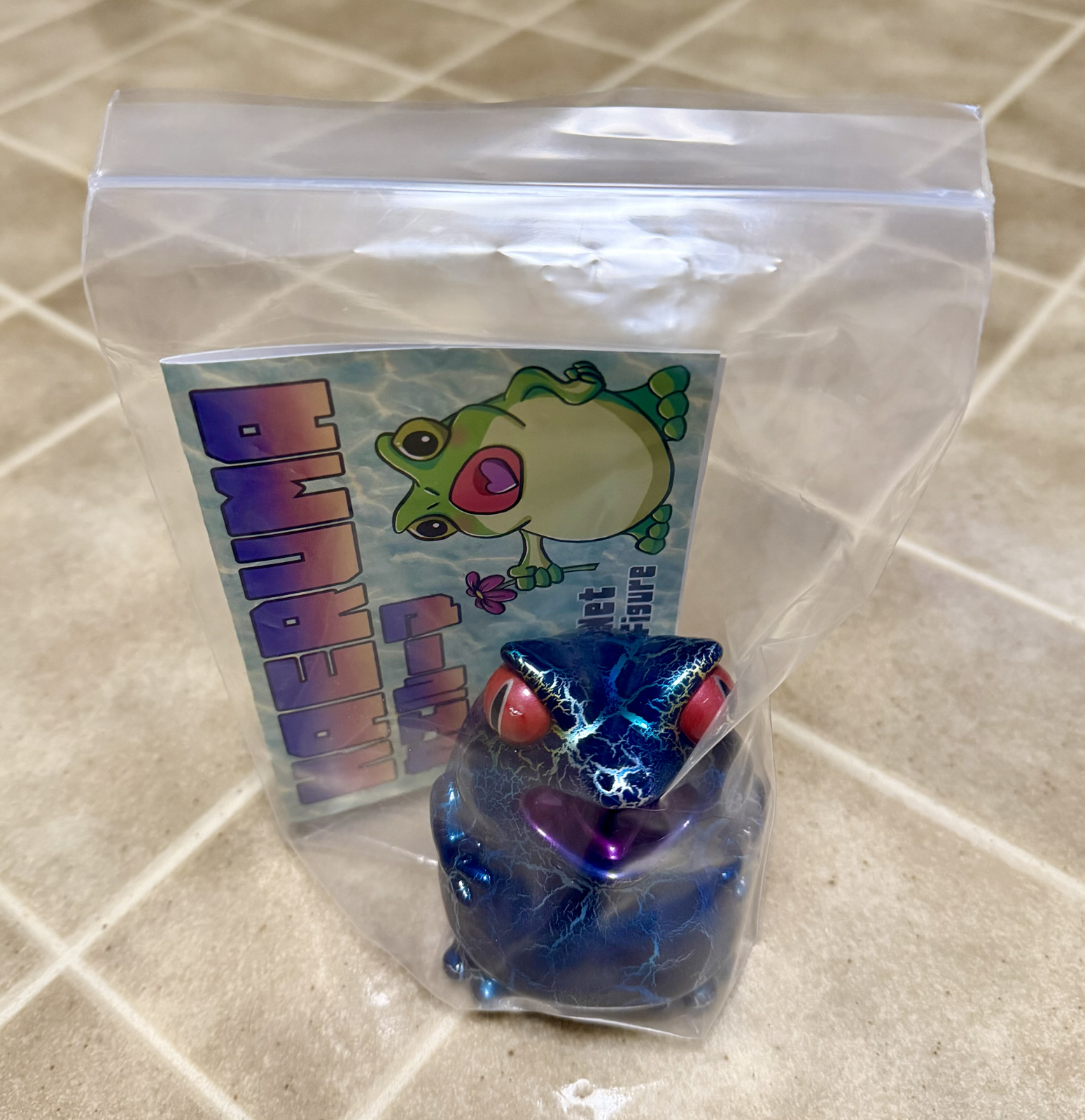
Kristin had wanted a vinyl figure for a few years now, and had even spied this guy (in a different paint job) on a previous trip. He’s a demonic little frog, and this particular version has what appears to be a dipped paint job using metallic paint.
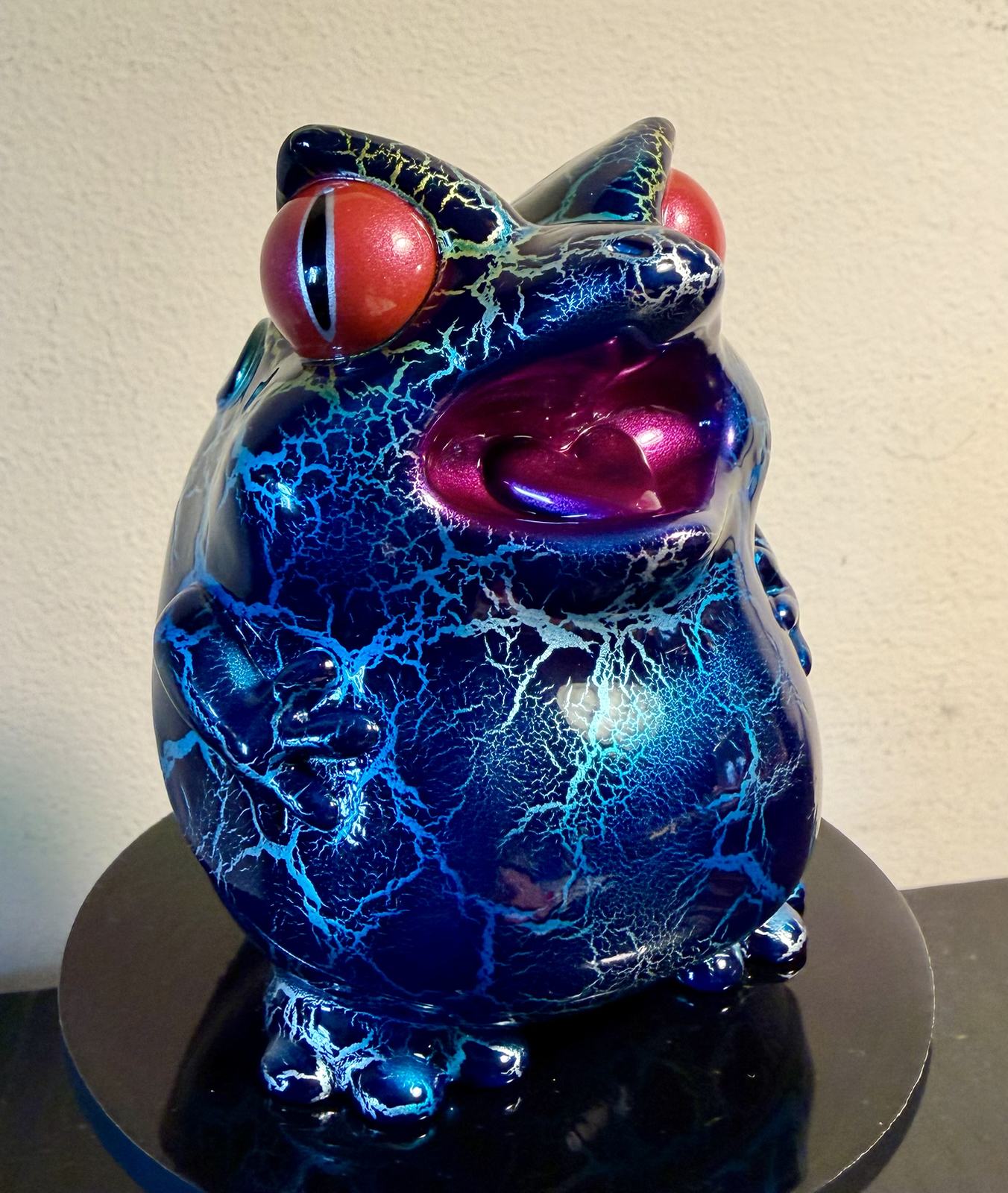
There’s an entire industry of creators sculpting and manufacturing small batches of figures, and lots of collectors eager to buy them. This guy wasn’t expensive, but some of them are very pricey indeed. And if you’re after originals from the 70s or 80s… that’s a path to bankruptcy 🙂
This guy fits in your hand though and is very cute. I doubt he’ll be our last vinyl figure.
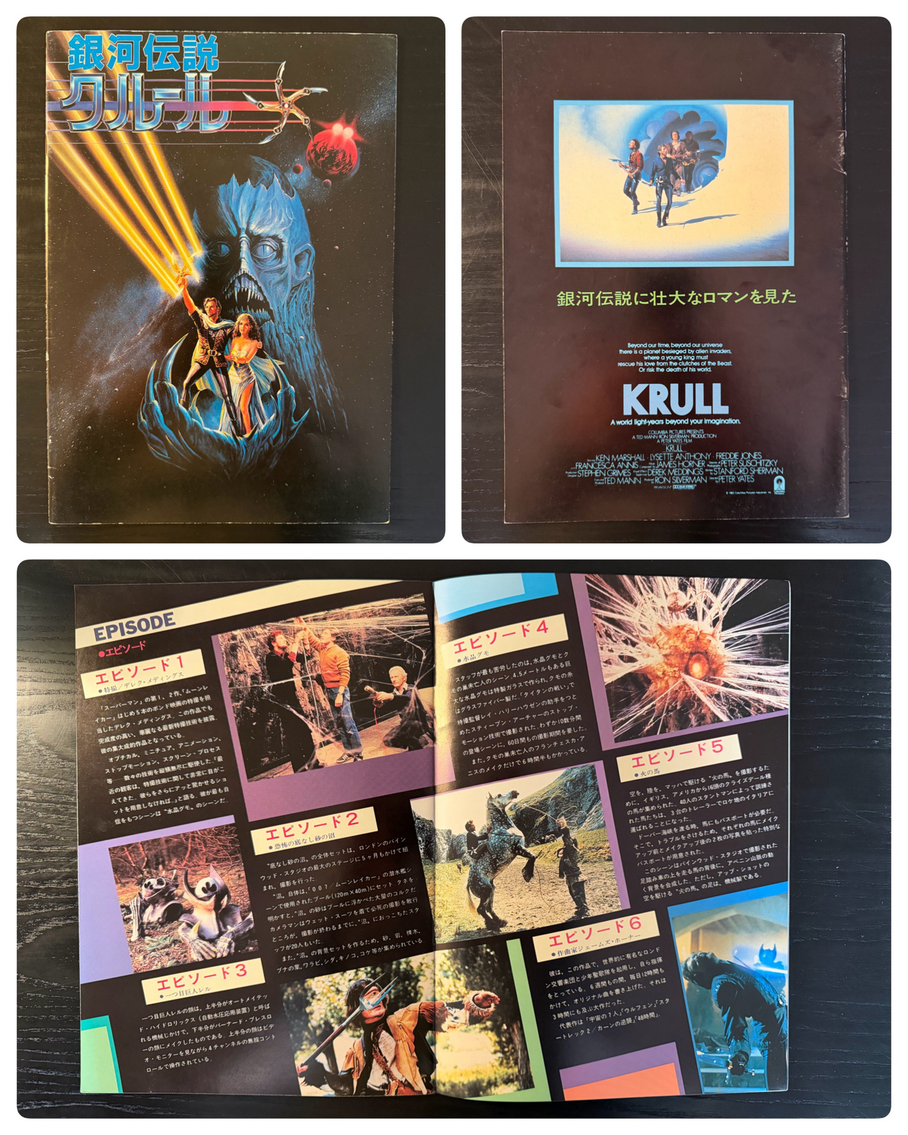
I bought this Krull movie program at a tiny used bookstore in Kobe. I only found it by accident after seeing a sign on the street, and the store was up a narrow staircase and occupied a single small room with no other door or even cupboard. An elderly man sat at a desk with a skull on it and quietly read as I browsed dense bookshelves full of magazines and movie programs.
I have fond nostalgia for Krull, and given this was only ¥50 (about $0.32) I grabbed it at light speed. It’s a beautiful little booklet, and will happily live in my cupboard for ever. Or at least until I send it to Bernard as a birthday gift.
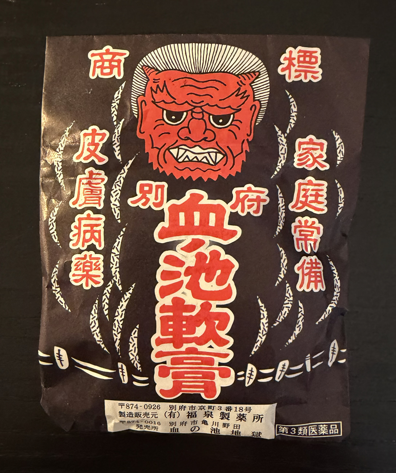
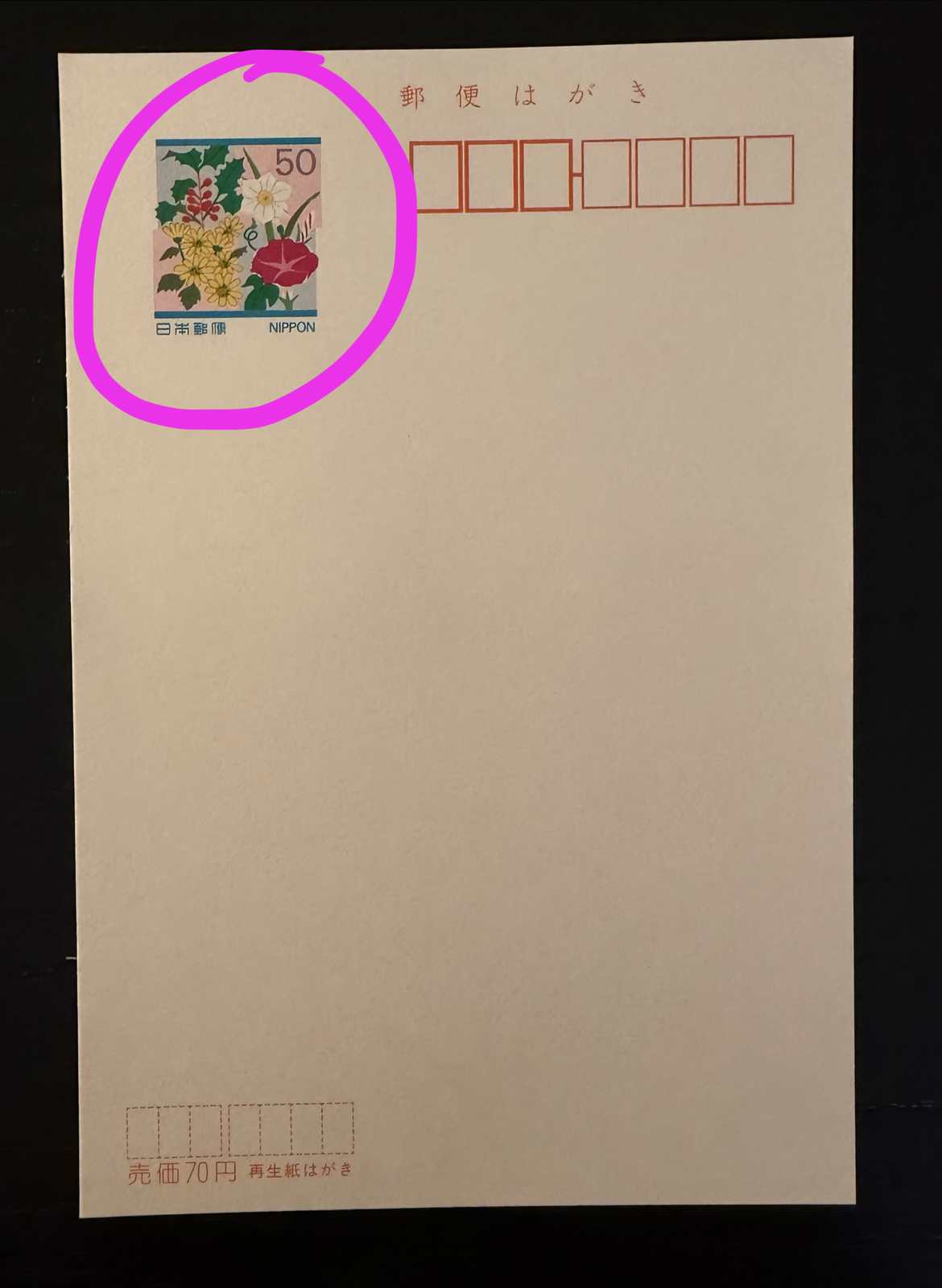
The above is ‘Blood Pond Ointment’ and was purchased at the ‘Blood Hell’ in Beppu. It’s a small pot of mud from the bottom of the red pool at the ‘Blood Hell’ (seen in this blog post) and is sold as a cosmetic item. Or maybe medicinal? We haven’t opened it yet, and before traveling we sealed the sealed paper bag in two ziplock bags since it absolutely reeks of smoke.
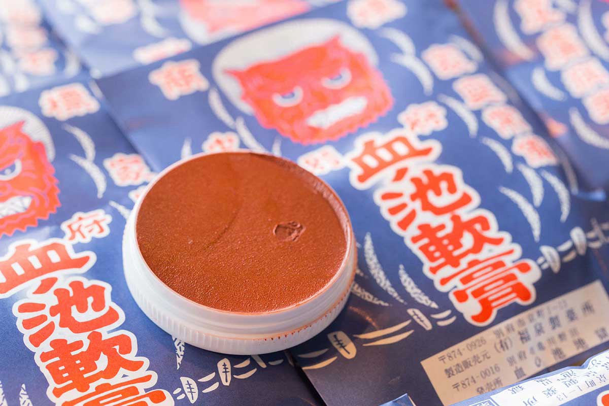
The above photo – I found online – shows what this product looks like. It’s literally mud, and makes wild claims about curing skin conditions and even removing blemishes or liver spots! Allegedly when it dried out you can submerge the pot in water to regenerate the healing power of the mud. KLS purchased this with some excitement, but since she hasn’t even opened it yet I wonder if she’s scared?
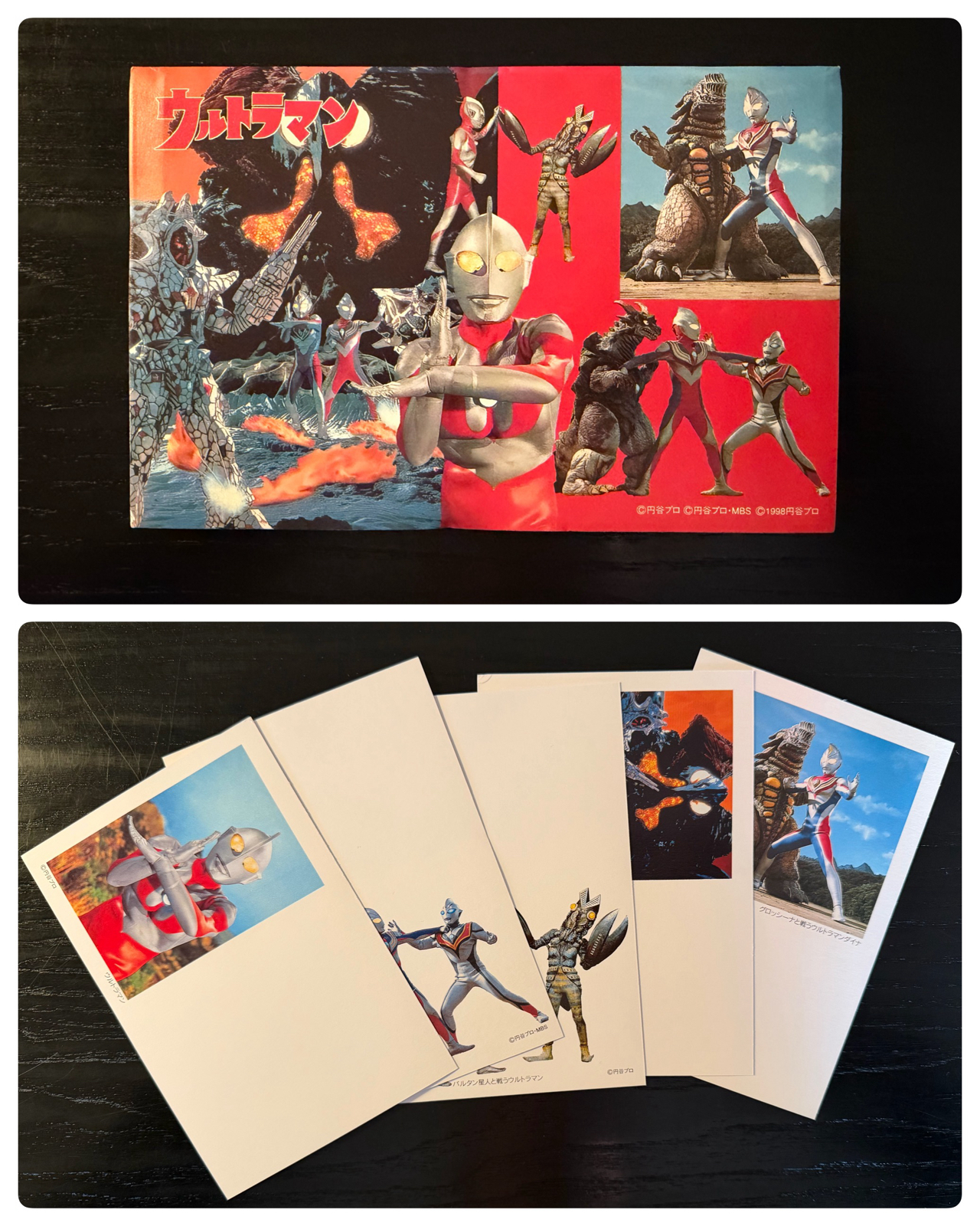
I purchased the above set of five postcards at Mandarake for the surprising price of only ¥200. This was surprising since it’s a 27-year-old Ultraman item, but at the same shop I also purchased two other postcard sets for a similar price. I suppose Mandarake doesn’t value postcards very highly?
To my amazement once I opened the set I discovered these are pre stamped cards! This postage is still good, which means I essentially purchased ¥250 worth of postage for only ¥200! A small profit admittedly, but one of the deals of the trip. I’ll send them all next time I visit Japan. If you want one let me know.
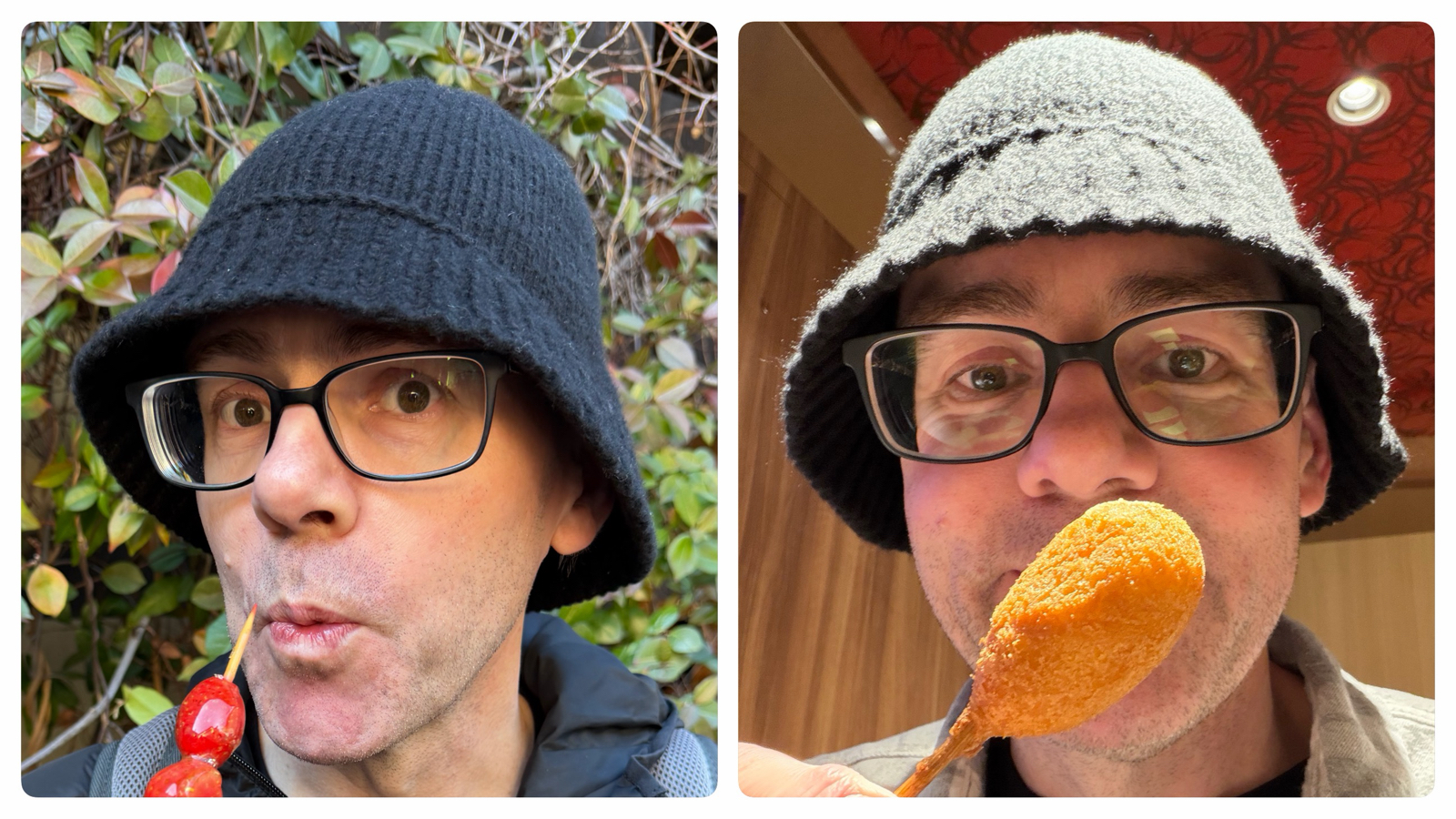
In Arima after exhausting myself walking up a steep the hill to the Postage Museum, I reunited with KLS at a strange little shop that houses the salt and pepper shaker museum on the second floor. KLS waited downstairs while I whirlwinded through the museum, and she noticed (as I had not) that the shop predominately sold bucket hats!
I love bucket hats. I wear them all the time, and even wrote a eulogy for one I lost! But the ones I had purchased always had a weakness: they weren’t warm enough for winter!
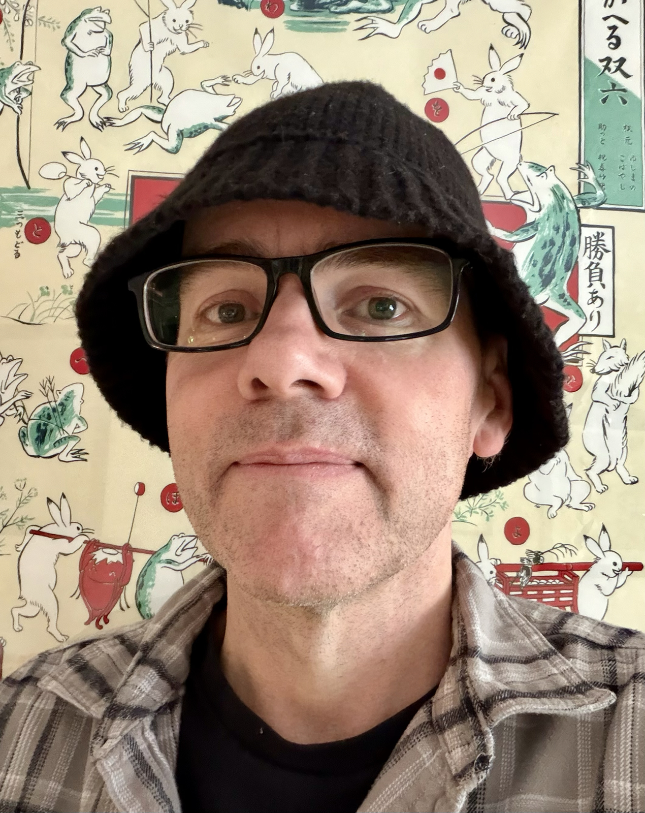
Which is why that little store in Arima was so special: they sold woolen bucket hats for cold weather. I was delighted to find the above, and from that day on wore it more or less nonstop during the entire trip! It’s now my favourite winter hat, and I love it so much I regret not buying a few.
As mentioned this is it for pickups from this past trip. The dozens of books, 9 Switch games, anime figures, endless piles of candy and trading cards: all this will remain unmentioned on this blog. Except maybe, one day, the cards 😉