The first arcade game I ever saw was Space Invaders. It was at – of all places – the kiosk at Nobby’s Beach, but I didn’t play it since there was quite a crowd. I believe this would have been in 1979. I do believe the first arcade game I ever played was Space Invaders as well, although I don’t recall exactly where.
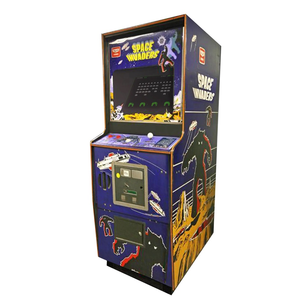
The game was released in Japan by Taito in 1978, and while not the very first arcade game, is unquestionably the most important and influential in creating the video game industry. It would eventually take the world by storm, but not until after it had completely conquered Japan.
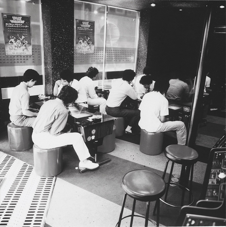
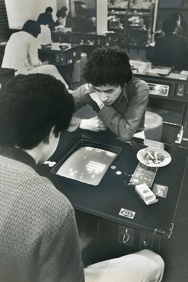
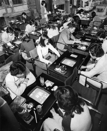
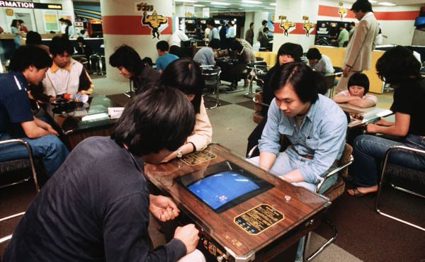
These photos were taken during the late 1970s Space Invaders craze in Japan, when Taito could hardly manufacture cabinets fast enough. Shortly after the game was released they engineered a new type of sit-down (cocktail) cabinet to satisfy the requests of business that wanted their patrons to be able to drink and smoke as they played. These became extremely popular in Japan, and accounted for the large majority of Space Invaders cabinets made for the Japanese market. (In researching this I learned that cocktail cabinets were also very popular in Australia, but relatively rare in the rest of the world.)
In almost all of these black and white photos, the only game being played is Space Invaders (or some variant of). In under a year 100,000 cabinets were distributed around Japan, and even this was hardly enough. It has been reported that the average cabinet in late 1978 Japan was played over 50 times a day, and recouped its cost within a month.
Space Invaders had become a phenomenon and showed no signs of slowing down. Popular with both children and adults, in those heady days the game was playable almost everywhere. Some businesses changed into arcades as they found Space Invaders more profitable than whatever else they were trying to sell.
The Japanese ‘Game Centers’ we know today were born then, originally in the form of squalid rooms filled with cigarette smoke and the sounds of invaders and laser blasts, but in time into well-lit and very large halls full of games and people playing them.
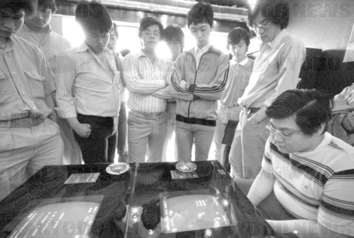
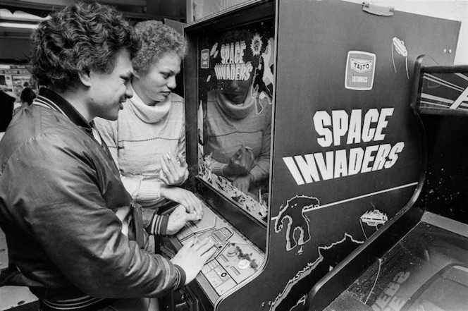
Arcade gaming was a spectator sport, and the cocktail cabinets a perfect arena for a crowd to watch. Good players became famous, and some were even invited to play live on TV so others could observe their skill. Some players even wrote books on how to better your score, which became best-sellers.
It was during this time two urban legends about the game were born: that it caused a shortage of ¥100 coins and that it led to a rise in delinquency among children. Neither claim has born up to investigation in the decades since, and seem to have been inventions of non-Japanese journalists, but the popularity of the game in Japan between 1978 and 1980 was still incredible. It was the #1 video game in Japan for three years, and earned more money than any film released during that time.
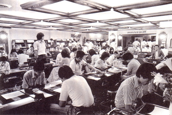
Isn’t it wonderful seeing how popular the arcades were – and this was mostly for one game! You didn’t go in those days to play ‘video games’, you went to play Space Invaders. Imagine the sounds of so many machines being played at once!
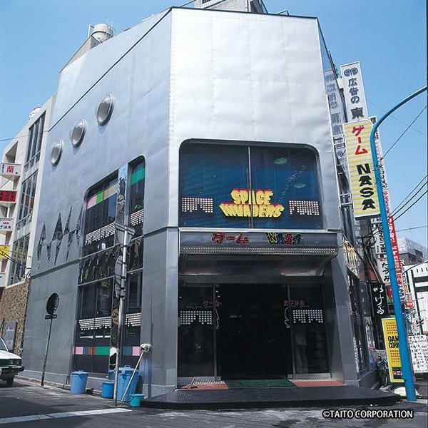
Even the arcades were unambiguous about their purpose, as the above photo shows. The earliest Game Centers were even called ‘Space Invaders Houses‘ since that was why they existed. (I believe this image – which dates to 1979 – shows the same building in Ikebukuro that is now Mikado Game Center.)
I found a few colour photos from that era as well, although these date from a couple of years later (I think that is Galaxian in the above shot). Woodgrain paneling on the cocktail cabinet is so evocative of those days.
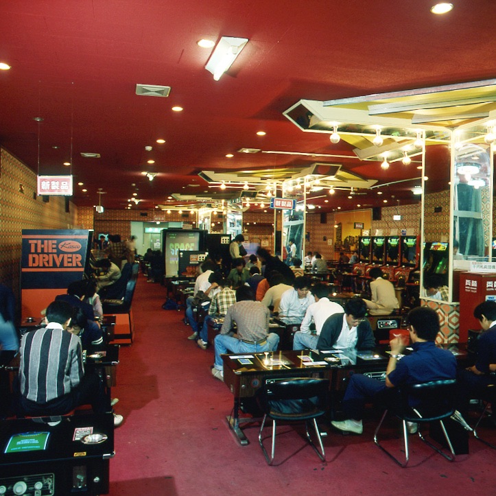
The above was an early Game Center in Nagoya, Japan. Most of the games look to be Space Invaders, and you can see four upright cabinets lined up in the background. The game on the left (The Driver) was a driving game released in January 1979 and was apparently a failure in arcades.
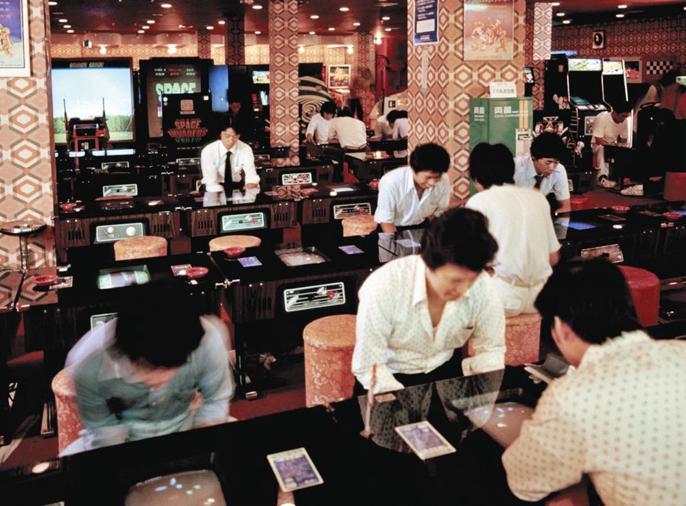
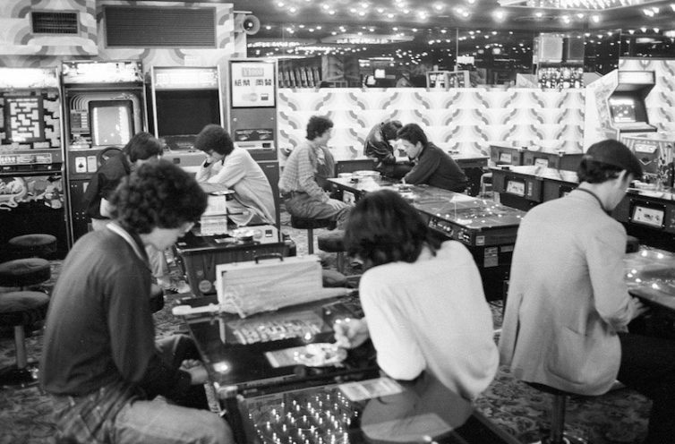
The above arcade looks so large and comfy. Once again it’s dominated by cocktail cabinets, and most of the uprights (at the back and far right) look to be Space Invaders or variants.
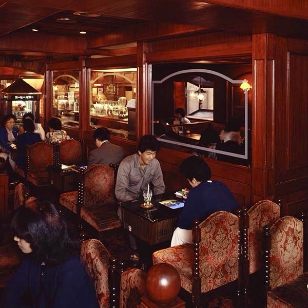
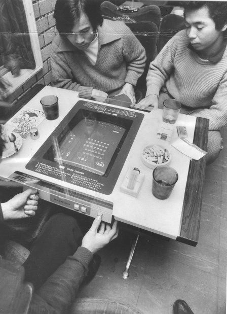
This photo is lovely! Plush chairs and cocktails (the drink, not the cabinets)! A proto-barcade if you will, showing there’s no such thing as a new idea. This brings back memories of a childhood trip to Canberra, and the arcade games they had in the bar. (I believe these guys are playing Moon Patrol.)
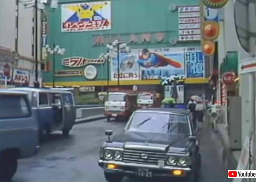
The above is a still from a (sadly now removed from YouTube) 1978 video of Nagoya city, showing a large billboard for Space Invaders displayed alongside a marquee for the first Superman film. When was the last time (if ever) you saw a billboard for an arcade game?
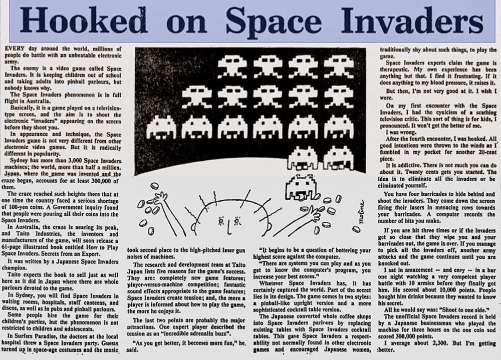
It wasn’t long until the Space Invaders craze spread worldwide, as the above story from the September 9, 1980 Sydney Morning Herald reveals. At the time of writing Sydney had 3000 machines, but Japan actually had almost 400,000. In time Japan would have over half a million, and to this day the total number of cabinets manufactured worldwide is unknown.
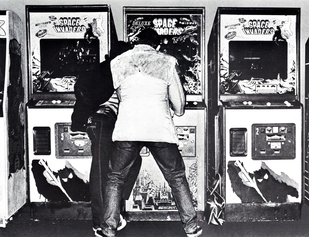
The rest of the world had its own version of the craze of course, but it wasn’t as intense or sustained as it had been in Japan because the game was six months old when it was released in the USA and almost a year old when released in Europe. This was enough time for other games (notably Galaxian) to steal some of its thunder. I was in the arcades by then – as often as possible! – and even with other games available I remember still playing Space Invaders, like the couple in the above photo taken in New Zealand in 1980, or this pair playing in Penn Station, New York in the same year:
Arcade game technology evolved quickly and only a few short years after 1978 Space Invaders was looking long in the tooth to most gamers. It had conquered the world, made an incredible amount of money, and even created a hobby now enjoyed by billions. But nothing lasts forever, and by 1980 the mania of Space Invaders – and arcades in general – seemed at its end, and the days of arcade games taking over the world looked to be fading into memory…