I sent home 55 postcards this past trip, and they’ve all arrived safe and sound. I sent an average of 3 per day we were in Japan, plus an extra on New Year’s Day.
Most of them are full of vivid and often humorous anecdotes about the trip, and I know I’ll be enjoying rereading them for years. I never seem to run out of things to write, perhaps not surprising since I estimate that including all travel and Postcrossing I wrote over 800 postcards last year!
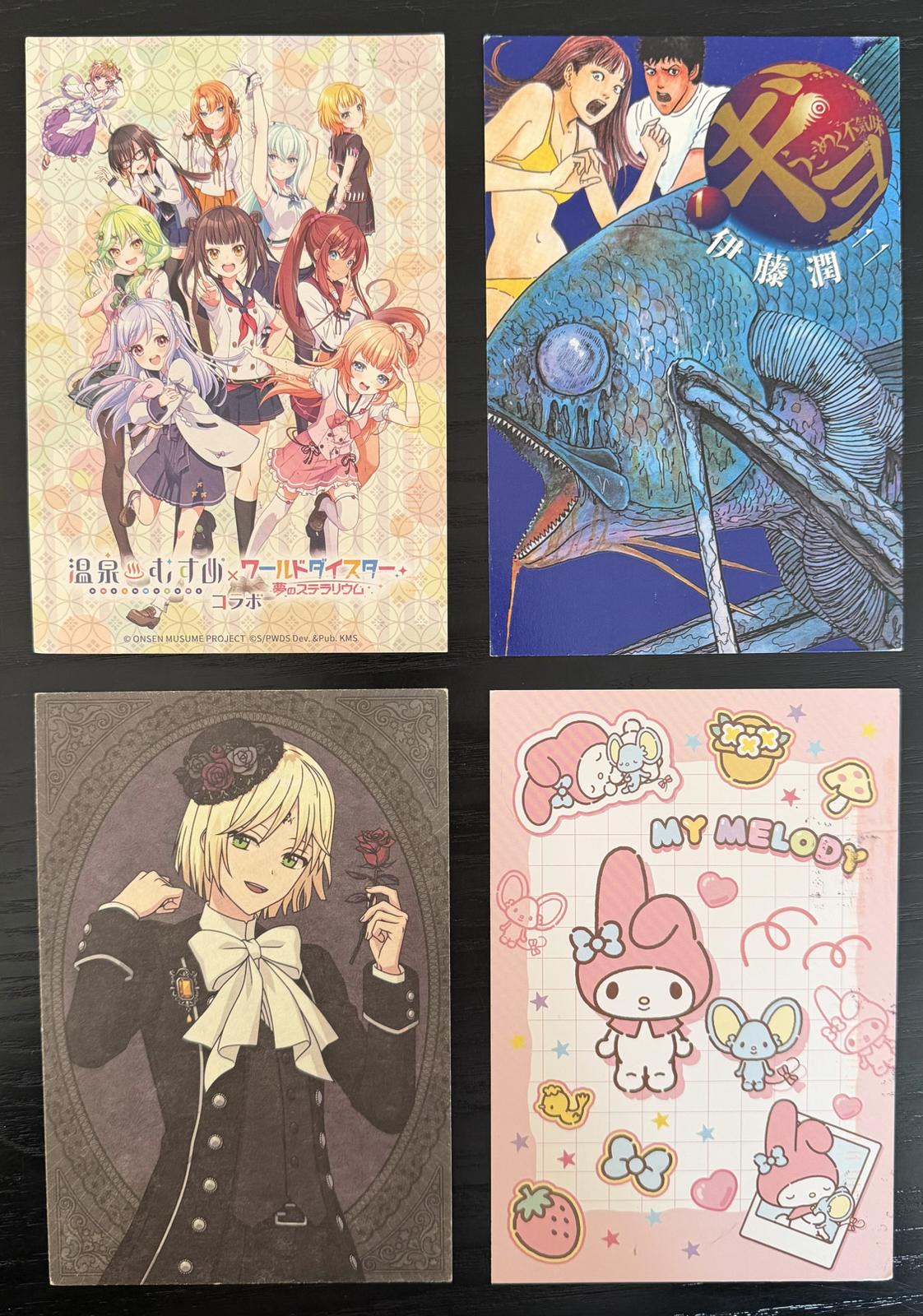
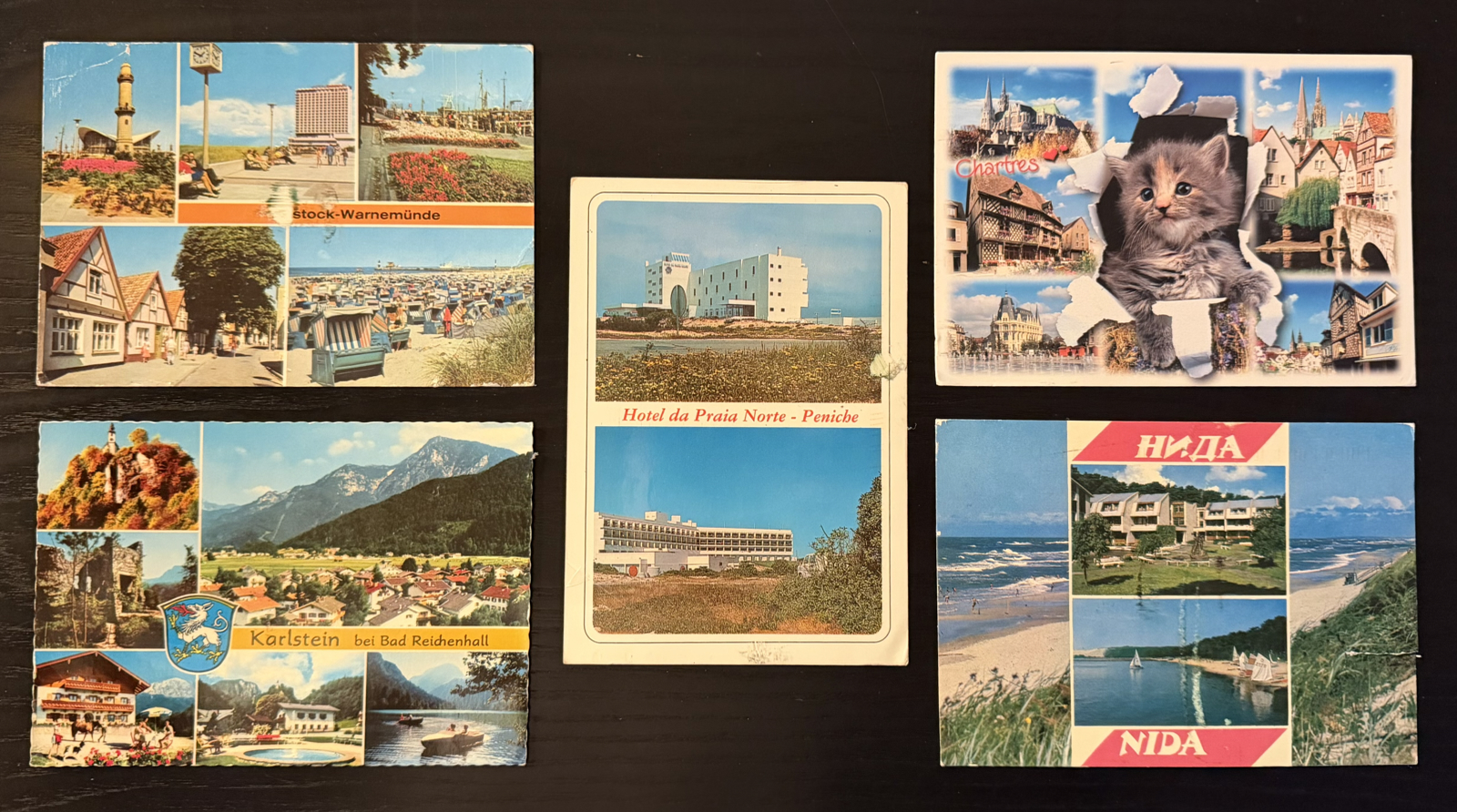
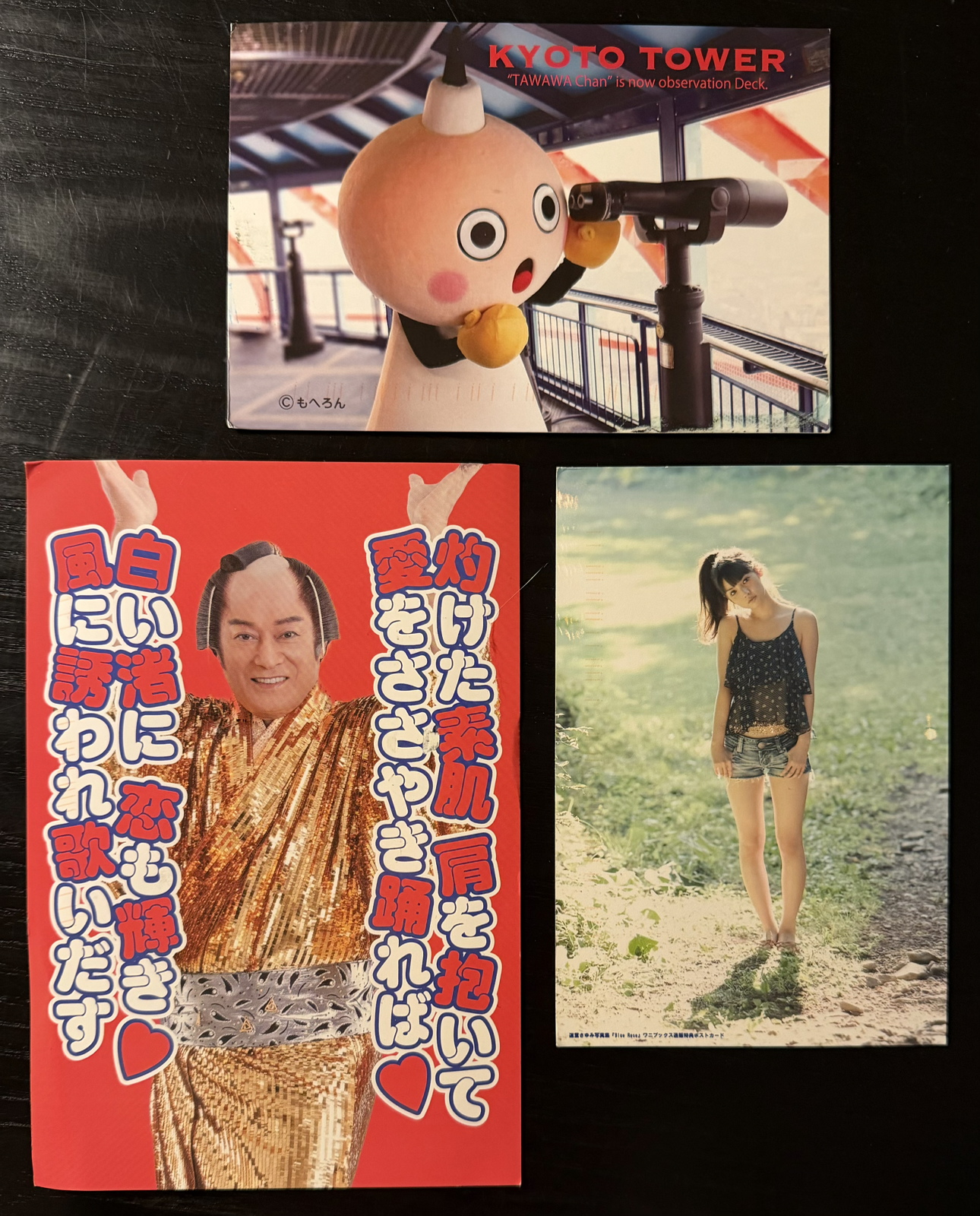
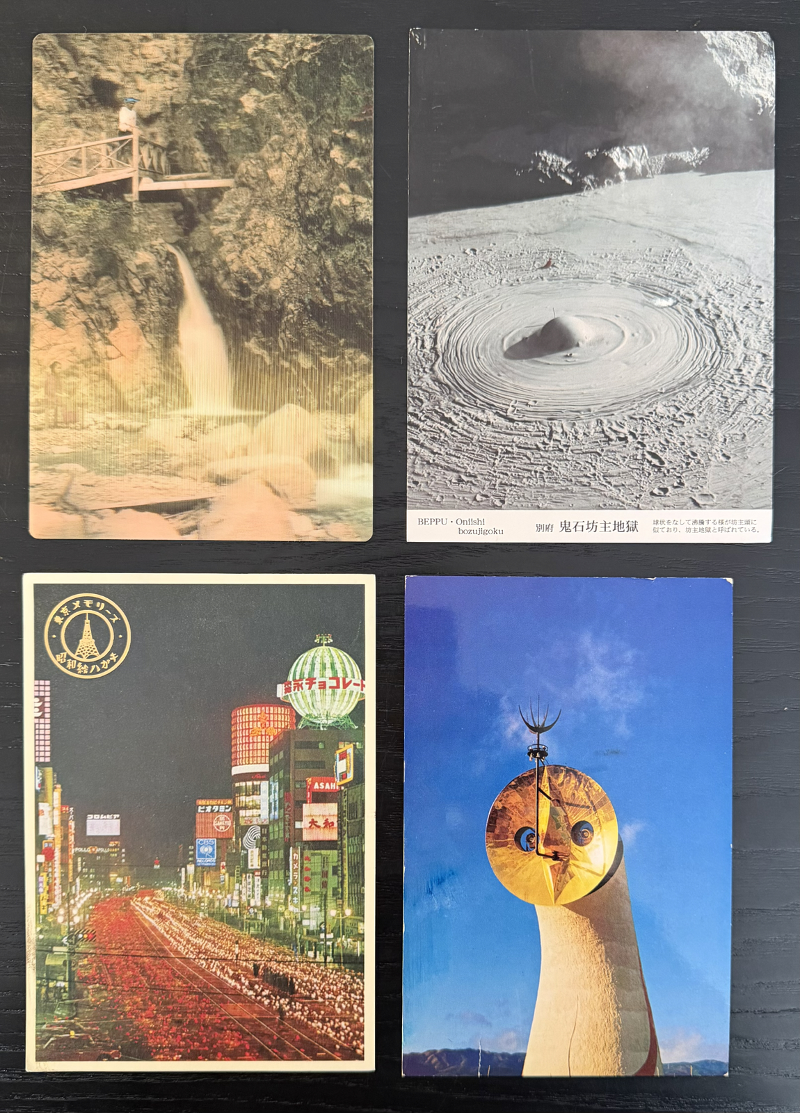
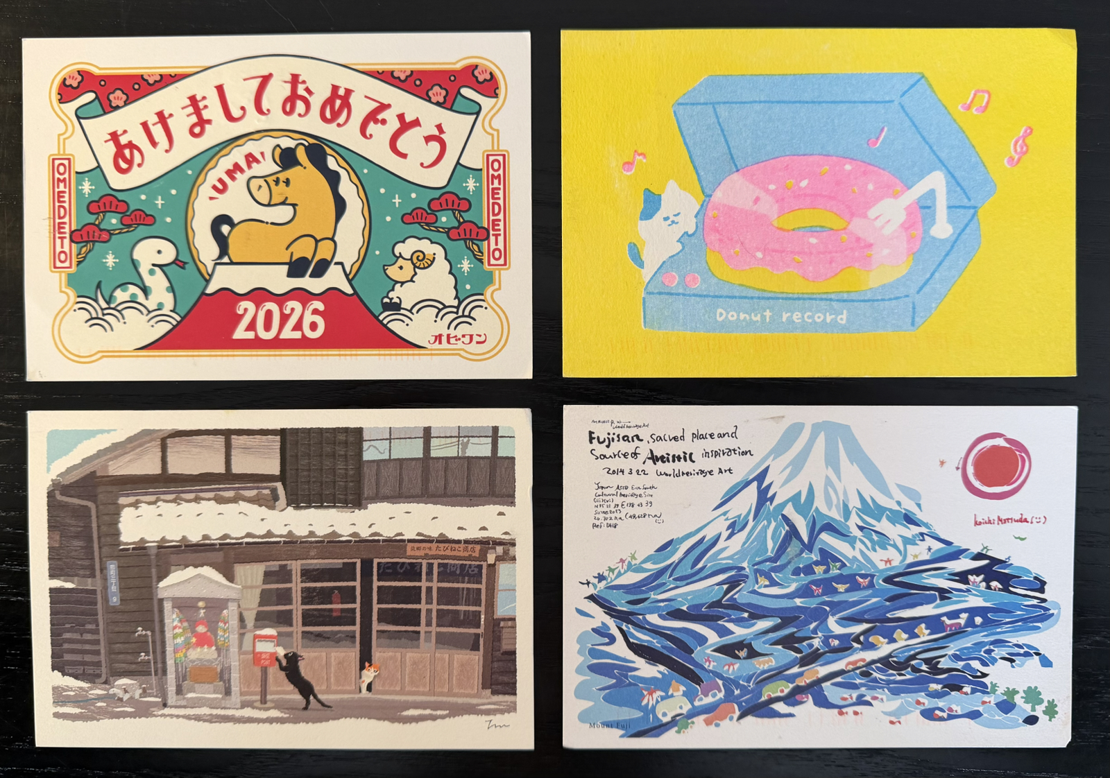
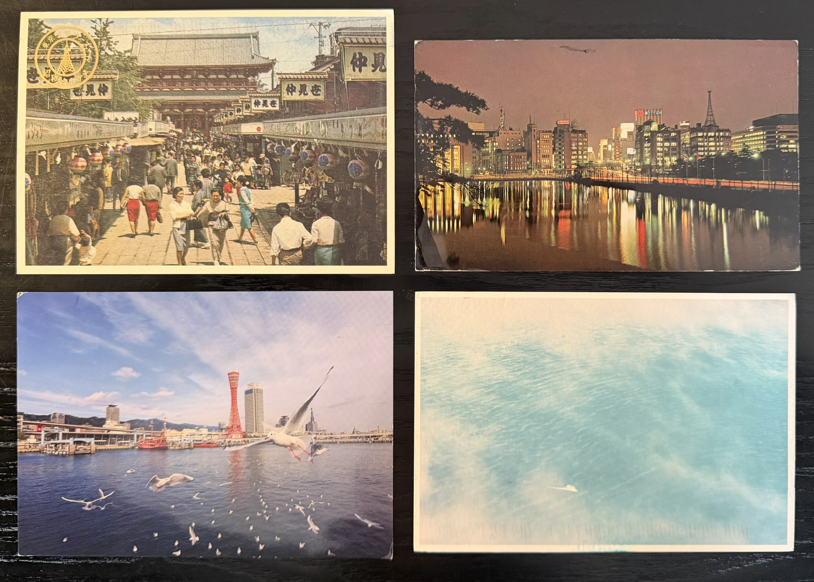
It’s become a little difficult to find tourist cards in Japan now – I saw none in Osaka – but the Japanese still seem to enjoy postcards in general so it’s easy to find artistic ones. Based on the stamps used I think I sent about 115 in total.
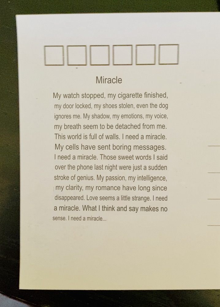
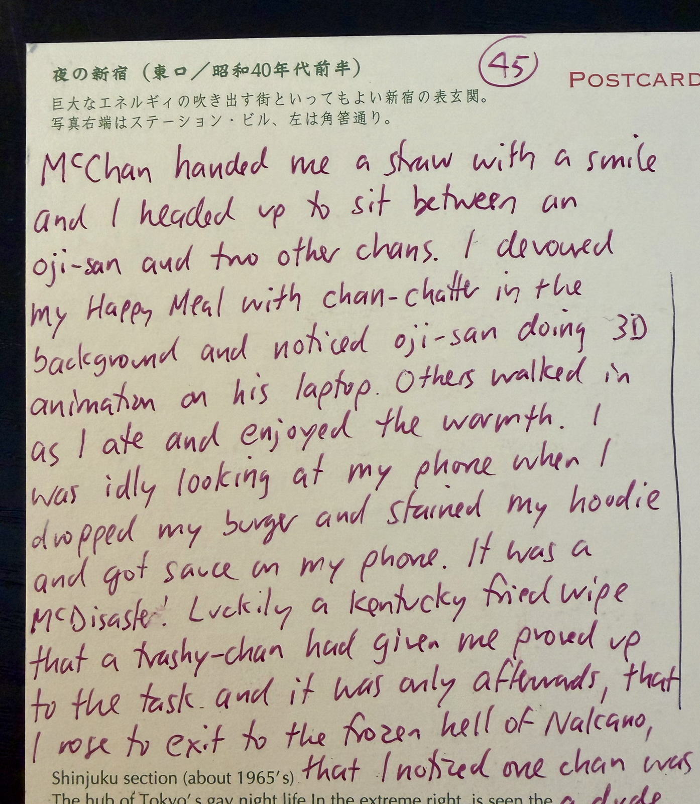
I write them every evening, although there were times I was too tired and wrote them the next morning. When I travel alone I often write them in restaurants but I only did that once this trip. Here’s the exact card:
I was going to write a ‘sequel’ to the above since as I was leaving an unexpected song started playing but by the end of the day I had forgotten and that card was never written. I often use my phone to record ‘postcard ideas’ but apparently I’d not done it that day.
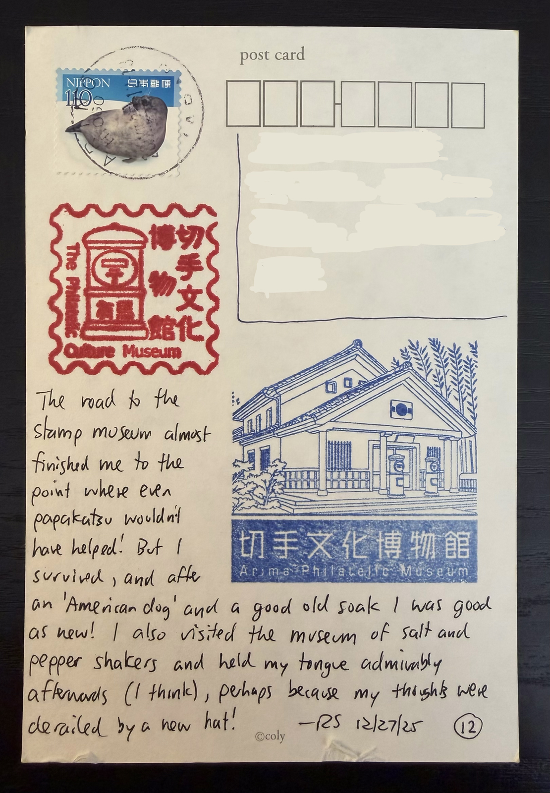
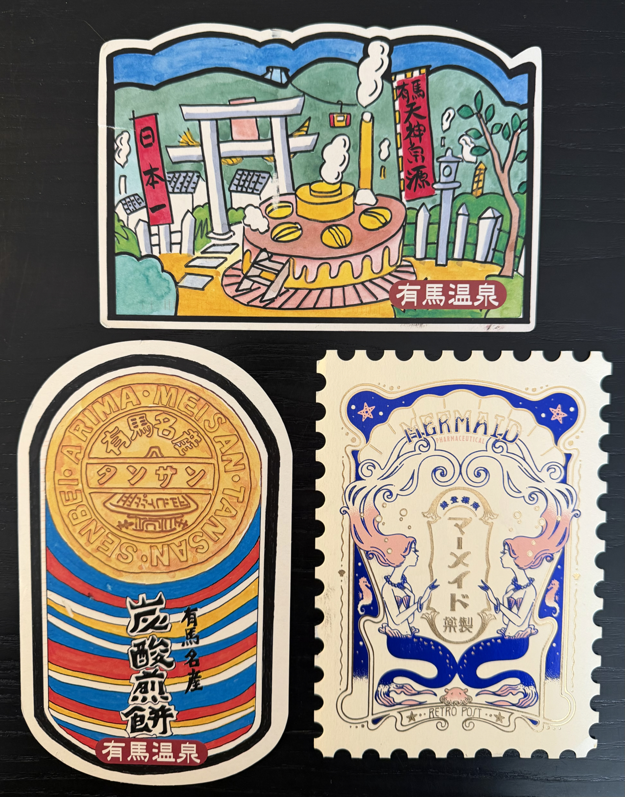
The above was sent from Arima, and was the day I went to the postage museum. Both eki stamps were collected inside the museum, and of course I had blank cards in my backpack for that purpose! We saw a lot of good eki stamps this past trip, and they all were collected on at least one card. Many of you would have got one in the mail.
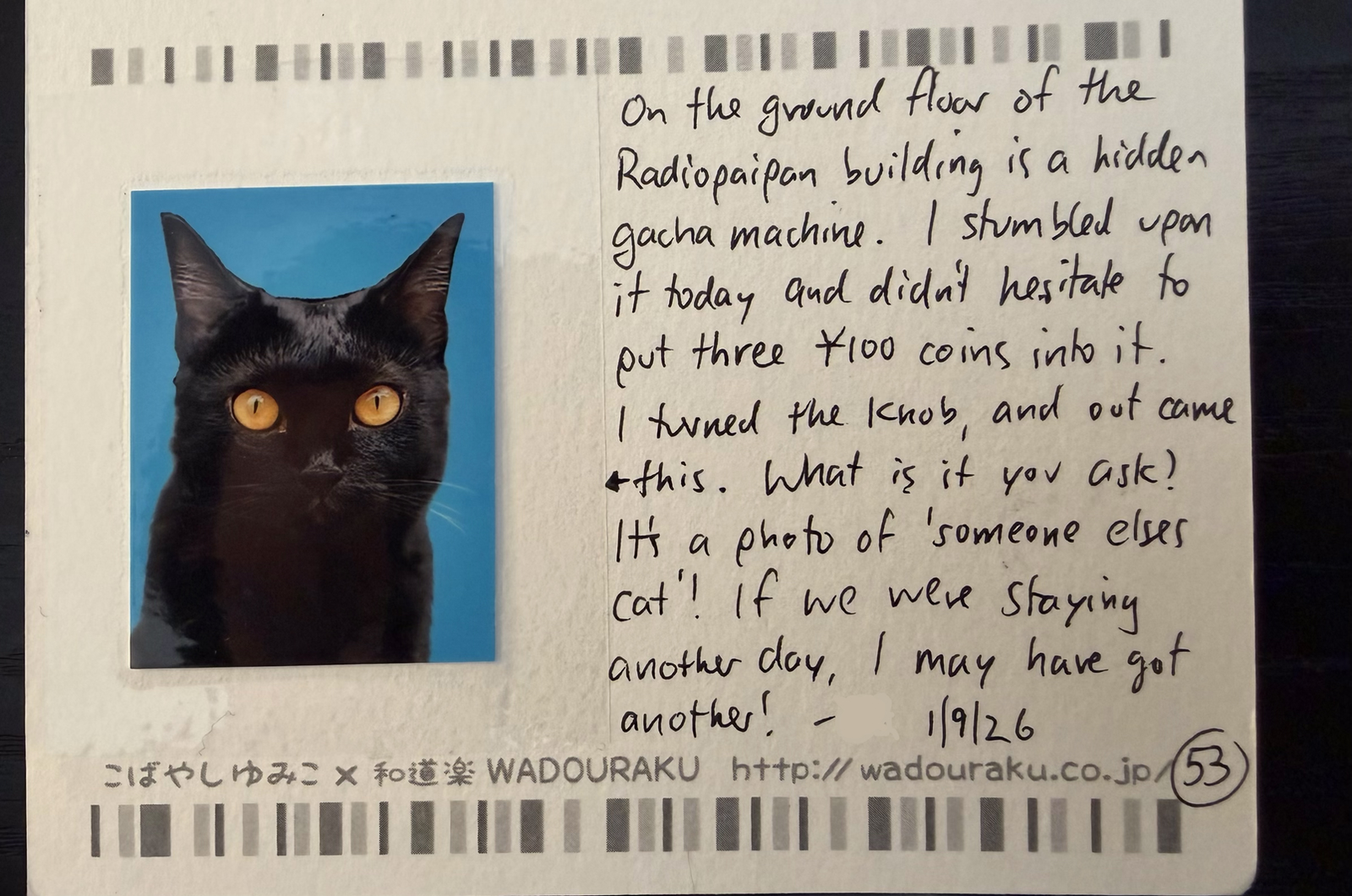
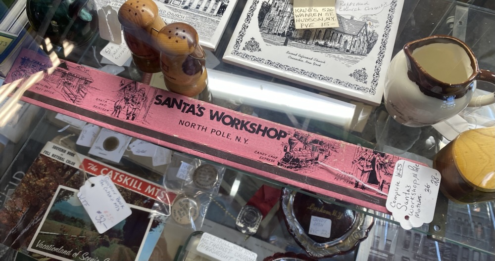
Do you remember ‘someone else’s dog‘? The above card chronicled my discovery of a similar gacha machine on the penultimate day! Tiny things like this are a common topic on cards I write.
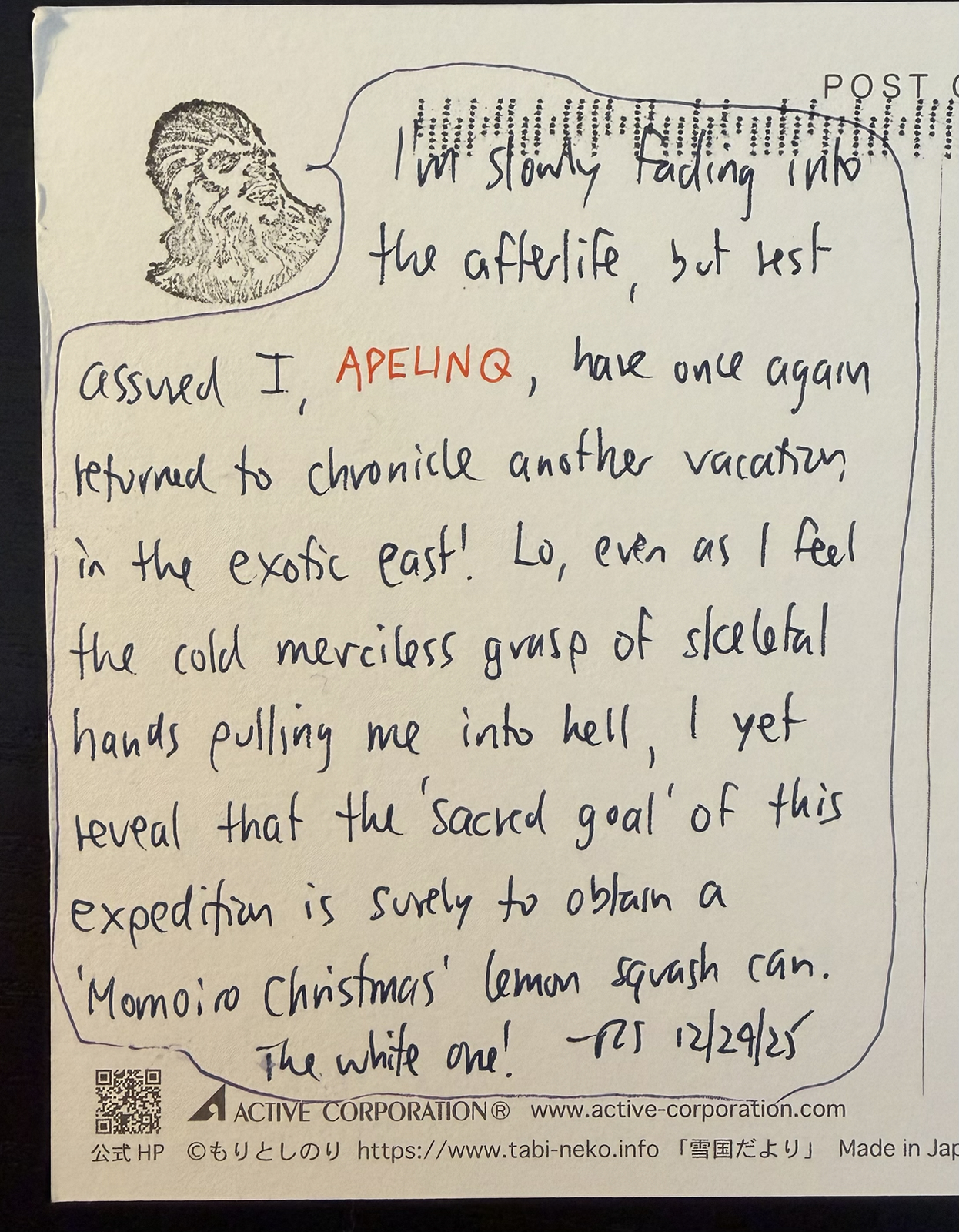
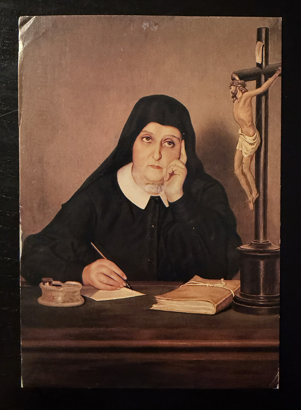
Many years ago Bernard send me a set of Star Wars rubber stamps and – for reasons long forgotten – I took to the Chewbacca, named him ‘APELINQ’ and have been using him to deliver sage comments on postcards ever since. Maybe you’ve even received one? The above card was written the day we found a sold out drink machine selling cans with stickers of a Japanese idol group. I made it my mission to find them for sale somewhere before we left…
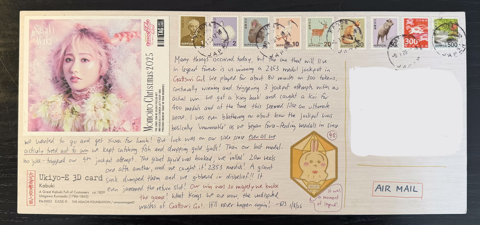
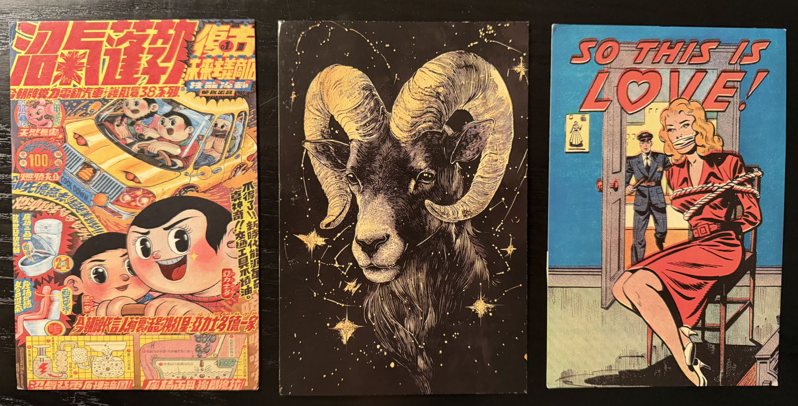
Some two weeks later, I succeeded. Alas it wasn’t ‘the white one’. And if you’re observing that the above card is massive, then that’s because it is:
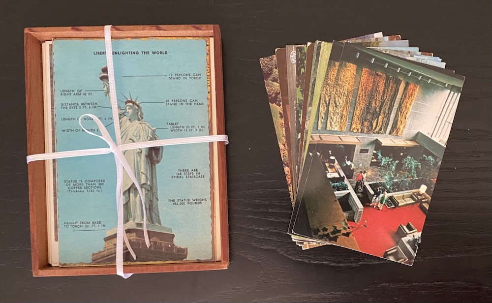
The above shows the two largest and the smallest cards all compared to a normal-sized one (bottom right). The biggest one is about five times larger than a normal card, and since it’s also lenticular it’s stiff and somewhat heavy. I put ¥918 postage on it and crossed my fingers and as is obvious it arrived in immaculate condition.
As it turns out I have an even larger card – twice the size of that one – that I plan send on a future trip. I’ll probably put even more postage on that one!
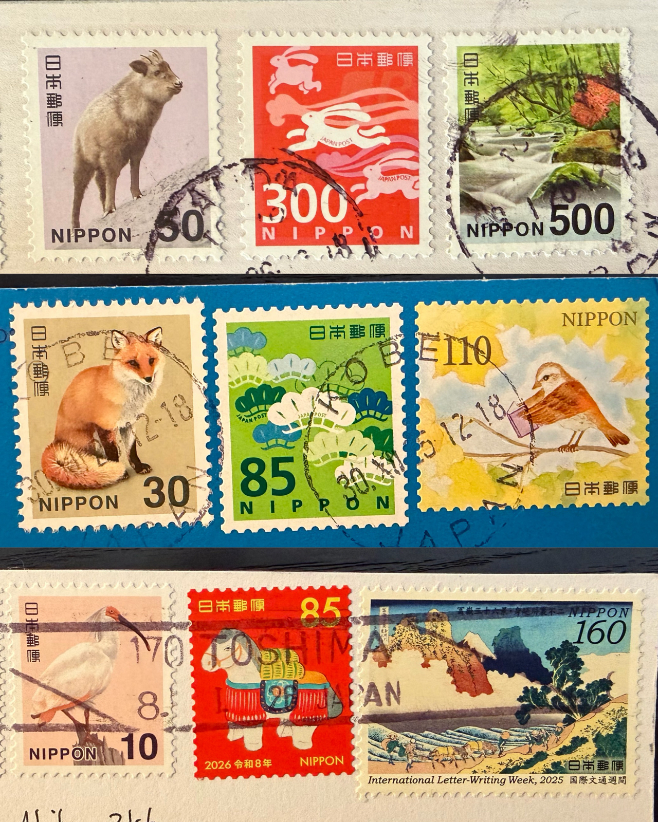
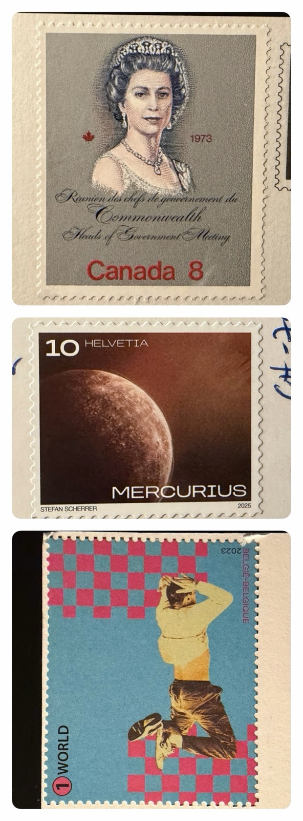
As I mentioned during the trip I went into a post office early on and bought a kings ransom of stamps, including one of each of the basic types, which include the ¥10, ¥30, ¥50, ¥300 and ¥500 above. In the end it wasn’t enough and I needed to buy more, but even sending over a hundred cards it still cost only a fraction of what it would from here or Australia.
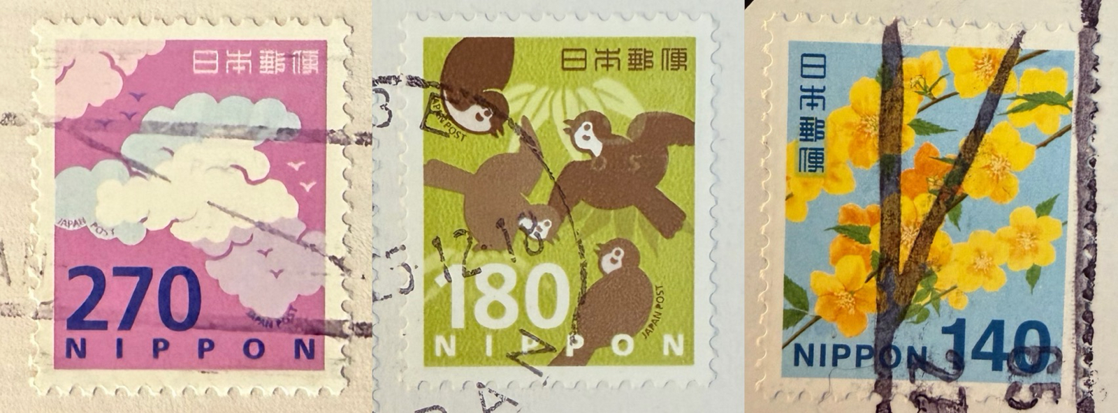
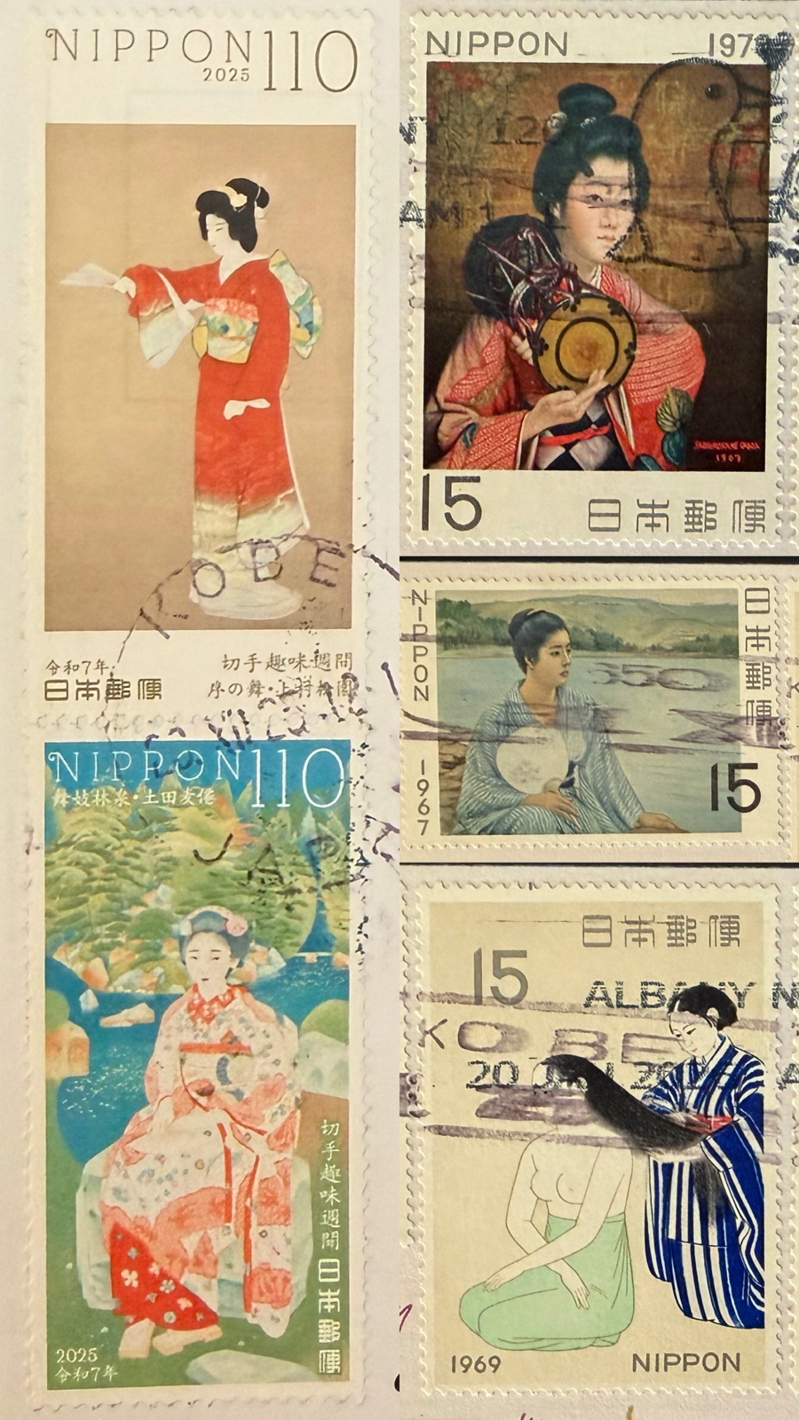
It costs ¥100 to send a card airmail from Japan, but when cards are oversized or unusually shaped you need to pay extra. In the past I’ve had such cards take much longer to arrive or not arrive at all, so to be safe now I load on extra postage. Someone got a card with a ¥350 stamp on it this trip. Was it you?
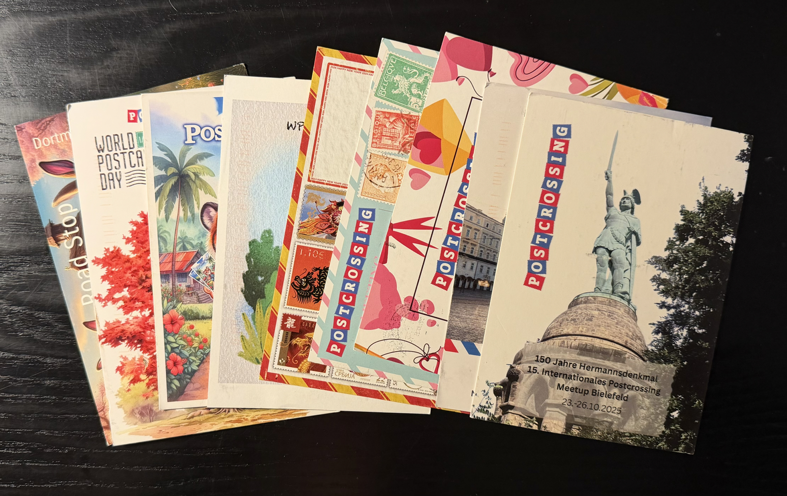
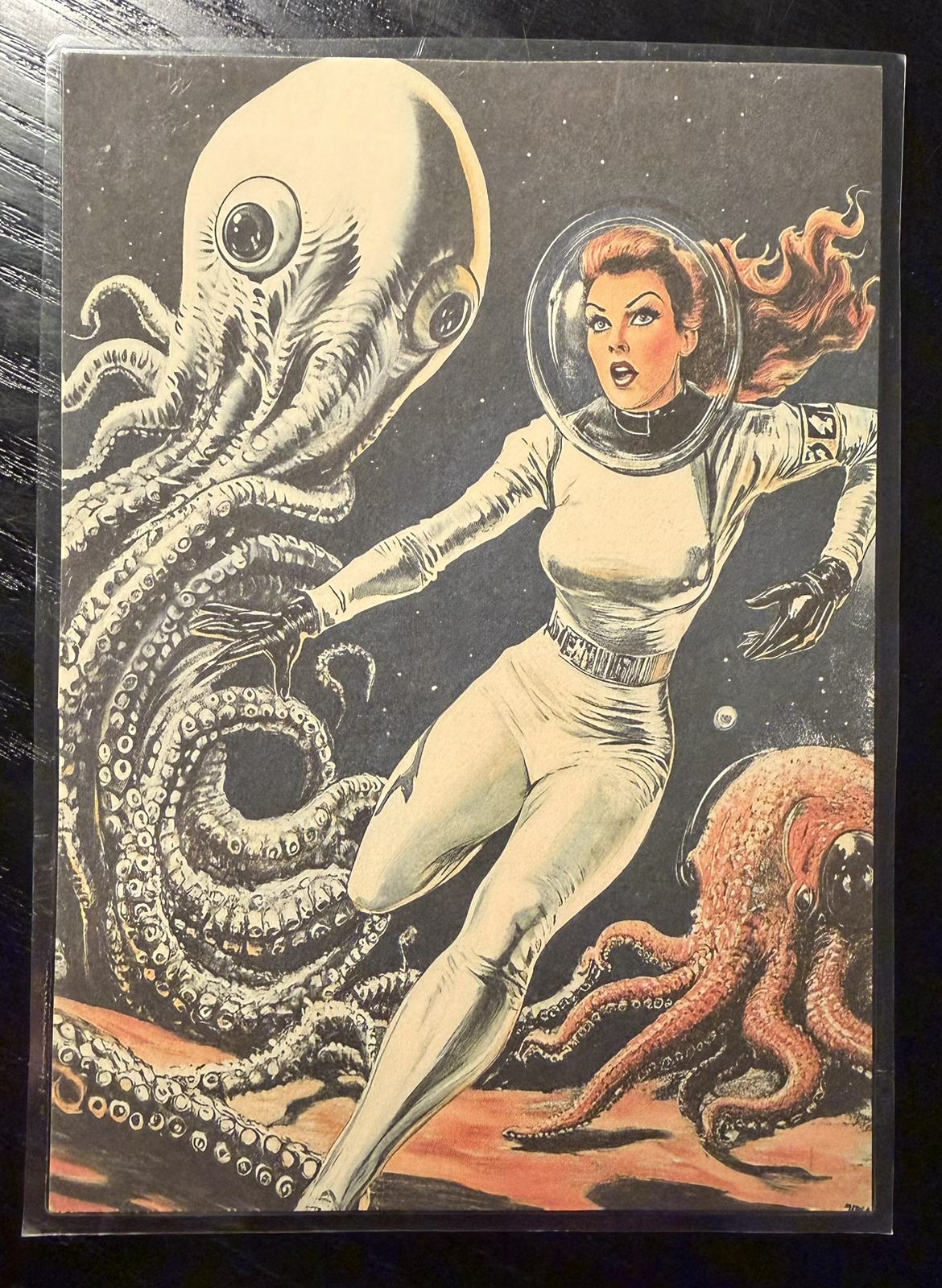
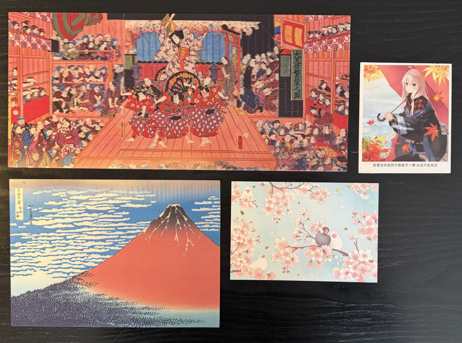
The above are the shaped cards I sent this trip. I was very pleasantly surprised the one at the bottom right wasn’t damaged in any way. In fact very few of the cards show any evidence of being damaged by USA mail sorting machines, which gives me hope they’ve improved their automation.
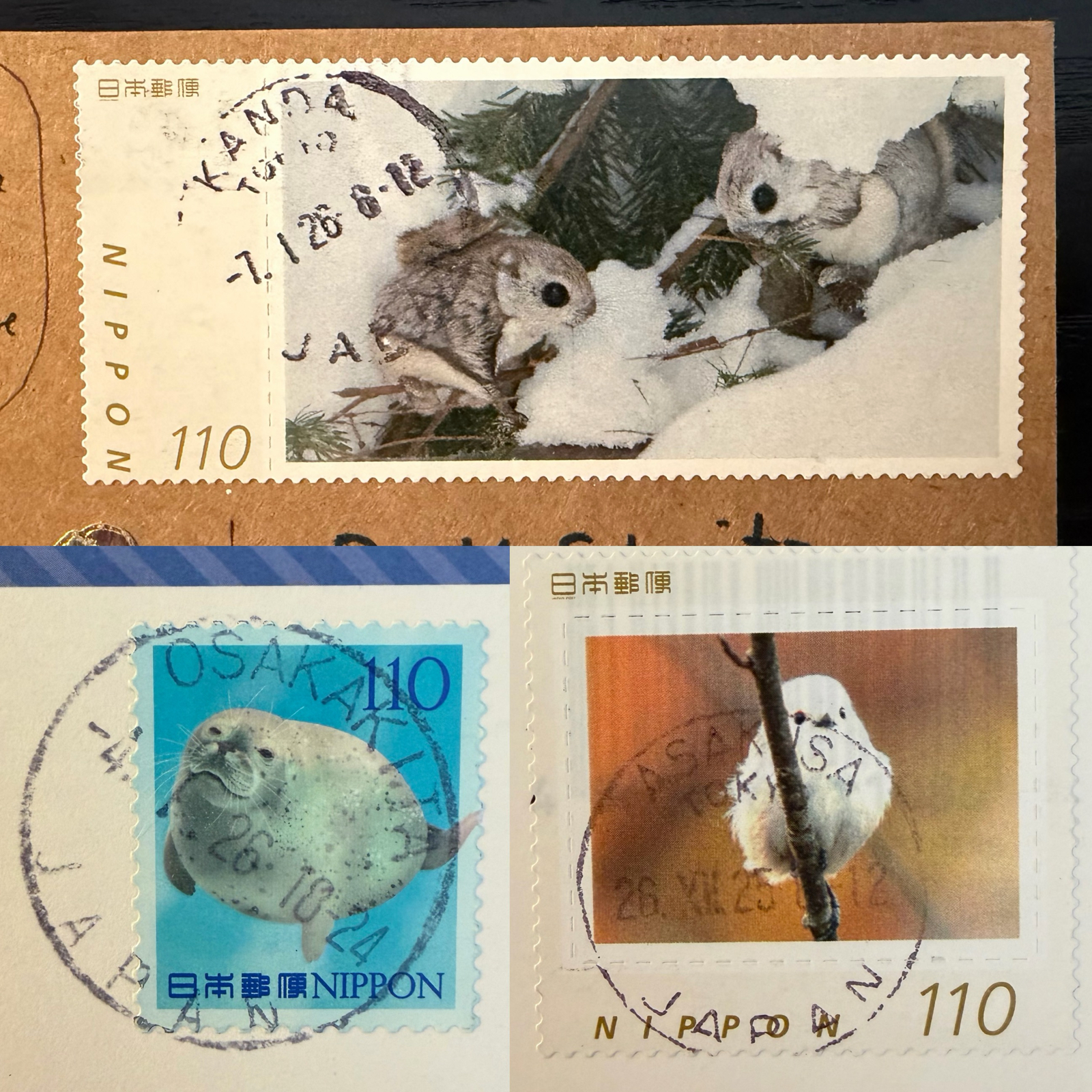
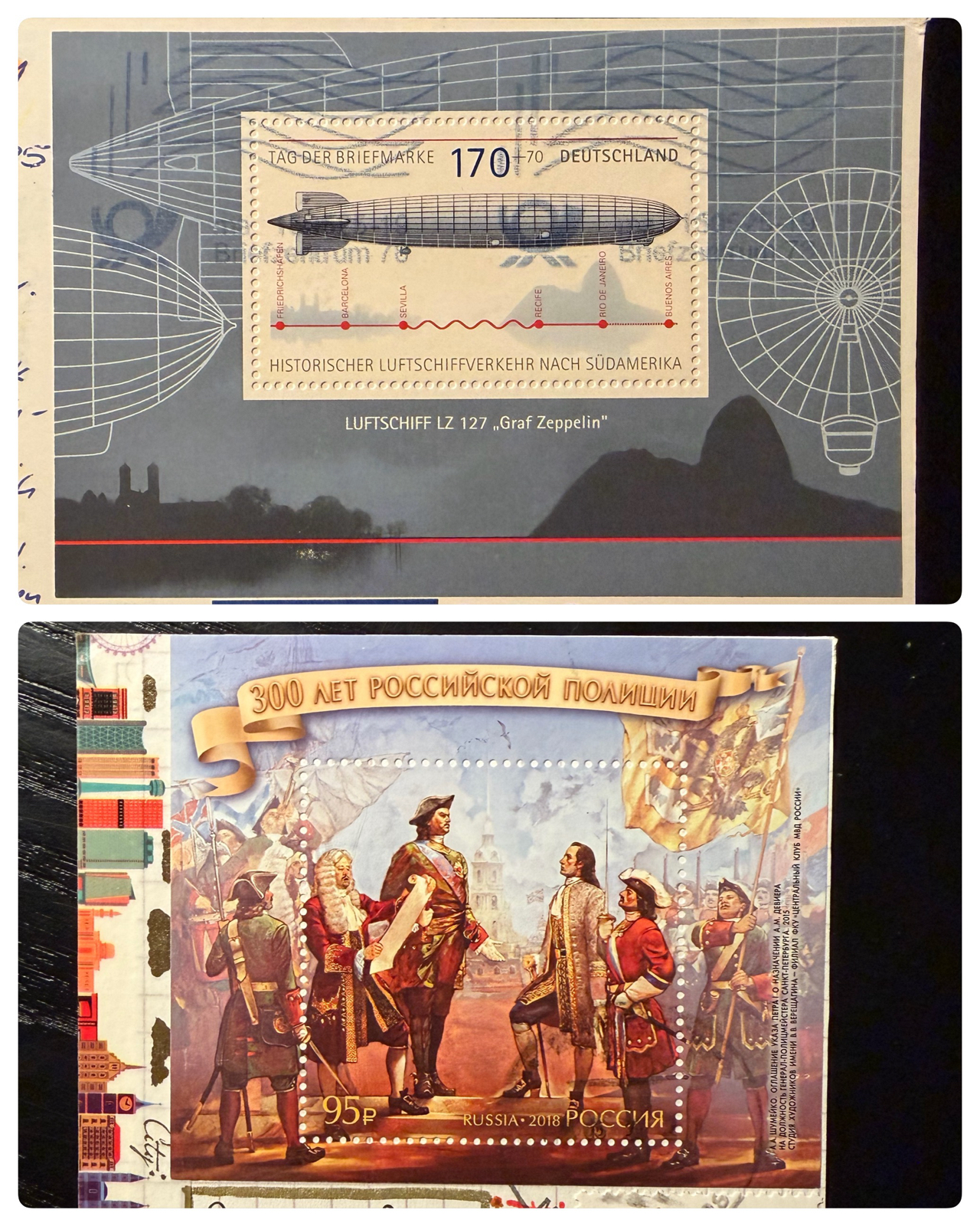
The stamp at the top is massive. In fact it’s so big I couldn’t really use it on some cards. I had exactly four of these (all different) and two came to us so maybe you got one?
The old stamps on the right were purchased at the postage museum. The had a tiny amount (only four) of unused stamps for sale and I bought them all, wishing they had more. A week or so later I found a stamp & coin shop in Osaka and bought several sheets of stamps from a couple of decades ago. They will be used on my next trip.
In fact I’ve even got most of the cards for that trip, since I found a stash of new tourist ones on the very last day we were there. I’ve got three dozen cards and about ¥4000 in postage all ready to go.
I suppose I should return so I can start sending them 😉