At the halfway point of our animal painting postcard contest, we were tied at 3 wins apiece and it was anyones game. All the paintings are now complete, sent, received and judged. It’s time for the final results! With no further ado…

Anglerfish
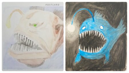
The judges (who were picking the subjects) began to get creative here, and this pick was one that would test our ability to paint lighting effects! Mine is on the right and Bernard’s on the left, and you can see our approaches are quite different. Mine seems cartoony, but I learned doing research that there are quite a few different types of anglerfish and I did my best to reproduce one of the more unusual breeds.
The judges had trouble with this one, and three split their votes. In the end I won with my fish 3.1 – 1.9, with many judges citing my light as being the decider. Here’s some specific comments:
“The fish on the right because of how well the glowing orb has been rendered.”
“The fish on the left looks a bit like something else – an orc or goblin. I think that’s because the surrounding murk looks like hair and a neck.”
“I like how dark the one on the right is and the creepy eyes.”
One judge may have said Bernard’s looks like an orc, but I can’t unsee what Bernard himself said his fish resembles: Mr T!

Porg
And here’s a judge giving us a not-real animal! Mine is on the left and Bernard’s on the right, and… well oh dear. I made a critical error in rendering the rainbow in the background (for no reason other than to use my new neon paints) and Bernard himself cited his method was to produce a portrait in the shortest time possible. Overall, the judges weren’t too impressed with either of these and it seems they were mostly choosing the one they felt least unimpressive!
Bernard won 3 – 2, and my two votes – both for the rainbow – were countered by three votes against the rainbow! It seems the judges had difficulty seeing past my the rainbow when evaluating these:
“The rainbow looks a bit half-hearted.”
“The one on the right looks like a spaniel.”
“I haven’t thought too much about the size of these artworks up to this point. I have always known that they are on postcards so in fact quite small. I can appreciate the difficulty of creating a detailed and interesting artwork in such a small space, especially in watercolour. Still the one on the right feels a bit lazy. Has the artist become bored with the competition. Is he lacking inspiration? Perhaps he is not inspired by the subject? Perhaps, like my hated of Minions, he despises the supposed cuteness of the fictional creature whose existence seems completely worthless. The banality of the subject has been rescued in the artwork on the left by the splashy rainbow, and this artwork therefore wins.”
“I LOVE the right. That porg pout. Holy bajesus!”

Quokka
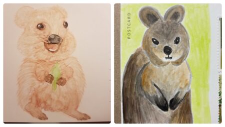
Mine is on the right, and Bernard’s on the left. Do these paintings even depict the same creature? If you’re wondering, I had attempted – and utterly failed – to paint a fur texture freehand. Even before the paint had dried on mine I said to KLS “This is Bernard’s to lose” but in the back of my mind I hadn’t forgotten the judge’s comment on the his porg and thought perhaps I could sneak a win?
It turns out I had no chance, and his painting blew mine away. The only surprise was I got any votes at all, and that his win was only 3.5 – 1.5. And yet this shouldn’t have been a surprise, since the judges continued to be as unpredictable as ever! Their comments:
“These are both delightful but the one on the right wins.”
“This is a tie. I think left presents the subject a little bit better but fundamentally it looks quite derpy. Also the nose looks weird. The right has an evil look on its face… I don’t trust the right quokka!”
“Having seem them up close in real life when I visited Rottnest Island, I feel confident in selecting the artwork on the left as the one which most accurately captures the quokka’s stupidly happy spirit“

Frog
The very first thing that entered my mind when frog was given to us as the next subject was a frog prince. I rejected it as too whimsical, and instead planned to paint a poison dart frog. But black paints are problematic (see my gorilla…) and I couldn’t get the prince out of my mind. Plus I did have some metallic watercolour paint…
Mine is on the left and Bernard’s on the right, and this one gave the judges quite a bit of trouble! Both approaches are fundamentally different, both striking in their own way and neither easily dismissable due to technical faults. Judging for this one was easily the longest of the entire contest, but in the end I won 3-2. Here’s what the judges had to say:
“King frog is best frog!”
“I love the gold crown on left, but I adore the slight leftward angle of the right head.”
“I like the color contrast of poisonous frog on mushroom. I like the eyes and soft feel of the painted frog, a little bit like Monet, but the coloring is too weak.”
“Left seems crafted to appeal to the supposed preferences of the judge. One might find the bright pretty colors and shiny baubles somewhat obvious and patronizing but I hate to admit I love this picture. Simple, balanced, well-crafter. The crown is magical. While this artwork is largely fairytale it’s as charming as a prince.”

Spider
There’s over 45,000 different types of spider on Earth and yet – with no collaboration – we both chose the same one! To Americans this is a black widow, but to both of us this was a redback spider. Going into this one I had a comfortable 6 – 4 lead, so I knew at least the contest would be a tie, and as such perhaps the pressure was off. But I redoubled my efforts, and in this case that meant I put extra effort into the web and perhaps not as much into the spider: mine is on the right and Bernard’s on the left.
As soon as I saw Bernard’s I knew the win would be his, and yet I was once again surprised when the judges agreed, albeit with a slight 2.9 – 2.1 victory. It turns out my web was impressive enough to score me a few points! Here’s the comments:
“The left spider is superb. How the artist was able to create such dimension with just two colours is genius. The natural stance of the spider is perfectly captured. The legs are well defined and the abdomen beautifully bulbous, ready to devour her mate.”
“The one on the right has a cartoon quality. The spider is cute but harmless. The colours are bright and the definition in the artwork belies the medium. The web is particularly well done.
“A tie. The shadow on the left is pretty nice. The web on the right I appreciate because it looks like it took a bit of effort. In the end though they both need to die in a fire because spiders!”

Scarlet Macaw
Mum chose the first subject (Panda) and it was finally time for her second choice. We were expecting squirrel but for our last animal she chose a colorful parrot! Bernard’s is on the left and mine on the right, and once again our efforts confounded the judges.
This was the third time three judges split their votes, and perhaps fittingly this was the result with the closest final score. In the end I squeaked in with a 2.7 – 2.3 win, and it literally came down to the very last vote of the contest! Here’s what the judges had to say:
“I vote for the one on the left, which has the best watercolor technique.”
“Left has more depth.”
“The colours are done well in both birds. The face gave each of you trouble. The winner is the one on the right; I love the composition.”
“The one on the right sparked the most joy.”
“Left is the better watercolour but right has better colours.”
Final Results!
Twelve animals over three months, and 60 individual evaluations by our panel of judges. It’s time for the final results…
I won, with 7 wins to Bernard’s 5!
Looking at total points, I scored 33.8 to Bernard’s 26.2, which means the final decision came down to only 4 votes. Looking at individual entries, it could be argued that Snake won the entire contest for me (since I swept that 5 – 0).
Looking back on the contest as a whole, here’s our opinions on our work, and the results:
- Bernard felt his best piece was his cat, and while I agree it was superb, I think his very best was his spider.
- I felt my best piece was my eagle, and Bernard agreed.
- Bernard felt his worst was his Porg, but I believe his snake was weaker.
- I felt my worst piece was my quokka, but he thought it was my cat.
- Bernard believes he should have won cat instead of me, and that I should have won eagle instead of him, and I agree with him on both of these.
- When asked for a statement on the judging, Bernard said this: “My win was clearly stolen by a panel of judges easily distracted by bold colors and metallic paints!“
- My comment on the judging is: “My win was harder than it should have been due to judges overlooking blatant rules violations by an opponent who brought pencil sketches to a watercolour contest!“
Jesting aside, thanks very much to all the judges for your valued and wise critique. Watch your mailboxes for a special reward from an award-winning artist…
We didn’t take as many work-in-progress pictures this time around, but here’s a few of mine:

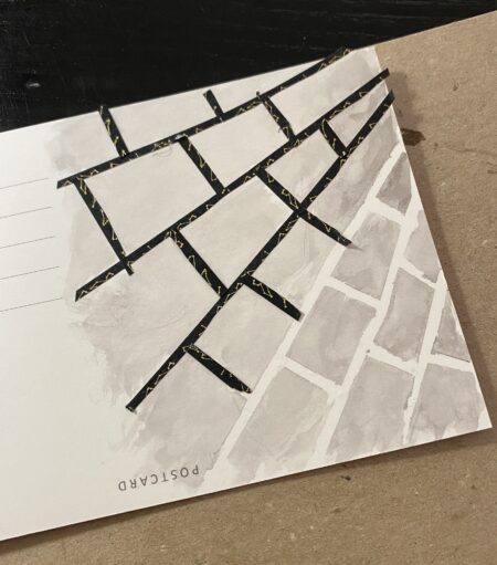
I used washi tape for my spider web, which I cut lengthwise before applying to the postcard and then painting over with a grey wash before removing the tape. I did this three times in fact (for practice), and the other two are in the mail on the way to lucky recipients. Of course while this looks good, the problem was the web was too small to paint a large spider on, and that it was extraordinarily difficult to find a reference photo posed correctly so I just made up the spider 🙂

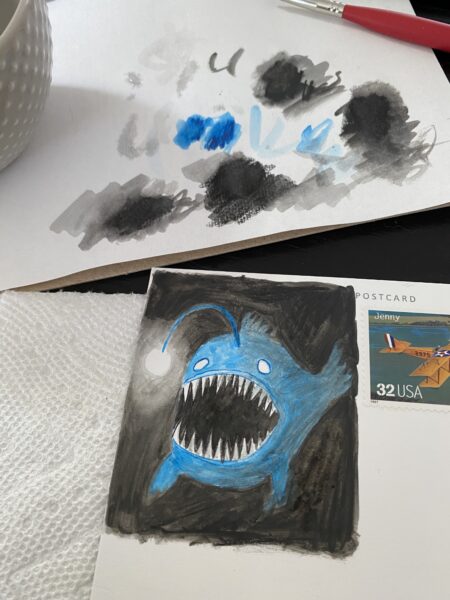
The above shows my anglerfish, which used only two colors. As you can see by this point I had mostly eschewed sketches and was applying the paint from a sort-of palette.

The size of the images sent to judges made detail difficult, and I was especially concerned (for no reason, as it turned out) that the metallic paint for the crown on my frog wouldn’t be visible. The above is a detailed photo showing how fancy that paint looks!
So another annual contest has ended. If you’re keeping track I won Postcards (in 2020), Bernard won Portraits (in 2021) and now I have my second win for Animals in 2022. What will the 2023 contest be? Perhaps we already know… but you’ll have to come back next year to find out 🙂


