Here’s a brief comment on every single game I played this past year. Once again almost all of them were on Switch, and they are presented in the order I played them this past year. If I played them for more than one hour the approximate time played is noted in brackets at the end.

Wizardry Variants Daphne: Contender for my game of the year. A wonderful remix of the Wizardry formula into a gacha with all the frustration and difficult retained! (iOS, too much time…)
Puzzle & Dragons: With 4500+ consecutive days played, this has become more a job than a game. (iOS, hundreds of hours in 2025)

Wizardry: Proving Grounds Of The Mad Overlord: Fantastic remaster of a legendary game. I lost characters permanently to a teleport-gone-wrong and needed to level new ones just before beating the final boss. It was sublime. (33 hours)
Crawlco Block Knockers: Ugly Pengo clone that isn’t fun to play. Notable only for its graphics, which are not what you’d expect on Switch. (2)
Waifu Discovered 2: Insane sequel to a bullet-hell shooter with outrageous graphics. Far from good, but I enjoyed unlocking everything in a single afternoon session. (4)
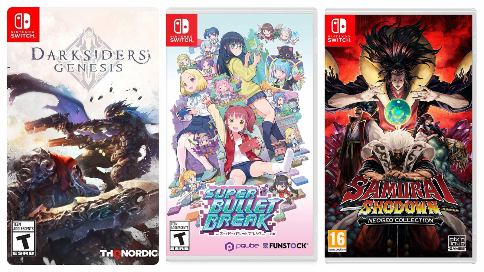
Darksiders Genesis: Competent third-person action RPG with fun but simple action and a forgettable story. Worth the budget price I paid. (25)
Super Bullet Break: Slay The Spire meets waifu gacha. Both better and worse than it could have been, and I feel it would have immensely benefited with a slight dial down in difficulty and the addition of rules-breaking relics. I enjoyed it while it lasted. (12)
Samurai Shodown NeoGeo Collection: A series that hasn’t aged as well as other fighting games. I forgot how brutal the difficulty of the early installments were. One for the collection.
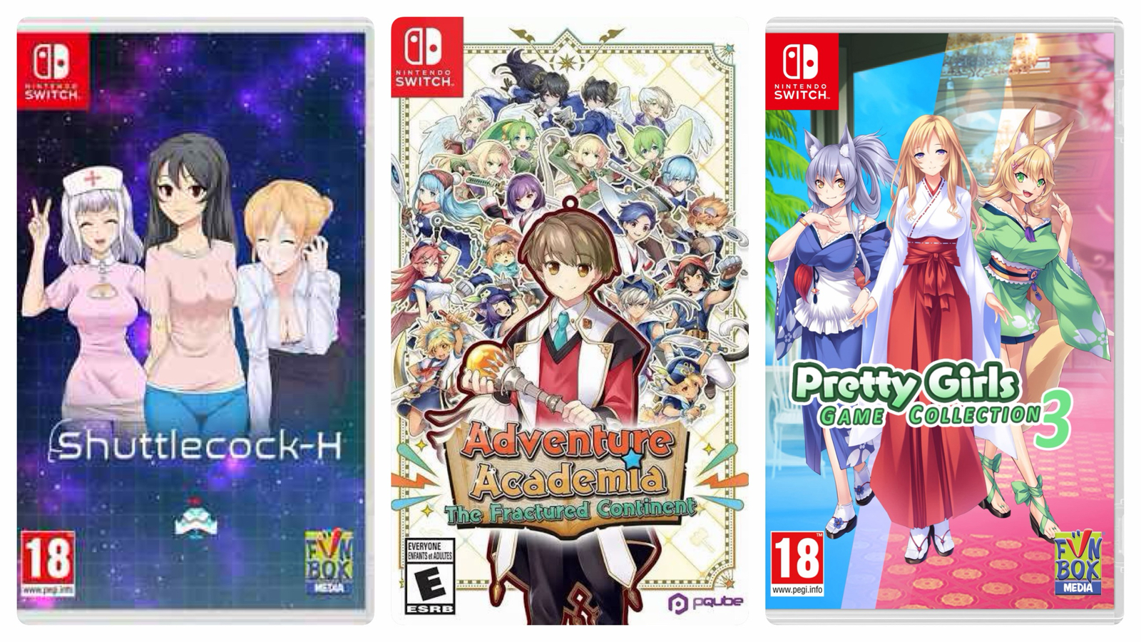
Shuttlecock-H: Weird ‘dont get hit’ bullet hell arena reminiscent of Every Arena Extend (a two-decade old game no one remembers). Insanely difficult and poorly balanced, but almost sublime in it’s challenge. Unspeakable graphics. (2)
Adventure Academia: The Fractured Continent: Switch port of a mobile tactics RPG that, in removing certain gacha elements, became grindy to the point of unplayability. A shame, since the basic loop had promise. (4)
Pretty Girls Game Collection 3: A collection of simple games with cheesecake graphics. It asks little of the player but overall the games are fun. The mahjong games are the best. (12)

Class Of Heroes 2: A fun dungeon crawl that’s much, much better than it’s predecessor. I enjoyed this one a lot. (35)
Warriors Abyss: Insanely fun and addictive ‘mousu’ rougelike that rips off Vampire Survivors in no small way. I had to delete this since I almost started dreaming about it! (35)
Mushihimesama: An iconic Cave shooter, but this port is either too easy or too difficult depending on the settings. I still recall when I first played this one in Japanese arcades. (2)
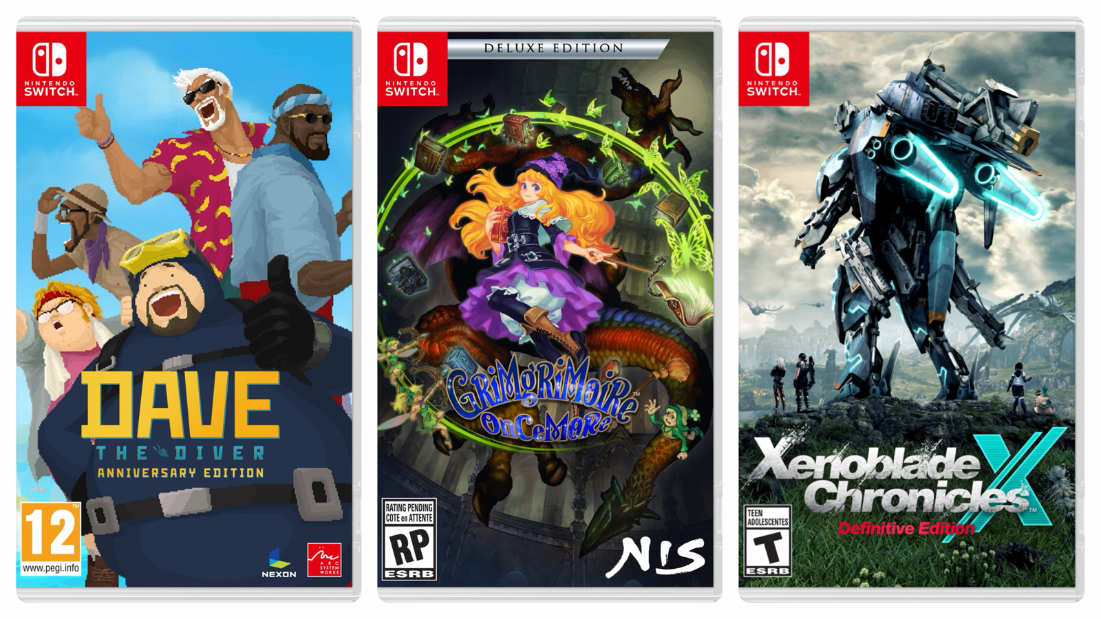
Dave The Diver: A wonderful roguelike diving game with oodles of content and a charming story. One of my games of the year. Play this one! (35)
Grim Grimoire Once More: Vanillaware’s fantasy RTS from a few years back that lacks the spark that (usually) makes their games so magical. The graphics are beautiful though. Maybe I should give this one another chance? (6)
Xenoblade Chronicles X: A clever port of the WiiU game, which is part of my favourite RPG series. I beat this when it was first released 10 years ago and had been wanting to replay it ever since. The bonus chapter added to this remaster was unfortunate, but hardly diminished the quality of this wonderful game. Forget Wizardry, this was my favourite game of 2025! (138 hours)

Balatro: Poker game programmed by Satan. Don’t even think of playing this if you value your time. (Too much time…)
Seven Pirates H: Simplistic and gratuitous RPG that I somehow played until the very end, probably because it was easy and short. (11)
Gun Force: Early 90s arcade Contra clone from Irem with no surprises in gameplay or graphics. Fun while it lasted.
Gun Force 2: This sequel is radically different and contains the DNA of Metal Slug, with amazing animation and bonkers explosions. Worth a play if you love run-and-guns.

Yars Rising: Barebones Metroidvania with decent writing and voice acting, but lacking in design nuance and – ultimately – fun. Disappointing. (6)
Dinosaur: Classic PC-88 game emulated on Switch. Sold on the US Switch store but completely untranslated and – alas – unplayable for those not fluent in Japanese.
Cat Quest 3: Shorter and easier than the previous two, but still a lot of fun. This entire series is worth your time. (6)
Gal Gun Returns: Unremarkable port of a PS Vita game but less fun due to the lack of touchscreen (when playing in docked mode). Shows its age, and more a showcase for various famous voice actresses than a good game. (3)
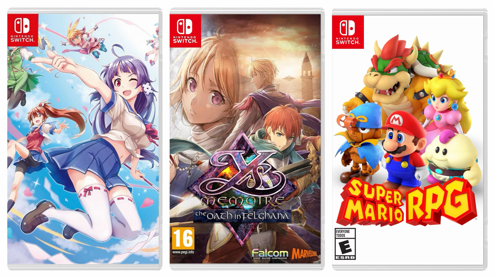
Ys Memoire: The Oath In Felghana: After playing this remake of a remake I think I’ve now beaten four versions of this iconic game! Maybe one day I’ll beat another remake? (12)
Super Mario RPG: A fun and easy game that didn’t outstay it’s welcome. The Switch port is more playable than the old SNES version. (11)

The Legend Of Zelda 2: The Adventure of Link: I beat this in 2023 but returned for another playthrough. One of my favourite games of all time. (NES, 10 hours)
Shining Soul: A handheld Diablo-like that I’ve returned to every few years with so much content I don’t think I’ll ever truly ‘beat’ it. Probably the best Gameboy game of its genre. (GBA, 10 hours)
Puzzle & Dragons 0: This spin-off from the main game was released this past summer and I quickly downloaded it and beat all the content. I stayed with it through two patches and even got so high in the progression that my username ended up in the game credits! Then I deleted it forever, since I don’t need so many mobile games. (100+)
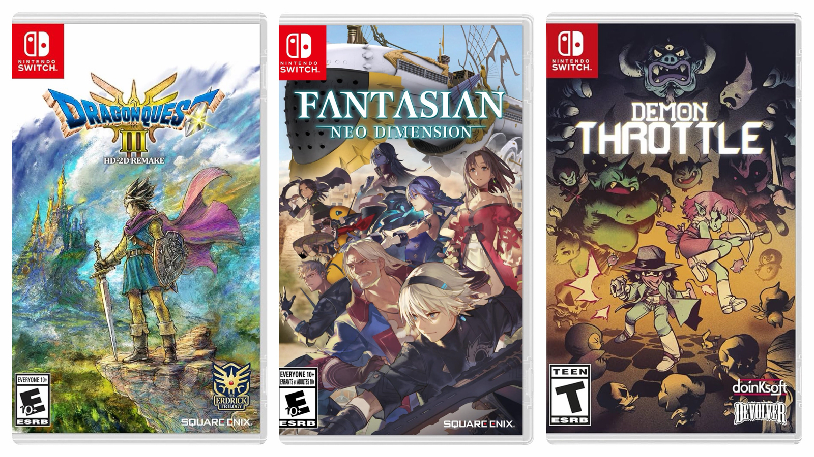
Dragon Quest III HD Remix: Wonderful remake of a deserved classic. Beautiful graphics and design, and fun from start to end. (31)
Fantasian: Neo Dimension: Starts strong with charming graphics and fun combat but the story is too weird for its own good and combat eventually becomes overly tedious. After 30 hours I gave up with no end in sight. (30)
Demon Throttle: Interesting pixel bullet-hell shooter with light RPG elements. Ultimately too (needlessly) difficult to be worth my time.
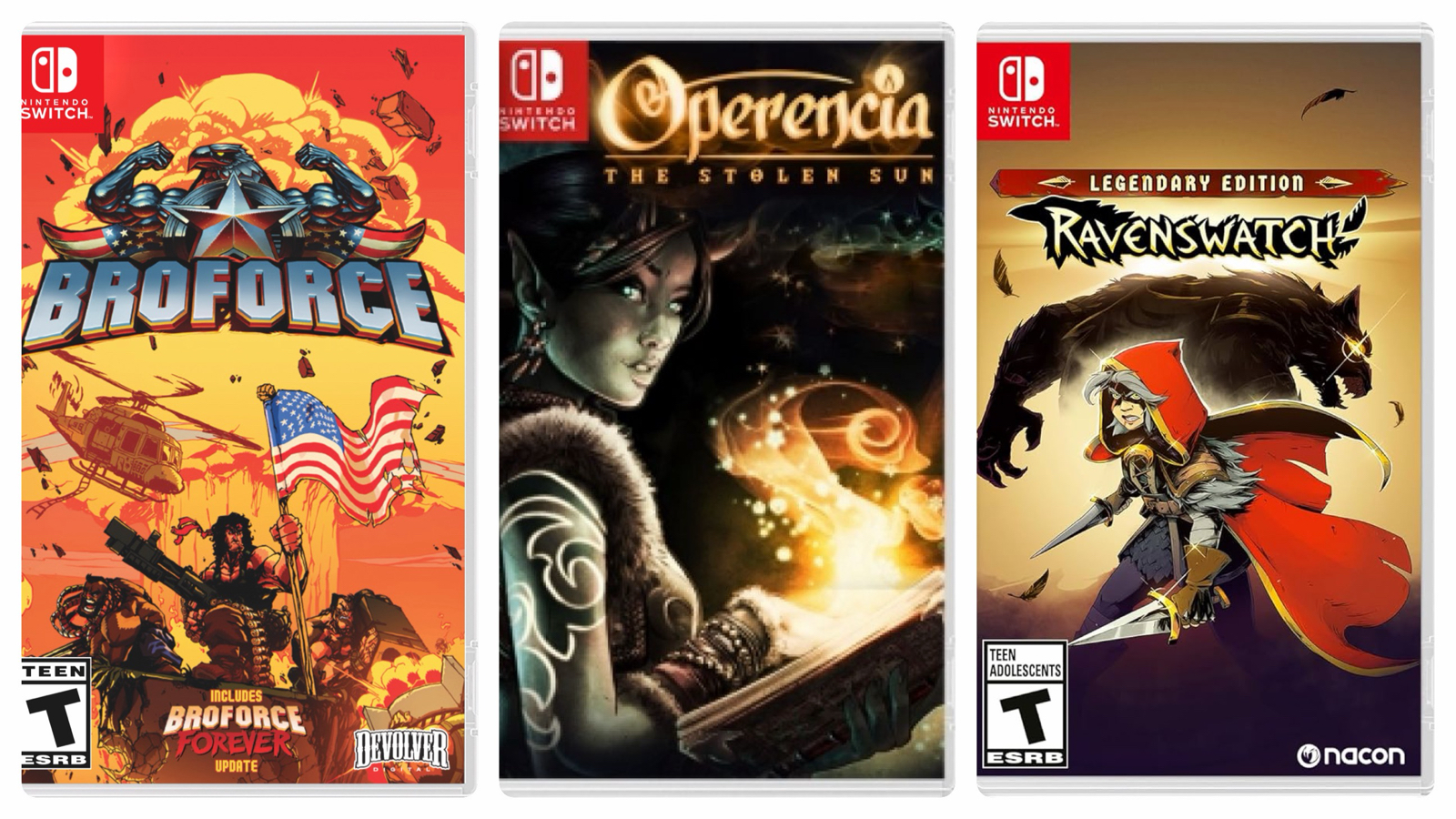
Broforce: Contra meets Terraria works well, but it can be at times too frustrating and the final (hell) level is distinctly worse than the 90% that came before. (8)
Opperencia: The Stolen Sun: Great dungeon crawl with an original, well written story and likeable characters. I enjoyed the secrets and backtracking and while combat was fun it could have been even better with a boost to melee characters. A pleasant surprise. (24)
Ravenswatch: Obviously inspired by Hades, this isn’t near as fun. I played long enough to unlock everyone, but it never quite comes together. Needs to be more generous to the player. (5)

Cadash: During the bath remodel I beat this with all four characters as I have many times before. A classic action RPG and I feel the Turbografx-16 version is best. (TG16, 6 hours)
Neutopia: A Turbografx-16 Zelda clone. While derivative, this was pure retro fun. Gets very challenging at the end, and I am unashamed to admit I abused save states. (TG16, 10 hours)
Neutopia 2: Very similar to – but better than – the first, albeit even more difficult. Still only in the shadow of Zelda. (10)

Chronicles Of The Wolf: Upper-tier Metroidvania in the ‘Iga’ school, and if that sentence means anything to you then just go and buy this one. I beat it completely including post-game superbosses. (15)
9th Dawn Remake: A fun indie action RPG with the spirit of Ultima. I happily played it to 100% completion in only a few days. (15)
Zelda: Echoes of Wisdom: Creative and fun Zelda game where you now play Zelda herself (not Link) and hands-on fighting is replaced with summoning beasts. I enjoyed exploring the dense world and devising creative ways to defeat foes and solve puzzles. This was wonderful, and ran silky-smooth on Switch 2. (22)
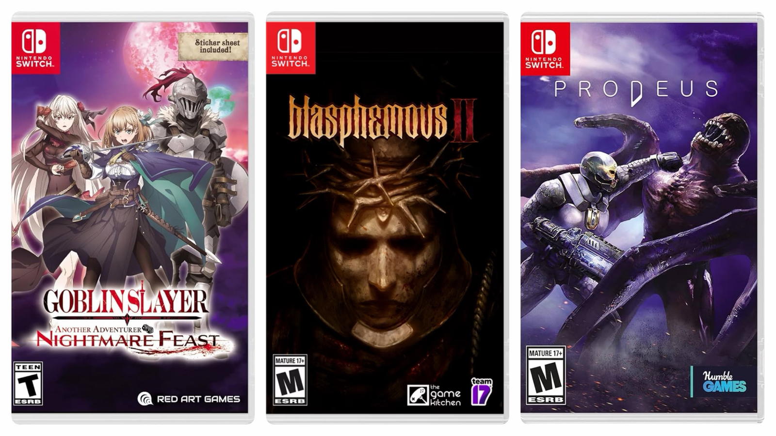
Goblin Slayer Another Adventurer Nightmare Feast: Somewhat lackluster tactical RPG with retro mechanics that I only played because I like the franchise. The final boss gauntlet is just unfair. Given the license, this should have been a dungeon crawl. (18)
Blasphemous 2: Extremely good soulslike with refined challenge and a beautiful setting. Even better than the first game. (20)
Prodeus: Competent old-school shooter reminiscent of Doom and Quake. Speedy play and a retro graphic style, but it was a bit too long. (8)
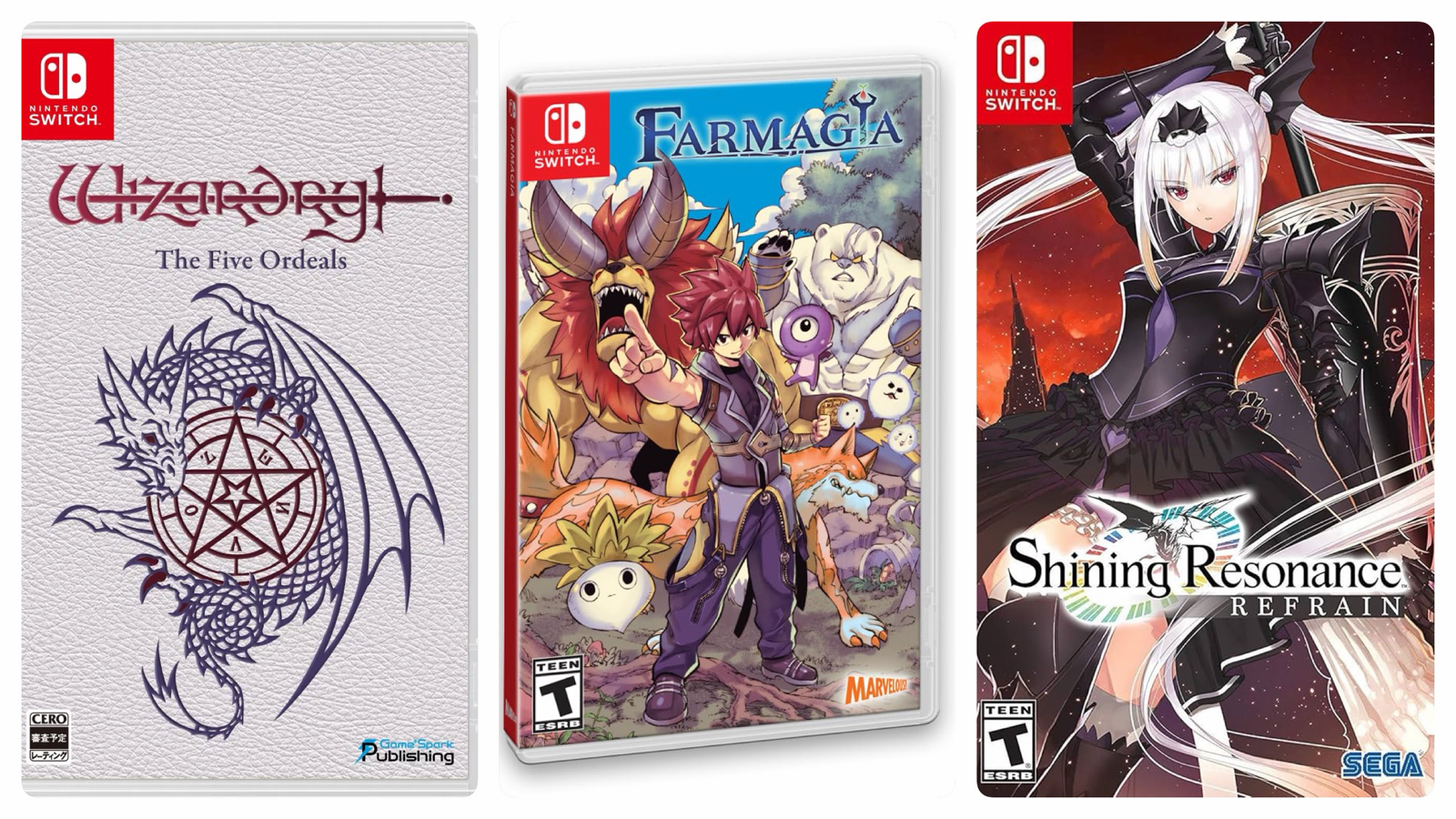
Wizardry: The Five Ordeals: Amazing installment in the series with unlimited content via user-created scenarios. Plays extremely well on Switch, and one of my games of the year. (65)
Farmagia: RTS action-RPG which reeks of low budget with every expense spared. Fails at almost everything: story, design, graphics and gameplay. One of my worst of 2025. (4)
Shining Resonance Refrain: Deeply flawed action-RPG that could have been improved with only a few tweaks to the combat system. Not at all worth your time. (6)
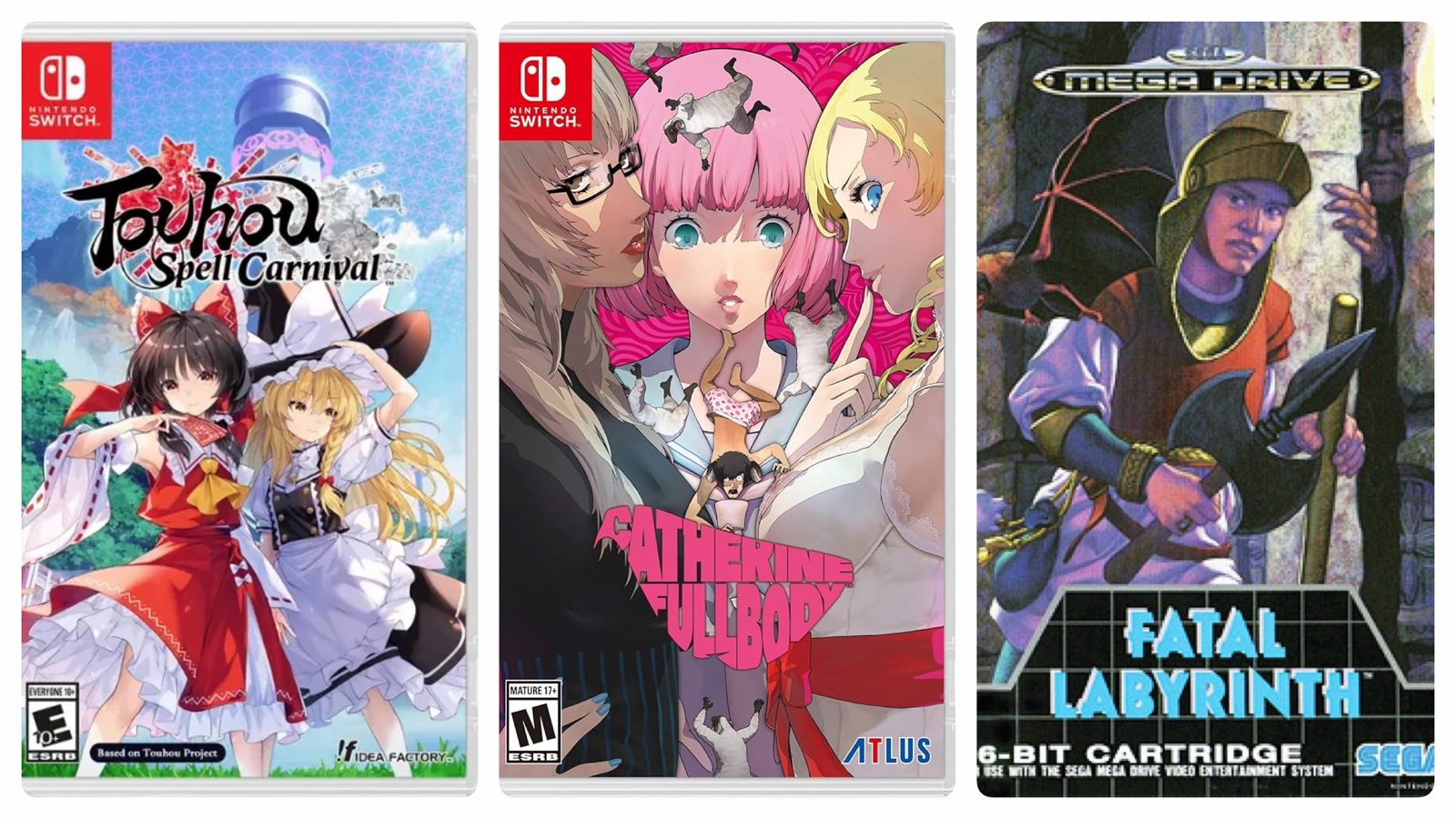
Touhou Spell Carnival: Awkward bullet-hell strategy game with terrible controls and empty moeblob characters. This should never have been released in this near-unplayable state. (2)
Catherine Full Body: A visual novel wrapped around a puzzle game. The story was good enough to keep me playing the puzzles, and overall I’m happy I persisted. A quirky game. (8)
Fatal Labyrinth: Near-impossibly difficult port of original Rogue to the Genesis. Even abusing save states to an extent rarely witnessed by humankind, I almost failed to beat this one. It’s hard to imagine anyone ever beat the original cartridge version! (Genesis, 4 hours)
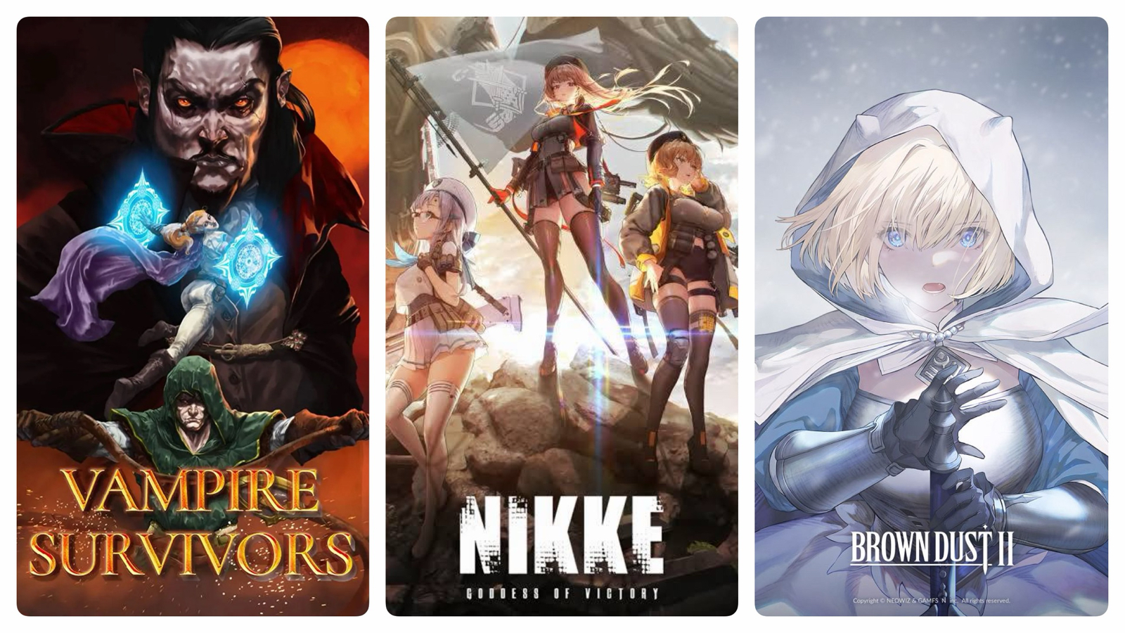
Vampire Survivors: Another game programmed by Satan. I keep returning to this one, and this year played through the Castlevania and Contra DLCs. What’s this I hear about a free Balatro DLC…? (Too many)
Nikke: Goddess Of Victory: If Wizardry Daphne didn’t exist, this would have been the second mobile game (after Puzzdra) that I picked up in 2025. I played the hell out of it for a couple of weeks – I even spent money on it! – then deleted it, never to look back. Maybe. (A few weeks)
Brown Dust 2: Graphically attractive gacha RPG that I deleted quickly since the gameplay was lacking. The graphics almost hooked me though… (A few days)

Daemon X Machina: Titanic Scion: A bit like Armored Core, a bit like Monster Hunter. This was rough around the edges and needed more time in the oven but I enjoyed it regardless and the gameplay loop was fun. A nice intro to the Switch 2. (38)
Space Adventure Cobra: The Awakening: Budget Metroidvania with bloated levels perforated with footage taken from the 1980s anime. The game wants to be more than it is, and made me wish I was watching the anime instead! (6)
Towa and The Sacred Guardians: Hades clone with pretty graphics and presentation but ruined by abysmal control and combat. How was this released like this? Not worth your time. (8)
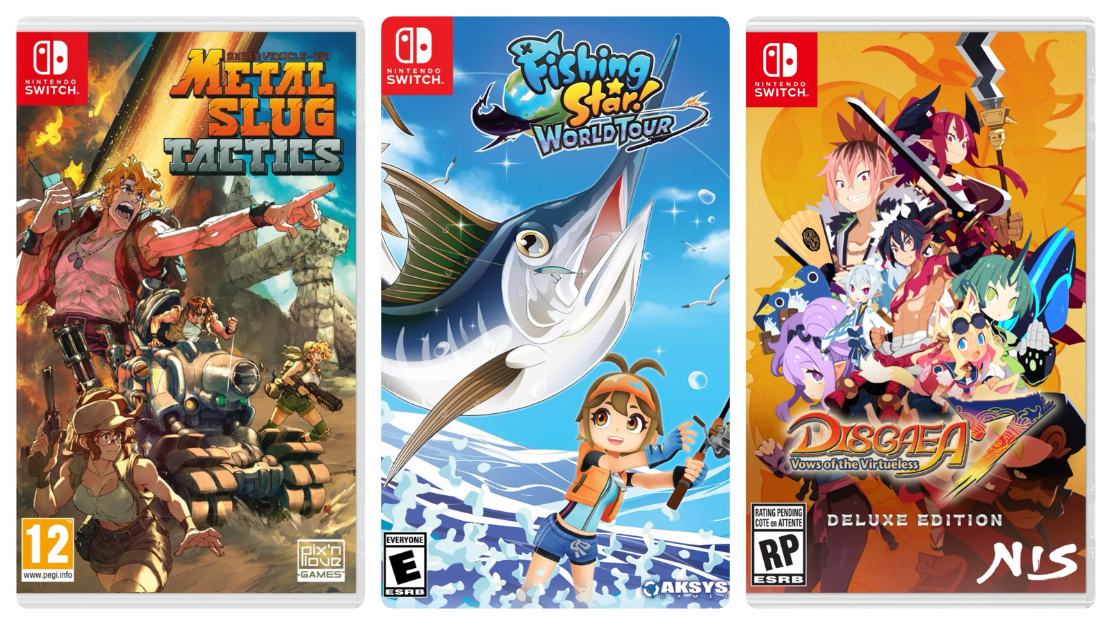
Metal Slug Tactics: Roguelite tactics game thinly stretched over the Metal Slug franchise. There are many issues with this one, but I think ultimately the hybrid game concept was itself a failure. (5)
Fishing Star World Tour: A fun fishing game with pretty graphics. Just what I needed at the time. (8)
Disgaea 7: Vows of The Virtueless: A solid and fun installment in this long-lived series with amusing characters and solid design. I broke the game early in the ‘item world’ and trivialized the entire endgame. (25)
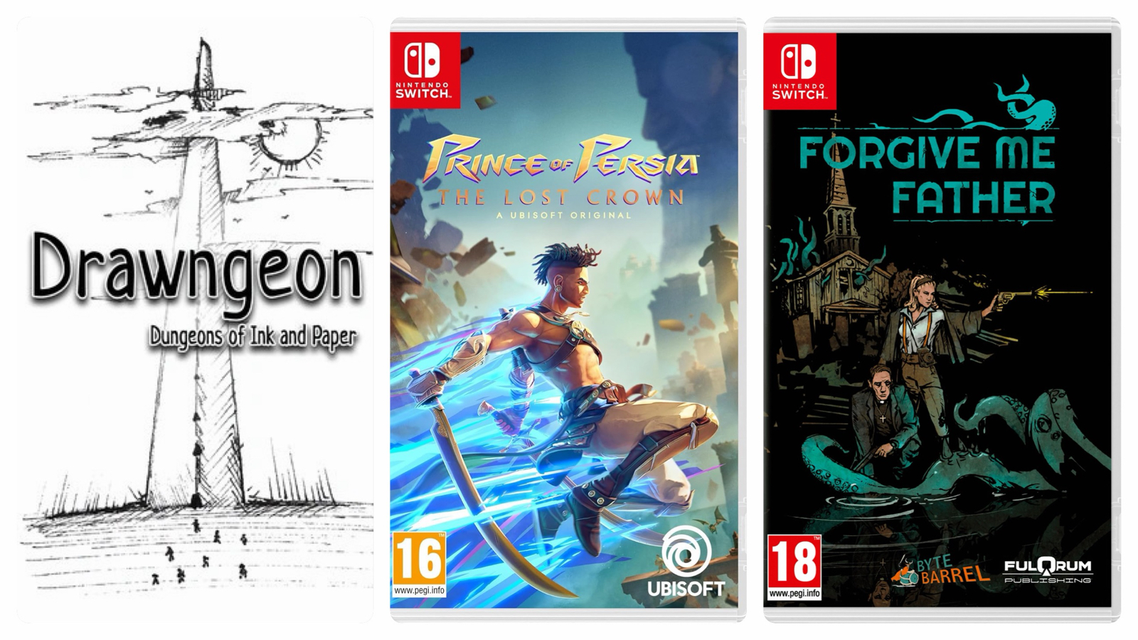
Drawngeon: Dungeons of Ink and Paper: A bare-bones dungeon crawl that felt more like a programming exercise than a full-fledged game. Fun for a few hours. (3)
Price Of Persia: The Lost Crown: One of the better Metroidvania’s of recent years. Super-tight controls made a very high challenge satisfying and I enjoyed hunting down (almost) every last secret. This is deep in the budget bin now, and absolutely worth the low asking price. (23)
Forgive Me Father: A Lovecraftian shooter in the Doom vein with character progression via level-ups and skill trees. A bit rickety on Switch, and obviously designed for mouse control, but fun enough for its short length. (6)
That’s a lot isn’t it? And what’s interesting is most of these games were purchased in 2024. What did I buy this year? Look for next years list of games played to find out 🙂