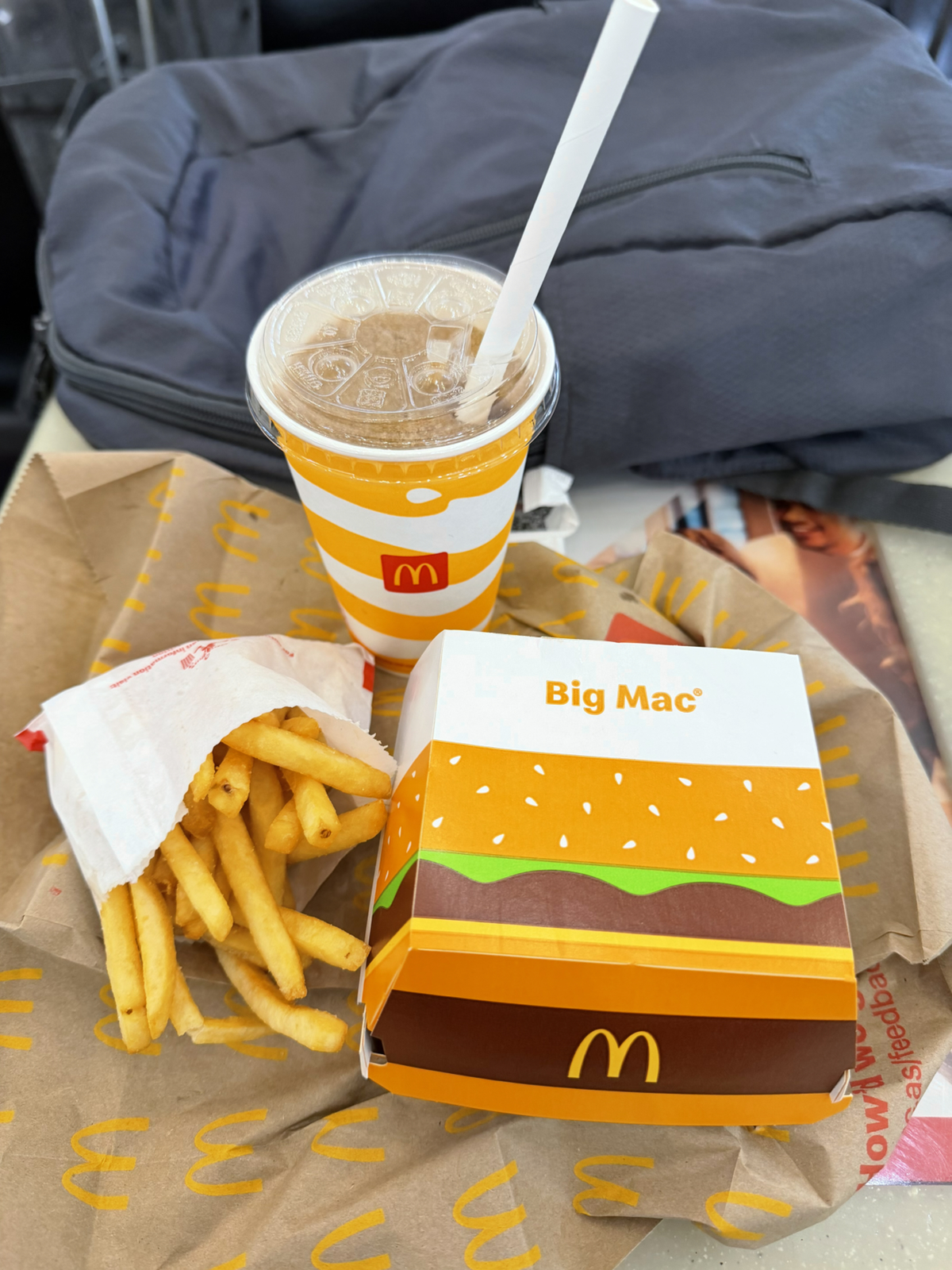
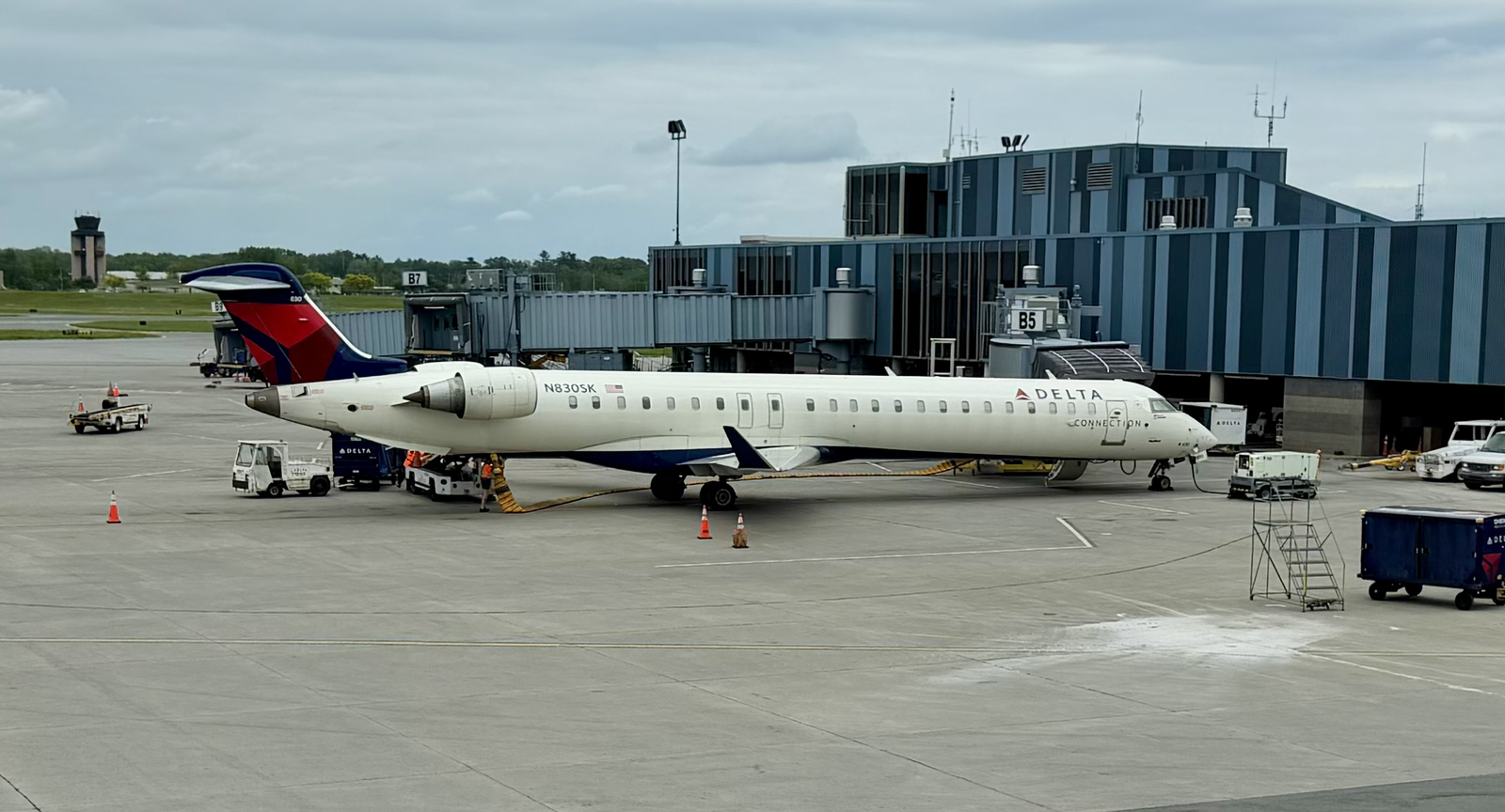
I woke at midnight, and after hours of doing nothing shuffled down to McDonald’s for breakfast around 5 am. The streets were almost empty, and the few souls I saw were clearly still enjoying their Friday night. I remain ruined by jet lag, and felt like a passenger in my own body as I staggered into Maccas…
…And then immediately walked out. It wasn’t the refuse and unidentifiable liquid on the floor. It wasn’t the crooked miscreant unconscious at his table, broken burger dripping limply from his hand. It wasn’t even the thin-lipped juvenile watching me with villainy in his eye. It was the smell. Enough said.
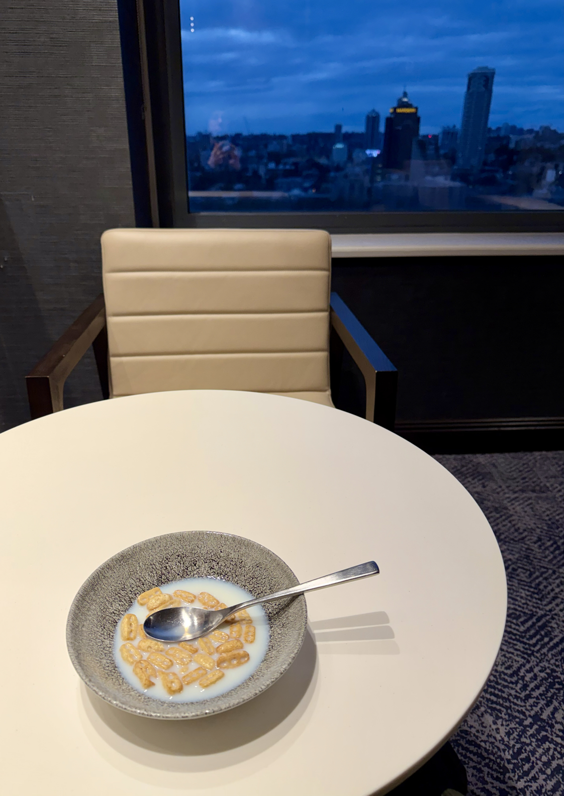
As it turns out my room includes a lovely breakfast buffet, so I hastily returned and enjoyed lashings of bacon chased down with watermelon. It was sublime!
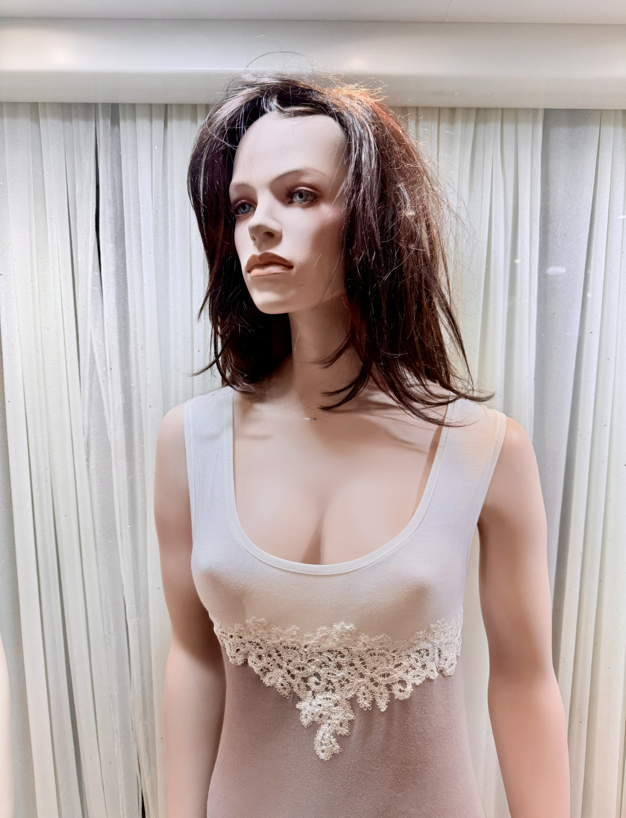
Then I shopped, for many that had given me a list and some that hadn’t. Items were purchased, and they’ve already been squirreled away in my bags. Thrice I passed this mannequin in my wanderings, and I’m sure her position changed. Even fake, she looked more alive than I felt.
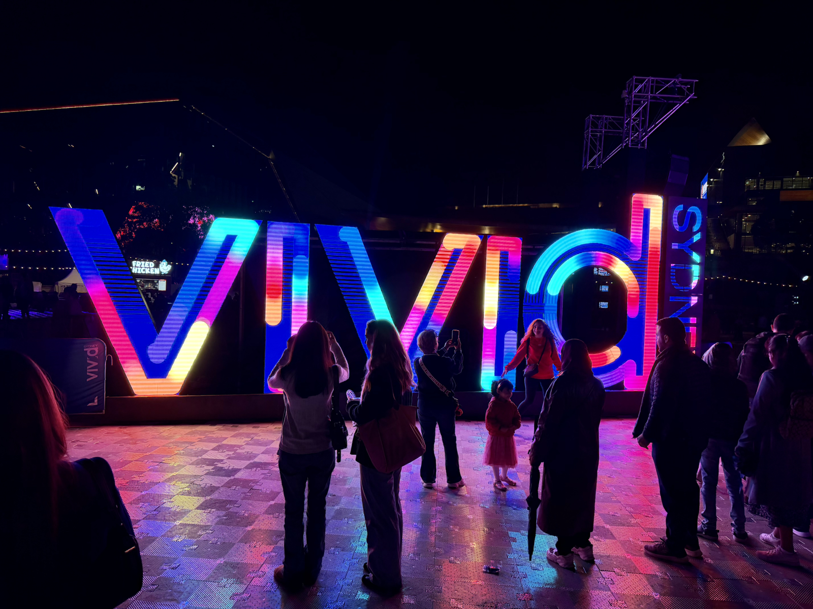
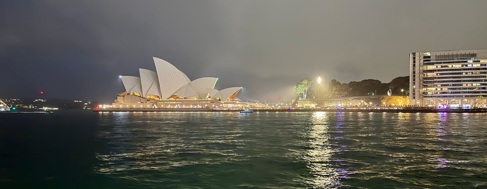
Sue came down to Sydney today – we’re heading off on a road trip tomorrow – and she had the brilliant idea of us taking a Vivid cruise. Since my plans of seeing the lights were thwarted last night I was optimistic, and happily the cruise exceeded even my high expectations. It was amazing.
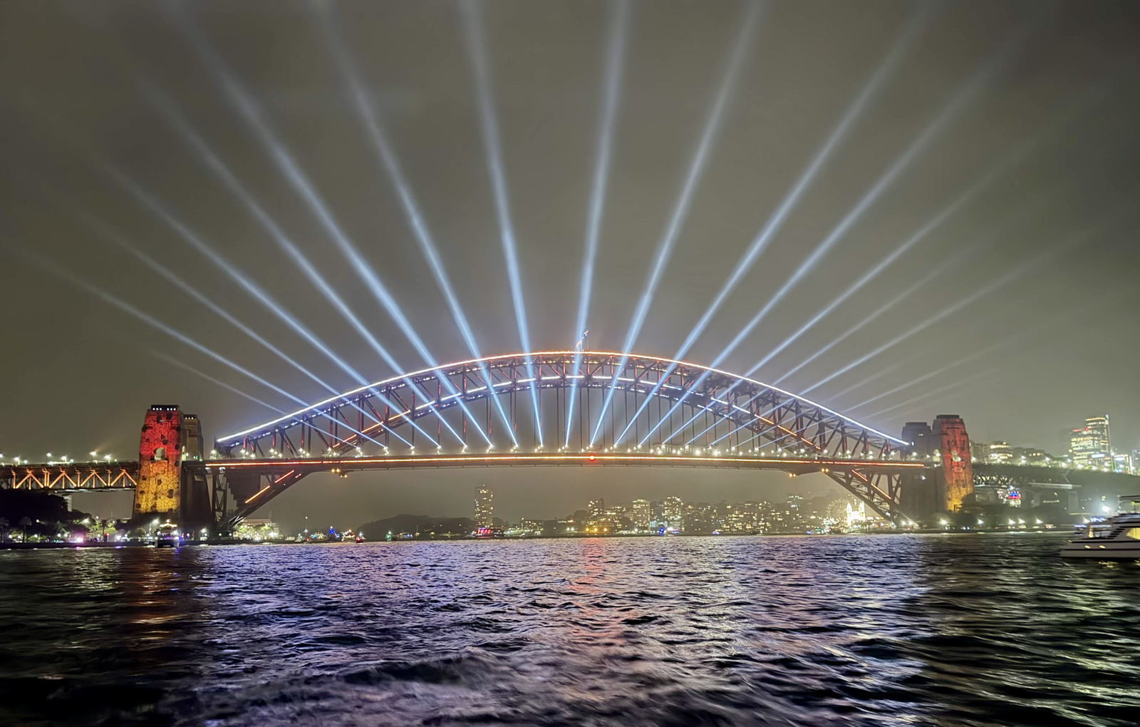
I’ve been to Vivid for several years now, and it’s so spread out and the light installations so large you can easily get good views. But today I learned the best view is from a boat!
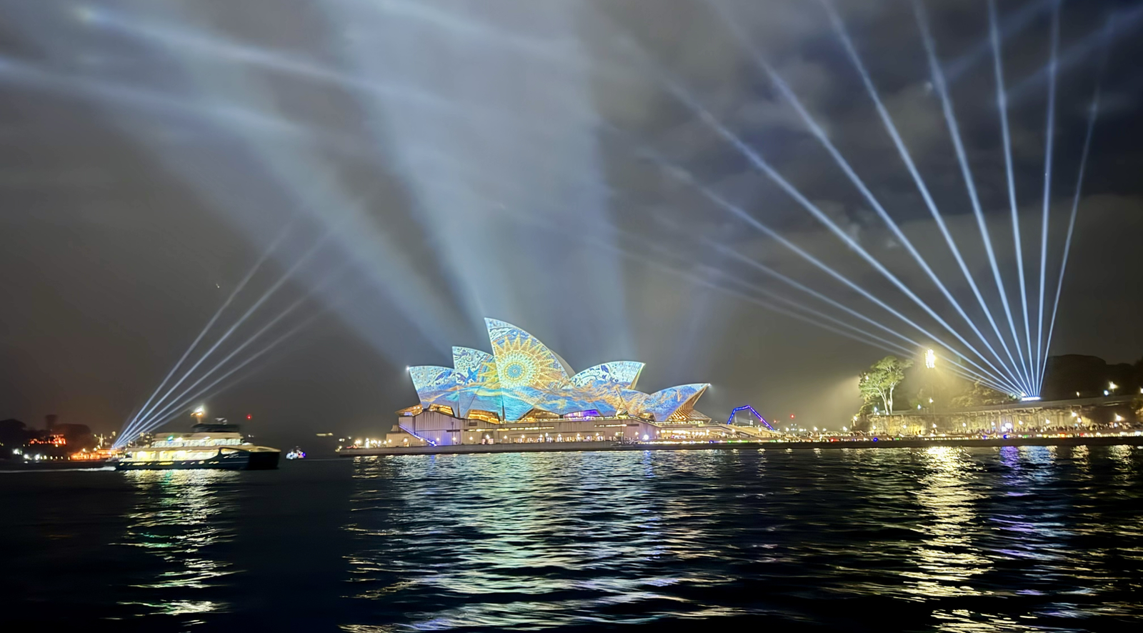
The bridge and opera house both looked brilliant in the lights, and the reflections on the water only accentuated this. As you can also see they dialed the spotlights up to 11 this year and the light rain in the air made them extra visible.
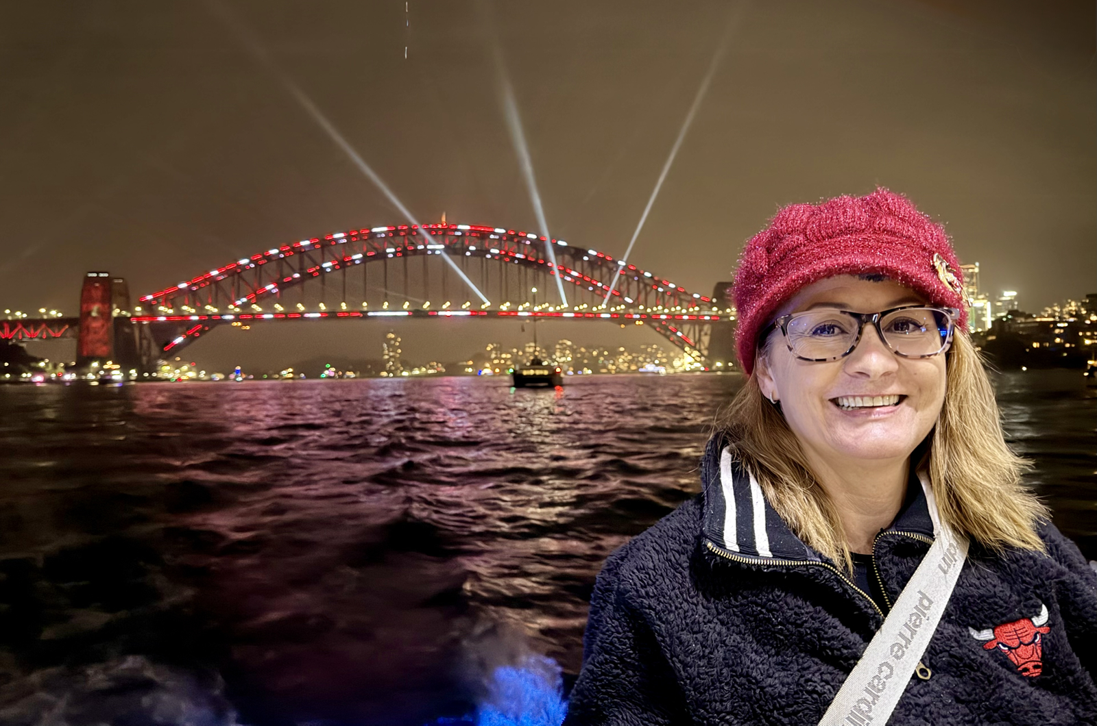
The boat went from Darling Harbour to Circular Quay and back and the cruise took about an hour. The weather was great – not cold at all – and the views unbroken and much better than you see on land. While the boat sometimes rocked, I’ve long since mastered my sea legs and it was no trouble at all.
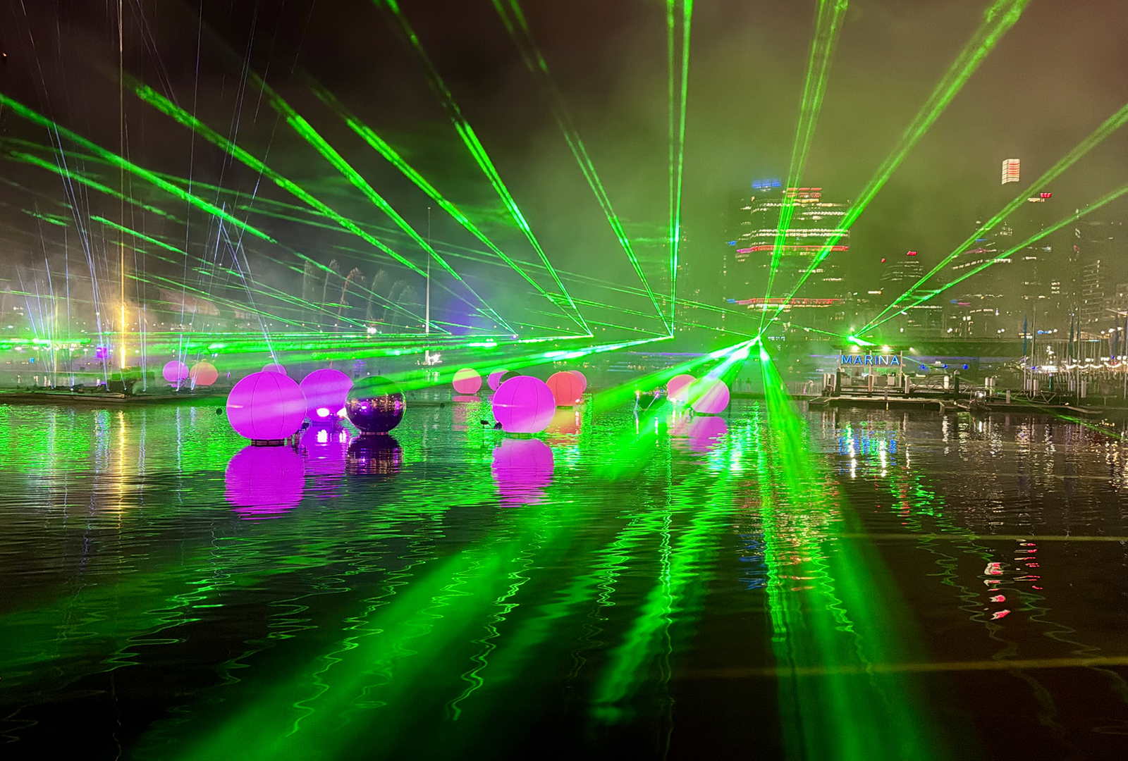
Afterwards we walked over to the installations at Darling Harbour (like the laser/sound show above) but by this point I’d been up over 20 hours and needed my sleep. And now, with this post done, that’s exactly what I’m going to do!