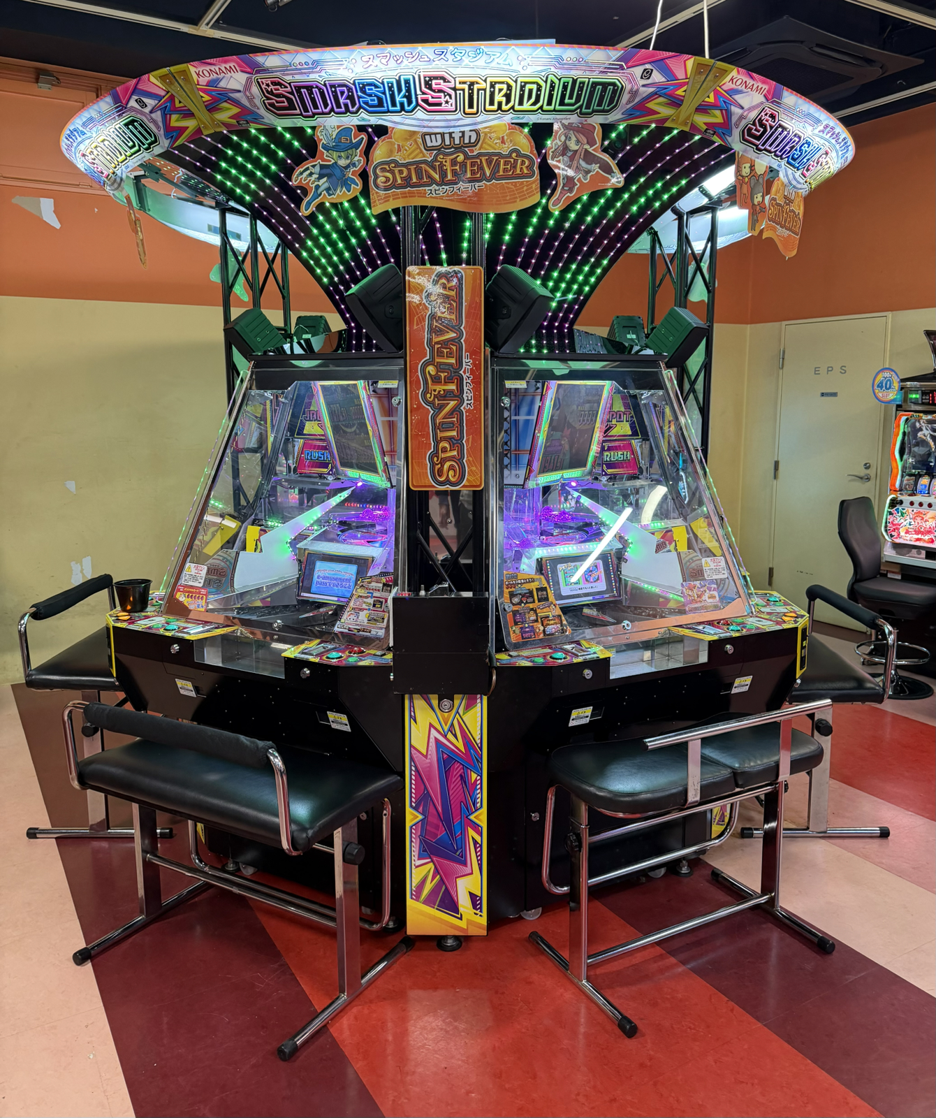
One thing in Japan I’d been wanting to try for many years were ‘medal games’. This is a medal game:
These are known in the west as ‘coin pushers’ (and are the basis of the TV show ‘Tipping Point’). The technology of the Japanese ones are similar to the western ones, only they take it much further here to make the fun based around playing as opposed to winning.
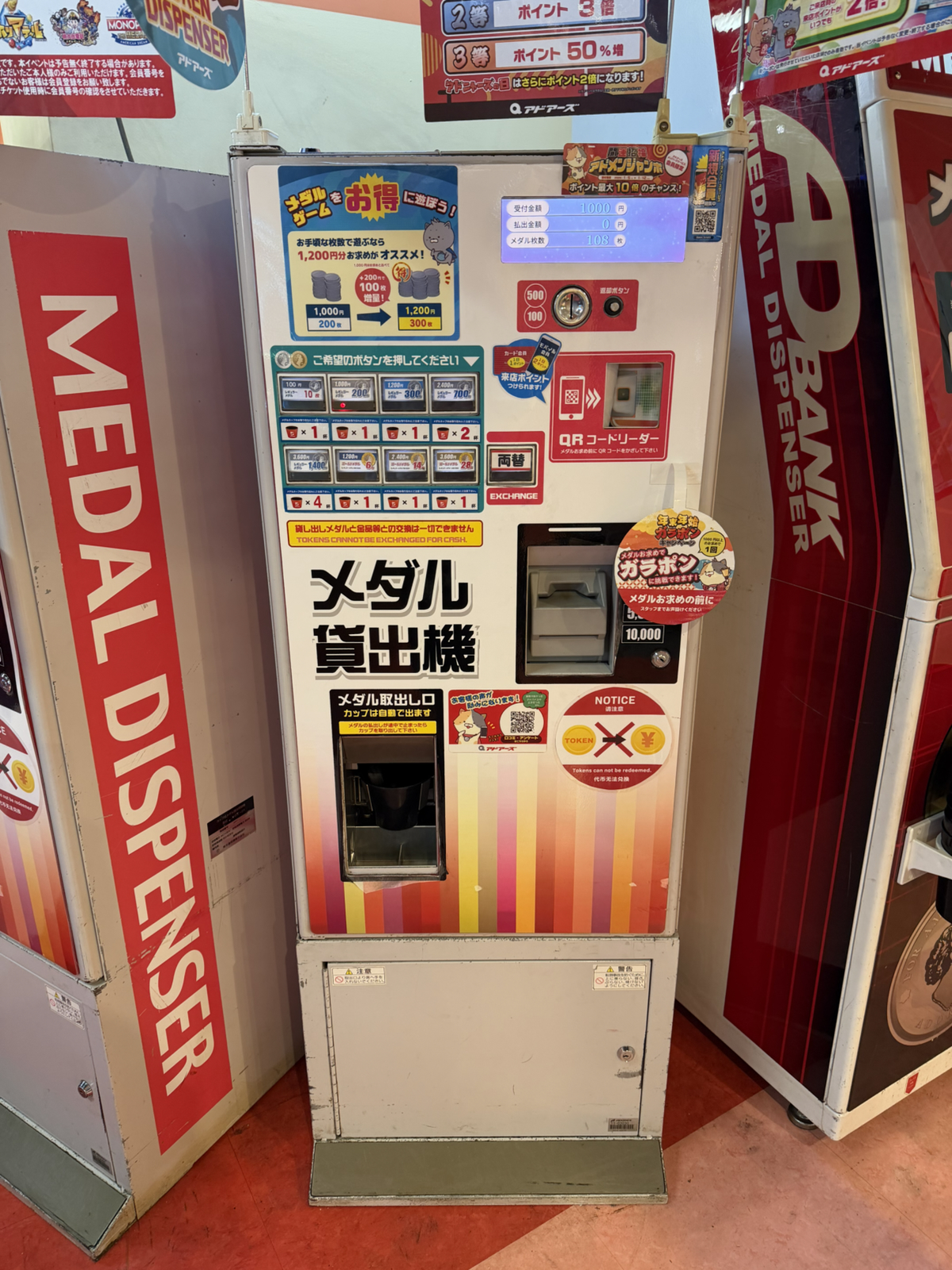
Before we get to the games I’ll talk about the medals. These are what you put into the machines to play, and you buy them at a machine like the one shown above. Depending on the Game Center we got anywhere from 120 to 200 medals for ¥1000 (about $7). Medals are not redeemable in any way – not for money or prizes – and are simply used to play the games. While you can win additional medals playing, they only extend your playtime.
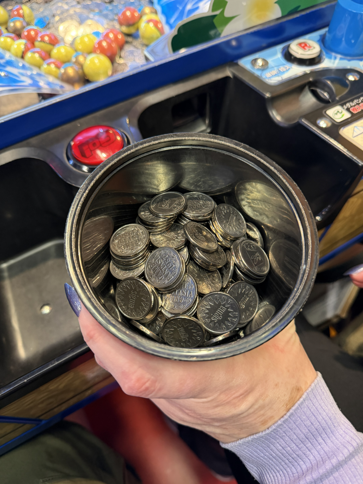
The medals are similar in size and shape to a ¥100 coin and a cupfull has a decent heft to it. When you’re in the medal game section of a Game Center there’s an endless cacophony of medals being carried and used by the players.
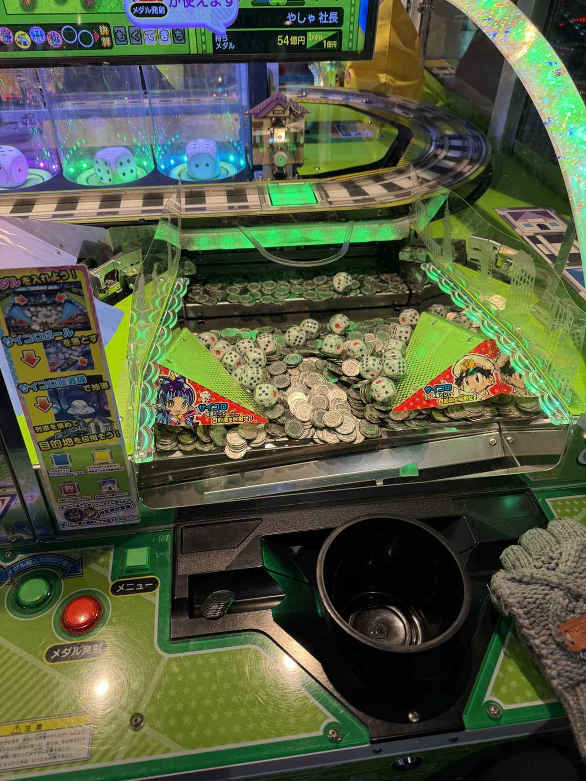
Thats a typical playfield. You can see the coins and the pusher behind them. When you put a medal in, it gets dropped onto the pusher like in any western machine. You can also see lots of transparent balls with dice in them: that’s part of the gimmick with this machine. When medals fall you get them to play with, but when a ball drops it triggers some sort of event on the screen which is above or to the side of the pusher. These events usually reward additional medals, but can also do things like power up jackpots or other things that in time make you win more.
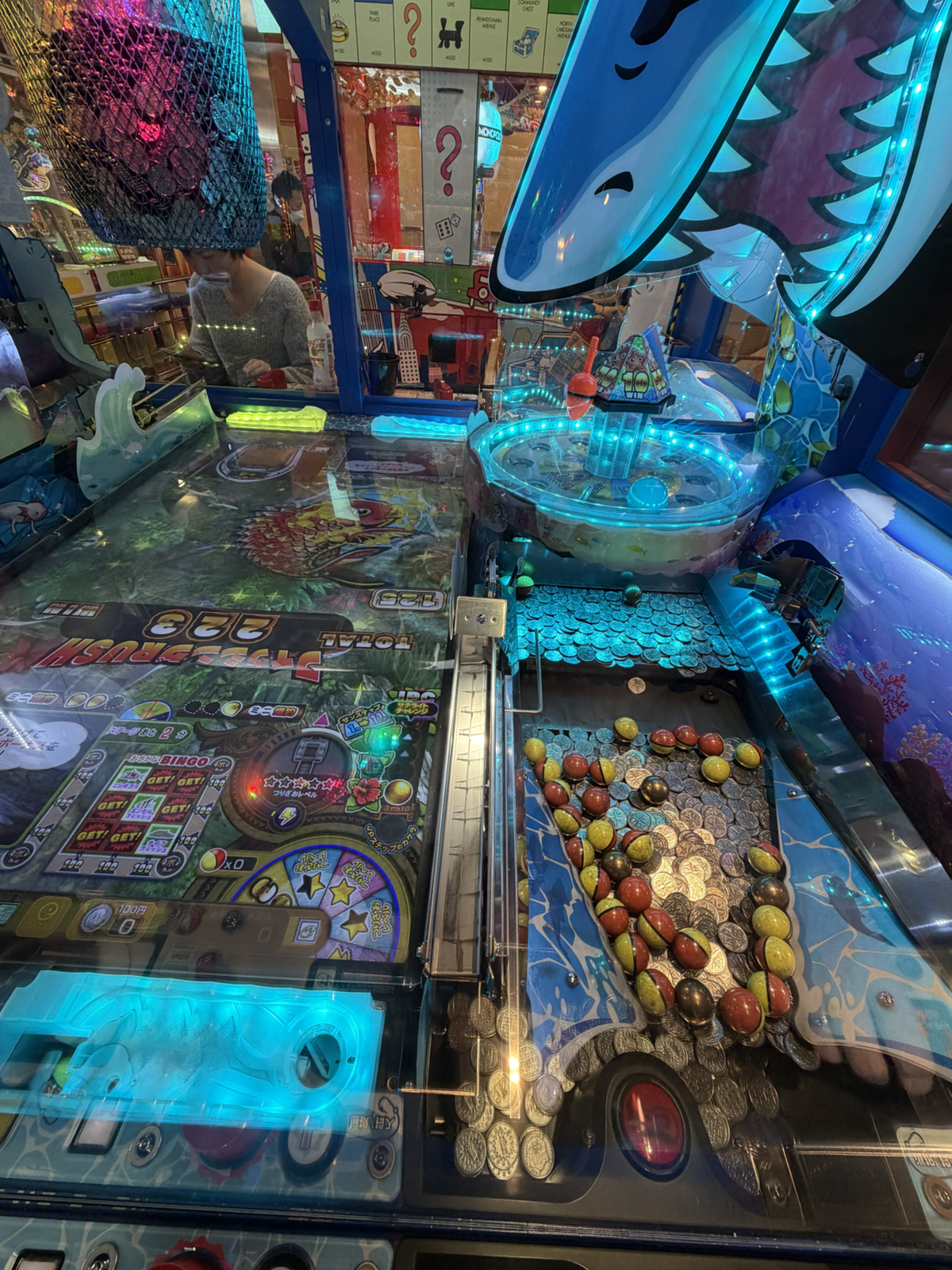
The machines are heavily based around these additional events, and gameplay – at least as far as we’ve discerned – focuses on getting the balls dropped to trigger events and increase prizes. It’s a little hard to see in the above pic but the right side is the medal/ball field and the left a giant screen. In this game every time a ball drops you can ‘go fishing’ on the screen at left to win additional medals.
Triggering and winning events is the reason these games are popular – remember you can’t redeem medals or win any physical thing. The games payout the medals by automatically dropping them onto the playfield. A few medals doesn’t have much of an effect, but a big win – 100 or more – leads to a cascading effect where you can keep triggering additional wins. It’s addictive and fun.
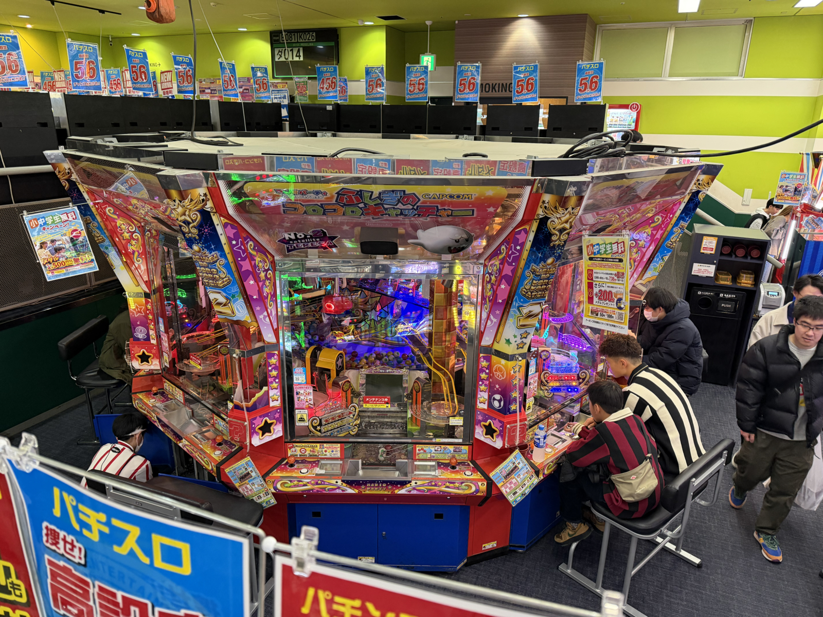
Most larger Game Centers have a medal game floor, and it’s usually got a half dozen or more machines like the one shown above. This has 8 stations (for up to 16 players since the seats accommodate 2) and a massive rotating section inside which can be part of the events. Often every seat at these games will be full, and there have been times this trip when we’ve been unable to play games due to them being popular.
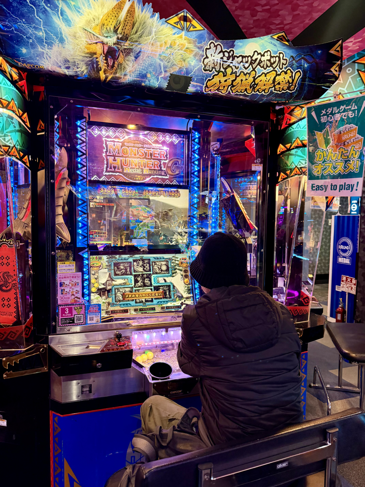
There’s loads of games, and the more recent ones are extremely technologically impressive so this is a game genre with ongoing innovation. We’ve played a few games now and our favourite so far is a Monster Hunter one based around a conventional slot machine system where the medals can drop into slots to trigger the wheels. This machine consistently triggers small events with low wins, that are fun regardless.
There’s no doubt that a language barrier prevents us from understanding the intricacies of these games, especially with regards to how to build multipliers and win jackpots, but they’re a hell of a lot of fun regardless. This won’t be the last trip I’ll play medal games!