Back in the summer when our bathroom was being renovated, I ‘lived’ downstairs with Zoffy. I took the chance to grab some unread gamebooks from my shelf and play them. Here are my thoughts.
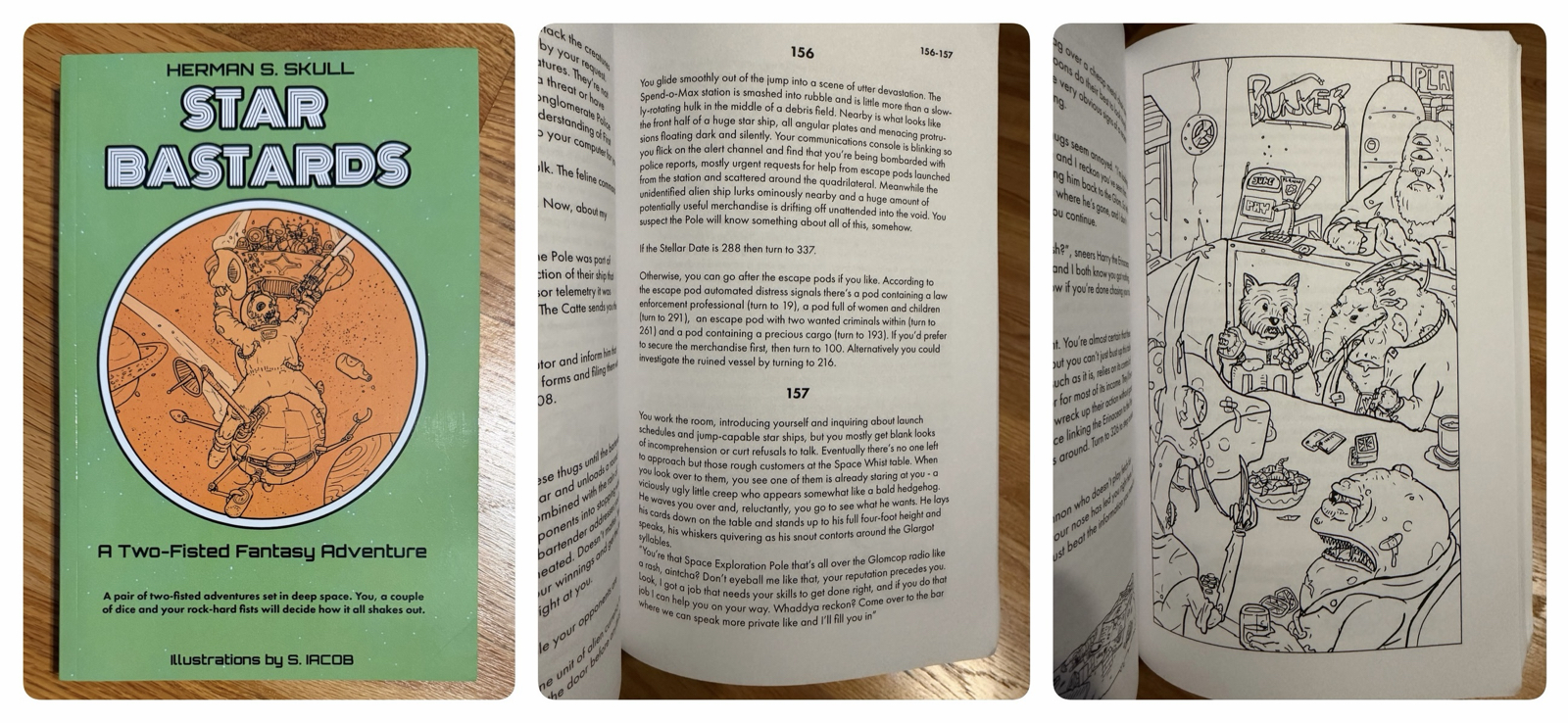
Star Bastards, successfully kickstarted in 2016, is supposed to be a newly rediscovered ‘long lost’ gamebook from the 1980s. I think it largely misses the mark both as a work of fiction and a game.
You choose one of two roles before you begin (law enforcement or a fugitive) and the story involves the cop chasing the criminal through space. I played the fugitive and in my first playthrough won (I think?) in fewer than 25 entries. The ending was vague enough that I wasn’t sure if it was a good or bad one, but I had no interest in trying again.
The game has lots of overly complex systems, almost none of which (including combat!) I used in my playthrough. The writing, while verbose, often lacks detail and the comedy is weak and breaks the fourth wall in a way that doesn’t really work.
While the book has more art than most modern gamebooks, it’s fairly amateur and in some cases visibly pixelated as of the source files were low resolution.
This book is a miss. I actually own the second in the series (a fantasy tale) which I’ve read isn’t ‘as good’ as this one so it’ll probably sit on my shelf a while before I read it.
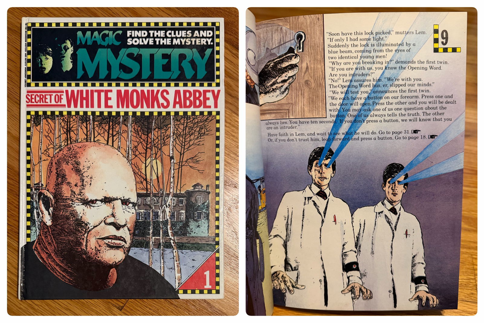
Secret Of White Monks Abbey, released back in 1985, is a strange book. It’s unlike the others included in this post in that is is (almost) systemless and every entry is a single full-colour page. But while brief, it’s a little more complex than your typical choose-your-own-adventure.
There are only 46 entries, and a single playthrough includes only about 10 to 15 of them. The entries are very short and as a result the story is very disjointed with frequent and unbelievable location changes.
It’s not a difficult book, and trial-and-error alone got me all the endings in well under an hour. None of the endings made any logical sense, and in the end it’s not ever even fully explained what’s going on in the titular mansion.
While obviously written for children, I wonder if a young reader would have enjoyed this even way back in 1985?
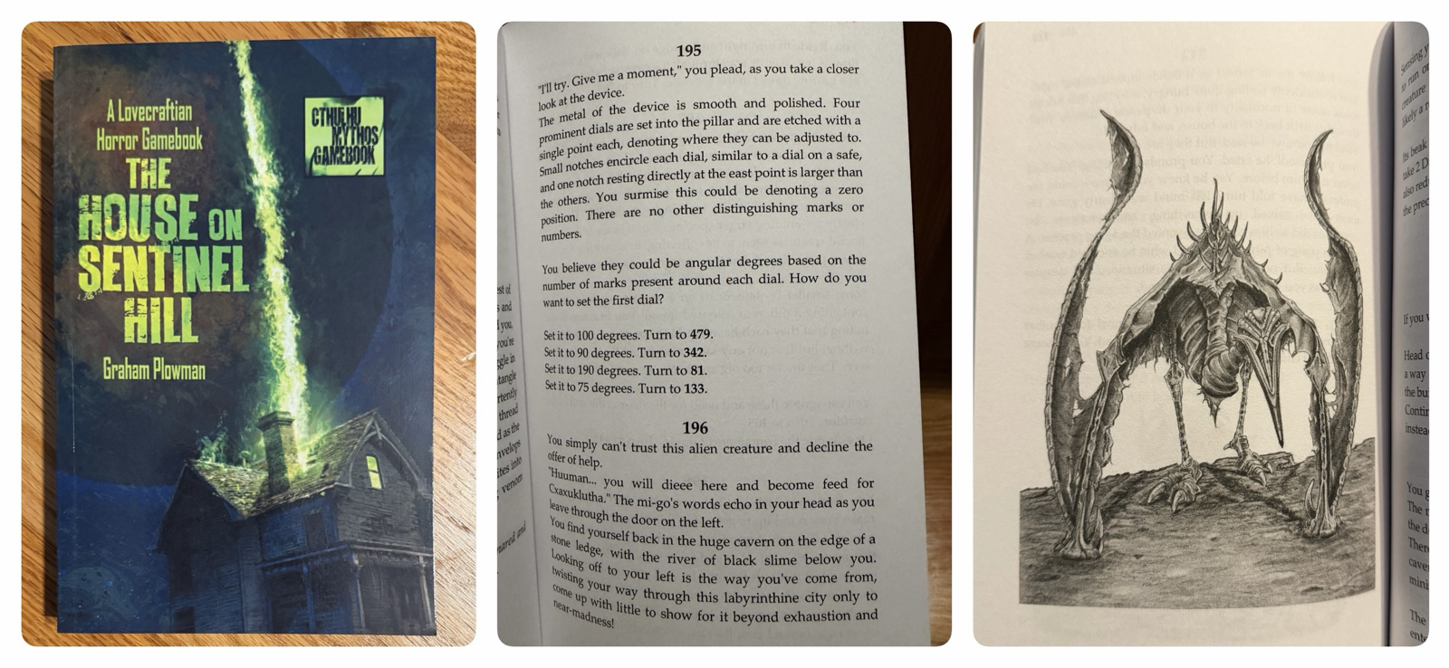
The House On Sentinel Hill is a Lovecraftian book released in 2022 which of the ones in this post is closest in format to a Fighting Fantasy book. It’s a well written and structured book which suffers from a very high difficulty.
Set in 1926, you play an investigator visiting an abandoned (or is it?) old house in New England and quickly getting mixed up in all sorts of cosmic horror. The story and writing are both strong from the start, and its cinematic in style and very faithful to the works of H. P. Lovecraft. It’s also got lovely, creepy art.
But it’s difficult. Not only does it have a punishing sanity mechanic (like the Call Of Cthulhu RPG), but the default player stats lead to failed rolls 58% of the time. There’s a lot of instant deaths, many of which have no preceding hint or warning, and most of which are distinctly grim.
When I played these books – since I was taking notes to review them – I decided to play them faithfully and not cheat. For this book this meant many deaths. I was so intrigued by the setting and the story that I kept trying and ended up playing it over half a dozen times before putting it down. I kept getting stuck at the same point: entering combinations into a weird alien machine. While several of my attempts had me visiting bizarre dimensions and being killed by various cosmic beings, flipping through the book showed me there was still a lot I never saw.
I wondered what I had done wrong and eventually sought a hint online. I managed to find a Reddit post by the author himself who gave a vague hint which didn’t help at all. Other reviews commented on the difficulty as well, and some specifically cited the same combination that stymied me! I never did find the solution.
It’s a good book, but too difficult.
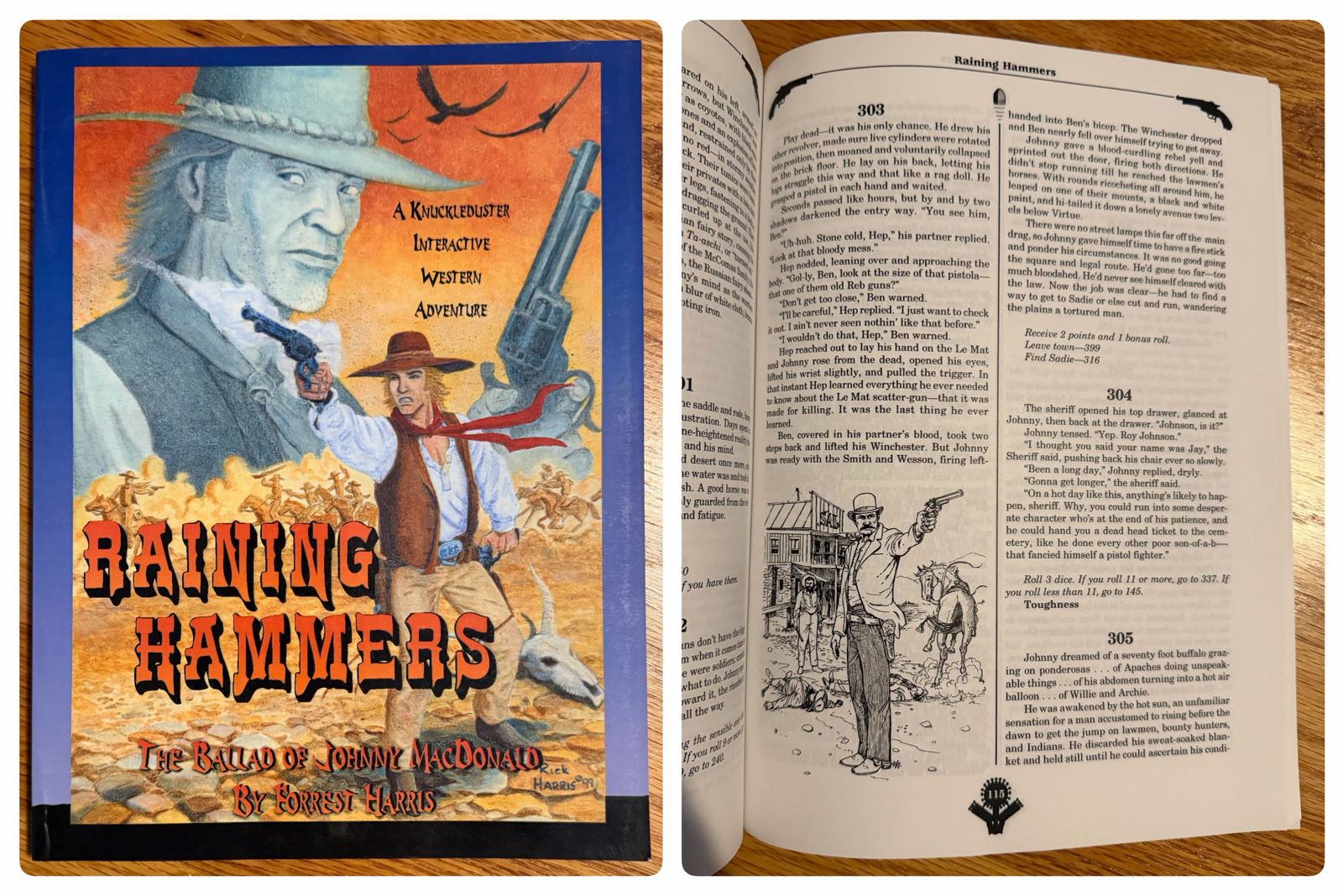
Western gamebooks aren’t common, and Raining Hammers may be the only one I own in a collection that now numbers well over 500 books. This is a book written for adults, with mature themes and writing, and takes a realistic (as opposed to fantastic) approach to its story of a lone gunman on a mission of revenge.
From the start this one works against the reader. The author made the unusual choice of writing the book in third person, which doesn’t work in a gamebook. It doesn’t feel like a gamebook either, as if the author wrote a normal book and then tried to turn it into an interactive one.
The first entry is almost a novella at six dense pages of tiny font, and sometimes I went from entry to entry with no decisions to make. It’s mostly linear, but also has occasions where you can revisit areas which don’t work in the context of the story. The gambling system also feels like it should have been cut, but perhaps if it had been this would have felt even less like a gamebook.
I think this one tries hard, and almost works, but in the end felt more like reading a novel than playing a game. I didn’t win, but I also didn’t care to try again. I think its legacy is that at 26 years old now it remains one of the very few gamebooks in its genre.
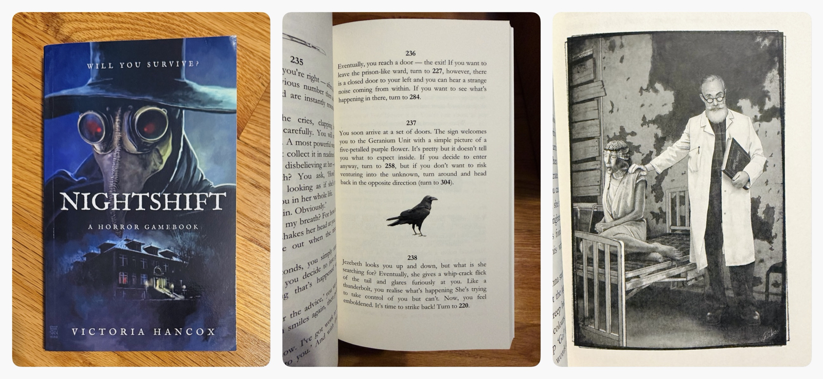
Nightshift is the best of these five by a wide margin. I was dubious at first since this is a book with no combat or even dice, but the puzzle-based gameplay is clever and the story well-written and very creepy.
You play a hospital worker who finds themself trapped in a hellish dimension full of demons, witches and all sorts of other weird denizens. You wander the hospital seeking a way out, and must solve many puzzles to find the true path to victory. I’d liken the story to Silent Hill or Hellraiser and it can be genuinely creepy at times.
As mentioned the writing is excellent, and the author skillfully avoids the usual pitfalls of gamebooks set in the modern world. At first the cause of the madness is unknown, but the slow reveal of what’s actually going on is done skilfully. I was particularly impressed by how well this worked through multiple attempts, where initially innocuous events sometimes take on a very different meaning.
The puzzles range from typical inventory or codeword based ones (do you have the brown key?) to math puzzles, word games and some that are more complex and clever. While dice are not needed, you will have to keep careful notes if you hope to beat this one.
This is the first in a series of six books by the same author, although I don’t think the stories are related. I was impressed enough I bought all the others, and look forward to playing them. This one is recommended.