It’s time to open some more packs of Japanese TCGs, all purchased during my trip either last year or this recent summer. Most of these are new expansions for old games, but some are brand new games as well.
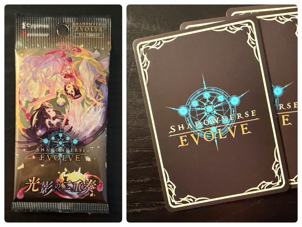
Shadowverse Evolve is a physical card game based on the digital Shadowverse card game. This expansion – Duet of Light and Shadow – was released in April 2024 and is the 9th of now 18 expansions for the game (they seem to release about every 2 months).
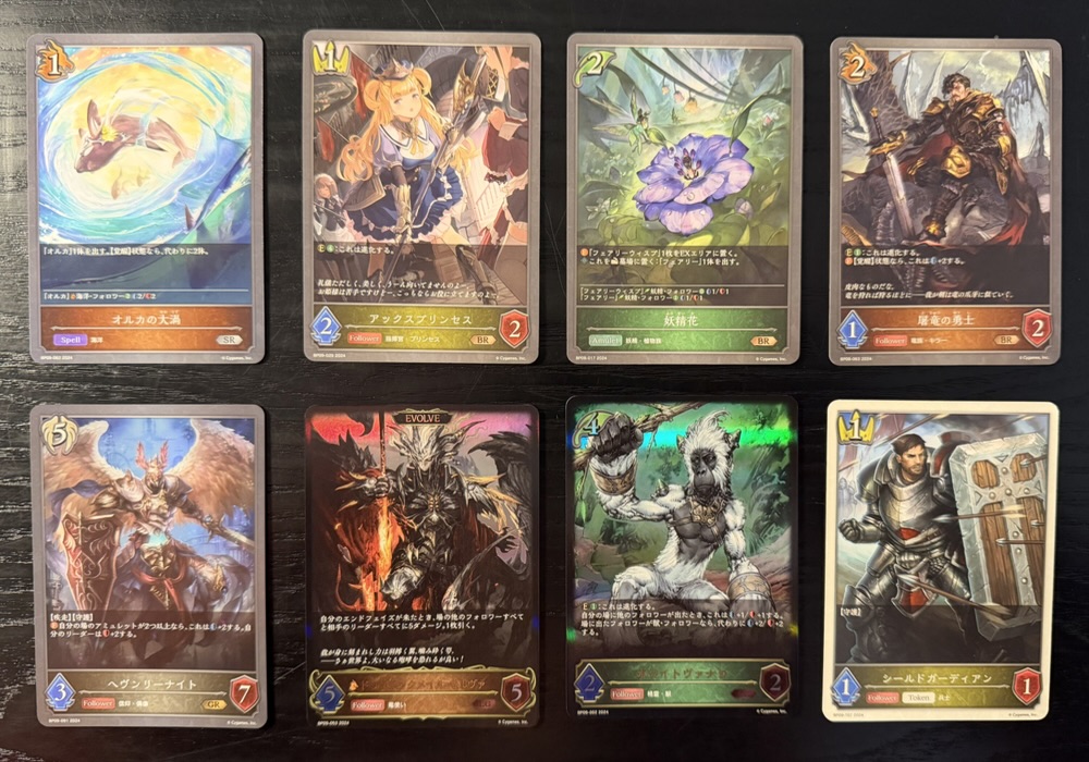
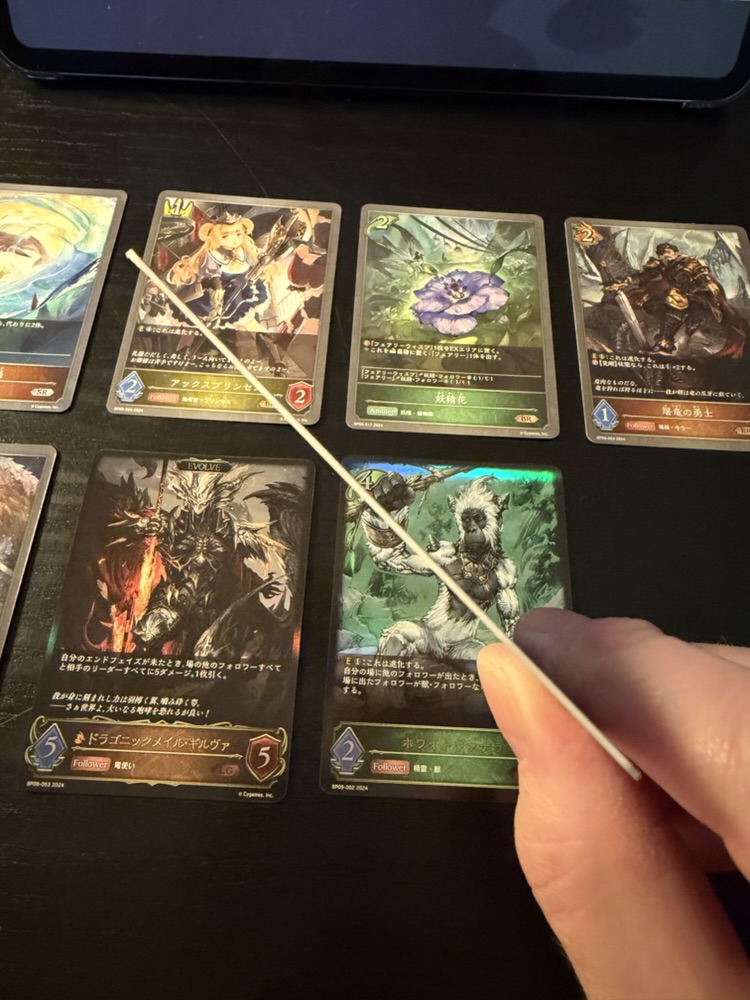
The cards are attractive, which is unsurprisingly considering the games heritage. There were eight cards in the pack, three of which were foil (the three on the left side of the bottom row). The most unusual card was the knight card at lower right, which was made of thicker card stock:
I wonder if this is some sort of avatar card? Surely it doesn’t get shuffled into a deck since it would stand out.
Shadowverse released a switch version which I enjoyed a great deal, and I hope the sequel gets a translation. I’ve never played this physical version but when I was in Japan last year there was an event in Akihabara that drew enormous crowds. It seems to be a successful game in Japan.
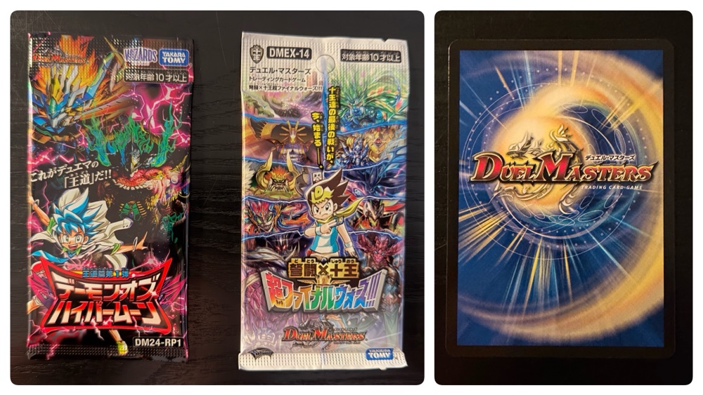
Speaking of successful games, Duel Masters continues to be Wizards of The Coast’s most successful game in Japan, outselling Magic The Gathering. These two packs are from recently released expansions.
Duel Masters has been around for 26 years now, and actually began as a manga (which itself was based on Magic The Gathering)! This card game began in 2002 and has to date received nearly 100 expansions. Two attempts to launch the card game in English markets have fizzled, but it remains one of the most successful card games in Japan.
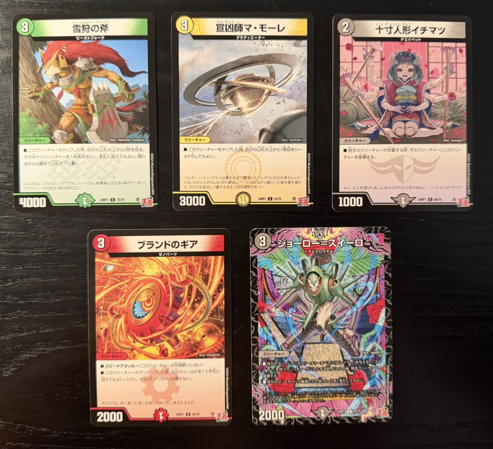
The first photo above shows the cards in the left pack, and the one immediately above shows the right pack. I played the English Duel Masters when it was released and I remember the game world and ‘story’ being fairly insane and this card art seems to suggest that hasn’t changed.
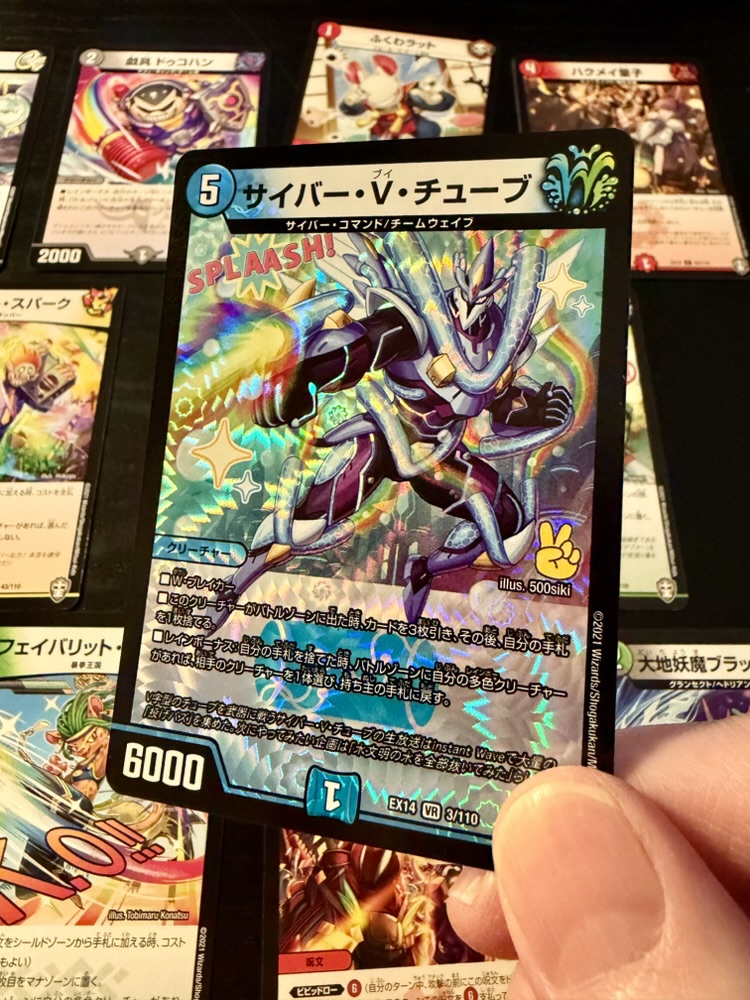
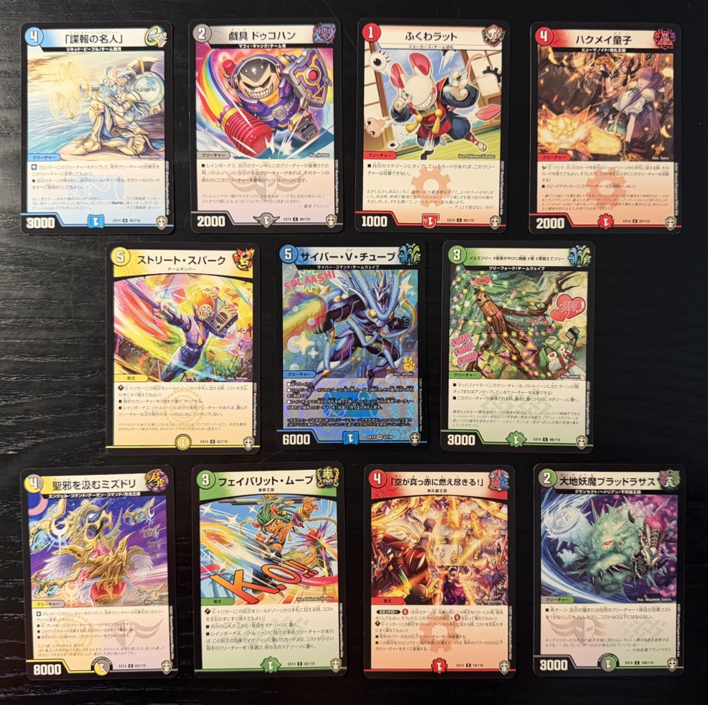
I buy Duel Masters boosters every time I visit Japan since they are cheap (~¥100) and because the special rarity cards are amongst the prettiest in any game. While this example I pulled from the second pack is dazzling, it’s still well below the most incredible cards I’ve pulled from boosters in the past. This seems like a fun game.
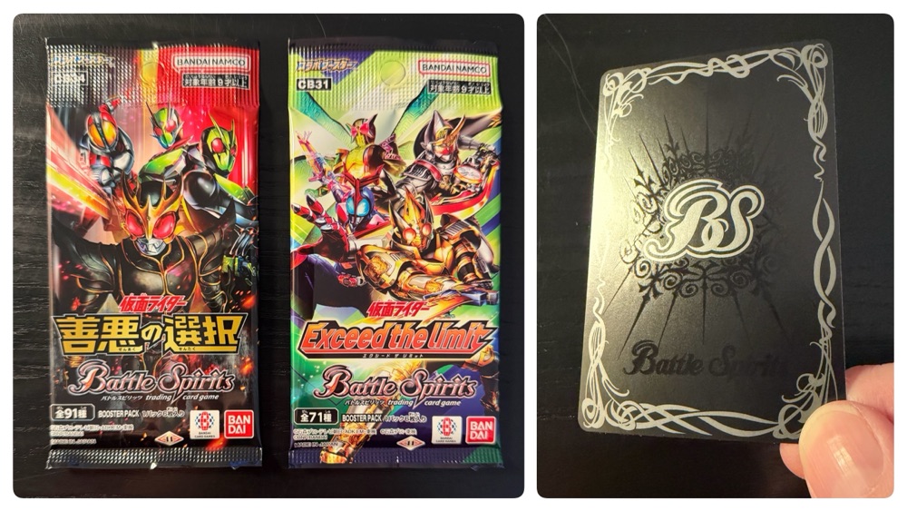
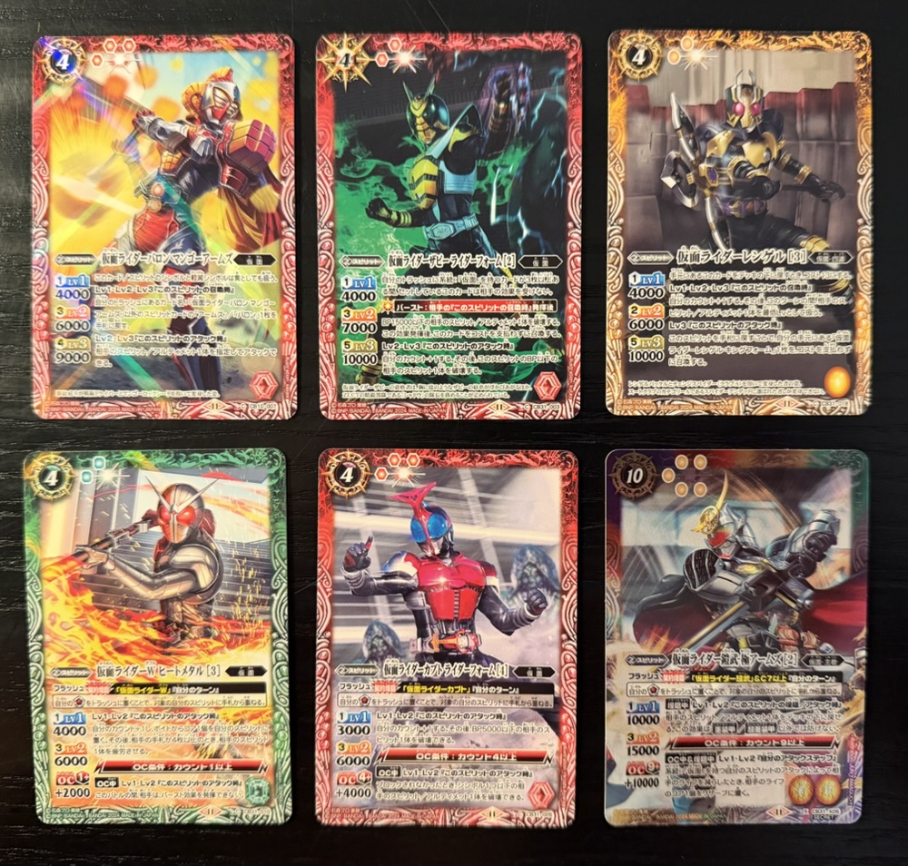
Here we have two Kamen Rider Battle Spirits expansions, one very recent and one from a year ago. I’ve opened Battle Spirits before and I knew these cards would impress.
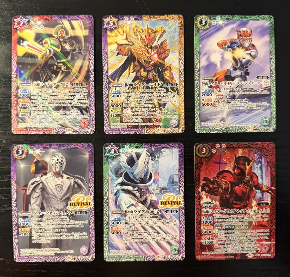
The above are from the left booster pack. Battle Spirits cards are plasticized and feel like thin credit cards. The print quality is exceptionally good, with super detailed artwork created just for the cards. This is clearly a product aimed equally as much at collectors as players.
I’ve read that each expansion introduces at least one new mechanic which is strongly supported by the new cards, so the game evolves with every new set. This is another game with organized play in Japan that must be interesting to watch since nearly every expansion is based on a licensed property.
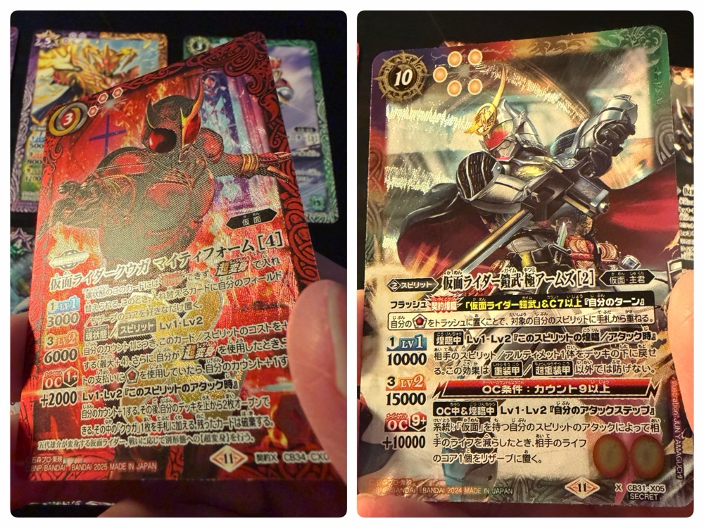
The high-rarity cards are very pretty. In these two packs I got one textured foil and another with a sort of spiral foil design that rotates as you tile the card. It’s a shame that a much bigger-selling game like Magic can’t implement these types of foils since it makes the cards feel very special.
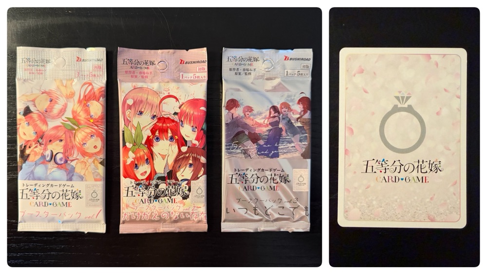
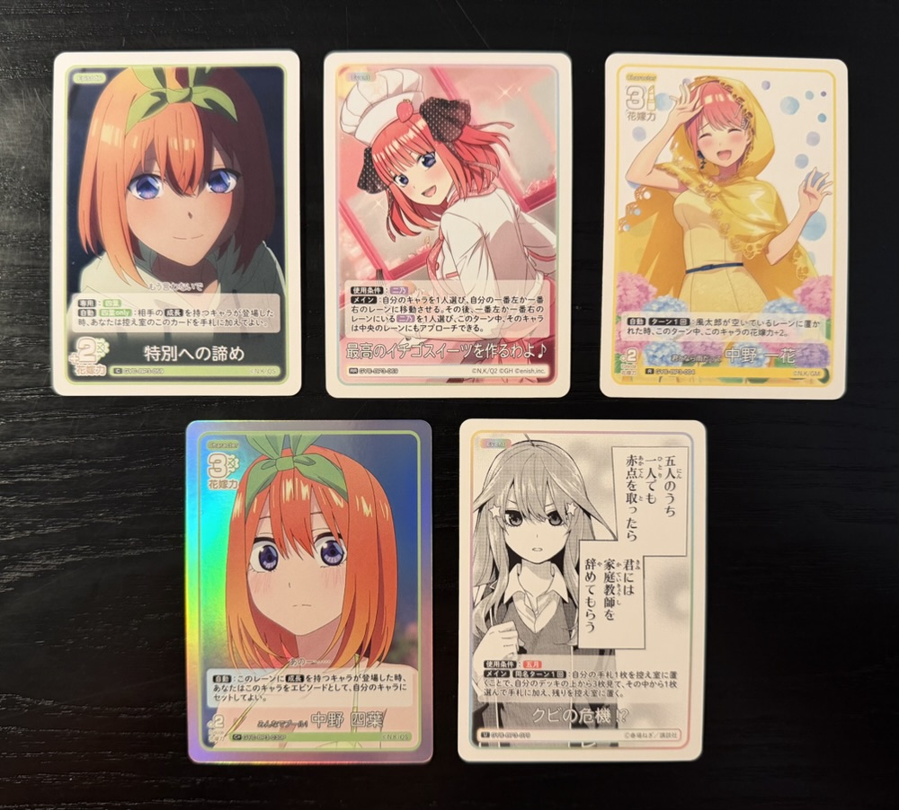
We’ll end today with the first three expansions from the new Quintessential Quintuplets card game. This game debuted last year, and I believe five expansions are now available.
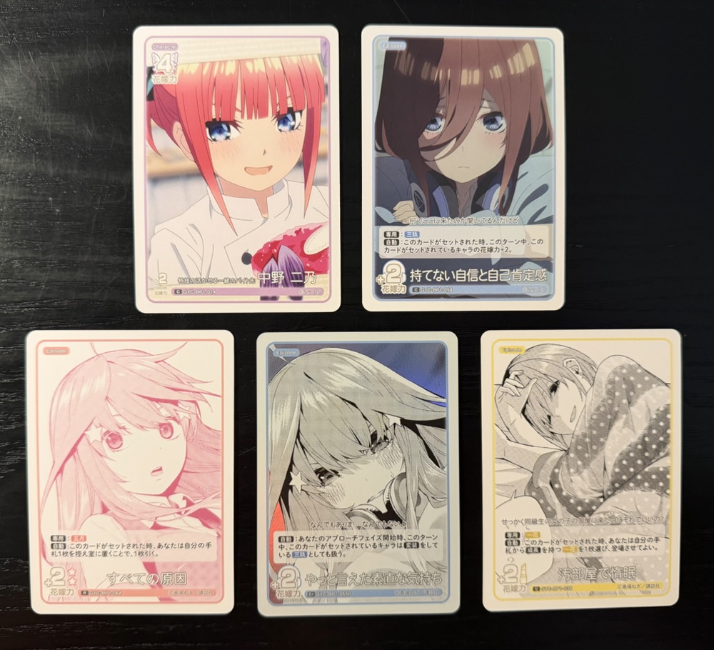
Each pack has five cards, and three of the cards in my first booster (volume 1) used manga art! I won’t say this looks bad, but it’s an unusual choice given that they do apparently have enough high-resolution colour art to use.
One card was foil, and the effect was a bit lazy since it was simply a background. But looking close I noticed even the manga art seemed unusually high-resolution, as if it had been redrawn.
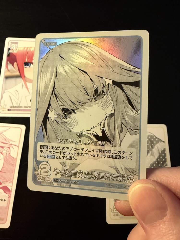
That’s the second pack, and again the quality of the art jumps out. Games based around anime often suffer from the curse of simply using screen grabs that are not of adequate resolution to look good on a card. That’s certainly not the case here. Look closely and you’ll see the foil also has a flower effect in the background.
This game is based on a manga/anime about a man that tutors five quintuplets and eventually marries one. The catch is the story begins with the wedding, but since the girls are identical we don’t know who he chooses until the very end. It’s wholesome and very well written and was a massive hit a couple of years ago.
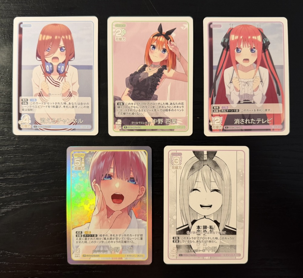
I’m a big fan of the story (the manga is one of my favourite completed series ever) and these cards are very attractive. I can see why this has been a success in the relatively short time it’s been out, and I’ll probably purchase one each of the expansions after these as well.