Category: The Unknown

The Hidden!

At the risk of making this a stamp blog, here’s another brief post about something I just discovered. I was reading an article in the latest issue of Gibbons Stamp Monthly about phosphor inks used on stamps. Usually this is so the automatic machines can read the stamps, but it’s sometimes for artistic reasons as well. Apparently it used to be more common, but is still occasionally done today.

So I got the 300+ postcards I’ve received from postcrossing and looked at them under a UV light. Here’s what I found:
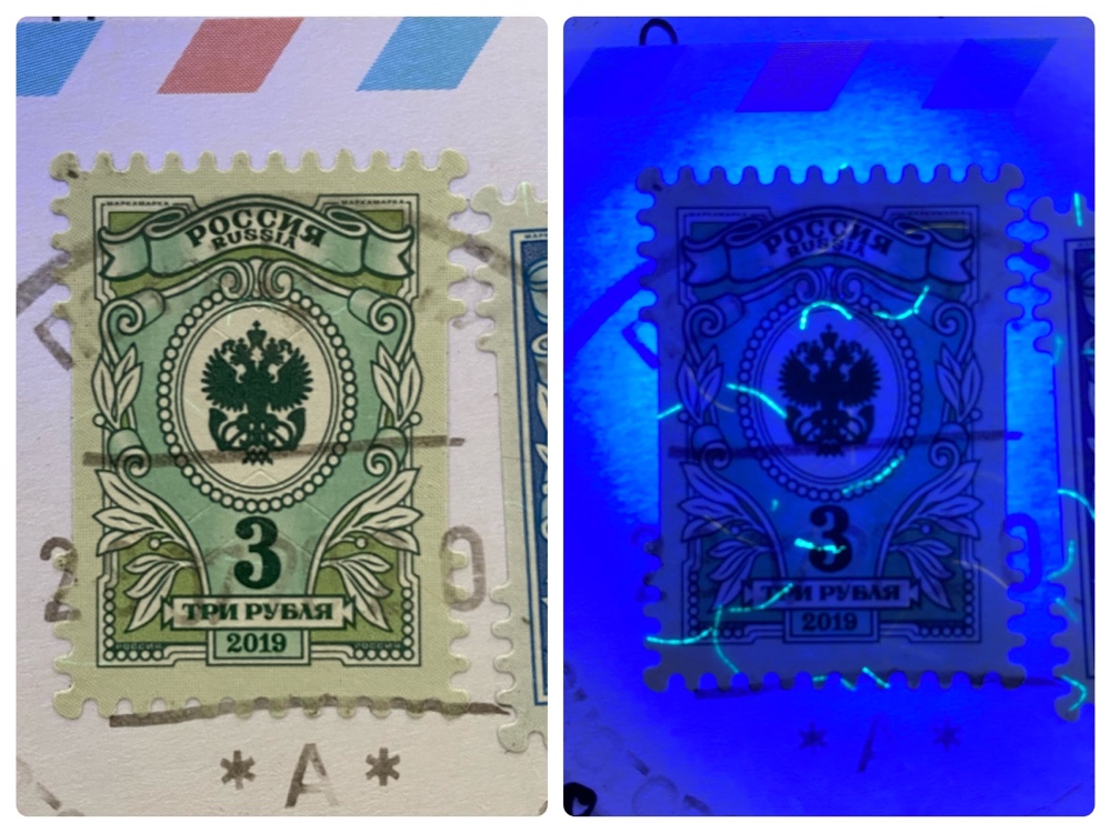
Many Russian stamps contain these phosphorescent ‘threads’ embedded in the stamp. They don’t seem to have any sort of pattern and I can’t discern their use for identification or artistic reasons. Even stranger I saw many cases of the same stamps either having or not having them. Weird.

Most Finnish stamps bear a silhouette of the country which, under UV light, is overprinted with the euro sign!
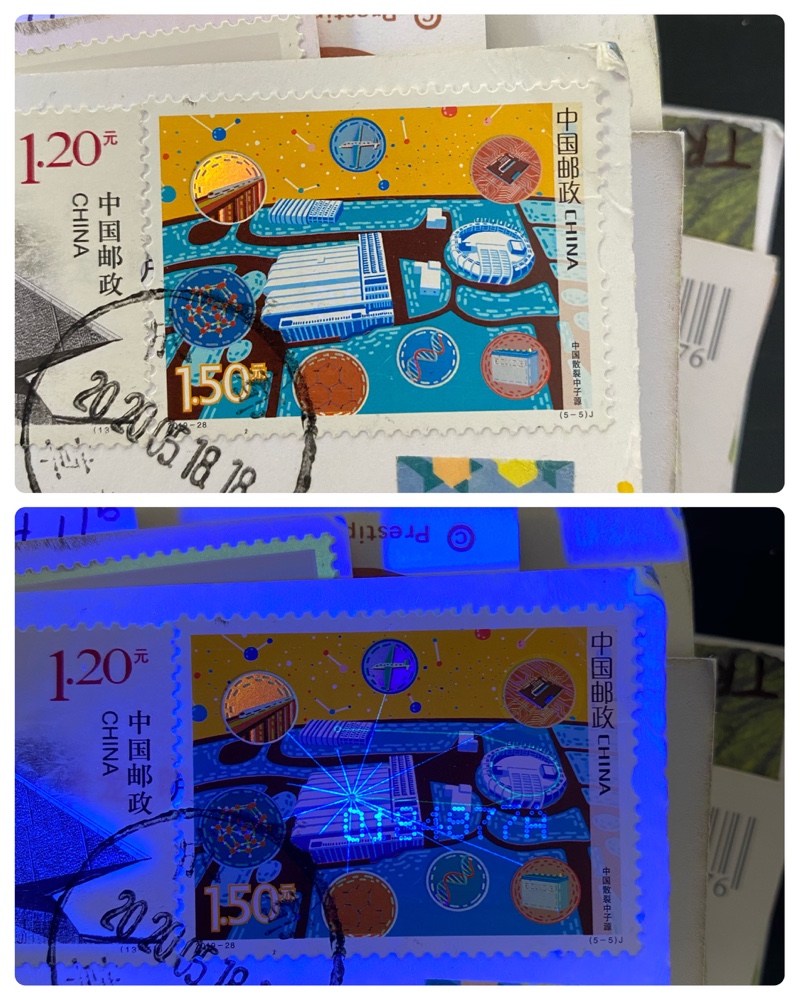
Here’s a Chinese stamp with a hidden UV element connecting various parts of the art. You can also see a number printed in phosphorescent ink on the stamp. This is very common in Chinese stamps, and I don’t know if it is done when the stamp is printed or as some sort of cancellation after mailed.
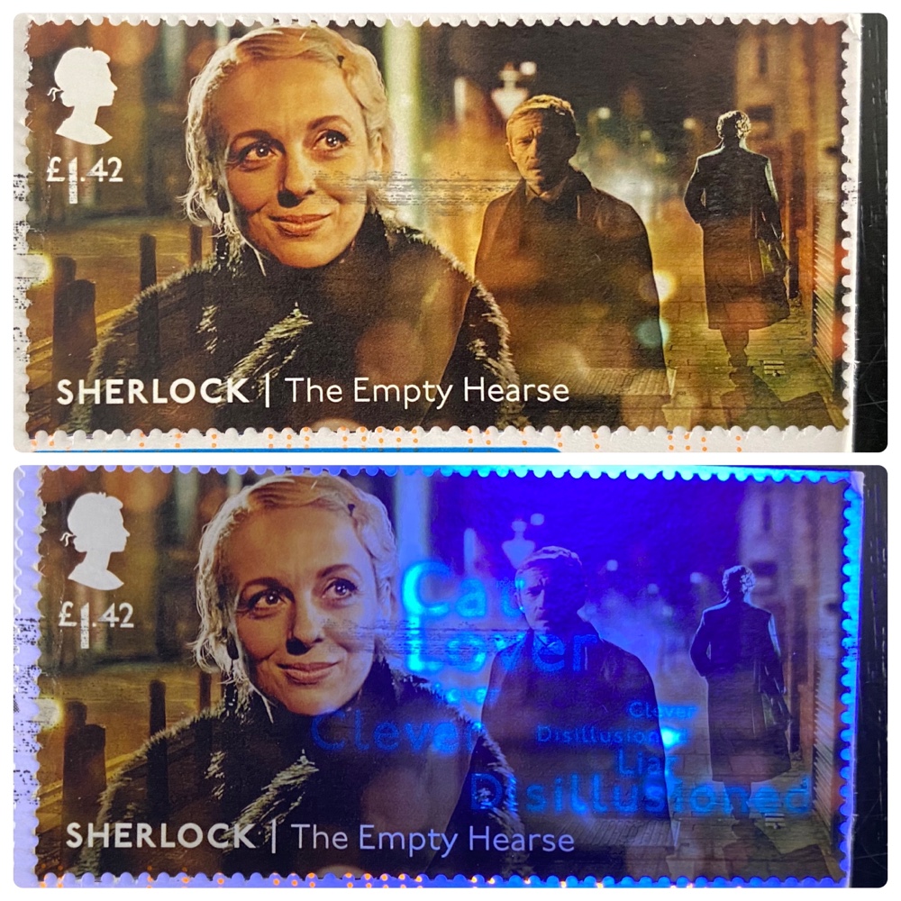
Cleverly, the UK Sherlock stamp series from a few years ago overprinted a series of words much like how the show used a similar method to show Sherlocks thoughts. As you can see the words are not very vibrant in the above pic, and this may be because the stamp is older. I found for instance that in the case of Russian stamps the ‘threads’ were more distinct on newer stamps so perhaps the inks fade over time?

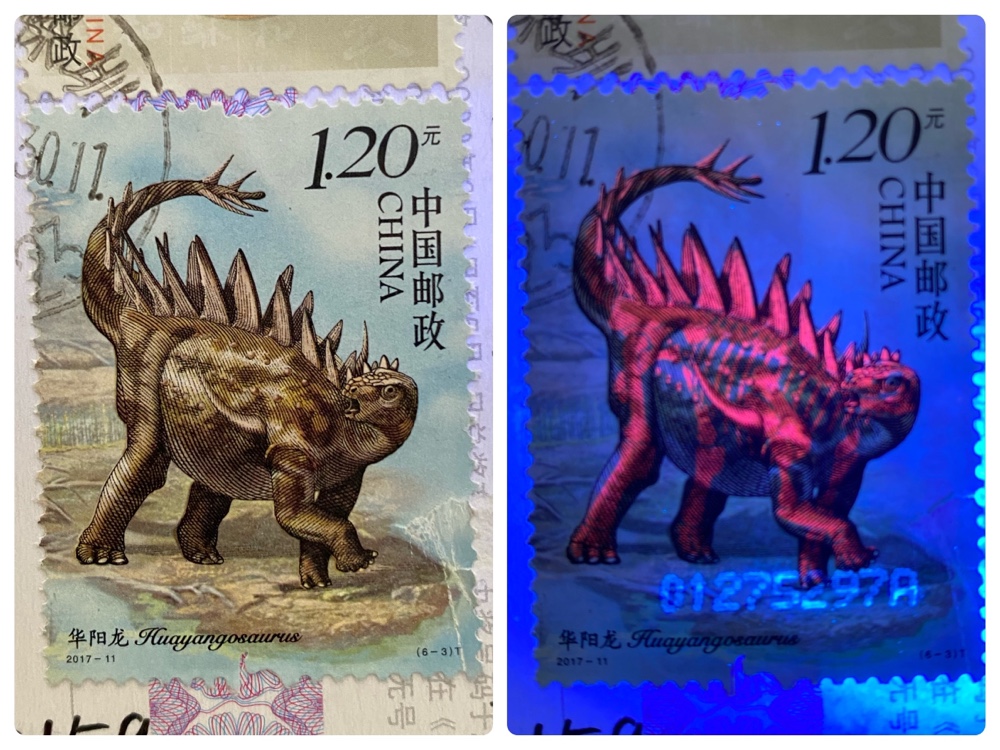
The best example – by far – that I found on the postcards I checked were on these Chinese stamps, on which you can see the skeletons overprinted in red phosphorescent ink under UV light. It’s extremely clear and crisp, and looks amazingly good. This was actually the very first postcard I shone the light on, and I was both astonished by what I saw and very excited to see what I’d find on others. Alas I soon discovered the UV overprints were rare indeed and never as flashy as this one.

So if you have a UV light and a bunch of older postcards why not shine it on them and see what you can see? There may be a few hidden secrets you missed the first time around 🙂
Postcard Contest: Halftime

Bernard and I are currently competing in a postcard design contest!

The rules are as follows:
1) Each of us selected 4 one-word categories.
2) We each designed (and professionally printed) one postcard per category and sent them once per week to each other.
3) Each pair of designs will be presented to a team of five elite judges who will select the best card each week.

The judges were not selected until after we’d made the cards, so as to avoid choosing designs to cater to a particular judge.

As of today we’re four weeks into the eight week contest. Four cards judged, four to go. Here’s the current results…

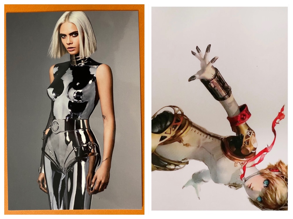
Category 1: Android

The first category was chosen by me, and both entries are shown above. Mine is the lovely shot of Cara D in a chrome suit, and Bernard cheekily chose Aegis in an effort to confuse the judges and maybe nick a point! Neither of these are technically androids, but there’s no rule that said that the cards had to adhere to the categories.

The votes were 3-2 in favour of my card. Here’s one judges comment: (She) has strong eyebrow game, and reminiscent of my purple rock star Barbie growing up!

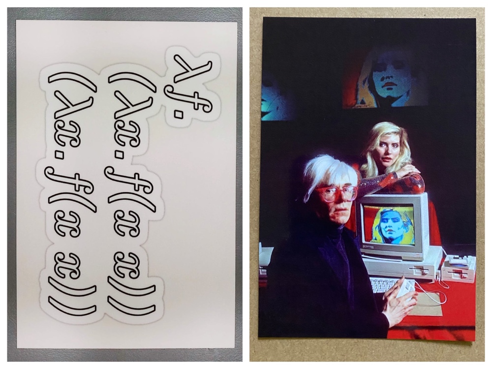
Category 2: Computation

Bernard chose this category and his design – some esoteric code – is on the left. I chose an artistic shot of Andy Warhol and Debbie Harry at the American Amiga launch in the 80s. As with all my designs I tried to make cards you’d see on a rack in a postcard shop, and this one certainly fits the bill!

Once again the judges favoured my design 3-1 (with one tie!). One judge said: While I appreciate the mathematical notation, which in this font resembles an ancient inscription, I cannot go past Andy and Deb “using” an Amiga.

Category 3: Gold

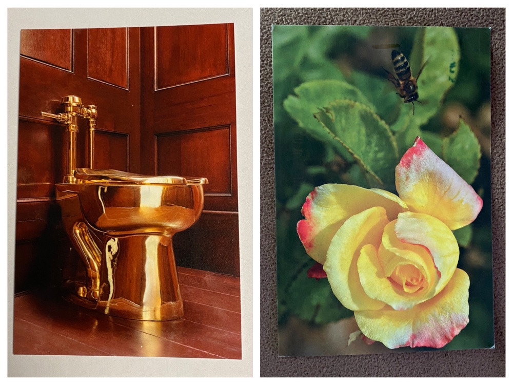
Once again this was my category, and it was a difficult one to choose an image of! I rejected many options before coming up with the cozy shot of the golden loo. I thought it was funny and would certainly buy such a card myself. Bernard on the other hand forgot to make a specific card and instead chose a flower card he has (coincidentally) printed and sent it as his entry 🙂

And… the judges chose his in a landslide 4-1 win. They were strangely quiet about their decision, so we can only guess as to why they preferred the flower to the toilet!

Category 4: The Holy See

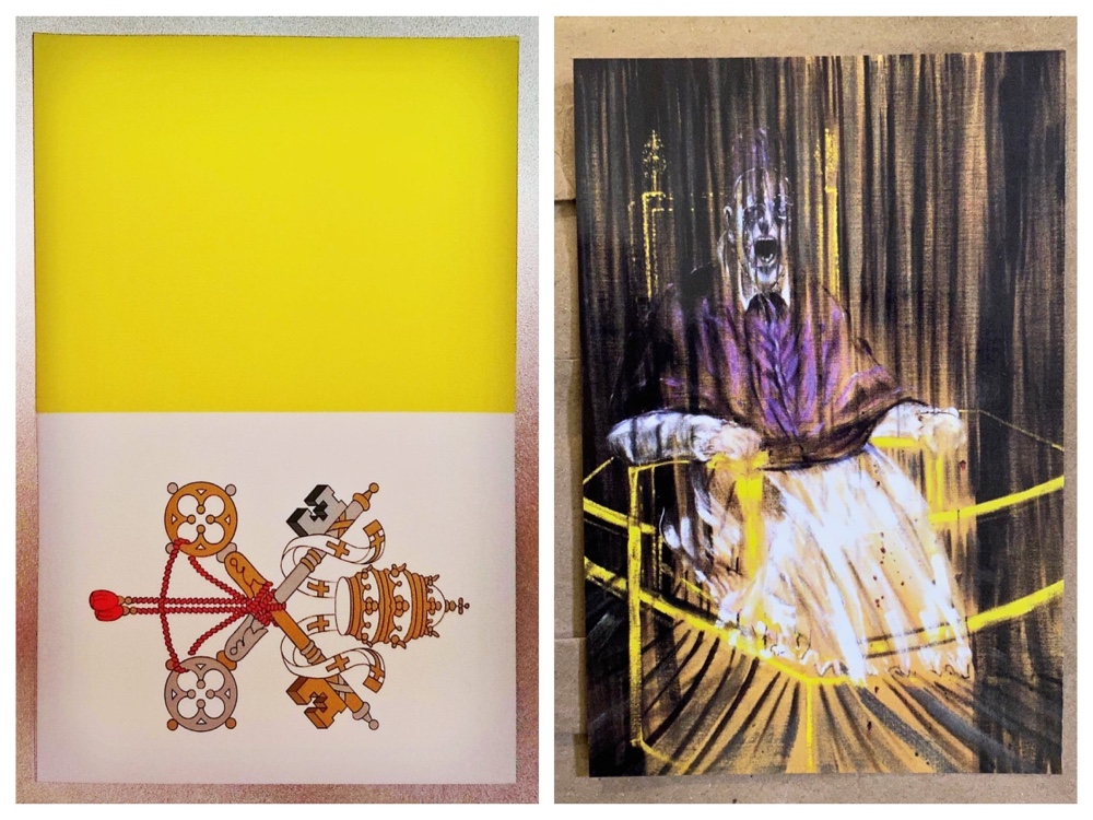
Bernard chose this not-quite-one-word category, and I think both of us regretted it since it was very difficult! He went with a safe choice – the Vatican flag – and I went with a too-clever choice of Francis Bacon’s Study after Velázquez’s Portrait of Pope Innocent X. This was of course because it was used as the cover of a Sisters Of Mercy record, but I wonder if the judges would know that?

They didn’t, or perhaps they just preferred the flag, since once again Bernard won 3-2! Two judges commented on how they preferred the flag since the Bacon art was scary 🙂

Halftime Score: Tied!

So after four cards the score is even Stevens: 2 points each!

Four cards left! What could the categories be? Will the judges remain as unpredictable as they have been? What about the fourth rule not listed above since it hasn’t come into play yet?

In a month, all will be revealed…

Day Trip

Today we drove 90 minutes north…

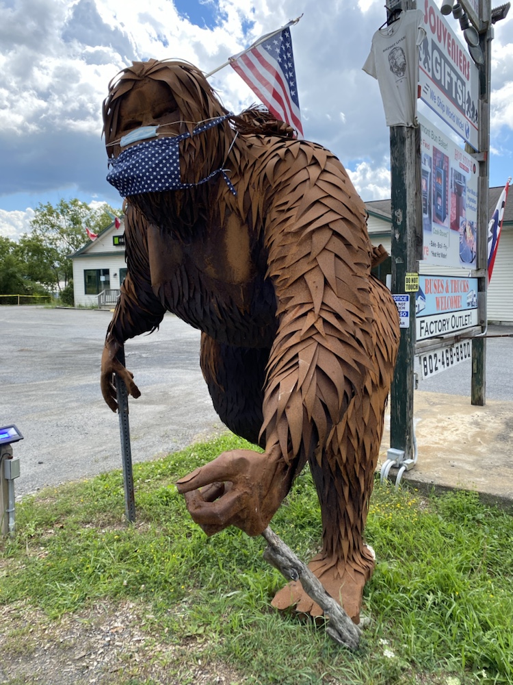
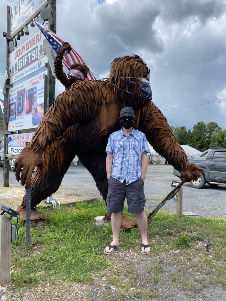
To visit Bigfoot…

Although just a metal statue, he was pretty impressive…

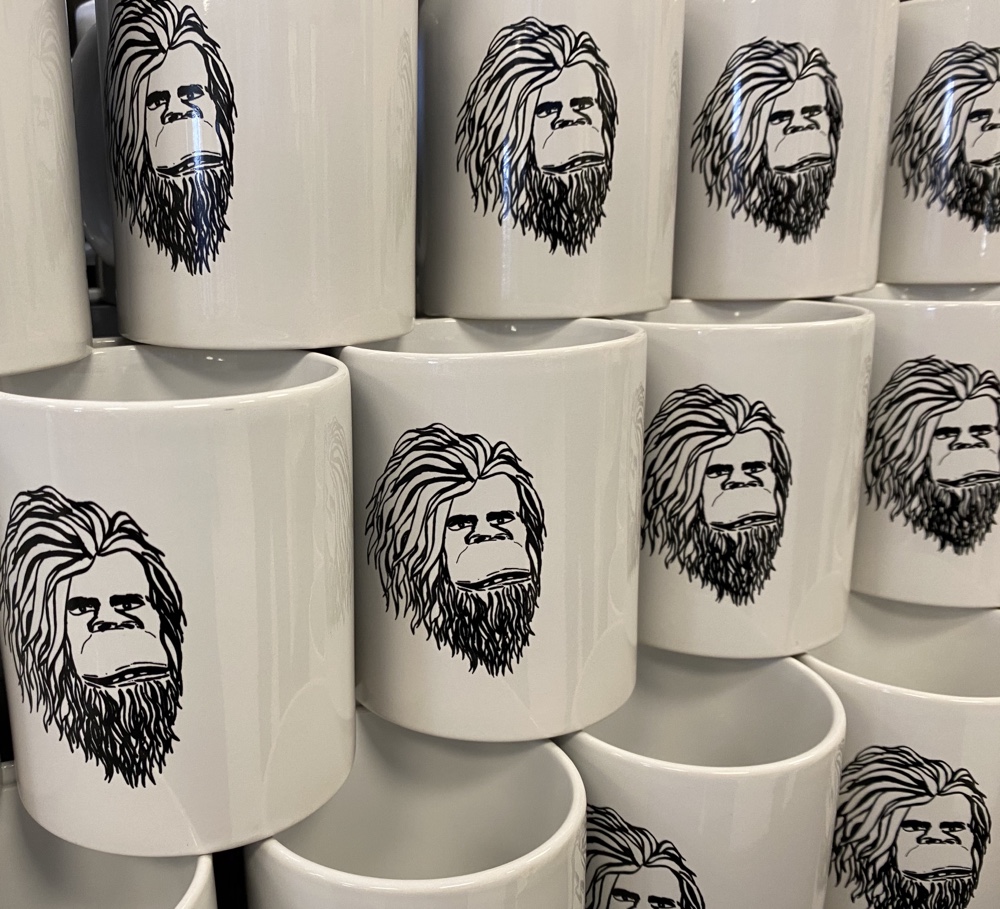
But the souvenir shop behind him didn’t sell anything good…

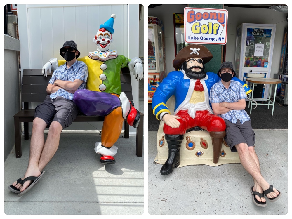
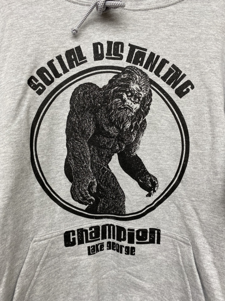
After a brief stop in Vermont we then drove over near Lake George and visited souvenir shops…

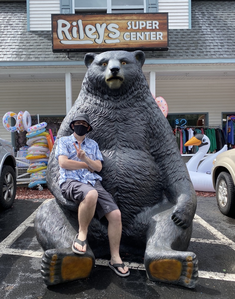
And some more souvenir shops…

And even bought a souvenir or two…

And then stopped for groceries on the way home…

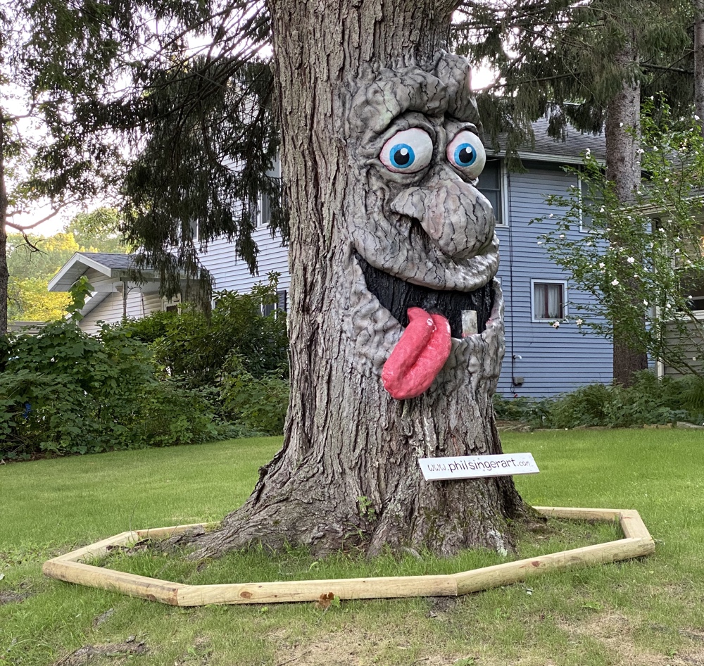
And ultimately, many hours later, found probably the strangest thing we’d seen all day just down the street from our home…

It was a good day 🙂